5 enchanting illustrated movie posters
Illustrator Sam Gilbey has raised the pop culture poster stakes over the past year. Find out more about what inspired his favourite five.
Sign up to Creative Bloq's daily newsletter, which brings you the latest news and inspiration from the worlds of art, design and technology.
You are now subscribed
Your newsletter sign-up was successful
Want to add more newsletters?
There's a variety of ways in which you can design a poster, whether it's retro poster design, modern poster design or movie posters, they're all wholly inspiring in their own way. Recently, we've discovered the work of illustrator Sam Gilbey, who specialises in creating pop culture posters.
"Thanks to doing a couple of pieces for Edgar Wright, it led to working with Picturehouse Cinemas and other clients," he explains. "My whole portfolio gradually evolved into being mostly focused on pop culture, and generally featuring portraits." Here, he talks about five of his favourite pieces of work.
01. The Raid 2 event poster
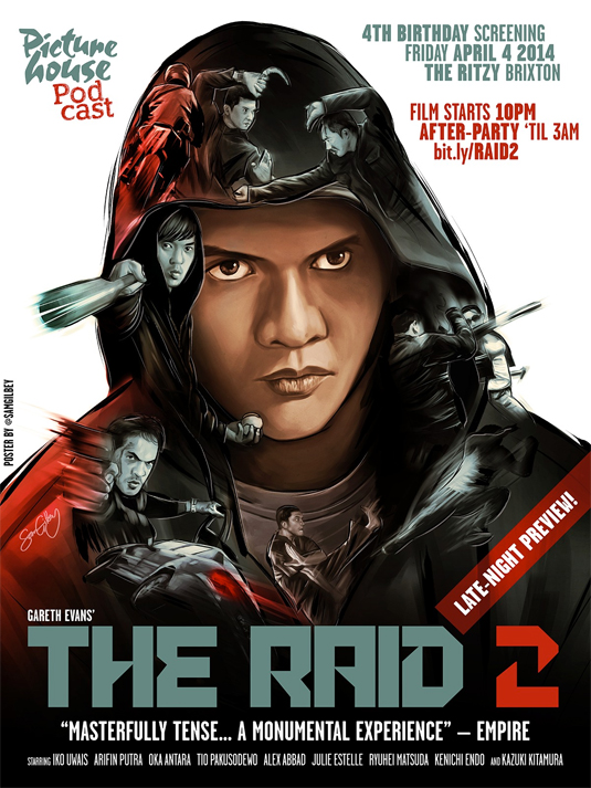
"Me and martial-arts flicks go way back - it's a genre I've loved as long as I can remember, and it's been amazing to see Gareth Evans make his mark on it, himself inspired by all the Jackie Chan films from the golden age of Hong Kong action cinema. As such, it was a blast, or should I say I got a kick out of creating this for an event.
Article continues below"I wanted to have the main focus as a portrait of the protagonist Iko Uwais, but then I saw how the guy with the baseball bat could be positioned to follow the shape of the hood on the left hand side and the whole concept just clicked. From there it was simply a case of looking for details that I could 'map' to the portrait - it's such a buzz when you spot a detail that will fit perfectly, such as Iko's flying kick for the V of the t-shirt."
02. 'Unlike you I'm not afraid of light'
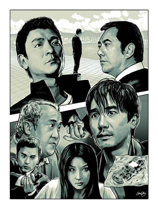
"As I've already said, I'm a huge fan of Asian cinema, and Infernal Affairs (remade as The Departed by Martin Scorsese), where the police have a mole in the triads and vice versa, made the perfect subject for an exhibition where the only restriction was that the artwork need to feature glow in the dark inks.
"In the glow in the dark version, the true connections between the characters can be seen, along with other details, such as the Morse code that two of them communicate with."
03. Stand By Me
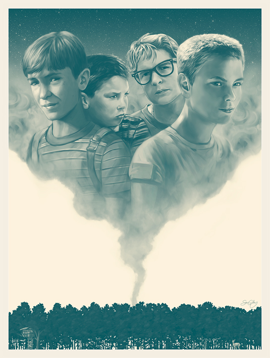
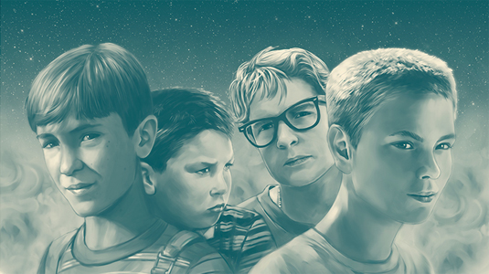
"I have a real soft spot for this film, which is based on a short story by King, and I thought it would be interesting to tackle it for an exhibition that was sure to feature plenty of horror inspired works.
Sign up to Creative Bloq's daily newsletter, which brings you the latest news and inspiration from the worlds of art, design and technology.
"I felt that the smoke plume from a campfire would be a good way to illustrate the fleeting, ephemeral nature of childhood and innocence that the film explores. The tree-line at the base of the piece also works as a very simplified timeline of their adventure, starting at the treehouse, with the campfire in the centre, and the deer that Gordie spots also in there."
04. An illustrated guide to the Marvel Cinematic Universe
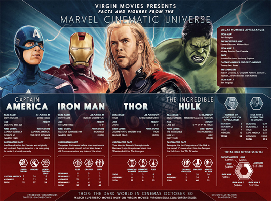
"I've worked with Virgin Movies a number of times, and this example (which I did around the launch of Thor: The Dark World) shows how my graphic design and illustration skills come together for various projects. It's important for something like this that the text is as balanced as possible, so I work to a grid and lay all the type out first.
"Then from there I try to ensure that the feel of the graphic elements suits the theme of the subject matter. In this case I created some bespoke icons to represent some of the numeric statistics. Hopefully then at that point the character illustrations can bring it all to life."
05. Electrick Children
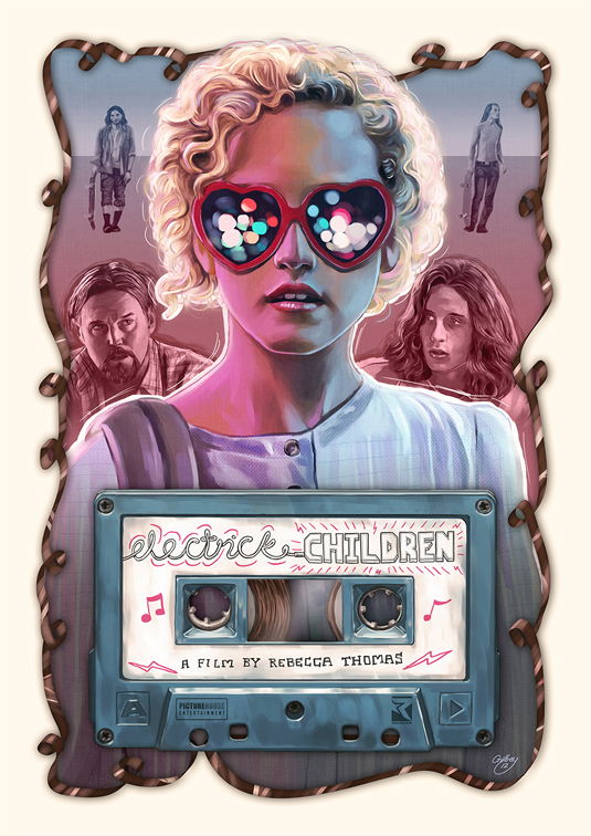
"It was one thing creating posters for various movie events, but when Picturehouse Cinemas commissioned me to work on an alternative poster for Rebecca Thomas' Electrick Children (a sweet road movie about a Mormon girl who hears pop music for the first time on a cassette tape and goes in search of the musician), little did I know that it would be so well received that they'd end up using the portrait of the girl (Julia Garner) as the official cover for the DVD and online sales.
"This is something I hadn't even dared to dream of getting the chance to do, with the vast majority of movies being promoted via Photoshopped imagery. That's partly why the alternative exhibition poster scene has sprung up, of course, as a reaction to that, but it was great to get to do something official in this case, and to be able to walk into an actual real store and see it."
See more incredible work over on the Sam Gilbey website.
What do you make of these pop culture posters? Let us know in the comments box below!

Sammy Maine was a founding member of the Creative Bloq team way back in the early 2010s, working as a Commissioning Editor. Her interests cover graphic design in music and film, illustration and animation. Since departing, Sammy has written for The Guardian, VICE, The Independent & Metro, and currently co-edits the quarterly music journal Gold Flake Paint.
