An organic typeface with a digital inspiration
Check out Karan Singh's Pivot: an experimental – but functional – typeface inspired by how figures are displayed on a digital watch.
Sign up to Creative Bloq's daily newsletter, which brings you the latest news and inspiration from the worlds of art, design and technology.
You are now subscribed
Your newsletter sign-up was successful
Want to add more newsletters?
Australian-born, New York-based illustrator and designer Karan Singh developed the modular typeface Pivot as a personal project, inspired by how numbers are displayed on the face of a digital watch: "Their forms are rigid, and defined by the constraints of the technology - in this case an LED screen," he explains.
Although experimental, Singh still wanted Pivot to be functional. He created a simple but effective structure to achieve consistency, using circles as joints: "Initially the lines that connected the circles were straight, but were revised to the tapering version as they unified the letters better. It also gives the type a more organic feel."
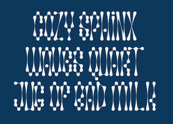
When testing the Pivot typeface, Singh was keen to use a phrase other than the usual 'quick brown fox', and researched some alternative pangrams. "I liked how quirky this particular phrase was," he smiles.
Article continues below 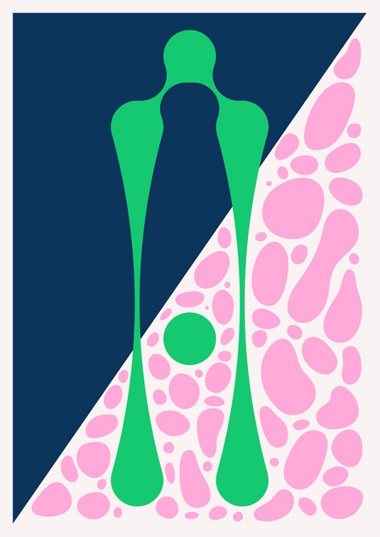
The 'A' was the first letter that he made for the Deco version of the typeface. "It happened by accident when setting the initial version, and a connecting segment was stretched," he reveals. "I liked how it turned out, and decided it would work well as a light version."
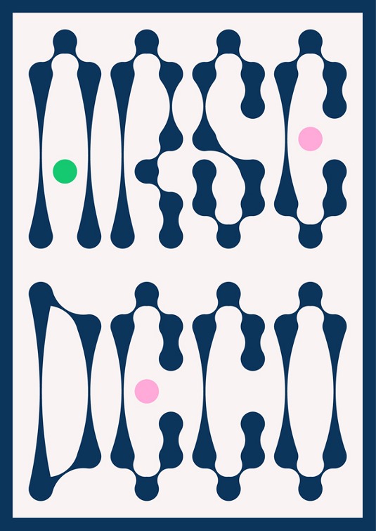
Arse Deco, a tongue-in-cheek play on the light version's name. "I liked how the letters sat together," adds Singh.
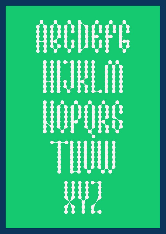
With his type samples, Singh aimed to convey something clean and minimal using interesting layouts, without taking too much away from the letters themselves. "This especially applies to the way the alphabet, pangram, numbers and additional characters were laid out," he explains.
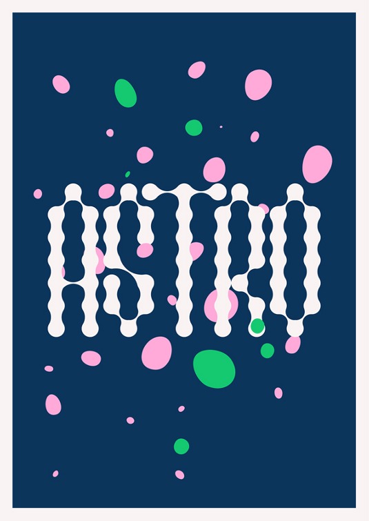
"The type is reminiscent of liquid, which is what inspired the multi-coloured blobs that float around," says Singh.
Sign up to Creative Bloq's daily newsletter, which brings you the latest news and inspiration from the worlds of art, design and technology.
This article originally appeared in Computer Arts issue 220.
Liked this? Read these!
- Download the best free fonts
- Top-quality typography tutorials
- Free tattoo fonts for designers
Seen an impressive font that we should feature? Tell us in the comments!

The Creative Bloq team is made up of a group of art and design enthusiasts, and has changed and evolved since Creative Bloq began back in 2012. The current website team consists of eight full-time members of staff: Editor Georgia Coggan, Deputy Editor Rosie Hilder, Ecommerce Editor Beren Neale, Senior News Editor Daniel Piper, Editor, Digital Art and 3D Ian Dean, Tech Reviews Editor Erlingur Einarsson, Ecommerce Writer Beth Nicholls and Staff Writer Natalie Fear, as well as a roster of freelancers from around the world. The ImagineFX magazine team also pitch in, ensuring that content from leading digital art publication ImagineFX is represented on Creative Bloq.
