The 15 best iPad apps for designers
Improve your productivity on the go with the best iPad apps for designers.
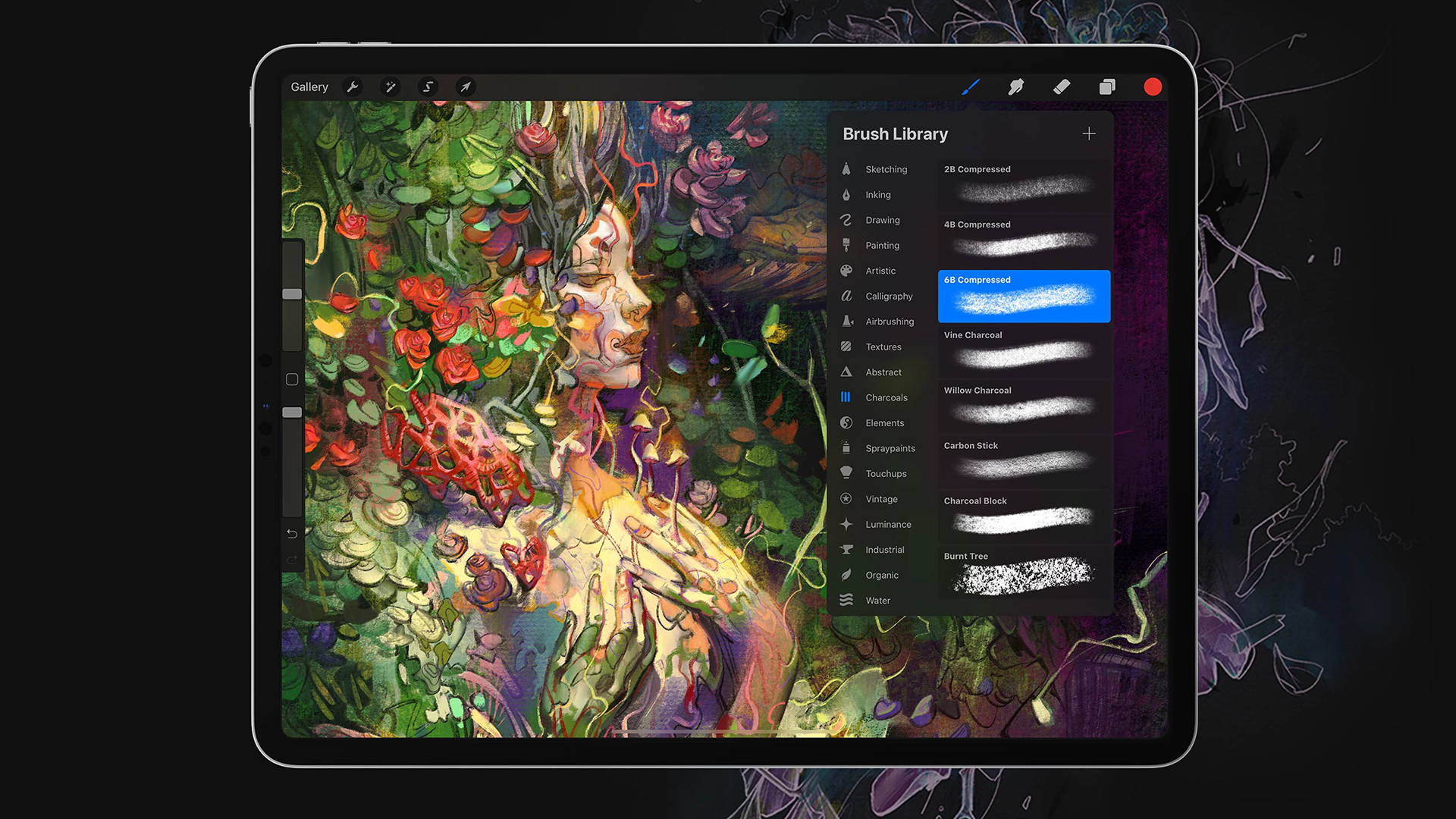
The best iPad apps for creatives can help you get more done on your Apple tablet, and possibly avoid having to power up a laptop. There are a huge range of iPad apps available in the App Store, and they can help you plan, organise and create while you're on the go, no matter which of the current iPad generations you have.
In our guide below, we've picked out options covering all aspects of the industry, from creation to admin, to help with every aspect of your workflow. We've evaluated them for user experience, usefulness and value through hands-on testing and a comparison of customer reviews.
If you're specifically looking for apps for drawing, see our guide to the best drawing apps for iPad. We also have a guide to the best iPad Pro apps compatible with Apple Pencil. You might also want to choose one of the best iPad stands to hold your device.
01. Affinity Designer
Why you can trust Creative Bloq
- Requirements: iOS 12 or later
- Price: from $18.49
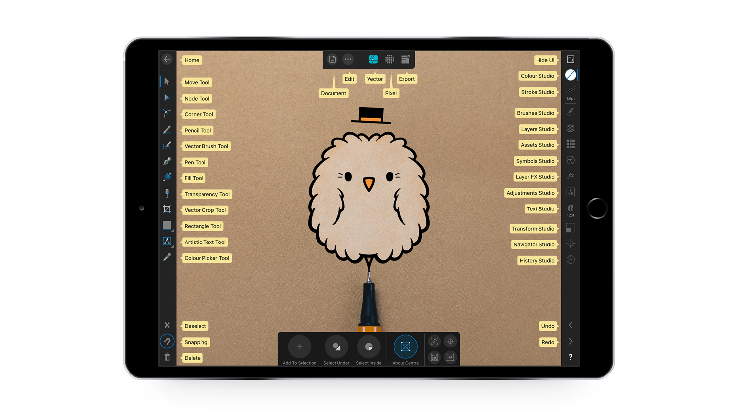
When we tested Affinity Designer, we found it to be one of the most ambitious creative apps for the iPad. Taking all of the power and precision that the desktop version is known for and migrating it to the iPad, this iteration of Affinity Designer has been specially upgraded to fit the device. We found that Affinity Designer is perfect for any part of the workflow, we loved the UI, the smooth pen tool and the typography options (to name but three features – see our Affinity Designer for iPad review for more). Affinity Photo and Affinity Publisher are also worth checking out.
02. Obscura 4
- Requirements: iOS 16.0 or later
- Price: Free (with in-app purchases)
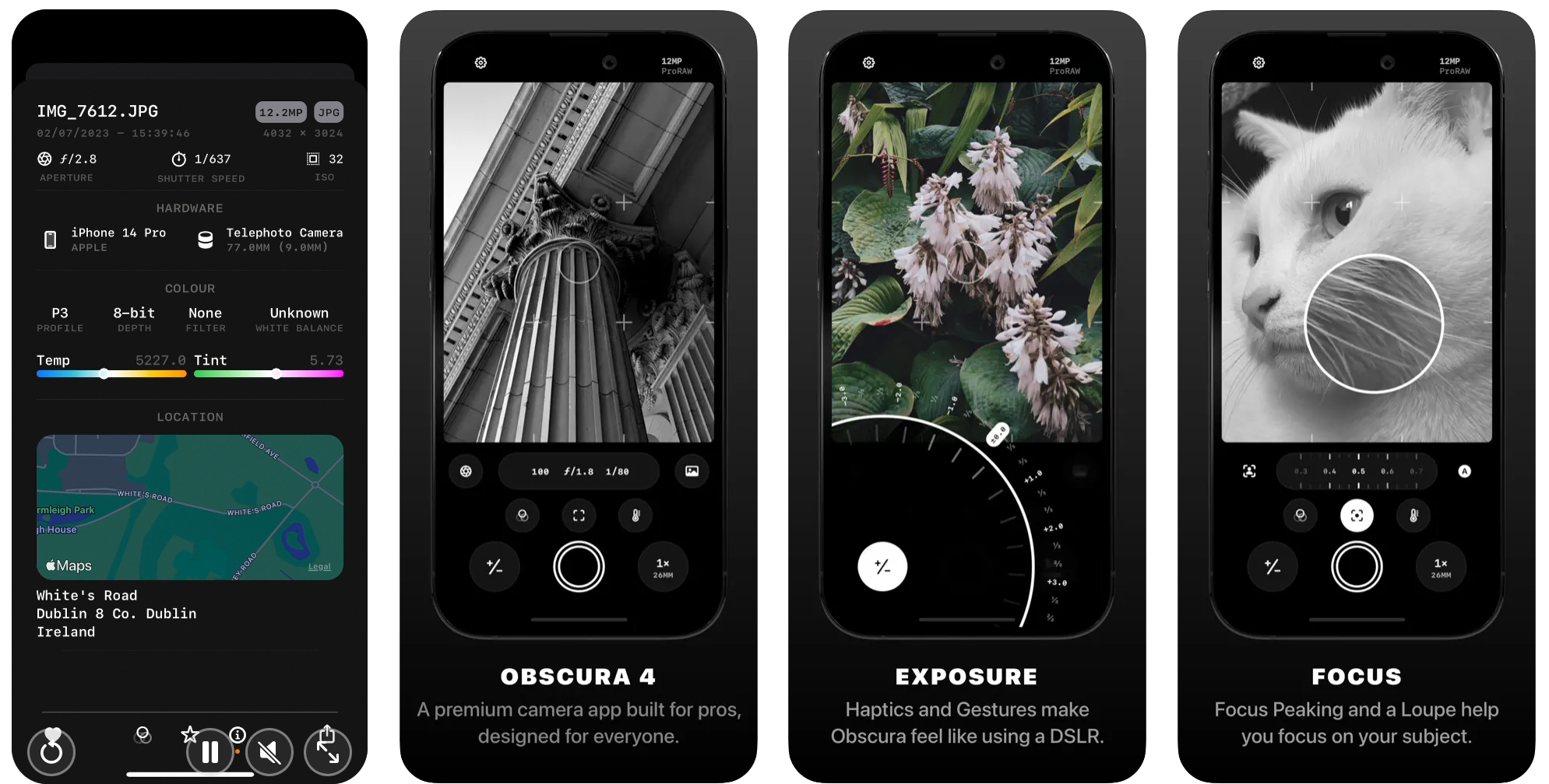
Want to take decent photos with your iPad? Obscura 2 should be your go-to app. It's intuitively designed to make it easy to shoot photos in a hurry, and the haptic feedback means it feels quite natural given you're only pressing on a screen. With multi-format capture and all the features of a 'real' camera, you can also add a wide range of filters to add pzazz to your images. You can also edit and share within the app.
03. Photoshop for iPad

Photoshop for iPad is included with all Creative Cloud subscriptions and can be downloaded from the app store. In our review, we weren't convinced by its limited feature-set, but it is fast catching up with the full version – with new capabilities being added all the time. You can create full PSDs, work with layers and, of course, retouch your images with tools like spot healing and clone stamp. See our full Photoshop for iPad review for more.
- Requirements: iOS 16.0 or later
- Price: From free
04. Pixelmator
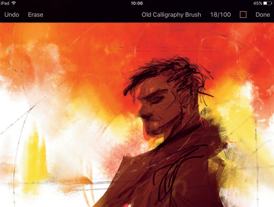
Packed with image editing and enhancement tools, Pixelmator contains everything you need for adjusting assets on the go. And we mean everything. When we tested it, we absolutely loved it and had barely any cons at all (see our Pixelmator review here). Thanks to Drag and Drop support, users can move images and graphics between iPad and other apps easily. Alternatively you can store images in the iCloud Drive and access them anywhere. By taking advantage of the iOS 14 technologies, Pixelmator offers best-in-class Photoshop file support, precision drawing and painting with the Apple Pencil, plus much more.
05. Trello

- Requirements: iOS 16.0 or later
- Price: Free (with IAPs)
Whether you're coordinating a big design project or just trying to organise a cleaning rota, Trello is a great tool for getting stuff done and staying organised. It makes it easy to invite people to collaborate on projects, and you can create custom boards for whatever you're working on. The iPad app is optimised for iPad Pro with plenty of tweaks to take advantage of its larger screen, and if you absolutely need project updates wherever you are, there are also apps for Apple Watch and even iMessage.
06. Procreate
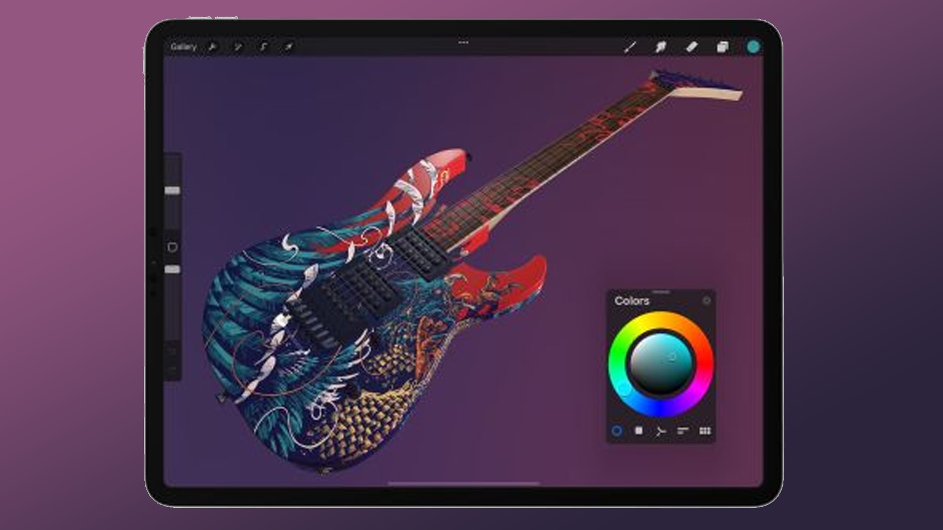
Our testing confirms that Procreate is a truly wonderful natural media app, and it's very fast – especially on more recent iPads, where it can take advantage of their huge power (see our Procreate review). The brush, colour and interface menus are versatile, offering a lot of control, and it now has a range of 3D painting features, expanding the range of mediums supported further. We found it to be particularly well optimised for the iPad Pro, with massive, ultra-hi-definition canvases, and it works super smoothly with Apple Pencil.
Other drawing apps to consider include Tayasui Sketches, Photoshop Sketch and ArtRage and Drawww. See our guide to the which iPad is best for drawing if you're still trying to decide which tablet will be the best canvas for you.
07. Apple Freeform
- Requirements: iOS 16.2 or later
- Price: Free
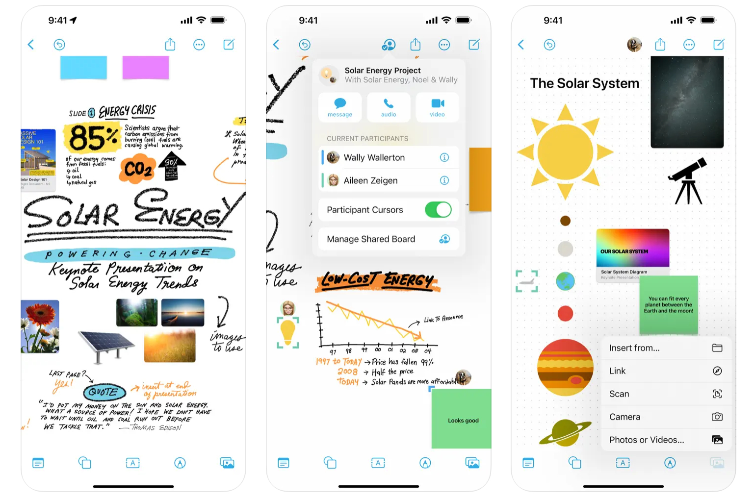
Apple's own Freeform app is basically a infinite digital whiteboard that supports all types of of inputs It works across Apple devices and syncs through iCloud. You can use it to brainstorm on a shared document with a team, write reminders and notes and basically use it as a surface for whenever you want to jot something down. We love the versatility of it: it's available across iPhone, iPad and Mac and allows us to write, sketch and import files, and even features built-in FaceTime support.
08. Noteshelf

- Requirements: iOS 16.0 or later
- Price: Free (with in-app purchases)
If what you want is the digital equivalent of a sketchbook, rather than a canvas – somewhere to write stuff down, doodle out a few ideas, take notes in a meeting – get Noteshelf. Its ability to mix typed, audio and handwritten notes – with beautiful ink effects – annotate documents and images, and even define custom paper designs to make it easy to create, say, iPhone wireframes for sketching app designs makes it an extremely handy iPad app for designers.
It pairs with a range of third-party styluses too, for pressure sensitivity and wrist rejection. You can even take notes on your Apple Watch and they'll sync to the main app.
09. Adobe Express
- Requirements: iOS 15.0 or later
- Price: Free with in-app purchases
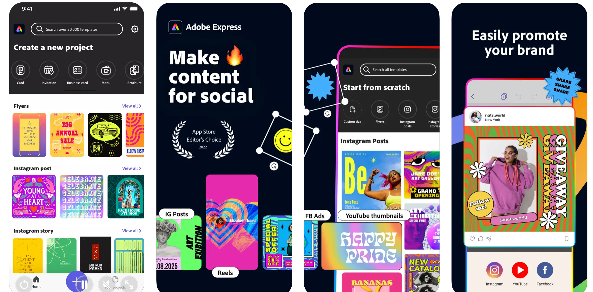
Adobe makes loads of apps for iOS now, but the 2024 update to Adobe Express packs in a lot. It intends to be a one-stop shop for content creation on the go, allowing creatives to design, edit and curate projects via Photoshop and Illustrator. It can provide access to brand kits, also now provides access to Adobe Firefly for text-to-image generation it's a handy tool for social media content as well as flyers and posters. To get the most out of Express, see the best iPads for graphic design.
10. Things 3 for iPad

Apple's Reminders app is actually more useful than most people give it credit for – especially if you set up reminders lists that can be shared among a team – but there's no doubt a more accomplished to-do manager will help you keep on top of complex projects more easily.
Some swear by OmniFocus, but for us it's just a little too daunting in its power. Things, though, lets you define some sensible groupings, makes it simple to add and sort new tasks, and lets you easily see what deadlines are imminent.
11. OmniPlan 4
- Requirements: iOS 13.0 or later
- Price: $199.99 (Free trial available)
While we've rejected The Omni Group's to-do app for being a little too complex for the kind of to-dos we creatives want to track, it's precisely that complexity that makes its project planning app a must-have – though only for big projects, and only for senior folk (if you're self-employed, mind you, or work in a very small team, guess what? You're the senior folk).
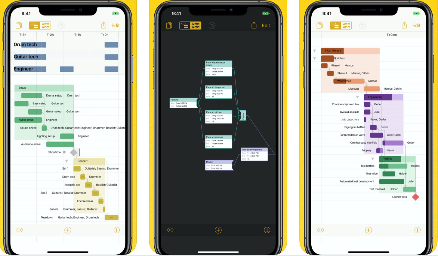
With OmniPlan, you can create Gantt charts to allocate time and resources to specific parts of a project, and because each part is interrelated, you can keep focused on what the material effects will be of the wireframing process, say, taking longer than you had anticipated. Everything is live and shared, and it will help you resolve scheduling impossibilities. Basically: if you wanna hit deadlines for big projects, get this app.
12. Slack
- Requirements: iOS 12.2 or later
- Price: From free
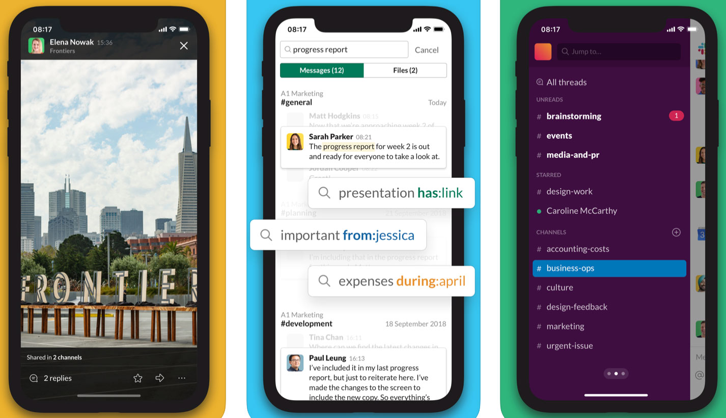
Hate how much time you spend on email? Us too. Make your team try Slack – it starts free, with some limitations – and marvel at all the time you get back. While it's ostensibly just a simple instant message tool, its become hugely popular in recent years (especially with remote working teams) thanks to the fact it integrates beautifully with a huge range of other services such as Dropbox and Google Docs, and so makes everything so much smoother.
13. Duet Display

- Requirements: iOS 12.0 or later
- Price: From $4.99 per month
One of the easiest ways to be more productive as a designer is to add more screens to your computer, so you can have source material on one while working on the main display, keep an eye on email (or Slack!) while you work without switching between tasks, or just as somewhere to put your palettes so you're not covering up your work.
It's not always convenient, though – maybe you're rushing to hit a deadline in an airport departure lounge, or you're hotdesking in a co-working space. However, you can turn an iPhone or iPad into a second display for your Mac or PC with this app, which earns it a spot in our list of the best iPad apps for designers.
While earlier apps that did this worked wirelessly (convenient, but laggy and compressed), Duet Display works over the cable, whether Lightning or 30-pin, with full support for Retina and touch. You might also want to investigate Astropad, which turns your iPad into a Cintiq-like graphics tablet for your Mac.
14. Invoice2go
- Requirements: iOS 15.0 or later
- Price: From $7.99 (free trial available)
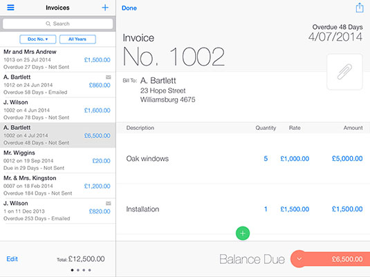
When the work is done, it's too easy to forget to invoice for it, but with your iPad (or iPhone or even Apple Watch), you can easily create, send and track invoices wherever you are. There are plenty of systems available, and if you already use, say, FreeAgent then get its app, but Invoice2go is a good option if you haven't got started with one yet.
15. Digital magazines

- Requirements: iOS Version 6.0 (or later)
- Price: Subscribe from $7.75/£7.75
You'd expect us to recommend reading more magazines, sure, but that doesn't mean to say it's not true. Your iPad doesn't have to be just a relentlessly practical workhorse; use it in your downtime too, to get inspiration and note new techniques you can use by subscribing to some digital magazines for your sector.
Of course we're going to suggest our own ImagineFXand 3D World titles, but there are plenty more to explore on the App store.
To get more from your iPad, also see our guide to the best iPad stylus.
Sign up to Creative Bloq's daily newsletter, which brings you the latest news and inspiration from the worlds of art, design and technology.

Christopher has written and edited a range of publications, including Apple-specialist titles MacFormat, Mac|Life and iPad User. His work has also featured in the BBC, Computer Arts, Digital Camera Magazine, PhotoRadar, Practical Photoshop, Macworld and TechRadar. He is currently head of podcasts at DC Thomson and has spoken at various design and tech events.
- Joe FoleyFreelance journalist and editor
