New talent: Royal College of Art degree shows
Jo Gulliver and Rich Carter select the best of RCA's 2014 School of Communication postgraduate exhibitions.
If you're looking for exciting new graduates for your studio or agency, don't miss Computer Arts' New Talent special, issue 230, featuring our handpicked selection of the UK's best graduates - on sale 24 July.
The RCA's School of Communication post-graduate degree shows were a highlight for the entire Computer Arts team this year.
On walking into the winding Stevens Buildings we were hit with a sensory explosion, courtesy of an overzealous filing cabinet (the handiwork of Jaap de Maat, from the RCA's brand new Information Experience Design course), bold prints by talented designer and animator Nicolas Ménard, and the sound of David Hedberg's Chromophonic Radio drifting through from the next room.
Article continues belowThe layout of the show seemed better planned than the year before, making the work more accessible as the exhibition weaved us around the building's multiple levels, with each room and display offering something new.
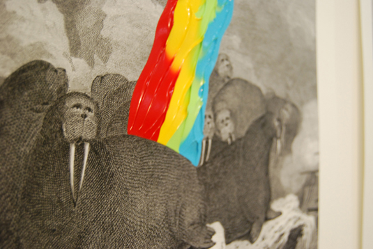
There was a strong sense of being able to interact with the work on show - in no small part due to Timor Davara's inventive 'slow-motion' animation, where visitors were encouraged to take away sheets from a large stack, moving it along a frame at a time.
And with a number of confident post-gradutes on hand to talk us through their displays, we received a real insight into their processes and ideas.
Overall, the quality of the work was of a very high standard – but we've managed to narrow it down to our top 10 projects from the three RCA shows we visited: Visual Communication, Animation and Information Experience Design...
Sign up to Creative Bloq's daily newsletter, which brings you the latest news and inspiration from the worlds of art, design and technology.
Nicolas Ménard

- Course: MA Animation
- Website: www.nicolasmenard.com
- Project: Loop Ring Chop Drink
Nicolas Ménard's engaging animation work has been on our radar for a while now. He recently featured in our 2014 Illustration Annual and we were excited to see his vibrant short film, Loop Ring Chop Drink, at the RCA Animation show.
Following the story of a heartbroken man, an online gambling addict, an alcoholic kleptomaniac and an anxious loner who live in the same apartment building, Loop Ring Chop Drink displays impressive craft as it tells the heartwarming tale of how the character's individual problems gradually connect their lives together.

"At the beginning of the project, I wrote a large amount of unrelated ideas, concepts and visual gags. The biggest challenge was to find a way to put them together by crafting a narrative for them. A drastic curation of those ideas lead to the final product," says Ménard, adding that the internet enabled him to collaborate with creatives around the globe on the project.

"A few passionate animators were keen to give me a hand," he smiles. "And working with the talented Rich Vreeland - who lives in California - for the sound and music was equally awesome."
Ménard's short - and its acompanying 32-page book, Pourquoi Never Allo - was a clear highlight in what looks to be a particularly strong year for animation at the RCA.
Sarah Lippett
- Course: MA Visual Communication
- Website: www.stanagraphicnovel.com
- Project: Stan
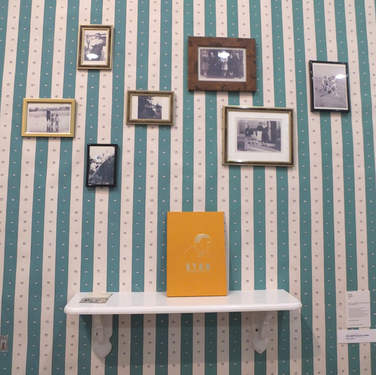
A beautiful wallpapered section in the Visual Communication exhibition drew us instantly to Stan, Sarah Lippett's charming book about the life of her grandfather Stanley Burndred - and another notable project from this year's RCA show.
Almost resembling the front room of a house, we felt as though we were being invited inside, where we found a tale that was just as personal as the design of the exhibit itself.

Burndred, who never met her grandfather, based the narrative on letters written by her grandmother and conversations held with relatives. "As an autobiographical-based work, I had to be very sensitive to the voices within the narrative," she says.
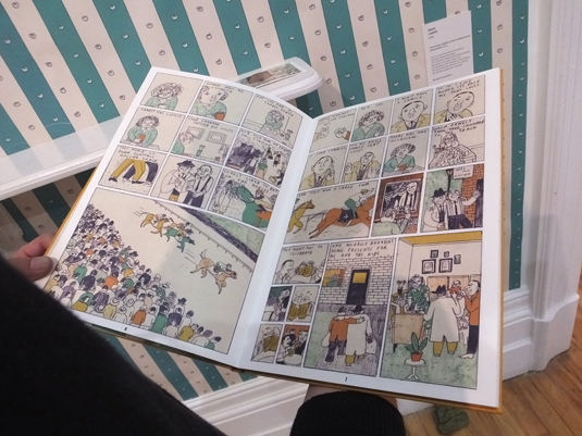
"My favourite part was exploring and finding visual devices to give pace to the story and to aid the reader in understanding the different time changes, moods, and emotions within the narrative," she adds.
"Colour played a big part in that, and I enjoyed playing around with my palette to use it as a tool to express the meaning behind particular scenes."
David Hedberg
- Course: MA Information Experience Design
- Website: www.davidhedberg.info
- Project: Chromophonic Radio
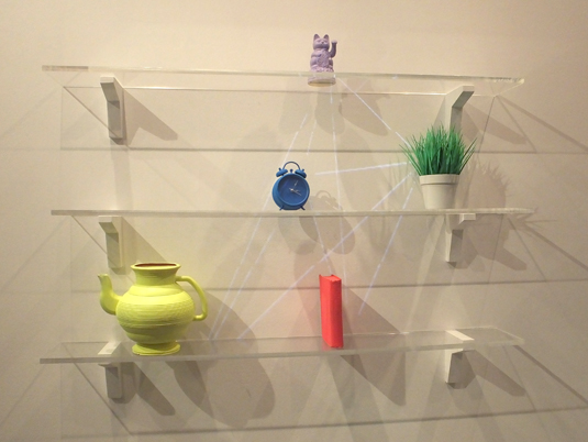
Another engaging project to bring a smile to our faces was David Hedberg's clever installation, Smile TV. With content at its core, Hedberg has reconsidered viewer engagement, exploring the idea that we have taken back control of the content we consume.
As Hedberg explains: "Bad TV reception used to be associated with poor technical performance of an antenna. Now, with content widely accessible, the question is no longer if we can receive - but if we are receptive."

Smile TV incorporates facial recognition and a "last-decade" TV set. When a viewer smiles at something they see, the TV set tunes itself - essentially turning the user into an antenna - and transmits that content onto somebody else.
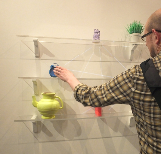
It's a thought-provoking experience that encouraged us to get hands-on with the installation, and left us questioning our own content consumption.
Joe Bichard
- Course: MA Animation
- Website: www.cargocollective.com/joebichard
- Project: The Waldgeist & Me
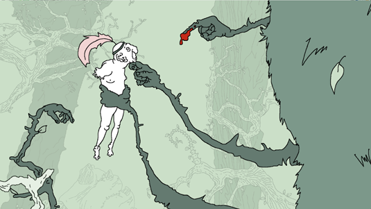
Having tackled the tricky subject of death in his first-year film, DEAD…, Animation student Joe Bichard took on an equally difficult subject - love - the second time around.
"The Waldgeist & Me focuses on some of the more negative aspects of love. In particular, unhealthy, bad relationships," says Bichard, who worked closely on the project with composition and sound designer Oswald Skillbard ("He designed all the wonderful sound and composed all the glorious music") and narrator Matt King ("I admire his work so much").
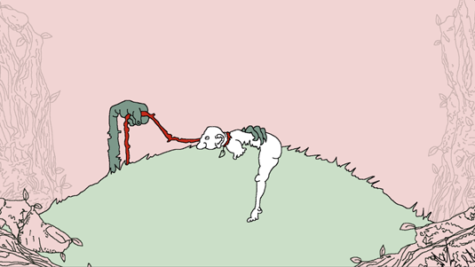
"The biggest challenge was the amount of time I spent project managing," Bichard reflects. "This is the biggest thing I’ve ever done, so liaising with all the various other talented people who contributed to the film took up way more time than I initially anticipated - which meant less time animating for me!'
However, once Bichard had managed the organisational structure of the project, the collaborative aspect soon turned out to be one of the most enjoyable parts - something we found to be a continuous theme whilst speaking to this year's RCA graduates.
Laura Jouan
- Course: MA (Hons) Visual Communication
- Website: www.laurajouan.fr
- Project: Posterland
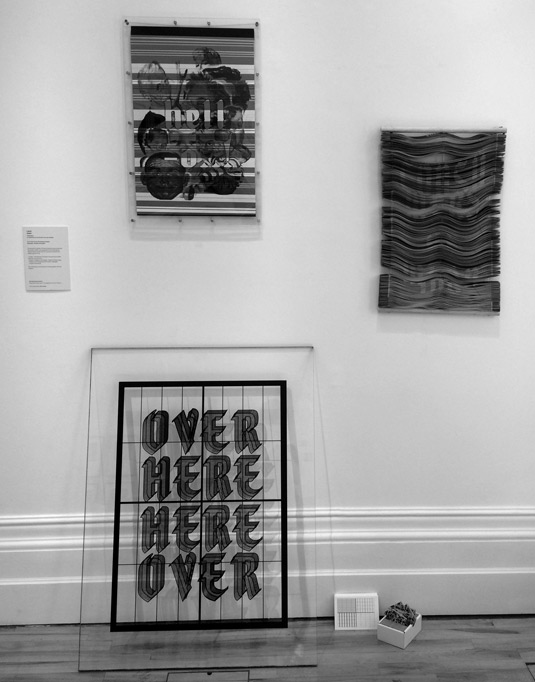
Laura Jouan's unique take on the physical poster made us look twice. Showcasing three separate examples, the Posterland series is a beautifully realised investigation of form that took us on a journey of discovery into the medium itself.
Each piece has been meticulously planned and pushes the capabilities of the medium, communicating through the materials rather than simply projecting a message onto each poster.
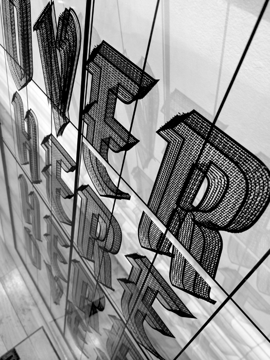
Over Here, Here Over [above] is a double-sided Perspex print that explores the grid, layout and structure of the poster format, and its ability to attract people.
The second [below] is a physical translation of a screen - "digital becoming analogue" - looking at the ability of the poster to connect people; and the third is an exploration of the poster as a "textile of information".
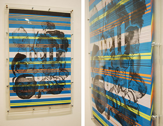
"This project could be seen as a propaganda for physical graphic design, where posters are not just plain surfaces with design laying on top," she explains.
Luke Griffiths
- Course: MA Visual Communication
- Twitter: @LukeTutor
- Project: Arc 18 magazine
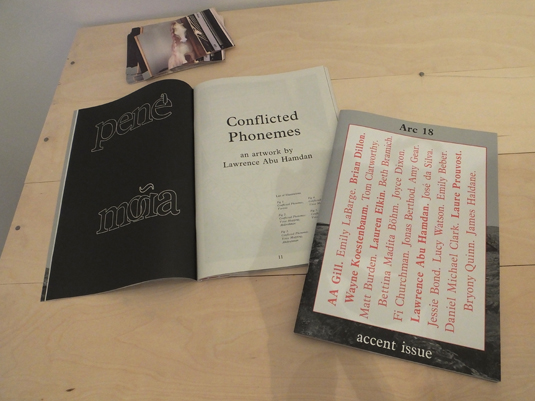
Arc is the RCA's student magazine. Luke Griffiths designed Arc 18, working in collaboration with the Critical Writing department.
Based on the theme 'accent', the slick monochrome magazine is about "personal voice and how things are spoken on and off the page. It depends on where you are, or have been, and who you spend time with. It's about dialect and how some things rub off or pass down or stop mid-Atlantic," explains Griffiths.
Constrained by a limited budget, the publication is brought to life with a contrasting glossy cover and a two-tone splash of colour that re-appears in the inside-centre section.
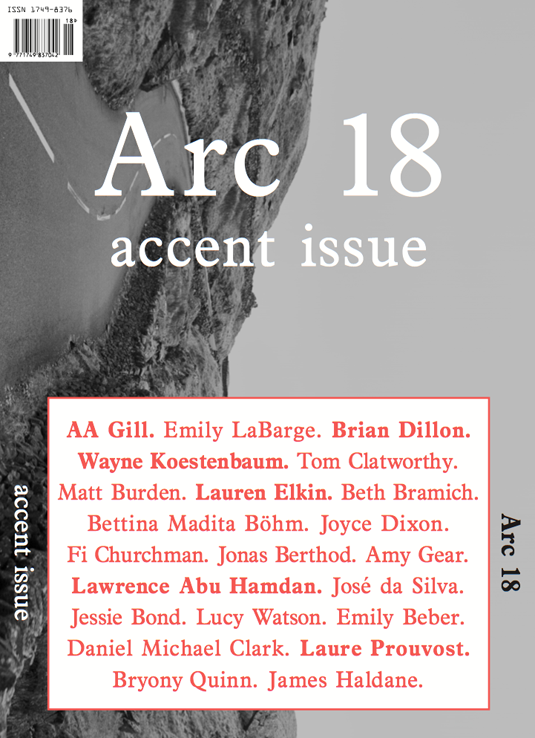
"The budget wasn't necessarily a hindrance, but it did pose a number of issues for balancing quality and price as a designer," adds Griffiths.
What impressed us most about Arc 18 was the scale of work and level of organisation required by the project. This, it turns out, was one of Griffiths' favourite part of the process: "Working collaboratively, in this case with writers, provided an invaluable opportunity to learn from each other's practice," he says.
Sofia Drescher
- Course: MA Visual Communication
- Website: www.sofiadrescher.com
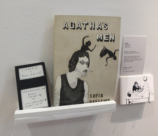
- Project: Agatha’s Men
Agatha's Men is a fantasy tale that touches on the negative effects of the pornography industry. It exposes the twisted ideals of beauty through the character of Larry, a lonely man who longs to meet his fantasy woman. The story follows his misadventures with Agatha, the woman of his desire.
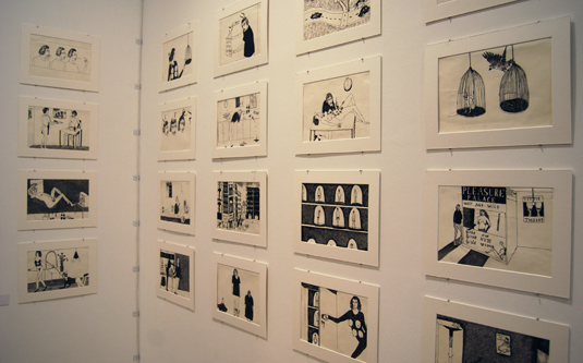
The biggest challenge Sofia Drescher faced while creating the project was communicating the right message: "I wanted the reader to be able to sympathise with the unlikable Larry," she explains, adding that she achieved this by shifting the balance of power in the storyline.
Her favourite part of the project? "Putting a humorous spin on such a taboo subject and opening up a forum for a discussion."
Stephen McNally
- Course: MA Animation
- Website: www.stephenmcnallydraws.com
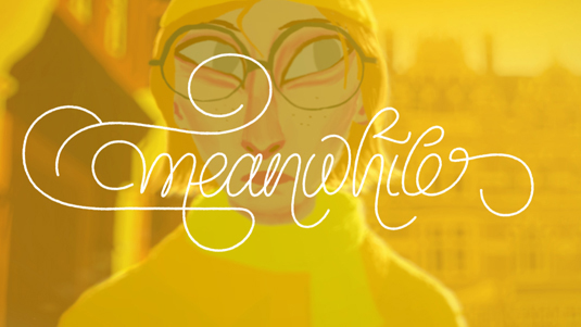
- Project: Meanwhile
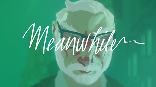
Stephen McNally's highly-evocative animation Meanwhile tackles the issue of how people in every major city in the world live in their own, isolated worlds - reliving memories, regrets and frustrations instead of actually engaging with the wider world around them.
Watching this beautifully crafted animation brings home characters that everyone can relate to, from the irate city cyclist to the daughter turned carer of her elderly frail mother.
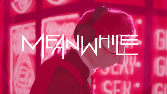
Meanwhile is a thought-provoking film that highlights many of life's trials and tribulations, from the everyday right through to the tragic. It documents love, loss and everything in between through the eyes of four disparate characters whose lives come together during the film.
"Trying to convey the internal lives of four characters in the space of five minutes, and then combining them in ways I would find narratively satisfying, was hard," confesses McNally. "Getting over this involved lots of hacking at both the script and the animatic, cutting it back and back until it finally began to take shape."
Tom Radclyffe
- Course: MA Visual Communication
- Website: www.tradclyffe.co.uk
- Project: Blue Cities for Crystal Globes
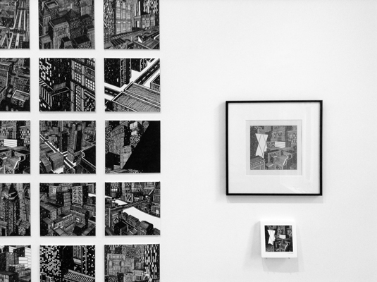
In Blue Cities for Crystal Globes, Tom Radclyffe set out to construct his own world, particularly focusing on the "organic manufacture" of a city. "The project allowed me to really push my imagery, whilst exploring a subject that I was really interested in," he says.
Radclyffe's biggest challenge was plumbing the depths of his imagination, and he deliberately set out to improve this aspect of his creative process in the course of the project. "I wanted to be able to work more freely from my imagination, and be less reliant on source images," he explains. "The more cities I produced, the more confident I became."
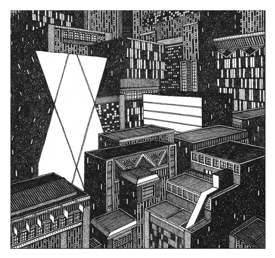
From the painstaking detail in the various buildings, it's evident how much blood, sweat and tears Radclyffe has dedicated to the project. "Each individual drawing took a long time to produce," he admits, "but I enjoyed the routine of creating them, and the opportunity to fully engage with a long-term project."
Half-price CA subscription offer!
We know it isn't always easy being a recent graduate. So to help - and celebrate the 2014 degree show season - we're offering an incredible 50% off an annual subscription to Computer Arts magazine.
For just £39 you'll receive an entire year of industry insight, opinion and inspiration, delivered directly to your door.
Plus: sign up by 10th July and you'll receive our New Talent issue, featuring our guide to 2014's most outstanding design graduates - and a very special cover designed in response to a joint brief with D&AD New Blood.
Julia is editor-in-chief, retail at Future Ltd, where she works in e-commerce across a number of consumer lifestyle brands. A former editor of design website Creative Bloq, she’s also worked on a variety of print titles, and was part of the team that launched consumer tech website TechRadar. She's been writing about art, design and technology for over 15 years.
