Trend report: The real thing
Mass production and digitalisation have given consumers a yearning for hand-crafted products with heritage, causing designers to reimagine tradition and authenticity
Studio Vasava created a video for the OFFF TOUR festival held in Cincinnati in October 2011 in the Contemporary Arts Center. OFFF is a post-digital culture festival; a meeting place to host contemporary creation through an in-depth programme of conferences, workshops and performance.
Meeting the makers
Who better to teach consumers about craftsmanship than the craftspeople themselves? Artisans are becoming an increasingly important part of brand narrative, driven by consumer fascination with provenance and a desire for direct contact with makers.
Websites such as Sight Unseen, Grain & Gram and Manufacture & Industry take audiences on factory tours and introduce them to woodworkers, printmakers, tailors and other craftspeople, giving unprecedented behind-the-scenes access. Brands are also increasingly unveiling the individual craftspeople behind their products, such as British fashion label Albam, which commissioned photographer John Spinks to create a picture journal documenting its factories and craftsmen.
Monica Khemsurov, co-founder and editor of online magazine Sight Unseen, says that curiosity led her to document the working lives of craftspeople. “Humans are innately curious animals. Almost all of us are voyeurs,” she reflects. “Backstories have a certain voyeuristic appeal — when you get to see the inner workings of something, you tend to pay that much more attention to it. And you fall a little bit more in love with an object when you’ve devoted your time to it, and it means something to you. Those connections are important.”
The most important element of this experience are the stories of the people who’ve made the objects. Khemsurov adds: “I love the stories we do where you get to see our subjects being people first, and designers and artists second.”

Typographic traditions reborn
Craft and typography go hand-in-hand beautifully, and hence traditional typography techniques are seeing a revival in appreciation. Designers and brands are looking to typography to communicate heritage, provenance and craftsmanship by using old-style methods with modern interpretations.
Kyle Durrie, founder of mobile letterpress Power and Light Press, sees the relationship between good design and typography as synonymous. “I think craftsmanship is the foundation of good design,” he explains. “Like anything well-designed, typography is about integrity of materials and form. And old fonts offer a hand-hewn feel that stands in sharp contrast to the crisp sharpness of modern digital typography.”
The Reverting to Type exhibition in London, co-curated by New North Press’s Graham Bignell, showed how centuries-old lettertype printing is being re-interpreted for modern usage. For instance, traditional signwriter Peter Hardwicke hand-paints shop signs, including Cleo’s barber shop in Spitalfields.

In So Paulo, Brazil, printing press Grfica Fidalga makes posters on a 1929 German letterpress using hand-carved wooden letters. The lightweight paper was designed for wheat-pasting and used to be common throughout the city. Everything is done by hand to create a more characteristic font.
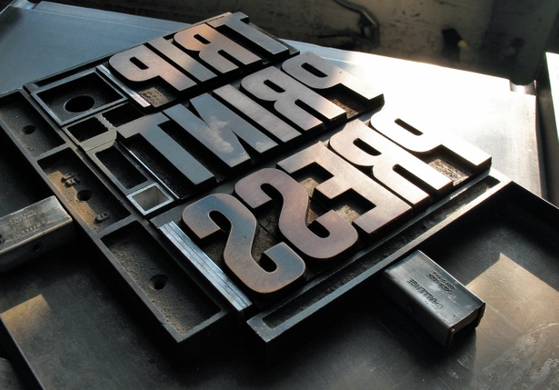
Some printers are developing whole new printing techniques in order to achieve unique and original results. Nicholas Kennedy’s Trip Print Press uses a letterpress machine (which is mainly designed for type) to print plates – and it also uses real ink and mixed colours instead of CMYK .
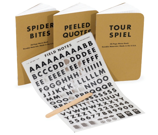
In efforts to socially and creatively engage consumers, American notebook brand Field Notes unveiled a new collection, the Dry Transfer ‘_____ Edition’. The covers, instead of featuring their logo, are plain, and users can design their own logo with authentic dry-transfer lettering – an old technique for creating fonts. Another example of old techniques being adapted to create modern fonts is the SKL project by Studio One Iota, which uses plates and presses.
sir Copenhagen’s Tnker magazine has made waves with its deliberate attempt to make its printing process reflect the craftsmanship of its text. To emphasise the hand-made nature of the project, the printers used a large slab of 150 million-year-old stone as the printing base. The stable porosity of the stone means that the final prints have a finish that appears hand-painted.
At OFFF 2011, Barcelona-based communications studio Vasava opened the festival with a video that highlighted a unique analogue approach to typography. Featuring craftspeople of all ages, the film demonstrated how craftsmanship and technology no longer have to be mutually exclusive.
Typography is proving essential to communicating craft, heritage and provenance to consumers. Designers and brands’ experimentation with new fonts and old methods is one of the most effective ways to visually tell the tale consumers want to hear. But most importantly, the revival of old traditions signals the burgeoning post-digital era we live in, where, amidst technological innovation, slow craft is growing an international appreciation and following.
Sign up to Creative Bloq's daily newsletter, which brings you the latest news and inspiration from the worlds of art, design and technology.

The Creative Bloq team is made up of a group of art and design enthusiasts, and has changed and evolved since Creative Bloq began back in 2012. The current website team consists of eight full-time members of staff: Editor Georgia Coggan, Deputy Editor Rosie Hilder, Ecommerce Editor Beren Neale, Senior News Editor Daniel Piper, Editor, Digital Art and 3D Ian Dean, Tech Reviews Editor Erlingur Einarsson, Ecommerce Writer Beth Nicholls and Staff Writer Natalie Fear, as well as a roster of freelancers from around the world. The ImagineFX magazine team also pitch in, ensuring that content from leading digital art publication ImagineFX is represented on Creative Bloq.

