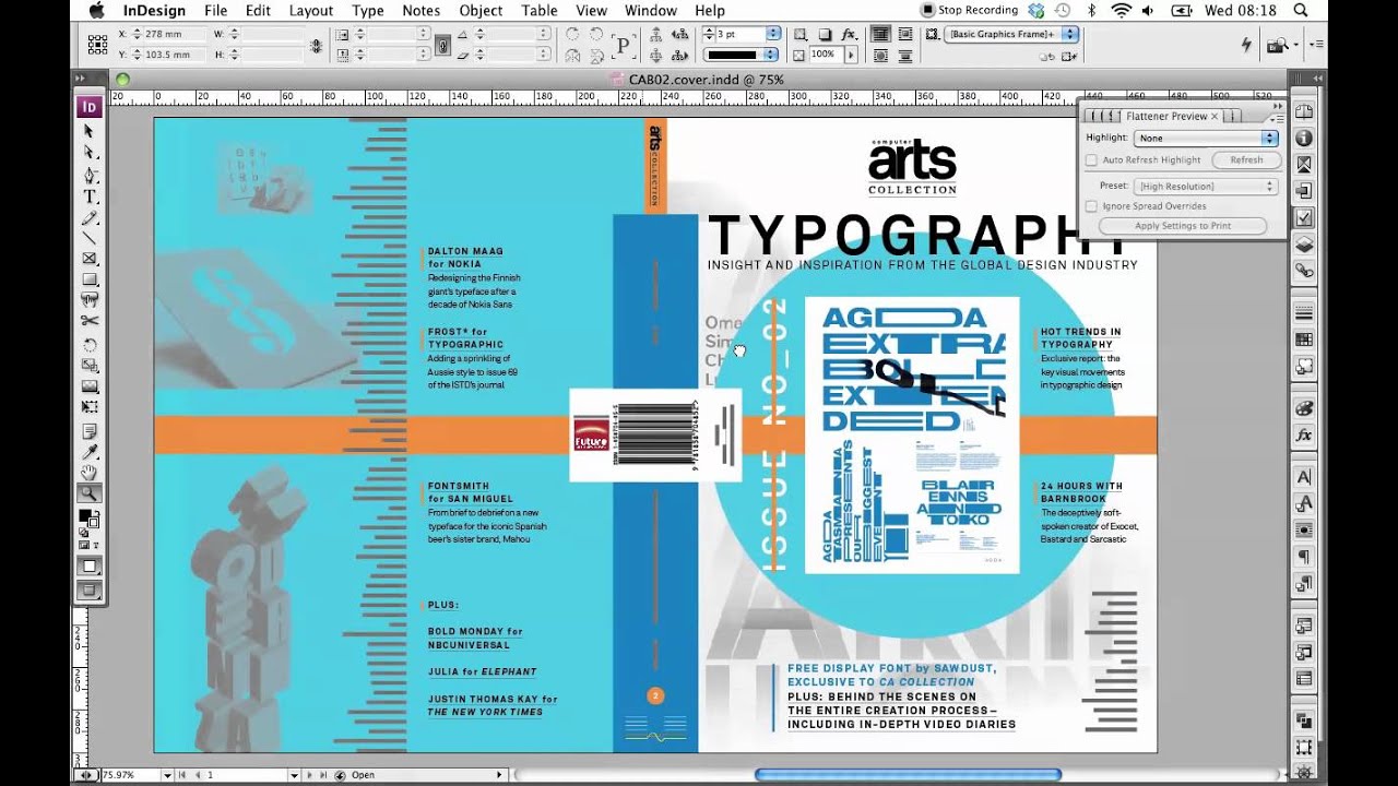
Video tutorial: Five essential tips for print preflighting
Luke O’Neill runs through five essential InDesign checks to avoid costly print errors
With a new generation of designers raised in the digital world, the specific parameters and constraints of outputting for print can seem as alien as CSS to an old-hand print designer. Whether you’re new to print or have years of experience behind you, it’s still worth checking, double-checking and checking again before finally outputting to print, because once the plates have been made and the press is about to run, errors can be very costly to rectify.
Through my experience in sending magazine covers to press, I’m more than aware of the potential pitfalls that lie in wait once the big Send button has been pressed. However, with a little foresight and careful final checking, you can avoid basic errors that – no matter how brilliant the design might be – could result in a disappointing piece of print.
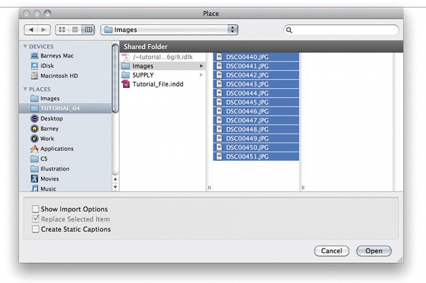
01 Checking image colour modes, colour profiles and resolution is essential. As a rule of thumb, all images should be CMYK at 300dpi. With a 300dpi image you can take the image to 120% in InDesign, or the resolution down to 266 and run it at 100%. These are guidelines: use your own discretion when checking images in PDF format. Always check PDFs at 300% to ensure that no pixellation occurs.

02 Check your Swatches panel is in good order before sending to press. Any unwanted Pantone or RGB colours can cause problems, even if they’re not used. To remove these, navigate to the top-right of the Swatches panel, choose Select All Unused and drag them to the trash icon.
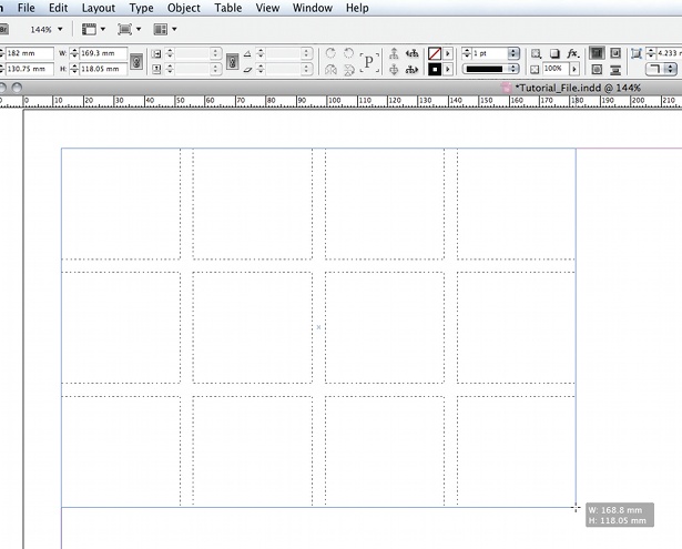
03 The Flattener Preview panel will highlight in red any areas where problems might occur. I’ve deliberately made a mistake here: you can see a lot of text is converting to outline. This occurs when transparent objects are laid over live text and can give a raggedy look. To avoid this, move the transparent object to a lower layer or outline the text in your document.
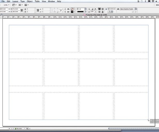
04 When using black type on a cover, ensure all smaller text is set to 100% black to avoid registration issues when using a mixed four-colour black. Normally we’d set the black to Overprint, but as we’re using Pantones we want it to knock-out. Uncheck ‘Overprint [Black] Swatch at 100%’ in the Appearance of Black pane of the Preferences panel. Check this by turning black off in the Separations panel.
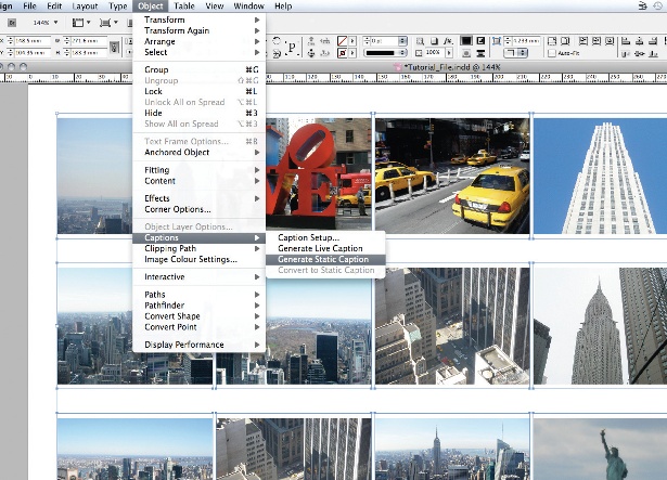
05 With special finishes like foil-blocking or spot varnish, a guide black plate must be supplied to the printer so it knows where to apply the finish. Once you have both PDFs back, drop them on top of each other in InDesign and reduce the opacity of the black plate to ensure everything lines up.
Sign up to Creative Bloq's daily newsletter, which brings you the latest news and inspiration from the worlds of art, design and technology.

The Creative Bloq team is made up of a group of art and design enthusiasts, and has changed and evolved since Creative Bloq began back in 2012. The current website team consists of eight full-time members of staff: Editor Georgia Coggan, Deputy Editor Rosie Hilder, Ecommerce Editor Beren Neale, Senior News Editor Daniel Piper, Editor, Digital Art and 3D Ian Dean, Tech Reviews Editor Erlingur Einarsson, Ecommerce Writer Beth Nicholls and Staff Writer Natalie Fear, as well as a roster of freelancers from around the world. The ImagineFX magazine team also pitch in, ensuring that content from leading digital art publication ImagineFX is represented on Creative Bloq.
