10 rules for better editorial design
T3 art editor Luke O'Neill offers ten rules of thumb for better editorial design.
The fundamental skills required to be a good editorial designer are much the same as any form of graphic design, but as with any specialised area there are always unique challenges and general rules that apply.
Over the next 10 points I'll run through some general rules and approaches for good editorial design that should set you in good stead whether you're launching a new title or simply thinking of a career in editorial.
01. Identify your audience and design for them
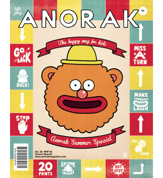
This is the most important rule really, whether you're launching a new publication or moving into a design role at an existing title, it's imperative that you know your audience and design for them accordingly.
In the same way that the reader must be able to identify with the tone of voice of the publication, the design must also speak to them, whether that be in an overt way or on a more subtle subconscious level.
02. Cover first
Whether you're a national consumer title, a small indie with a targeted distribution or a digital-only mag, the fact remains that the front cover is the most important page of the magazine, and a large proportion of your time should be dedicated to getting it right.
The cover needs to work on a number of levels -- it must be unique enough to attract attention on a crowded newsstand whilst at the same time not alienating existing readers. It must spark curiosity and intrigue and tell a story selling the contents of the title to the onlooker. Always try to design bespoke covers for digital editions as what works on the newsstand and in print probably won't work as well on screen or as a tiny thumbnail.
03. Take the right cover approach
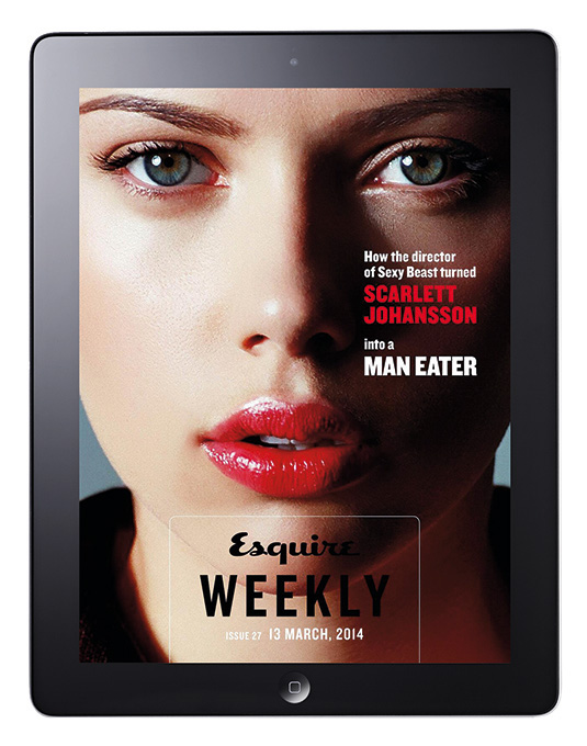
There are many and varied approaches to cover design but when starting a mag from scratch a good rule of thumb is to design the cover first and let that inform the design of the inside. There's no paint-by-numbers formula to designing a great cover (although people may try to tell you otherwise). It's a combination of working with a great idea in the first place, having the best possible assets and perhaps also a touch of magic.
Daily design news, reviews, how-tos and more, as picked by the editors.
It's a collaborative approach so work with the editor and wider team and take advantage of their expertise, bounce ideas off one another and don't be afraid to kick back if you think something isn't working, or simply ask for some alternate cover lines. Most importantly, never try to design in a vacuum.
04. Keep it gridded (but not too gridded)
Grid systems are a fundamental of all areas of graphic design but nowhere more so than in editorial design. It's essential that you have a solid grid in place as this will form the backbone of your design, giving your pages their structure.
A six column grid with a symmetrical two columns of text has a very different feel to a seven column grid with two columns of text and a bastard column. Try and set your body copy first and then build the grid around this as the point size and leading that you choose will then inform the baseline grid and so on.
Having said that I'm now going to contradict myself by saying that as important as grids are, its also important in my opinion to bust out of those constraints on occasion. A little freeform design can offer a welcome relief from the overall rigidity of a solid grid system.
05. Typographic hierarchy
You'll find some of the most beautiful and experimental examples of typography in magazines but its not all about the fancy. All great editorial design must have a strong typographic structure, from body copy to headline display faces and everything in-between, the type choices that you make will not only help to give the title its visual voice but will also act as a guide for the reader to navigate through your layouts.
There are too many varying approaches to mention here but I personally subscribe to the notion that less is more when it comes to type choices. A handful (or even the one family) of complimentary faces can be far more impactful end effective than trying to throw everything plus the kitchen sink at it. Too many varying faces and your design runs the risk of looking cluttered and lacking in voice.
06. Don't be afraid of white space
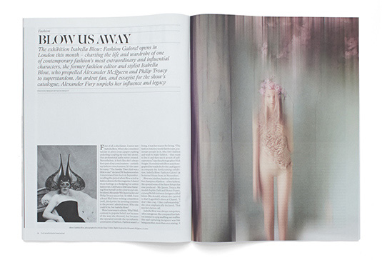
Although for many of us white space is somewhat of a luxury, don't be tempted when you do have some extra room to just fill every available inch of it.
A stunning photograph might have all the more impact if scaled down and framed by negative space, or attention could be drawn to a headline by running a river of white space across the page before starting the body copy.
07. Pacing
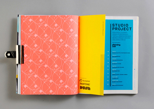
Pacing is incredibly important in any magazine and a structured flat-plan with section breaks can really help, allowing the content to breath and letting the reader know where they are in the publication.
The use of different paper stocks is a great way of signalling to the reader that they're in a different section and will immediately give it a different feel. If you don't have that luxury then the simple use of full bleed imagery on a feature opener or opening it on a right rather than a double page spread can be a welcome break from the norm.
08. Hierarchy of elements and entry points
When faced with a number of different elements or stories of varying size and importance its easy to feel a little overwhelmed. Ensure that it is clear which story or element takes prominence through prime positioning and larger headline and image sizes. Drop caps, arrows and simple entry point graphics can help to guide the reader.
Be wary with these devices in digital editions as decorative graphic elements may be seen as interactive buttons. When designing for iPad try to think of it as a wayfinding project where every graphic device serves a functional purpose.
09. Always think cross platform
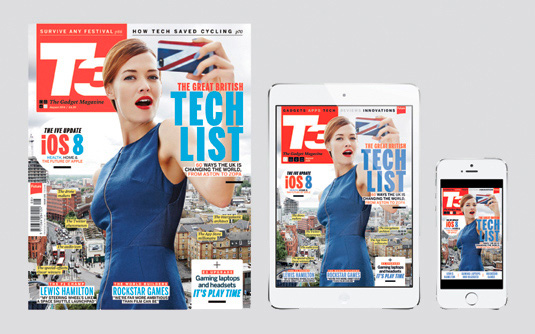
Whether you design for print or tablet first or work on them both in tangent, it's important that your designs work across all platforms in a unified way without the design and visual language feeling disjointed.
A good practice is to design for digital first and get the usability right as its often much easier translating that to a static page than the other way around. Also think about how commissions can work across different platforms, if you're commissioning illustration is there an opportunity to add in some animation for the digital version? Perhaps a boxout talking head in print could be a real talking head video on iPad?
10. Be unique
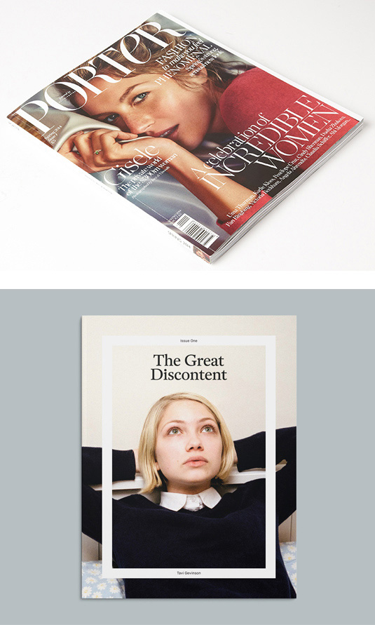
Lastly and perhaps most importantly, be unique in both your ideas and design application. In a period of what seems like constant flux in the publishing industry, it's never been more important to stand out from the crowd.
Testament to this is the seemingly never ending stream of new, beautifully designed and well thought through indie titles that keep sprouting up. Not to mention digital native companies and blogs such as Net a Porter launching magazines into the market, and not just digital-only customer magazines but in Net a Porter's case, a full-blown glossy high-end fashion title to sit alongside Vogue on the Newsstand. But I thought print was dead?
Words: Luke O'Neill

The Creative Bloq team is made up of a group of art and design enthusiasts, and has changed and evolved since Creative Bloq began back in 2012. The current website team consists of eight full-time members of staff: Editor Georgia Coggan, Deputy Editor Rosie Hilder, Ecommerce Editor Beren Neale, Senior News Editor Daniel Piper, Editor, Digital Art and 3D Ian Dean, Tech Reviews Editor Erlingur Einarsson, Ecommerce Writer Beth Nicholls and Staff Writer Natalie Fear, as well as a roster of freelancers from around the world. The ImagineFX magazine team also pitch in, ensuring that content from leading digital art publication ImagineFX is represented on Creative Bloq.
