Build animated feature sections with CSS3
Josh Netherton guides you through creating an animated features block, from sketching storyboards to coding out the CSS3 animations – learning the syntax on the way.
Sign up to Creative Bloq's daily newsletter, which brings you the latest news and inspiration from the worlds of art, design and technology.
You are now subscribed
Your newsletter sign-up was successful
Want to add more newsletters?
With the recent release of Internet Explorer 10, all the latest versions of modern browsers now have support for CSS3 animation. So, if you haven't had a chance to look into some of the basics of creating animations with CSS, now's a perfect time.
In this tutorial we're going to walk through the process of creating an animated feature section. We'll start with the initial planning of the animation, add the basic layout and then lay the foundation for our animations using CSS transforms. Finally, we'll go through the CSS animation syntax while we create the animations to finish up our project. You can download the source files for this tutorial here.
Planning the animation
Planning is important with any web project; but for animations, some basics can save a lot of time when you start working in your text editor. Whenever I'm ready to create a multistep animation, the first thing I like to do is storyboard it.
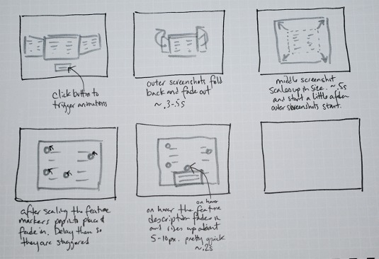
Storyboards are basically a series of frames that show how the animation is going to progress over time. This doesn't have to be anything too detailed or polished, just a few quick sketches outlining what you want your animation to do and some notes to go along with it.
Article continues belowThey enable you to work out basic ideas for placement, direction of motion and timing before you start coding. One of the biggest benefits is that this also allows you to visualise how many smaller animations you'll need to create when you code the full thing.
Setting the basic layout
The HTML for the feature block essentially consists of two unordered lists along with a checkbox input, which we'll style as a button and use as the animation trigger. The overall style for the demo elements is kept fairly simple so we can focus on the animation and not the design.
One small note on the trigger: we're using the checkbox trigger in this demo to show how you can trigger animations using purely CSS. There may be reasons to not use this trigger technique in a production environment, such as screen reader accessibility and semantics, and instead use a button click event or other JavaScript based trigger.
<div id="feature-block">
<input type="checkbox" id="button" class="button" name="button" />
<label for="button" class="button">View Features</label>
<ul class="screenshots">
<li id="screenshot1"><img src="images/screenshot-left.png"></li>
<li id="screenshot2"><img src="images/screenshot-middle.png"></li>
<li id="screenshot3"><img src="images/screenshot-right.png"></li>
</ul>
<ul class="features">
<li id="feature1"><span></span><p>Feature 1: Here's some text about this feature.</p></li><!-- repeat this li for any other feature markers -->
</ul>
</div>
And here are the basic styles for the HTML:
#feature-block {height:400px; width:600px; position:relative; margin:0 auto;}
.button {position:absolute; top:350px; left:225px; z-index:30; text-align:center;}
input.button {display:none;}
label.button {display:block; width:150px; background-color:#bbb; border:1px
solid #ddd; padding:10px 0; border-radius:5px;}
input#trigger:checked, input#trigger:checked ~ label {z-index:0;}
.screenshots {width:600px; height:400px; position:relative; margin:0 auto;}
.screenshots li {position:absolute; z-index:10;}
#screenshot1 {top:90px; left:-200px;}
#screenshot2 {height:400px; z-index:20;}
#screenshot3 {top:90px; right:-200px;}
.features li span {display:none; height:20px; width:20px; backgroundcolor:#
2e913c; border:3px solid #39b54a; border-radius:50px; position:absolute;
opacity:0; z-index:40; box-shadow:0 0 8px rgba(0, 0, 0, .2);}
.features li p {display:none; opacity:0; z-index:40; width:200px; padding:10px;
border:1px solid #959595; border-radius:3px; background-color:#f1f1f2;}
li#feature1 span {top:120px; left:80px;} /* repeated with new positioning for each feature marker */
li#feature1 p {top:135px; left:-20px;} /* repeated with new positioning for each feature description */
Adding the transforms
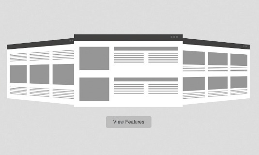
With the basic layout in place, we can now add a couple of CSS transforms to the screenshots to set up the starting points for our animation. First we're going to scale the middle screenshot. The scale transform enables you to increase or decrease the size of the element. In this case we're going to decrease by setting the scale value to .6 (or 60% of the original size).
#screenshot2 img { transform: scale(.6); }
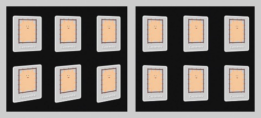
Next, we need to fold the two outer screenshots back a bit in 3D space. We're going to do that by using the rotateY transform and rotating the image 40 degrees around the Y axis.
#screenshot1, #screenshot3 { perspective: 800px; }
#screenshot1 img { transform:rotateY(-40deg); transform-origin:right; }
#screenshot3 img { transform:rotateY(40deg); transform-origin:left; }
There are a couple of important things in that last snippet of code. In order to transform an element in 3D space you have to add perspective to the element or its parent. If we didn't add a perspective value, then our rotateY transform would just kind of squash the image, instead of giving a rotating effect.
A lower value for the perspective generally means you are closer to the object, while a greater value means you are further away; 800-1200px is generally a good range to get natural looking rotations.
We've also added a property called transform-origin. The default origin for transforms is 50% 50% (the centre of the element). If we left that as is, then our screenshots would be rotating from the centre (kind of like the generic cardflip style animation). By changing the transform-origin, we can rotate the full images back in space from one edge.
Sign up to Creative Bloq's daily newsletter, which brings you the latest news and inspiration from the worlds of art, design and technology.
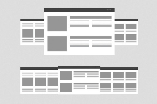
One thing to note is that we've started our section with screenshots that are laid out nicely without any transforms applied. This allows the design to degrade gracefully in browsers that don't support transforms.
Browsers that don't support transforms will see the basic layout and browsers that support 2D, but not 3D transforms, will still get the scaling of the middle screenshot and show three screenshots of the same relative size.
Starting the animation
Now we'll move on to creating the CSS animations. If we take a look back at the storyboard, we see that there are four distinct animations we'll need to create:
- The outer screenshots fold back into 3D space and fade away
- The centre screenshot scales up in size
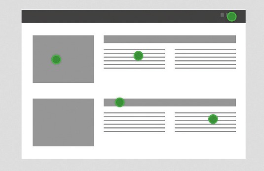
- The feature markers pop out and overlay the centre screenshot
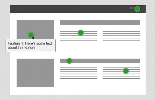
- The feature description fades in and slightly moves up into place
The first three of these are triggered by clicking on the View Features button, and the fourth by hovering over the feature markers. There are also some notes on timing that will help us figure out when each of those animations should happen.
The first step is to create the keyframes at-rule, enabling you to set the intermediate points (keyframes) at which CSS properties change during the animation. When you create a keyframe you give it a name or unique identifier that you'll use to apply your keyframes at-rule to an element.
The scaling of the middle screenshot is the simplest, so we'll create that one first. We need that image to scale up from .6 to 1 and we'll name it grow (naming keyframes based on what happens during the animation is helpful when it becomes time to use or reuse them). It's also a great idea to start a snippet library for your keyframes. You might be surprised at how often you can reuse certain snippets.
@keyframes grow {
from {transform: scale(.6);} /* can use 0% instead of from */
to {transform: scale(1);} /* can use 100% instead of to */
}
Note that I'm using the unprefixed version of @keyframe for code brevity in the tutorial. To hit all the major browsers we'd need to use @-webkit-keyframes and @-moz-keyframes (IE10 and Opera support unprefixed animations).
Next, we'll need to use the animation property to associate the keyframe with the specific element we want to animate. There are four properties required for each animation:
- animation-name – name of the keyframe at-rule you want to use
- animation-duration – length of time for one animation cycle
- animation-timing-function – rate of change over the duration of the animation
- animation-iteration-count – how many times you want the animation to run
There are also several optional values that we can use:
- animation-delay – how long a delay to add before the animation starts once it's triggered
- animation-direction – whether the animation starts over at the beginning each time it runs or switches direction
- animation-fill-mode – whether the animation finishes with the last running keyframe or the first
- animation-play-state – a way to pause and resume the animation
#screenshot2 img {
animation-name: grow;
animation-duration: .5s;
animation-timing-function: ease-out;
animation-count: 1;
animation-delay: .2s;
}
Luckily there's also shorthand for the animation properties. This is the same as the last code snippet:
#screenshot2 img { animation: grow .5s ease-out 1 .2s; }
As the animation runs, the grow keyframe will run on the middle screenshot; the image will grow from 60% of its size to 100%. By default, an animation reverts to its starting point after it is run, so the image size will return to 60%.
This isn't the behaviour that we want here, so we can add the animation-fillmode property to set the end state of the animation. Adding the forwards value will stop the animation at the last encountered keyframe:
#screenshot2 img { animation: grow .5s ease-out 1 .2s; animation-fill-mode: forwards; }
Triggering the animation
Right now our animation is set to happen as the page loads, and that's not really what we'd like to happen. We still need to add a trigger to start the animation. There are several ways we can do this. For example, we could use JavaScript to add a class when the View Features button is clicked, or run the animation when the user hovers over the feature area.
Here we're going to use the :checked pseudo-class to trigger the animation. By changing the selector for our rule to the following, when the checkbox (we've styled it to look like a button) is selected our animation will be triggered:
#trigger:checked ~ ul #screenshot2 img { animation: grow .5s ease-out 1 .2s forwards; }
Folding in the outer screenshots
Now we need to make our other animations. For the outer screenshots, we'll need to create separate keyframes (since they're folding in opposite directions). We have two properties that we're animating (transformY and opacity) and they'll change at slightly different rates, so instead of using to and from we'll use percentages to set our keyframes:
@keyframes fold-left {
0% {transform: rotateY(-40deg); opacity:1;}
95% {opacity:0;}
100% {transform: rotateY(-70deg); opacity:0;}
}
@keyframes fold-right {
0% {transform: rotateY(40deg); opacity:1;}
95% {opacity:0;}
100% {transform: rotateY(70deg); opacity:0;}
}
And this is the rule with our animation property:
#trigger:checked ~ ul #screenshot1 img { animation: fold-left .3s linear 1 forwards; }
#trigger:checked ~ ul #screenshot3 img { animation: fold-right .3s linear 1 forwards; }
Showing the feature markers
For the appearance of our feature markers, we need to make two different keyframes. The first is for the opacity of the marker and the second is to give it a slight bounce-in when it appears. We could create these effects in the same rule, but we're using a different animation-duration for the two rules.
@keyframes appear {
from {opacity: 0;}
to {opacity: 1;}
}
@keyframes bounce {
1% {transform: scale(0.1);}
25% {transform: scale(0.7);}
45% {transform: scale(1.5);}
63% {transform: scale(1.05);}
79% {transform: scale(0.95);}
100% {transform: scale(1.0);}
}
In order to apply multiple keyframe rules to the same element, you separate values for the longhand properties via a comma in the animation property. We're just showing the first marker here, but for each marker we add, we should add .2s to the animation-delay property. This will stagger the appearance of the markers.
#trigger:checked ~ ul.features li#feature1 span {
animation: appear .3s linear 1 .5s forwards, bounce .5s linear 1 .6s forwards;
display:block;
}
Showing the feature descriptions
Our last animation is fairly simple, but will use :hover for the trigger. When the user hovers over the feature markers, the feature description will fade in and move up from underneath the marker. Here's the code for this keyframe:
#trigger:checked ~ ul.features span:hover ~ p {
display: block;
position:absolute;
animation: appear-feature .2s linear 1 forwards;
}
@keyframes appear-feature {
from {transform: translateY(5px); opacity:0;}
to {transform: translateY(0); opacity:1;}
}
Conclusion
And there we go. Now click View Features and see the finished product. We've created a nice feature block that can be modified for a myriad of projects. As we've left it relatively unstyled, it should be simple to skin it to your needs.
It's a good bit of animation we've been able to create with no JavaScript and great browser support now. Hopefully seeing the process, from sketching to final product, has given some insight into one way to plan and tackle a CSS animation project.
Words: Josh Netherton.
Thanks to Chris Mills for his peer review of this tutorial. This article originally appeared in .net magazine issue 238
Liked this? Read these!
- Check out these examples of CSS
- Our favourite web fonts - and they don't cost a penny
- Stunning examples of CSS3 animation
Need a little help? Ask away in the comments.

The Creative Bloq team is made up of a group of art and design enthusiasts, and has changed and evolved since Creative Bloq began back in 2012. The current website team consists of eight full-time members of staff: Editor Georgia Coggan, Deputy Editor Rosie Hilder, Ecommerce Editor Beren Neale, Senior News Editor Daniel Piper, Editor, Digital Art and 3D Ian Dean, Tech Reviews Editor Erlingur Einarsson, Ecommerce Writer Beth Nicholls and Staff Writer Natalie Fear, as well as a roster of freelancers from around the world. The ImagineFX magazine team also pitch in, ensuring that content from leading digital art publication ImagineFX is represented on Creative Bloq.
