Create a responsive CSS3 product wall
It's time to show off your website's products. Ian Lunn explains how to create a fullscreen product wall using some of CSS3's finest features.
Sign up to Creative Bloq's daily newsletter, which brings you the latest news and inspiration from the worlds of art, design and technology.
You are now subscribed
Your newsletter sign-up was successful
Want to add more newsletters?
CSS3 has lots of features to make creating web pages and applications a breeze, with still many more being developed and made available. For me, the most exciting aspect of CSS3 is combining its features to create things that have yet to be seen on the web.
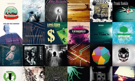
In this tutorial, you'll learn how to create a CSS3-powered product wall to display CD covers that will show more information when clicked. Using the :target pseudo-selector, CSS can be changed based on the target element clicked. You'll also use media queries to make the product wall look great across devices, and transitions to smoothly animate selected products.
- Download the support files for this tutorial
The product wall will be created entirely with HTML and CSS (except for a few unavoidable lines of JavaScript to make sure the product wall works in older versions of Internet Explorer that don't support the use of the :target pseudoselector). See a demo here.
Creating the basic structure
Start with a basic index.html page with the following code:
<!DOCTYPE html>
<html lang="en">
<head>
  <meta charset="utf-8">
  <title>CSS3 Product Wall</title>
  <meta name="viewport" content="width=device-width, initial-scale=1.0">
  <link href="css/styles.css" rel='stylesheet' media="all">
</head>
<body>
</body>
</html>
The product wall will consist of an HTML5 <section> element, with an <article> inside for each product. Within the <body> tags, add the following:
<section>
  <article id="one">
    <a href="#one"><img src="images/cover1.jpg" /></a>
    <div class="info">
      <div class="description">
        <h1>Product 1</h1>
          <p>Lorem ipsum dolor sit amet, consectetur adipiscing elit. In in massa ultrices diam lobortis convallis quis in risus. Phasellus a augue vitae sapien condimentum condimentum quis at eros. In nisl lacus, pharetra nec.</p>
      </div>
      <ol>
        <li>Lorem ipsum dolor</li>
        <li>Consectetur</li>
        <li>Fringilla libero</li>
        <li>on malesuada</li>
        <li>Adipiscing</li>
        <li>Purus arcu nec</li>
      </ol>
      <a class="button purchase" href="#">Purchase</a>
    </div>
  </article>
  <!-- lots more products will be added here -->
</section>
Note only one <article> is shown, but each product will consist of nearly the same markup - so you can copy and paste it as often as you need to. For this tutorial I've added 24 articles.
You may like to use a backend technology, or template engine such as Handlebars.js, to generate the <article> elements you require, but that's beyond our scope here. I say the <article> elements almost have the same markup - there are differences.
Sign up to Creative Bloq's daily newsletter, which brings you the latest news and inspiration from the worlds of art, design and technology.
Crucially , each <article> has its own ID. In this tutorial, the first has an ID of one <article id="one">, the second, two <article id="two"> and so on. Each then includes a link around the image that refers to itself <a href="#one">. You may like to give these IDs meanings that relate to your products, especially as they'll be used in the URL to help users navigate to a specific product. So going to http://mysite.com/index.html#one will open the information for product one.
In this tutorial, each article's text content is the same, but each product image has a different source. Just to keep it easy, product one has the source of images/cover1.jpg, product two the source of images/cover2.jpg and so on.
A final important facet of the <article> elements' markup is that there should be no whitespace between a product's closing tag and the next's opening tag:
<article id="one">
  <!-- product 1 content -->
</article><article id="two">
  <!-- product 2 content -->
</article>
This is because you will shortly change the layout of these elements using display: inline-block;. If inline-block elements have whitespace between them in the HTML, they will have a 4px gap between when the page is rendered. By ensuring there is no whitespace, they'll sit side by side perfectly.
That's it for the structure of the products. Later you'll add a little more HTML to ensure the product wall works in old IE versions, but for now, on to the CSS!
The CSS
Adding a CSS reset
In the same directory as the index.html file you created, add a directory called css, then within that save a file called styles.css. Now add Eric Meyer's CSS reset to the style sheet. This will ensure that all elements are styled almost identically across all browsers, making for a more consistent base to begin with.
Defining the product wall layout
The aim for the product wall is to take up the whole width of the screen but, as screens differ greatly in size, some screens may be so wide that there will be many products displayed in rows without many columns. This isn't ideal. Be sure the product wall doesn't ever grow too big. Give it a maximum width:
section {
  max-width: 1600px;
  margin: 0 auto;
  overflow: hidden;
  position: relative;
}
The <section> element will grow no larger than 1600px; if the screen is wider, the product wall will be centred with the declaration margin: 0 auto;.
Why 1600px? The CD cover images for this tutorial are 200x200px, so you can fit eight into this 1600px layout. Most screens are smaller than 1600px, so most users will see a product wall filling the whole width. Users of wider screens will see a maximum of eight product rows with margins on each side.
Note the section element is also given overflow: hidden; and position: relative; declarations. This is to fix a bug in Internet Explorer 7.
Laying out the products
As mentioned, the products are to be inline-block: they'll sit inline (side by side), but still act as blocks so they can take on width and height properties. Add the following to your style sheet:
section article {
  display: inline-block;
  *display: inline;
  zoom: 1;
  vertical-align: top;
  width: 50%;
  margin-bottom: -5px;
}
Via inline-block, you've ensured products vertically align to the top of the line (or row) and given them a margin-bottom of -5px to prevent gaps between rows. (Note that IE7 doesn't support display: inline-block;. To make it work consistently in IE7, use the declarations *display: inline; zoom: 1;.)
Each article by default will have a width of 50%. I'll come back to the reason behind this in a moment.
Styling the product contents
To style the product images, add the following:
section img {
  width: 100%;
  height: auto;
} 
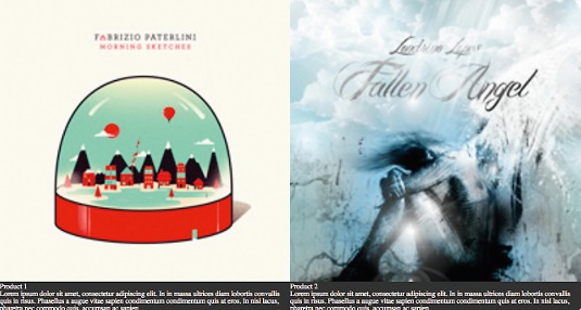
Each image will take up the full width of its article, and its height will be based on its width to ensure a perfect aspect ratio is met so the image never looks stretched or disproportionate.
As shown in Figure 2, because the <article> elements are 50% wide and the <img> elements within them are 100%, on larger devices, such as a tablet or desktop computer, images exceed their original width and height of 200x200px.
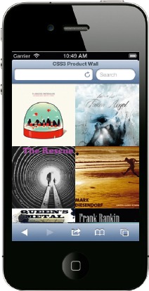
In Figure 3, you can see the product wall as it would appear on a mobile device. The image widths on a smaller device are a little less than 200x200px, which is perfectly fine. Later, you will add media queries to determine the size of the screen and adjust the width of the <article> elements accordingly, adding more products per row when possible - a mobile-first approach.
Styling the product information
Along with an image, each product will have further elements, such as a description, track titles and a purchase button. To style these, add the following:
section .info {
  width: 180%;
  padding: 2em 0;
  margin: 0 10%;
}
section .info h1 {
  margin-bottom: .5em;
}
section .info p,
section .info ol {
  margin-bottom: 2em;
  line-height: 140%;
}
section .info ol {
  margin-left: 20px;
}
section .info li {
  list-style: decimal;
  line-height: 140%;
}
section .info .purchase {
  display: block;
  margin-top: .4em;
  padding: .4em;
  background: #006699;
  color: white;
  text-decoration: none;
  text-transform: uppercase;
  text-align: center;
  font-size: 1.4em;
  transition: 0.5s background-color;
}
section .info .purchase:hover {
  background: #0066CC;
}
In the section .info ruleset, you've specified the width of the information should be 180%, that's 200% (because there are currently two products per row), less 10% each side for a margin. A padding of 2em top and bottom is also added to give some space all around the information. The remaining rulesets space out the information elements a little more and add interactive transitions. (Note: browser-prefixes have been omitted for brevity and, at the time of writing, are required on the transition property.)
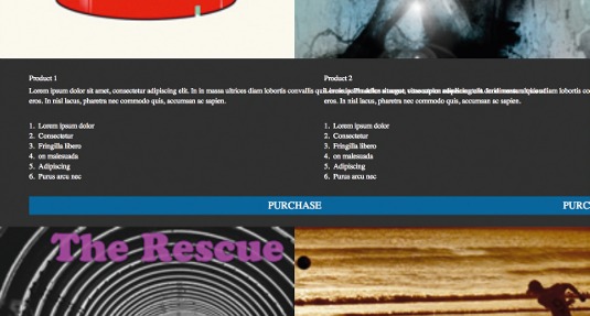
As shown in Figure 4, the information from one product overlaps that of another. That's not a problem: in a moment you'll hide all information elements, showing one at a time when the user clicks a product image.
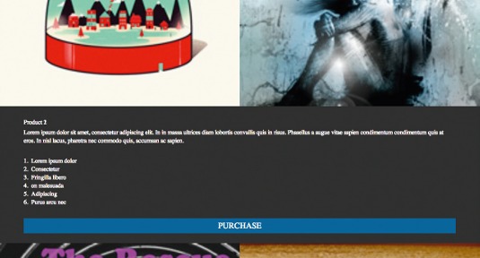
In Figure 4, you'll also see the information from product 2 aligns directly below it, which is something we don't want! Instead, position all of the information elements so that they all appear on the left of the screen, in the same place that product 1's do. In the section .info ruleset, add the following:
position: relative;By making the .info relative, its position can be manipulated without affecting the layout of any other elements on the page. Now add the following:
article:nth-child(2n+1) .info {
  left: 0;
}
article:nth-child(2n+2) .info {
  left: -100%;
}
Here you've used :nth-child() selectors to select the first .info of every two and the second .info of every two (remember you're working with just two products per row at the moment).
The first .info can remain where it is, but the second should be moved 100% to the left so it appears in the same position as the first (as shown in Figure 5).
Hiding the product information
By default, the product information will be hidden and only revealed when the user clicks a product image. In the section .info ruleset, add the following:
float: left;
opacity: 0;
height: 0;
font-size: 0;
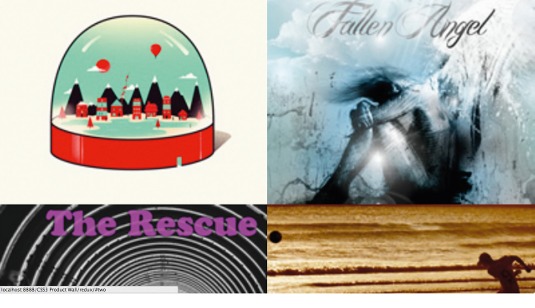
As shown in Figure 6, the information for each product is now hidden. You may be wondering why we use so many styles to hide the extra information when display: none would suffice? The reason for these styles is: hiding and showing an element using display: none; and display: block can't be smoothly animated using a CSS3 transition. So, a little extra groundwork is needed.
float: left; height: 0; and font-size: 0; will collapse the information element completely, making it invisible, ensuring it has no height whatsoever and preventing it from affecting layout when hidden.
Emulating a click event
Whenever a product image link is clicked, such as <a href="#one">, the URL will change to include that hashtag, for example, http://mysite.com/index.html#one. The browser window will jump to the target element <article id="one">. Using CSS3's :target pseudo-selector, you can style a target element however you please. Although this was most likely introduced to CSS3 for highlighting titles and sections within a page, you can push it to the limit and use it as a click event and open up the information relevant to each product. Add the following to styles.css:
section article:target .info {
  height: auto;
  font-size: 100%;
  opacity: 1;
  transition: .5s .5s opacity;
}
Now, when the <article> element is the target (its ID matches the hashtag within the URL), the following will happen to .info:
- Its height will change from 0 to whatever value is required to contain all of its content
- Its font-size will switch from 0 to 100%
- Its opacity will move from 0 to 1 over half a second after a half second delay
This means that whenever you click a product, .info will open up and the text will fade in. What's more, because the product wall relies on the :target pseudo-selector, products will open and close as you use your browser's forward and back buttons, as well as when you link directly to a product with a link, such as http://mysite.com/index.html#three.
To make it obvious to a user which product they are currently viewing, add:
section article:target img {
  box-shadow: 0 8px 3px -5px rgba(0,0,0,.5);
  transform: scale(1.1);
  transition: .5s;
}
When the target image is being viewed, its scale will increase by 1.1 and it'll be given a box-shadow. Both of these properties will smoothly transition over half a second.
Adding more products
At the moment, the product wall is only capable of showing two products per row. You're almost certainly creating the product wall on something larger than a mobile device, so the images are stretched and the content maybe appears further down the page than you'd like. Using media queries, you can fix that!
With two products per row, each at 200px, when the browser window reaches a width of 400px, the images are going to become too wide, so add the following media query to styles.css:
@media only screen and (min-width: 400px) {
  section article {
    width: 33.333333%;
  }
  section article .info {
    width: 280%;
  }
}
When the screen is a minimum of 400px wide, a product will be made 33.333333% wide and the product information will be 280% wide (300% minus 10% either side for a margin). In that media query, add the following:
section article:nth-child(3n+1) .info {
  left: 0;
}
section article:nth-child(3n+2) .info {
  left: -100%;
}
section article:nth-child(3n+3) .info {
  left: -200%;
}
Now there are three products per row, the .info elements need adjusting again so they always start on the screen's far left. Here you've moved the second of three products 100% to the left and the third 200% to the left.
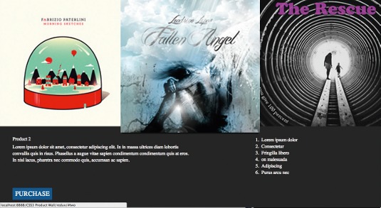
When the browser window is greater than 400px, it'll have three products per row (as shown in Figure 7); when it's less, two. You can continue repeating this process, adding another product per row every 200px, right up to 1400px.
To help you with the next one, add a media query with a min-width of 600px, make the article width 25% (four products per row), and the .info width 380%. Add four :nth-child() selectors so that the first .info is left: 0;, second left: -100%;, third left: 200%;, and fourth: -300%;.
Should you need a help with the remaining media queries, compare your code with the downloadable files.
Modifying the information for wider screens
In the min-width: 400px media query only, add the following:
section article .purchase {
  display: inline-block;
  *display: inline;
  zoom: 1;
  float: left;
  clear: both;
  width: auto;
  margin-top: 2em 0 0 0;
}
section article .description {
  float: left;
  width: 50%;
}
section article ol {
  float: right;
  width: 30%;
}
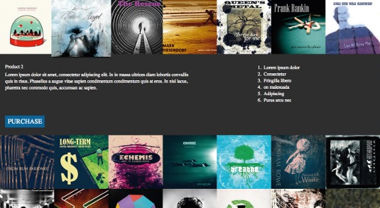
As shown in Figure 8, when the window is wider than 400px, the product description and purchase button will show on the left; the tracklist on the right.
Old versions of Internet Explorer
In this tutorial, you've used some technologies that aren't supported in older IE versions but, with the help of some JavaScript, you can patch it right up!
Before the closing <html> tag in index.html, add the following:
<!--[if lt IE 9]>
  <link href="css/ie.css" rel="stylesheet" media="all">
  <script src="//ajax.googleapis.com/ajax/libs/jquery/1.8.3/jquery.min.js"></script>
  <script src="js/selectivzir-min.js"></script>
  <script src="js/html5shiv-printshiv.js"></script>
  <script src="js/respond.min.js"></script>
  <script src="js/scripts.js"></script>
<![endif]-->
These conditional comments apply only to IE versions below 9. jQuery and Selectivizr will make nth-child() and :target work (:target will only work in IE8, so more work is needed for IE7 support). HTML5 Shiv and Respond.js will make HTML5 elements and media queries work; script.js is used to emulate :target in IE7 by giving a selected <article> a class of target, so .target can be selected instead of the unsupported :target pseudo-selector.
Conclusion
The :target pseudo-selector is little known, though very handy, and allows for an app-like experience using just CSS. By using it, not only can you emulate click events in CSS; it also saves states within the browser's history – the back and forward buttons will navigate between the previously selected products.
Words: Ian Lunn
Many thanks to Jenn Lukas for her peer review of this tutorial. This article originally appeared in net magazine issue 243.
Liked this? Read these!
- Stunning examples of CSS3 animation
- How to build an app: try these great tutorials
- Check out these inspiring ecommerce website designs
Got a question? Don't be shy, ask away in the comments!

The Creative Bloq team is made up of a group of art and design enthusiasts, and has changed and evolved since Creative Bloq began back in 2012. The current website team consists of eight full-time members of staff: Editor Georgia Coggan, Deputy Editor Rosie Hilder, Ecommerce Editor Beren Neale, Senior News Editor Daniel Piper, Editor, Digital Art and 3D Ian Dean, Tech Reviews Editor Erlingur Einarsson, Ecommerce Writer Beth Nicholls and Staff Writer Natalie Fear, as well as a roster of freelancers from around the world. The ImagineFX magazine team also pitch in, ensuring that content from leading digital art publication ImagineFX is represented on Creative Bloq.
