Create a style prototype for your responsive site
Jeremy Loyd explains why Sparkbox offers clients style prototypes as a first-phase design deliverable.
Sign up to Creative Bloq's daily newsletter, which brings you the latest news and inspiration from the worlds of art, design and technology.
You are now subscribed
Your newsletter sign-up was successful
Want to add more newsletters?
A key challenge with responsive web design is determining appropriate deliverables when it comes to sites' visual design. Should you create full-width Photoshop site comps and tweak design until the client is happy? What about mobile and tablet-width resolutions? Or should you jump directly into designing in the browser?
These can all be acceptable options. But in our quest to find the most efficient and useful process, we've arrived at the style prototype as our initial design deliverable (a live version can be viewed here).
- Find the source files for this tutorial here.
What are style prototypes?
A style prototype is a single HTML page that shows proposed site colours, typography, button styles, rollovers, photography styles and other necessary elements to establish a website's proposed design direction. The goal is to give clients an idea of where the visual language of their website is headed, without having to create Photoshop comps for all the unique templates on the site. A style prototype is similar to Samantha Warren's Style Tiles but is an actual HTML page in a browser as opposed to a static JPEG.
Article continues belowWhy use one?
The main advantage of a style prototype is that, with minimal time commitment, you can show a client a snapshot of a site's proposed visual language. It gives them an early look at design and can help to prevent a scenario where hours, or days, are spent in Photoshop or code on a design the client ends up rejecting.
Because it's in a browser, it also reduces client confusion when going from comp to code. There are always differences in how a static JPEG of a website looks compared with how it appears coded in the browser. Since the client is viewing the prototype in their browser of choice, it's a good opportunity to discuss how different browsers render code. Additionally, showing web typography, buttons and button hover states and building our style prototypes responsively adds another layer of interactivity and brings clarity for the client.

Building a style prototype
Building a style prototype is about creating a deliverable that's both useful and easily replicable. There's not necessarily a rigid order or process to creating it, but there are basic elements that should be included. Beyond these, you may feel the need to show other items based on your needs or priorities. We've found it works well to include an element or two specific to the site we're building, such as an illustration, custom icon set or a signup form.
How we built it
We use SCSS as our CSS preprocessor and use SCSS variables for defining items such as colours. This allows for easy editing when we go to create the next prototype. Our style prototypes are also responsive and use media queries. We typically keep it simple and only use one media query, but it helps to show the client how different elements could react to different browser widths.
Sign up to Creative Bloq's daily newsletter, which brings you the latest news and inspiration from the worlds of art, design and technology.

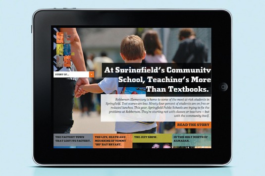
For simplicity's sake, we keep each of the 'modules' that make up a style prototype inside of their own div element. For example, here's the HTML code for the last module, device:
<div class="device">
<h4>STRY Website</h4>
<img src="../i/ipad.png">
</div>
With the exception of the header, there's no specific source order to follow, but it's good to show basic elements like typography, colour swatches and buttons first followed by modules that may contain more specific content to the site. Now, let's talk in more specifics about what we include in our prototypes.
Header
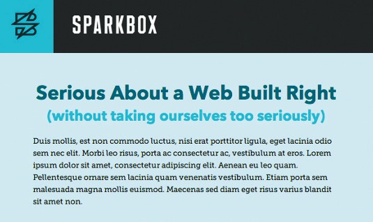
For the header, the goal is to show how the client's logo will be positioned. In the end, the site nav would likely be housed in the header, but we needn't worry about that now. There are too many complexities with navigation, especially at mobile width, we don't want to get into at present. We want to communicate how the logo will be positioned and on what colour or texture it's placed.
Typography
This is where we show how headlines, subheads and body text could be displayed. We usually try to show an h1, h2 and paragraph styles here. It just depends on what's applicable to your project. Also, this is a good place to show how you envision the type alignment to generally work.
Colour swatches
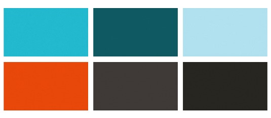
An important part of a style prototype is colour swatches. This establishes the palette for the entire site. Often, these colours may be pre-established by your client's brand standards guidelines. Other times it's open to interpretation. In any case, the swatches should trigger a good conversation with the client about the colour palette, and which colours should be primary and secondary.

We've created a SCSS variables file that enables us, in one location, to change the colour palette of the site. These variables are then referenced in the SCSS.
// COLOUR PALETTE
$primary: #50b7c8;
$secondary: #252525;
$neutral: #265e67;
$secondary1: #a3eaf5;
$secondary2: #F0592B;
$secondary3: #3f3d3d;
Button
One of the great things about a style prototype is that it lets the client interact with buttons and get an idea of the intention for rollover states. Typically, we show just one type of button, usually one used in a call-to-action scenario.
Additional items
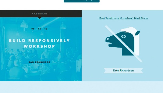
In addition to these items, I like to include an element or two that are more specific to the project. This could be iconography, photo treatment, patterns or textures you plan to use. This helps the client relate their project to the style prototype while seeing content relevant to their project.

What we've learned
We've been using style prototypes consistently now for about nine months and we've learned a few things along the way. The main thing to keep in mind is that the style prototype needs to be specific enough to initiate worthwhile feedback, but vague enough so that it doesn't feel like an actual web page.
Make sure your client knows that the goal here is to get a general feel for design direction and to not get hung up on how things are laid out on the page. We've been on both ends of the spectrum in the past and I think we've finally arrived at a place that we feel is both efficient and useful in our responsive design process. I'd encourage you to give it a try and see if it works for you.
Words: Jeremy Loyd
This article originaly appeared in net magazine issue 244
Liked this? Read these!
- Create a perfect mood board with these pro tips and tools
- Our favourite web fonts - and they don't cost a penny
- Get some web design inspiration with these examples of CSS

The Creative Bloq team is made up of a group of art and design enthusiasts, and has changed and evolved since Creative Bloq began back in 2012. The current website team consists of eight full-time members of staff: Editor Georgia Coggan, Deputy Editor Rosie Hilder, Ecommerce Editor Beren Neale, Senior News Editor Daniel Piper, Editor, Digital Art and 3D Ian Dean, Tech Reviews Editor Erlingur Einarsson, Ecommerce Writer Beth Nicholls and Staff Writer Natalie Fear, as well as a roster of freelancers from around the world. The ImagineFX magazine team also pitch in, ensuring that content from leading digital art publication ImagineFX is represented on Creative Bloq.
