Introducing CSS Grid Layout
Explore the benefits of the new CSS Grid Layout specification.

For over half of my career on the web, frontend development involved a lot of creating images in Photoshop, then chopping them up and using markup to construct the design in a browser. Thankfully, CSS has evolved to a level at which we don't need to do much of that any more. Creating rounded corners, gradients and even animations are now possible just using CSS.
One area of CSS hasn't evolved quite so quickly: CSS for layout. We are still reliant on fragile floats, positioning and display inline-block or table, and are increasingly coping by using frameworks like Bootstrap. However, things are changing, and one of the most exciting new modules is CSS Grid Layout. In this article I'm going to introduce the module with some simple examples. It's a big and complex specification, but once broken down the individual concepts are pretty straightforward.
What is CSS Grid Layout?
CSS Grid Layout is a specification for creating two-dimensional grids. It will give you the ability to set up a grid for your webpage and place elements precisely on it. The specification is currently in Working Draft status, and there is an excellent implementation behind a flag in Chrome.
Grid is a companion to the Flexible Box Module (flexbox). Flexbox is designed for one-dimensional layout, so things can be arranged in an unbroken line. Grid is designed for two-dimensional layout, meaning the items don't need to sit next to each other. In the future we're likely to use both: Grid Layout for main page areas, and flexbox for the smaller UI elements it excels with.
Creating a Grid
To create a grid, we need to use the grid or inline-grid value of the display property, and then set up rows and columns. My page has a wrapper element with a class of grid. Inside this is a header, nav, sidebar and a footer.
<div class="grid">
<header></header>
<div class="content"></div>
<nav></nav>
<aside></aside>
<footer></footer>
</div>
I then create a grid with CSS:
.grid {
display: grid;
grid-template-columns: repeat(5, 1fr);
grid-template-rows: repeat(3, auto);
}
The grid has five equal-width columns and three auto-size rows. The rows will expand to the height of their content. The repeat keyword repeats the pattern after the comma the number of times stated before the comma. So our grid-template-columns value could also be written:
Daily design news, reviews, how-tos and more, as picked by the editors.
grid-template-columns: 1fr 1fr 1fr 1fr 1fr;All the immediate child elements of .grid are now able to be positioned on the grid. There are two main methods of placing items – by line or template area.

Positioning by line numbers
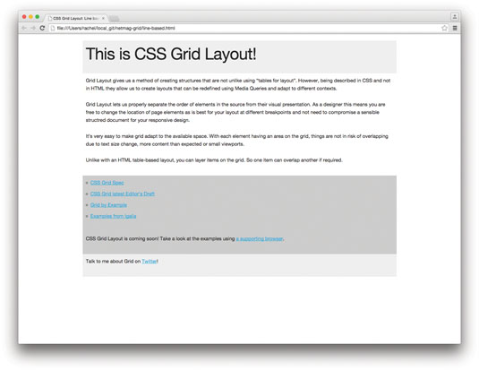
Grids have lines that can be referred to by number or name. Our five-column grid has six lines and four rows, including the line after the final column track and final row track. To position my elements as a standard layout with a header, a main content area with a sidebar on the left and right, and a footer, I would do the following (code here):
header {
grid-column: 1 / 6; grid-row: 1;
}
.content {
grid-column: 2 / 5; grid-row: 2;
}
nav {
grid-column: 1 / 2 ; grid-row: 2;
}
aside {
grid-column: 5 ; grid-row: 2;
}
footer {
grid-column: 1 / 6; grid-row: 3;
}
The grid-column property is a shorthand for grid-column-start and grid-column-end. The value before the / is the value for start, the value after for end. The grid-row property is shorthand for grid-row-start and grid-row-end.
So we specify the line on which the content starts and ends. Our header for example starts on the first line and finishes on the last line. If content only spans one track, you can omit the end value, as spanning a single track is the default.
It is worth noting that by default the columns will stretch to full height – you can see this from the grey background on the sidebars. No clearing is needed. The footer, for example, is sat in its own row. It can't jump up and cover content above, no matter which column is the longest.
Positioning by template areas
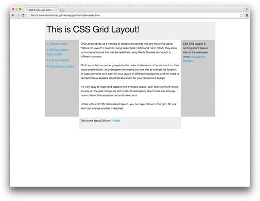
The second method of positioning items involves creating template areas and placing items onto them (see here). If we have the same markup, we first need to assign a name to the elements we want to position using the grid-area property.
header {
grid-area: header;
}
.content {
grid-area: content;
}
nav {
grid-area: nav;
}
aside {
grid-area: sidebar;
}
footer {
grid-area: footer;
}
With each area named I use the grid-template-areas property on the parent element – in our case .grid.
.grid {
display: grid;
grid-template-columns: repeat(5, 1fr);
grid-template-rows: repeat(3, auto);
grid-template-areas:
"header header header header header "
"nav content content content sidebar"
"footer footer footer footer footer";
}
The value of grid-template-areas uses the names we assigned to each element to position them. If a name is repeated, it means we want the area to span across that track. Here, our header and footer span all the columns, but the nav is in a single column to leave space for the content, which spans three.
To leave a column empty, you use a full stop character (.). So if I wanted the footer to just sit under the content and not the sidebars, I could describe my layout as follows:
grid-template-areas:
"header header header header header "
"nav content content content sidebar"
". footer footer footer . ";
The spec allows the use of one or more consecutive .s to indicate a null cell. This can help you to line up your ascii art to make it easier to read.

Grid and RWD
CSS Grid Layout means you can redefine your grid or the position of things on it at any breakpoint. Because Grid can display things out of source order, you can order your document in the most accessible way, moving things around for each breakpoint.
With our template areas example, we might choose to only go to the three-column layout for wider screens, and a single-column layout for mobile devices. Outside of any media queries, I would name my elements as before and then lay out a single column, using Grid to place items in the order I think is best for my mobile users.
.grid {
display: grid;
grid-template-columns: repeat(5, 1fr);
grid-template-rows: repeat(3, auto);
grid-template-areas:
"header header header header header"
"nav nav nav nav nav"
"content content content content content"
"sidebar sidebar sidebar sidebar sidebar"
"footer footer footer footer footer";
}
Then inside media queries at my chosen breakpoint, I'd redefine that layout back to three columns.
@media (min-width: 550px) {
.grid {
grid-template-areas:
"header header header header header "
"nav content content content sidebar"
"footer footer footer footer footer";
}
}
As we don't have to define the layout by adding classes, we can add as many small breakpoints as needed for different devices.
Future technology
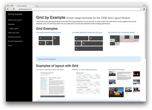
The CSS Working Group is keen to hear feedback as it finalises the spec – you'll find the latest draft here. I'm also building a collection of examples you can use as starting points for your experiments. Now is a great time to be part of the exciting future of CSS layout.
This article was originally published in issue 272 of net magazine.
Liked this? Read these!
- The designer's guide to grid theory
- Great examples of doodle art
- Brilliant Wordpress tutorial selection

Thank you for reading 5 articles this month* Join now for unlimited access
Enjoy your first month for just £1 / $1 / €1
*Read 5 free articles per month without a subscription

Join now for unlimited access
Try first month for just £1 / $1 / €1
