The problem with adaptive images
Designer and developer Christopher Schmitt examines the problem of adaptive images and looks at issues such as screen resolution and Retina displays, bandwidth and browser width
Sign up to Creative Bloq's daily newsletter, which brings you the latest news and inspiration from the worlds of art, design and technology.
You are now subscribed
Your newsletter sign-up was successful
Want to add more newsletters?
Like the James T Kirk character in Star Trek, I don’t believe in no-win scenarios. That is until I come across the idea of serving adaptive images in responsive web design.
Adaptive images isn’t just about the issue about scaling images, which has already been demonstrated by Ethan Marcotte (see unstoppablerobotninja.com/entry/fluid-images). It’s about dealing with other issues and variables to keep in mind when delivering the best user experience. Variables such as:
- Screen resolution
- Bandwidth
- Browser width window
The problem with trying to determine the best image to send to the browser is these kinds of factors can be independent of each other. And that's the problem:
Article continues belowKnowing the value of one item, such as screen resolution, doesn’t mean you get the full picture of the user’s browser experience.
Tiny displays
First, the iPhone 4 introduced the notion of the Retina display. Retina display is the inability to distinguish a computer display from that of a piece of paper when using the device.
Before the iPhone 4 one might have gotten away with letting just the browser width dictate, since the idea was that the smaller the screen a site’s visitor has, the slower your internet connection is as well. However, that’s not the case as displays are becoming great at compacting lots of image data in a small screen.
CSS and retina displays
To detect if a site visitor is using a Retina display, use the vendor-prefix property webkit-min-device-pixel-ratio with a value set to 2 in media queries. If you want a separate style sheet that contained only CSS rules for delivering retina images, the CSS code would look like this:
Sign up to Creative Bloq's daily newsletter, which brings you the latest news and inspiration from the worlds of art, design and technology.
<link rel="stylesheet" type="text/css" href="/css/retina.css" media="only screen and (-webkit-min-device-pixel-ratio: 2), only screen and (-moz-min-device-pixel-ratio: 2), only screen and (-o-min-device-pixel-ratio: 2), only screen and (min-device-pixel-ratio: 2)"/>When you want to write CSS rules within a style sheet, you can write the retina display detection code with the @media rule :
@media screen and (-webkit-min-device-pixel-ratio: 2),screen and (-moz-min-device-pixel-ratio: 2), screen and (-o-min-device-pixel-ratio: 2), creen and (min-device-pixel-ratio: 2) {.image-class { background: url(filename-mobile@2x.png); background-size: 100%; }}While on a broadband connection with a fast computer, you might not notice the drag, but users browsing on a mobile network will.
Thought experiment
There are various challenges to delivering the appropriate image in an adaptive web environment. To help get our heads focused on the issue, let’s think of this problem in another way with the following thought experiment:
Let’s say a visiter comes to your site with the iPad 3 (officially promoted by Apple as “the new iPad” when it came out). This is the first tablet that came out with retina display that rivals and even surpasses most desktop displays and high-definition television sets. (Also see 15 top tips for developing for the new iPad 3). In addition, the iPad 3 has the ability to connect to the internet through mobile and wireless connectivity.
Since the screen of the iPad is the same dimension as the iPad 2, the browser “width” is going to be the same. With that as the setup, here are the questions:
- Realising that the browser width isn’t helpful to determining the best image and if a site visitor is surfing the web on an iPad 3 with 3G, which image do you deliver on your site?
- Do you deliver the low-resolution, mobile friendly version?
- Or do you let the iPad 3 have the larger version, but with the longer download time?
Measure a few additional times, cut a couple more
The ultimate solution to delivering responsive web design images is to have an image download once and that image would always be the appropriate image for each device and browser it finds itself in. However, that’s not possible at this time.
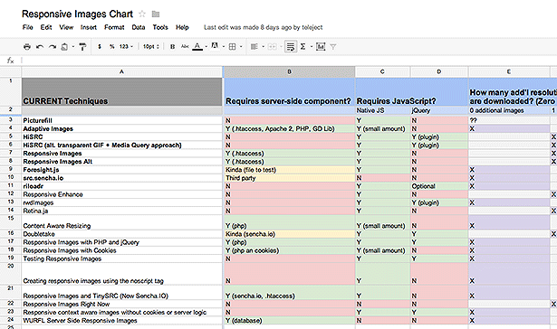
The best approach in most current solutions is to set mobile friendly images as the value for SRC attributes for image elements. It turns out that there are many patches or polyfills to this problem. Actually, there are 22 at the last count.
Working with Chris Coyier and others, we’ve made a spreadsheet (see telejec.tv/JdvEkt ) that marks the benefits and characteristics of each solution.

Each solution is different, offering their own sets of pros and cons. Some require backend support, others are only client-side solutions. Check out the list of solutions and find the right solution for your needs.
Don't miss Christopher Schmitt's Tips and tricks for Retina images in responsive web design.
Header image by Mrs Logic.

The Creative Bloq team is made up of a group of art and design enthusiasts, and has changed and evolved since Creative Bloq began back in 2012. The current website team consists of eight full-time members of staff: Editor Georgia Coggan, Deputy Editor Rosie Hilder, Ecommerce Editor Beren Neale, Senior News Editor Daniel Piper, Editor, Digital Art and 3D Ian Dean, Tech Reviews Editor Erlingur Einarsson, Ecommerce Writer Beth Nicholls and Staff Writer Natalie Fear, as well as a roster of freelancers from around the world. The ImagineFX magazine team also pitch in, ensuring that content from leading digital art publication ImagineFX is represented on Creative Bloq.
