10 UX things we remembered this year
TH_NK's senior experience designers Stuart Pill and Gavin Wye present 10 key takeaways from 50 hours of usability testing
Over the last year at TH_NK we have observed approximately 50 hours of usability testing. The rest of the time we have spent designing, facilitating and communicating with business people, developers, analysts and strategists. As a result of this time, there are a number of things that we knew but had forgotten.
In the following article we will describe these sometimes obvious things … along with a few other key takeaways from the last year.
We hope this little bit of insight will save you from that *facepalm* moment in the year to come.
Article continues below1. You are not your customer
It’s very easy to forget that your customers do not behave in the way that you would like them to. Never forget that as an employee of a company you have in-depth knowledge about what your company does and what it’s products or services are. Even if you are working in a consultative role it’s easy to become accustomed to the way things are, and take for granted that people outside of your bubble will understand what you are trying to communicate. Your customers have much less contact with your company and its products; therefore, they may need assistance with things that appear obvious to you. And the chances are that your customers probably care a lot less about what you are doing than you think they do.
2. Navigating home
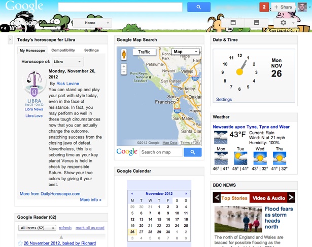
In the usability tests we observed, few users know that clicking on a site logo will take them to the homepage. Many users navigate back to home using the browser back button – even though clicking on the logo is a commonly accepted norm, and the vast majority of websites use this convention. We found users were not as familiar with this as we thought they might be, even some 13 years after Jakob Nielsen suggested it in Ten Good Deeds in Web Design way back in 1999.
3. Country selection with a drop-down list
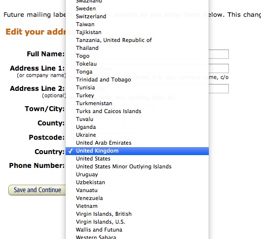
We tested the checkout for a global retail site and found many users don’t use keyboard shortcuts to access drop-down lists. Few people we observed knew that they could type a letter on their keyboard, use the arrow keys or hit enter to select the option. Users still use their mouse to navigate and hence found long drop-down lists frustrating.
The problems with drop-down lists, especially when used for more than about seven items, have been known for a long time and widely documented. What we found interesting here is that most users still don't use the advanced navigation features.
Sign up to Creative Bloq's daily newsletter, which brings you the latest news and inspiration from the worlds of art, design and technology.

An interesting solution to this problem is the Redesigned country selector by Christian Holst. Although we haven't tested this it certainly looks to be a better option than a traditional drop-down list for country selection.
4. Drag and drop
Although drag and drop seems obvious – and often cool – to advance users such as us, people still don't notice this advanced functionality. Relying on this type of functionality can be costly to your design. By all means use things like drag and drop, but provide users with obvious signposts and easy alternatives to allow them to complete their tasks in other ways. On a recent redesign project, one of the main features of the site hinged around drag and drop. Placing functionality behind advanced features, such as drag and drop, limits the number of people who can access it to people who are familiar with that function.

5. Security
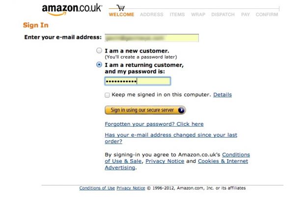
Again when testing checkouts, we found users are split in terms of attitudes to security. Some are happy to submit any information, whereas others are very cautious and need to trust a site before handing over any personal data. Highlighting that a site is secure during the checkout stage is very important. Amazon famously uses the term ‘Sign in using our secure server’ in its Sign In button – reinforcing users' perception that their details are secure. Again, the thing we found interesting was not the fact that security was important, but the fact that it was one of the most important elements for users, especially those who were not frequent internet users.

6. Use smart defaults wherever possible
Forms facilitate the conversation with users, and so are an integral part of the online experience: the less friction and effort, the better. Providing users with smart defaults such as ‘name@yourdomain.com’ in an email field will help users complete forms. Reading each form label, understanding the question and then entering data is more time consuming than scanning a form for what seems right, in the context of the form.
7. The bar is still relatively low
In most of the sessions we observed that users were delighted by the smallest things. We found their expectations were that they would have to compromise – and they expected things to be difficult. Therefore we think it's still important to focus on the basic things. There's no point spending time perfecting complicated interactions if you haven't met the basic needs of your users.
It’s easy, when you are surrounded by and immersed in the internet, to forget how hard some people find it to do things online. The web is still a confusing place to some people. Making tasks familiar by using established design patterns increases the chances of users completing these tasks, and so leaving your site with a sense of fulfilment and satisfaction.
8. Design your content
Your content is what a user visits your site for, whether that's words and images or something that supports a task the user wants to achieve. Therefore, to create a compelling experience, content must be ‘designed’ during the design stage of a project. Many sites appear amazing at the concept level. However, once the content that's available from a client has been applied to the new site templates, it’s common to find that even though the ‘design’ is the same, the site looks somewhat incohesive in terms of it’s aesthetic.
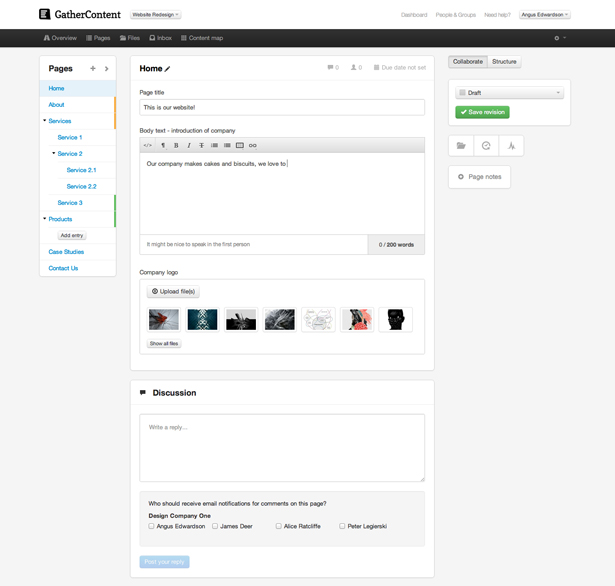
Putting this content at the heart of your design process – by working from the content out – has an added bonus. Ensuring that your content is well-structured semantically sets you up well for a responsive design. There are some great tools out there such as Gather Content: you should make every effort to work a solution such as this into your projects workflow.

9. Focus on shipping
It's important to remember that if you try to do lots of things all at once, you're spreading yourself or your team very thin. Focus on the things that you can 'ship' or launch with the minimum of fuss. As we've already said with drag and drop, users generally don't understand – and so don't use advanced functionality. If you're spending all of your time trying to perfect things like this, you may well be neglecting the important, basic needs of your users.
10. Using the right tool for the job
The UX world can be obsessive about the tools we use and the next new technique. Often we have seen people wanting to use a technique or tool just for the sake of it. While it's all very well spending time learning new tools and techniques, you should make sure that you are not producing deliverables for the sake of deliverables. Everything you do in the course of the project should have the explicit goal of moving the project forward. If you can't answer the question: 'What is the value to the business of what we are doing right now?', you should probably stop and reassess what you are doing.
Fifty hours is not a lot of time to spend with users, but even this small amount of time is vitally important for any designer. People generally look for evidence that supports their opinions. Spending time with users who can show you the faults in your design is crucial to design teams. That's not to say that you must rigorously test everything you design – all too often we see usability testing being made a separate part of a project. Usability testing is best done as part of the design process, when you can react to the things you are learning.

The Creative Bloq team is made up of a group of art and design enthusiasts, and has changed and evolved since Creative Bloq began back in 2012. The current website team consists of eight full-time members of staff: Editor Georgia Coggan, Deputy Editor Rosie Hilder, Ecommerce Editor Beren Neale, Senior News Editor Daniel Piper, Editor, Digital Art and 3D Ian Dean, Tech Reviews Editor Erlingur Einarsson, Ecommerce Writer Beth Nicholls and Staff Writer Natalie Fear, as well as a roster of freelancers from around the world. The ImagineFX magazine team also pitch in, ensuring that content from leading digital art publication ImagineFX is represented on Creative Bloq.
