The new Chester Zoo logo has a powerful hidden meaning
Sign up to Creative Bloq's daily newsletter, which brings you the latest news and inspiration from the worlds of art, design and technology.
You are now subscribed
Your newsletter sign-up was successful
Want to add more newsletters?
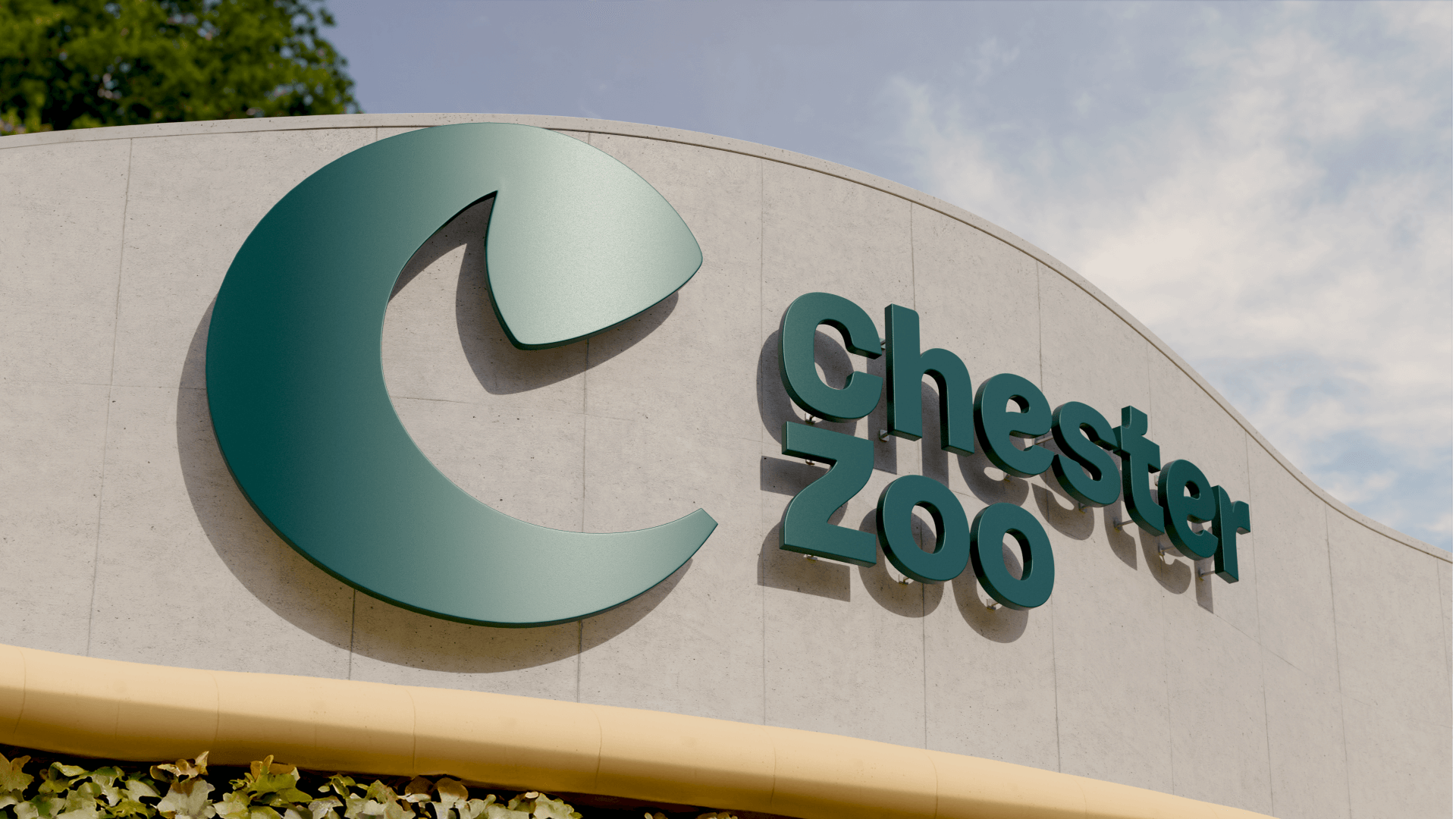
The purpose of many zoos has changed over the years. Rebranding can communicate that, but it can be difficult to strike the right balance. I think Chester Zoo's taken the right direction with its new logo and brand identity, which are cleaner and more grown up but still have a lot of personality.
Chester Zoo's shift in focus to conversation isn't entirely new, but the rebrand better communicates it. It strips away the more negative connotations we might associate with zoos – their history as places primarily for the amusement of humans – and highlights the zoo's work in global conservation, breeding and research (see our pick of the best rebrands of the 2020s for more inspiration).
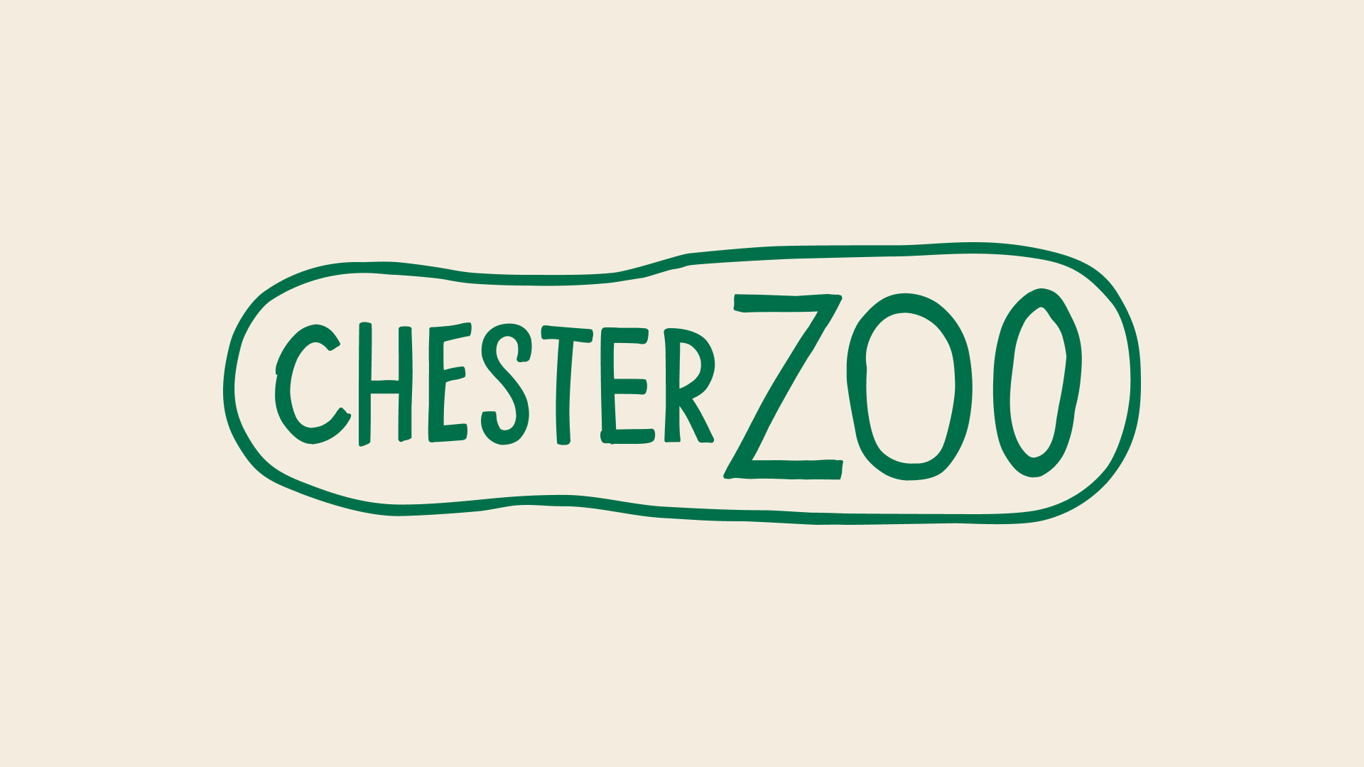
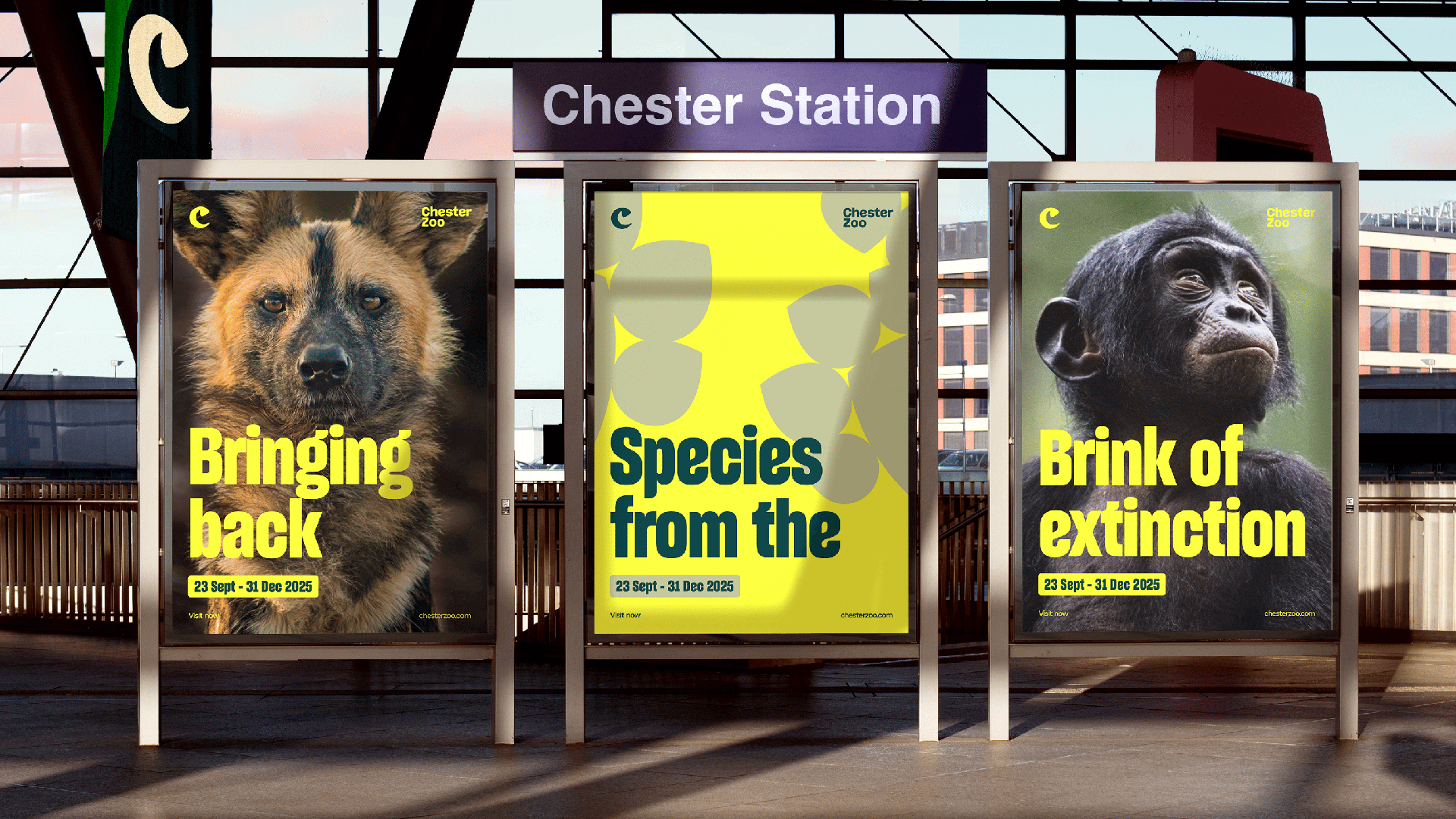
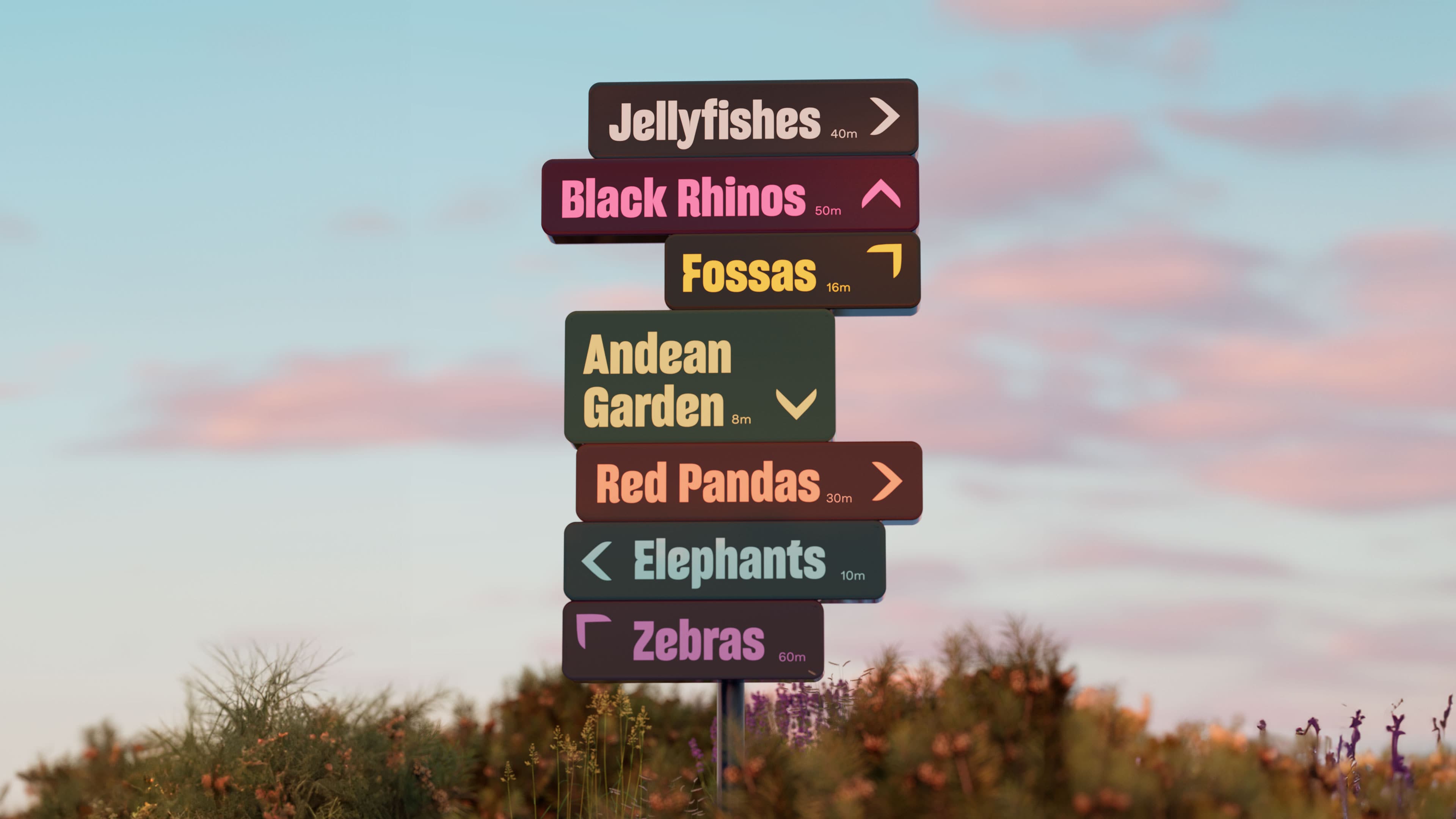
The branding agency How&How found that Chester Zoo needed a new brand and website to better reflect its nature-positive efforts, but it still wanted to convey the zoo as an appealing place to visit. The result was an idea it dubbed ‘Force for Nature’
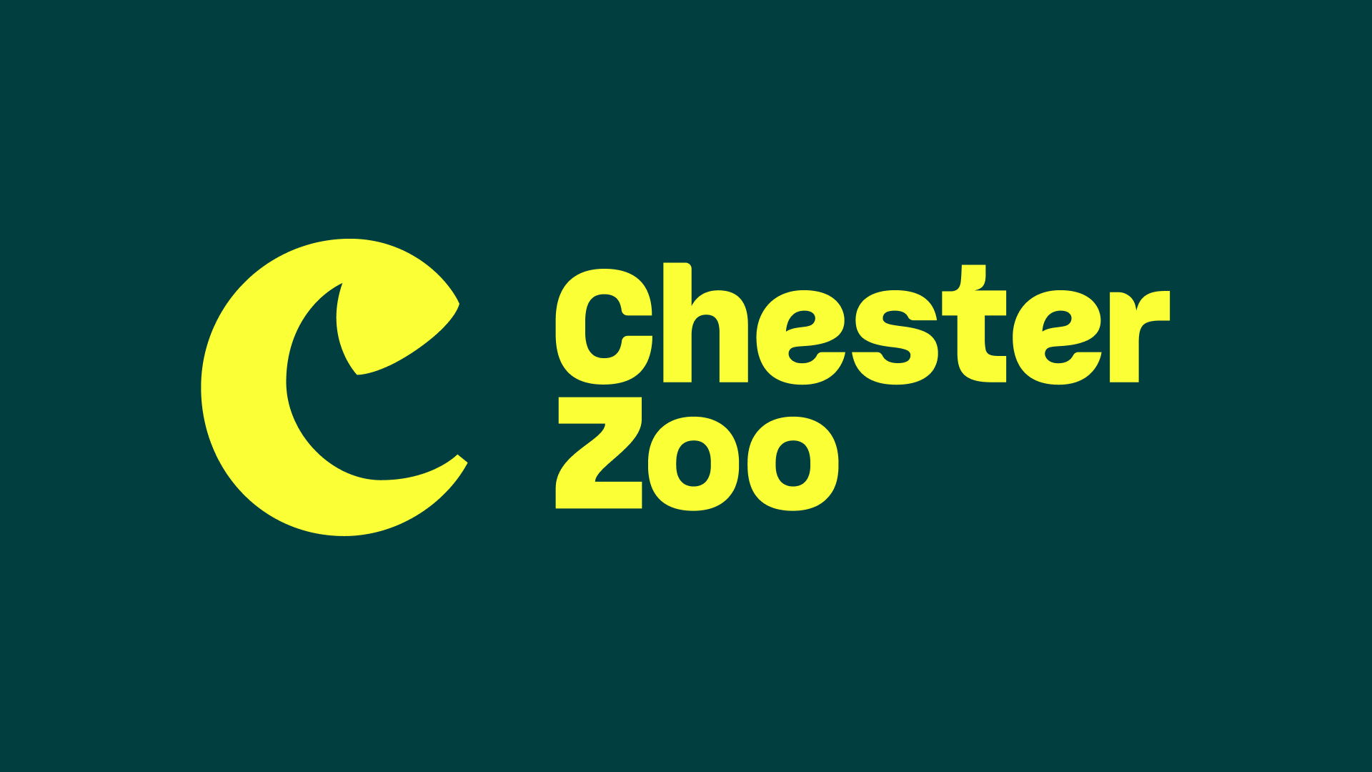
The new logo is a custom ‘C’. And within that, there's a clever design secret that you might not notice at first glance: a hidden counter form inspired by a rhinoceros horn. And there's good reason for that specific reference. It recalls the Zoo’s history of supporting critically endangered Eastern Black Rhinos. Its efforts date back to 1999 and helped to breed a rare calf. You can see the Easter Egg evealed below.
How&How also created a custom typeface with US-based Sharp Type: a twist on a Grotesk with cuts and curls to mimic tails, leaves and claws. And it used expressive pattern overlays inspired by the migrations and movements of mammals, birds, fish, reptiles and flora. These are paired with vibrant colors and imagery that have been designed to be flexible and work across everything from formal presentations for partners to signage and social media.
As for web design, the new site takes inspiration from the content-rich allure of streaming platforms, creating a sense of abundance and choice through endless carousels and immersive video content, which provide an invitation into a world of so many experiences.
The colour palette, named “Forest Mode” aims to immerse users in a dark natural world with vivid pops of colour throughout. The verbal identity was created with the aim of inspiring people to connect, care and act, with messaging linking what’s going on in the Zoo with what’s happening in the field.
Sign up to Creative Bloq's daily newsletter, which brings you the latest news and inspiration from the worlds of art, design and technology.
Cat How, Founder & ECD at How&How said the two-year project was a challenge due to the number of moving parts. "We pushed them, and they pushed us back, in a fantastic collaboration and meeting of minds between two teams dedicated to making sure everyone knows about the Zoo’s conservation and research work," she said.
For more great rebrands of 2024, see the GOSH Charity rebrand. And make sure you check out the Brand Impact Awards 2024 winners.

Joe is a regular freelance journalist and editor at Creative Bloq. He writes news, features and buying guides and keeps track of the best equipment and software for creatives, from video editing programs to monitors and accessories. A veteran news writer and photographer, he now works as a project manager at the London and Buenos Aires-based design, production and branding agency Hermana Creatives. There he manages a team of designers, photographers and video editors who specialise in producing visual content and design assets for the hospitality sector. He also dances Argentine tango.
