
It's no secret that style guides can be a little dry sometimes, but file hosting service Dropbox has bucked the trend, unveiling a new brand guideline microsite with a slick interactive twist. With its dynamic UI design and immersive storytelling, the site expertly showcases the creative prowess of Dropbox's identity, putting a much-needed creative spin on the corporate brand rulebook.
To create a style guide that informs and engages is no mean feat, yet Dropbox's microsite is a shining example of the future of design, creating a fluid and captivating experience that uplifts its content. From iconography to motion, each curated detail demonstrates Dropbox's design evolution, ushering in a new era of innovation.

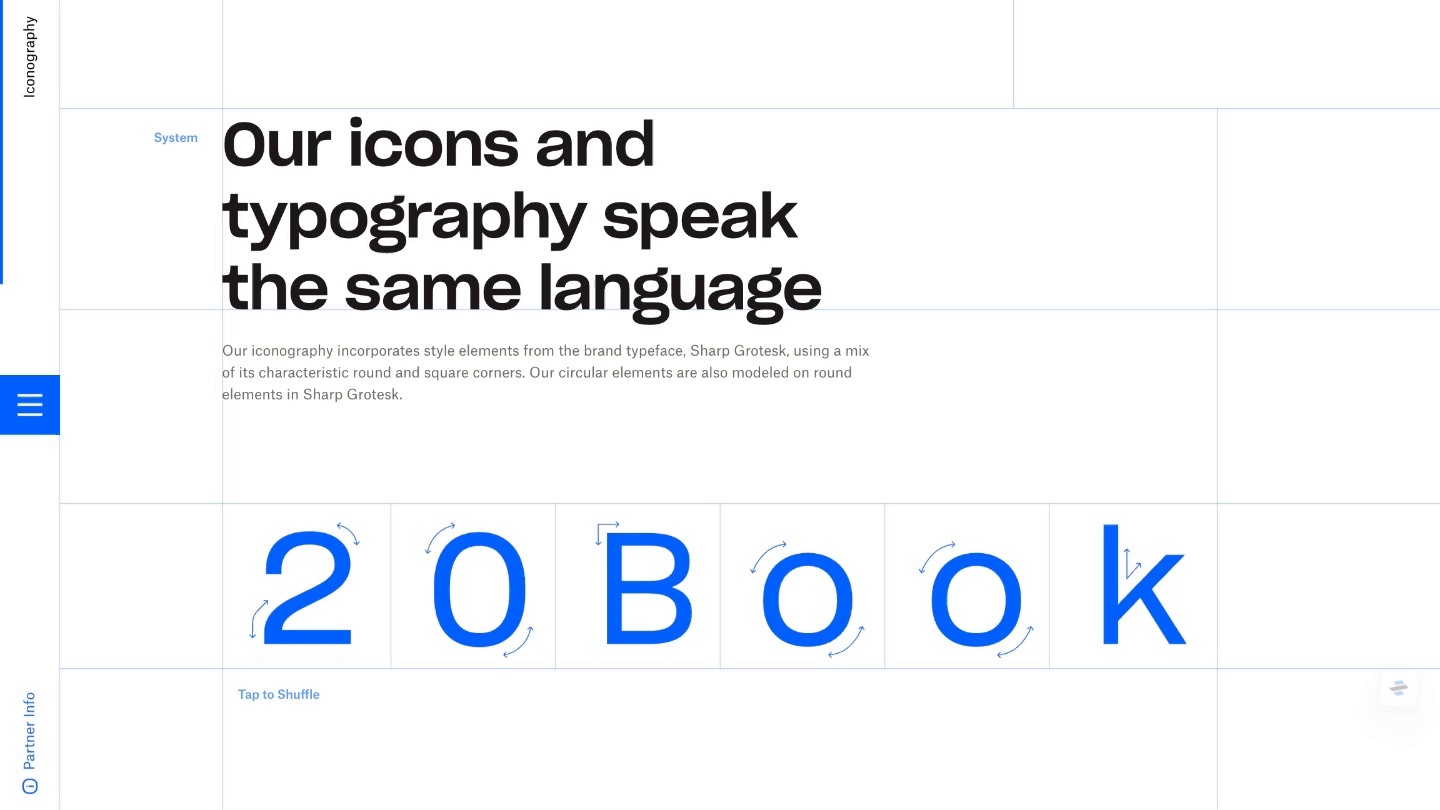
Dropbox's brand guideline site is a treasure trove of interactive experiences, acting as a functional info source enriched with a playful taste of the brand's creative craft. Created in collaboration with Daybreak Studio – utilising technology from Webflow and Rive – Dropbox's visual playground explores branding features such as voice and tone, logo, imagery, motion and more.
The site's highlights include the Variable Type Explorer tool, which allows users to explore the flexibility of Dropbox’s custom typeface by adjusting its variations at the click of a button. An interactive Icon Slot Machine brings an element of play to the guide, showcasing the diverse range of iconography and how they combine to form a harmonious design aesthetic.
Dropbox's ambitious new brand guideline site demonstrates that there are creative opportunities to be found in even the most traditionally dry places when it comes to business branding. A shining example of how branding style guides should reflect the essence of a brand's creativity, Dropbox's site has set a high standard that hopefully marks the end of plain, static style guides.
For more design inspiration take a look at these amazing examples of motion in logo design. If you're after more branding news take a look at Wieden+Kennedy's wild logo designs that celebrate London's eclectic creative talent.

