The best subtitle fonts for accessibility
Accessibility experts, subtitlers and media companies share which accessible fonts you should use for subtitling work.
Whether you’re making a video for social media, a short film, a cinematic blockbuster or a TV show, you need to factor in subtitles for accessibility. Designers, videographers and digital marketers are more aware than ever of the need for subtitling – giving a written transcript of any dialogue in the frame of your video – especially in this video-centric media world.
You can even get subtitles and captions for theatre shows, thanks to services like Stagetext; video games also have subtitles available. Fonts should be accessible so they are easy to read and understand, following the pace of the speech on screen. Though some are paid for, we’ve made sure to include plenty of free fonts on our shortlist. If you use captions instead (which also include non-audio information, such as descriptions of people’s movements and clothing) these also need to be user-friendly.
We spoke to a range of experts, from professional subtitlers to media companies and accessibility consultants, and narrowed down the most accessible fonts for subtitling. For more on why subtitlting matters and how to do it correctly, see our subtitling FAQ section.
Article continues belowTop subtitle fonts
01. Tiresias
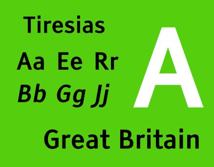
Tiresias, from the renowned Bitstream type foundry, comes recommended by Ofcom and is used by the BBC, Sky and Channel 4, plus broadcasters in Denmark, New Zealand and beyond.
This sans-serif font family was designed in 1998 by the RNIB’s scientific research unit, working with optometrists, and it’s named after a mythological Greek prophet who was blind. Tiresias is deliberately suitable for subtitling and for low resolution displays; variations in the font family include Screenfont and Infofont.
02. Arial
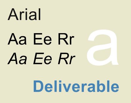
A clean, reliable humanist classic, this is recommended by Alexa Heinrich, social media strategist and Director of Accessible Social. It’s also a favourite of Veed, the subtitling software.
However, not everyone is a fan: Canadian website Screenfont.ca called Arial "a two-bit knockoff of Helvetica". Love it or hate it, the Microsoft staple is here to stay.
Sign up to Creative Bloq's daily newsletter, which brings you the latest news and inspiration from the worlds of art, design and technology.
03. Roboto
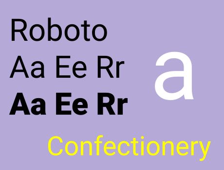
- Find Roboto on Google Fonts or use on Adobe Fonts.
Alexa Heinrich also highlights Roboto, which is a simple, curvy choice, as well as the default for subtitling on YouTube and a favourite of Google. The font family includes Bold, Black 900 and Medium; separate families are Roboto Condensed and Slab. Find this font on Canva for doing quick social media videos or video presentations.
04. Montserrat
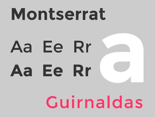
Submagic analysed font data from 2 million videos and created a list of the 15 most popular fonts used by video creators; Montserrat made it to number 1, with Montserrat Bold the best from the font family. However, Submagic recommended all-caps, which is terrible for accessibility, and also can come across like shouting. We suggest sticking to lowercase and sentence case.
05. Consolas
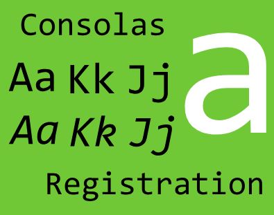
The default subtitle font on Netflix, Consolas was designed by Luc(as) de Groot for Microsoft. It’s monospaced and functional, with no frills, because it’s aimed at programmers. Inconsolata is seen as a good free alternative to this font, if you’re on a zero-budget project.
06. Atkinson Hyperlegible
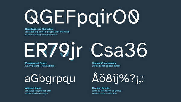
This is recommended by Max Deryagin, Chair of SUBTLE, the Subtitlers’ Association in the UK. Atkinson Hyperlegible was also one of Creative Bloq’s choices in our round-up of the best accessible fonts. It was specifically designed to be accessible for both people with low vision and those learning to read, so each character feels unique.
07. Helvetica
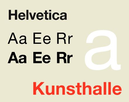
Here’s another recommendation from Ofcom, seconded by Alexa Heinrich. Helvetica is a neo-grotesque font, from the legendary Linotype foundry, readily available in Adobe Premiere Pro for those of you making and editing serious film content. It’s also the go-to choice for Criterion film subtitles. The tall x-height helps with distance reading, too.
08. Poppins
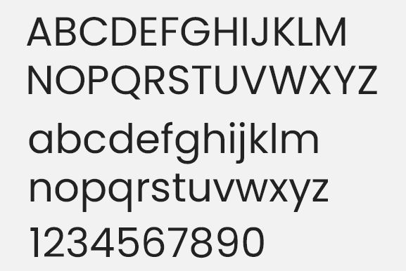
Developed by Indian Type Foundry, Poppins is a modern classic geometric font that’s comfortably rounded. It’s not just good for subtitling, either - according to Google, Poppins is used by more than 18.1 million websites. Its friendly appearance makes this fun for videos aimed at kids, as well.
09. Dyslexie
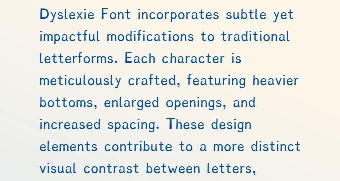
Also chosen by Max Deryagin, Dyslexie was developed for readability by a dyslexic designer. It includes heavier bottom strokes, wider openings and slightly slanted letters.
Similarly, we have Dystitles, developed in 2023 by French broadcaster CANAL+, advertising agency BETC Paris, and a speech therapist and psychologist from dyslexia NGO Puissance Dys. However, Dystitles is only available through CANAL+ so far.
10. Lato
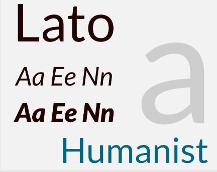
Developed by Polish designer Łukasz Dziedzic in 2010, originally for a bank, Lato is available through Adobe Fonts, Google and Canva. As with Poppins, it’s hugely popular for websites, too. Styles in the font family range from Hairline to Black, but don’t go thinner than Lato Regular for subtitles.
11. Futura
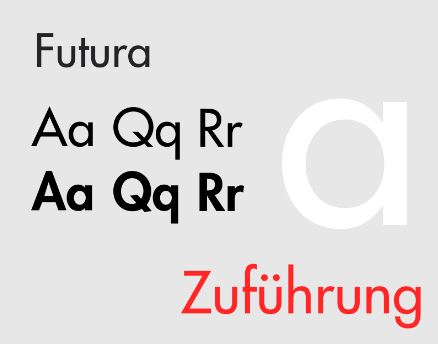
The font family may get some slack in the typography world for being used in the Dune films in 2021 and 2024 (as Futura PT Light), but Futura is a valid option. Its geometric sans-serif appearance, with 39 styles, is inspired by the Bauhaus art movement. If it’s good enough for artists and Hollywood, give it a go.
12. Antique Olive
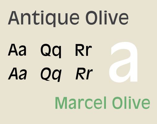
If you need something that looks a bit more stylised and elegant, try this humanist typeface, which dates back to the 1960s. Again, it comes from URW Type Foundry, with 16 styles in the font family. Antique Olive won’t suit every subtitling project, but it might work well for a documentary or short film.
Subtitling FAQ
Why does subtitling matter?
With smartphones giving us access to video content on the go (and the ability to make our own short videos), the way we consume this content makes a difference.
- Most videos are watched without sound (as many as 85% on social media, according to Hootsuite); think of when you watch clips on the bus, or sneak a look at social media at work.
- We need to consider the many viewers with hearing impairments, sensory processing disorders, sight impairments, and so on; in 2023, a RNID charity survey found that 4 out of 5 deaf people miss out on their favourite TV shows because there are no subtitles. Another hearing charity, Action on Hearing Loss, has run the ‘Subtitle It!’ campaign since 2017.
- Language barriers are a further consideration, whether you’re watching a subtitled crime drama or you’re actively learning a language, plus using subtitles is said to help children learning to read.
- Our listening environment also plays a part, according to Mark Harrison, Senior Language Manager at Netflix: “We know, for example, that some members will use subtitles when they eat crunchy food, or when they need to keep the sound low with a sleeping baby.”
You can generate subtitles from video or audio content using paid software for transcription, or free open-source software. Make sure you correct any errors, because no transcription service is flawless.
How should you format subtitles?
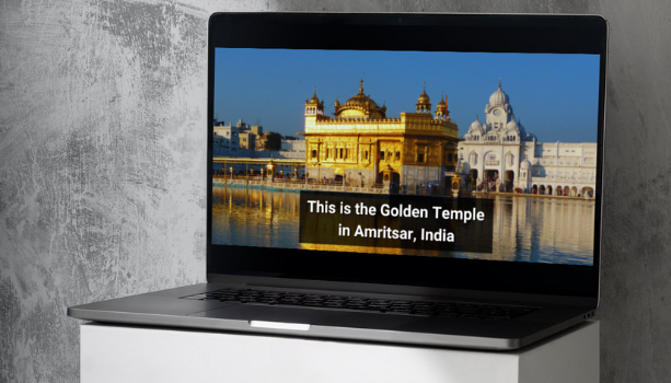
Once you’ve chosen your font, there are some other factors to work out, like the size and colour of the text.
- On many streaming services, the user can choose the size of text they want to see. “Our members helped us develop the well-spaced fonts which are highly readable and can be configured by colour, style and size,” says Mark Harrison at Netflix.
- When it comes to colour, Max Deryagin advises: “Usually people opt for a white, slightly grey, or golden yellow colour. What matters is that there is enough contrast against the video and that the colour doesn't clash with the shot.”
- You can then add a drop shadow outline or a shaded box (working much like a highlighter) to your subtitles to make them even more readable. On Netflix, you have a drop shadow option, then three flat colour options of dark, contrast, and light.
- Two or three lines should be the absolute maximum amount of text on screen; both Netflix and Channel 4 ask their media partners to fit a maximum 42 characters per line, and maximum two lines on screen.
- Bear in mind reading speeds. “Leaving text on screen for as long as the edit allows means that a broad range of viewers can easily understand what’s happening,” says Mark.
- A person’s TV can affect how subtitles appear, according to Amie Tsang, Head of Executive Communications at Channel 4: “The exact font used is determined by a viewer's set-top box or television device, and might differ depending on whether they are viewing over a broadcast or digital service, or one of our streaming services.”
- In terms of what to avoid, Natasha Robinson, Inclusion Officer at RNID, says: “For captions, we would advise avoiding any fonts that mimic cursive handwriting, or have hard to read characters that can be confused for one another.” Along these lines, we’d steer clear of Papyrus, the much-derided subtitle font used in James Cameron’s Avatar films.
Why are subtitles in the media important?
So, why does this all matter? It’s about setting a good example and bringing your skills and empathy to an often-overlooked design element. Media law is also catching up to its importance, especially for streaming TV viewers.
“The Media Act was passed earlier this year, which introduced binding quotas for Tier 1 on-demand services,” says Natasha. “Once the quotas are enacted, the big names in on-demand TV such as Netflix, ITVX and Channel 4 will have to have 80% of their content subtitled.”
As for applying design skills? “Almost no one cares about font design, which is a shame,” says Max. “Fortunately, Netflix and the BBC have designed very nice fonts for their services, but the rest are lagging behind.”
This is also true for digital marketers, as Alexa points out: “There’s a huge education gap within the digital marketing industry when it comes to accessibility. Accessibility for social media content is still considered very new, and it’s something we as an industry need to fix by setting a consistent standard.”

Polly Allen is a freelance journalist and marketer based in Bristol. She specialises in travel and lifestyle journalism, including art reviews. As a marketer, she has worked for the charity sector, the travel industry, the museum sector, and healthcare organisations.
