My Favourite Font: Designer Viviana Caponnetto on Freitag
"It's a fun hippie girl at a festival in the 70s!"
It's Typography Week here at Creative Bloq, and we've been catching up with graphic designers around the world to talk all things type. Every designer has a favourite font or typeface (although let's be honest, it's likely to keep changing). For more typographical inspiration, take a look at our guide to the best free fonts.
Viviana Caponnetto is an Italian graphic designer based in Catania, Italy. Through Viviana Graphics, she shares her love for design and helps businesses stand out in the market. With years of experience in design and a degree in Visual Communication Design, she now creates fun and helpful content on Instagram, TikTok, and YouTube.

What's your favourite typeface?
Article continues belowI bet that this is a very difficult question to answer for any designer, but especially for someone like me who’s obsessed with type. I don’t have a specific typeface that comes to mind, but usually I tend to go for bold and quirky display fonts. An all time favourite is Freitag by Zeta Fonts: when I first saw this font I immediately felt drawn to it and I think it describes me and my style perfectly.
Can you tell us about a project you've used it for?
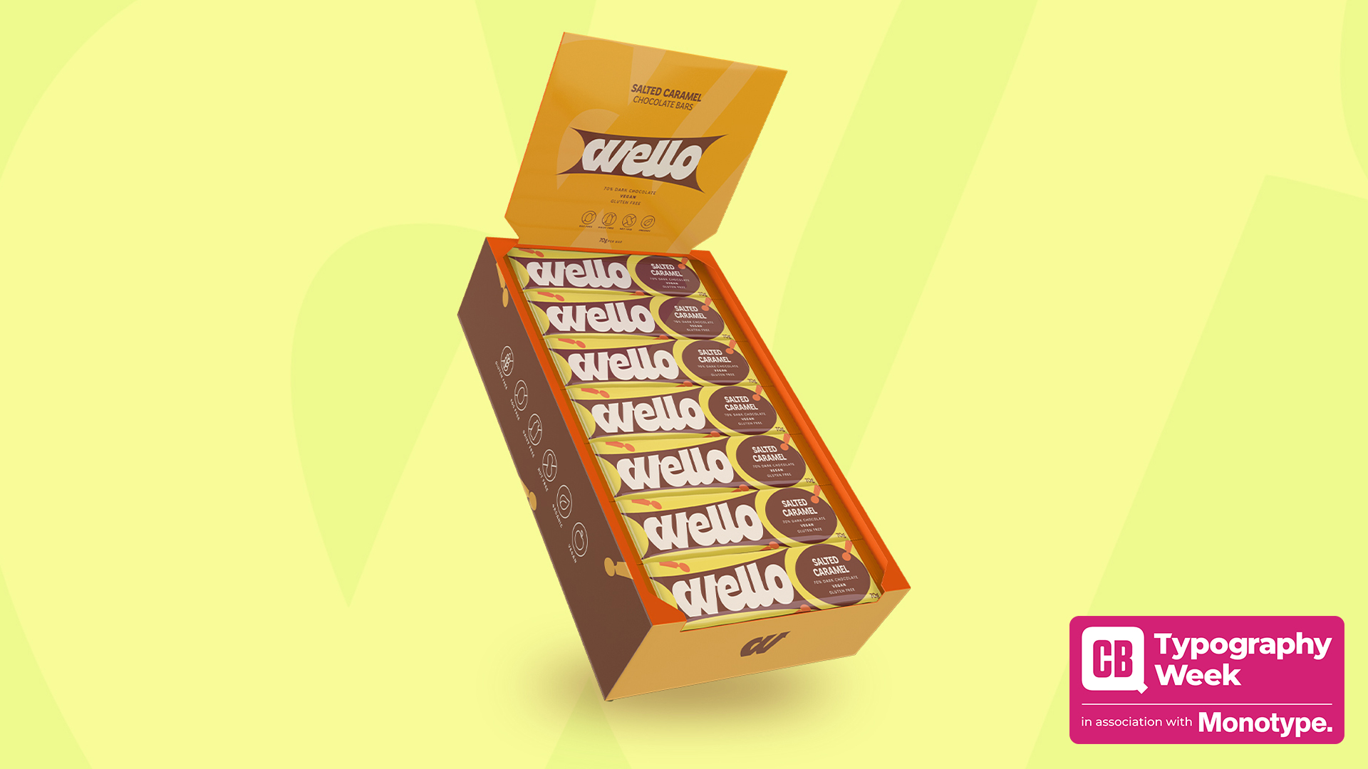
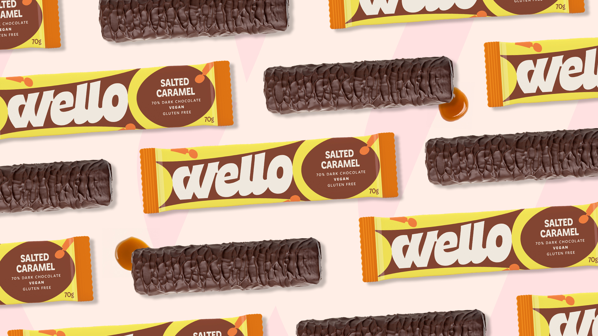
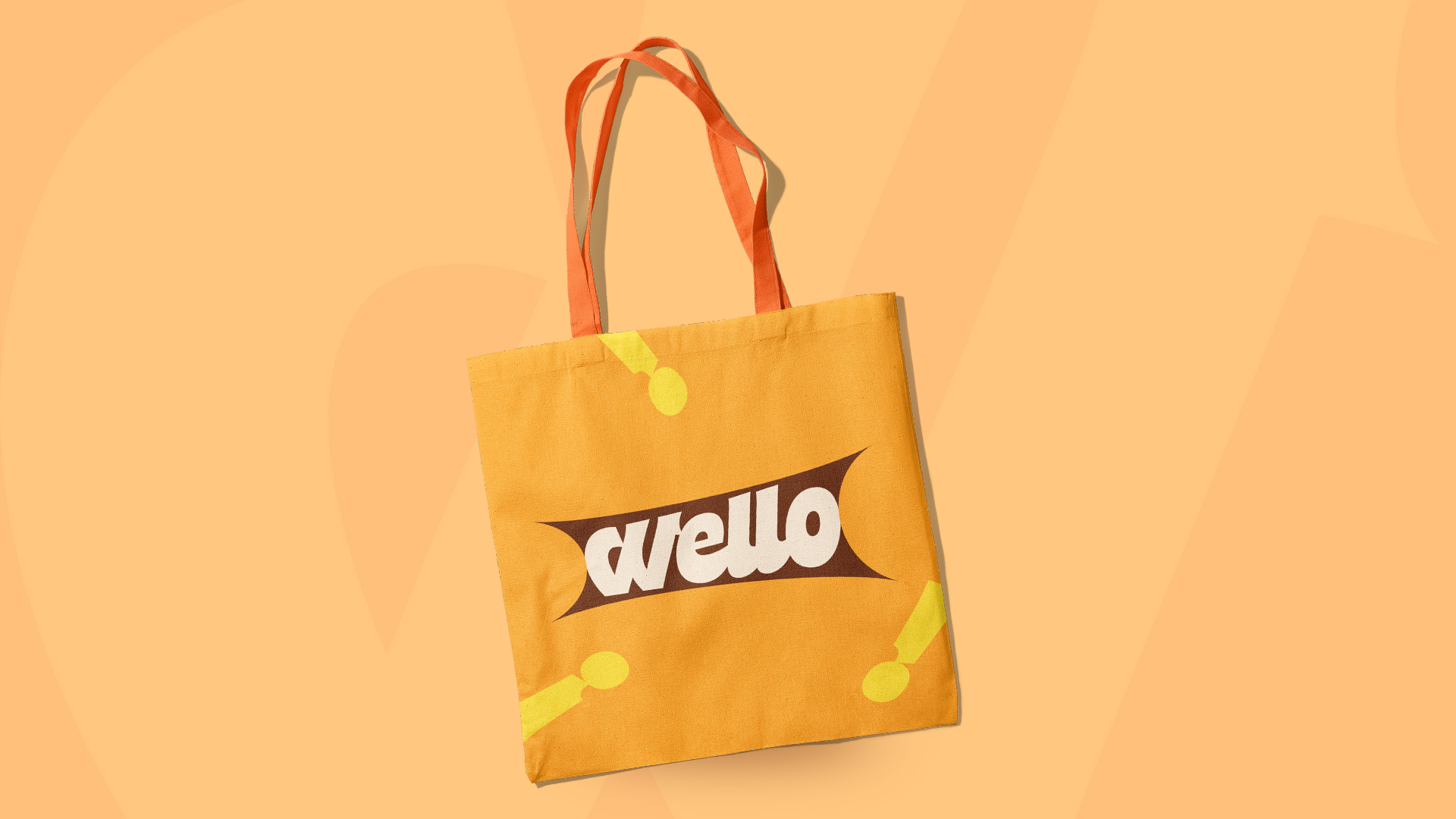
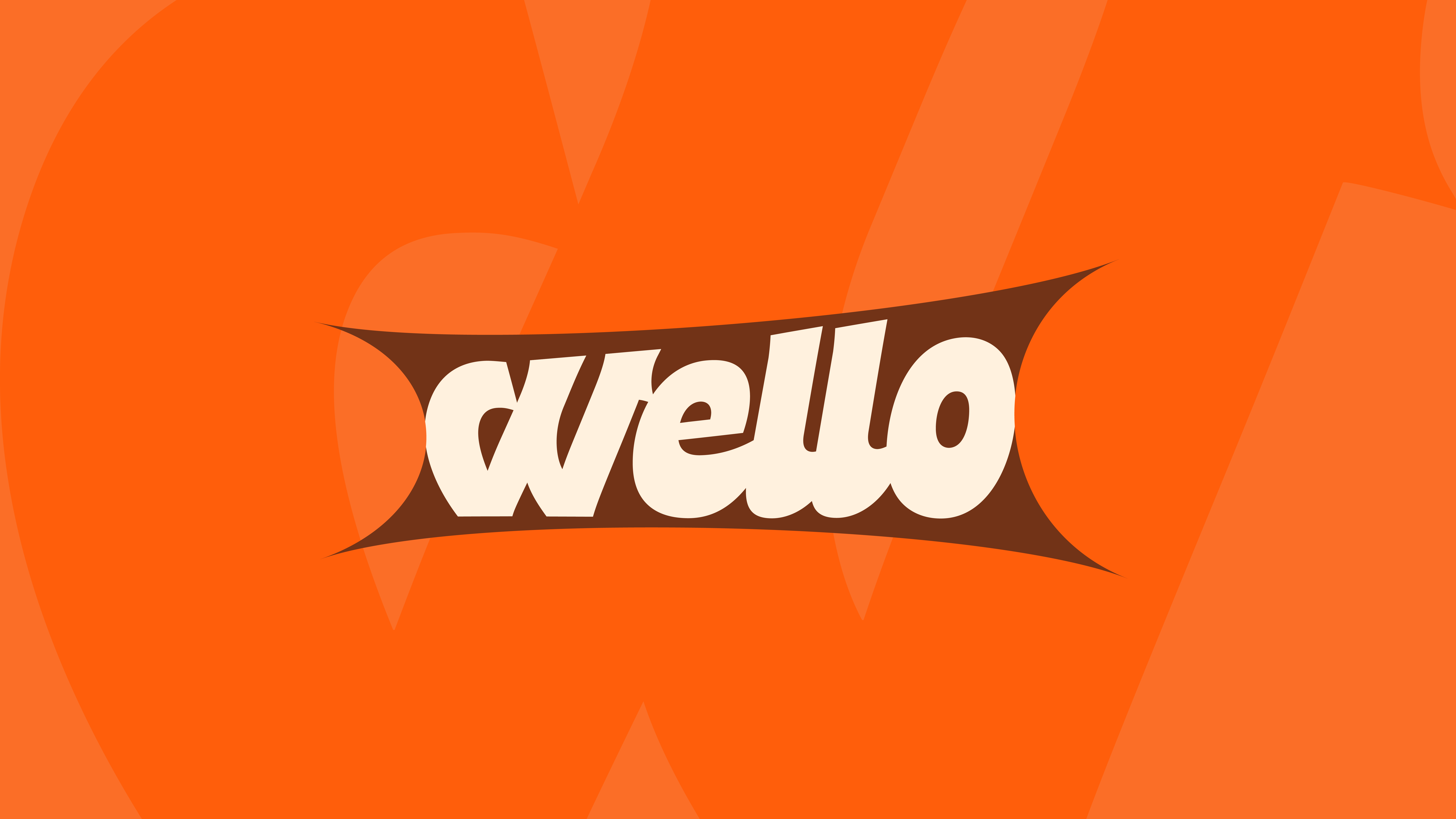
I used Freitag a few times, but my favorite was for a passion project I worked on a while ago: Wello, a vegan caramel-infused chocolate bar. The goal for this project was to create something that would appeal to both adults and kids, so the type had to be quirky but legible and trustworthy. Freitag was already a great base for the logo and text on the packaging, and so I had to make only a few adjustments to give it a bit more personality and convey a friendly and approachable feeling. I particularly focused on making the logo more dynamic and eye-catching.
What makes this typeface unique?
While searching for the right font, I stumbled upon Duckie. I especially liked it not only for its airy feel but also for its bold quality, which I thought perfectly represented the song. From the start, I knew I wanted to incorporate the square pattern I saw everywhere in Japan, and I felt that a script typeface would nicely contrast the edgy graphic elements with its rounded forms.
How would you describe its personality?
Airy, playful, and bold.
What kind of response do you think it elicits from the viewer?
Sign up to Creative Bloq's daily newsletter, which brings you the latest news and inspiration from the worlds of art, design and technology.
My goal when designing the posters was to capture the feeling I get when listening to Twilight Bay City. However, by the end, I realised the posters became a reflection of how I view Japan overall—where modernity and tradition coexist beautifully. I’m not sure how viewers interpreted them, but my hope is that they saw the beauty of typography, especially in Asian languages.

Daniel John is Design Editor at Creative Bloq. He reports on the worlds of design, branding and lifestyle tech, and has covered several industry events including Milan Design Week, OFFF Barcelona and Adobe Max in Los Angeles. He has interviewed leaders and designers at brands including Apple, Microsoft and Adobe. Daniel's debut book of short stories and poems was published in 2018, and his comedy newsletter is a Substack Bestseller.
