As the world faced a second global war, among the politics and propaganda, the 1930s saw significant change in the way people communicated through design – particularly as the written word became increasingly important for governments to speak to the public. Alongside, there was an increase in advertising, the rise of modernism and the continued influence of Bauhaus.
It remained an era of contrasting styles in typography in many ways – decorative versus functional, modern versus traditional, technological innovation versus artistic expression. And it was an era when several of today’s most popular typefaces were first published.
Here (in no particular order) typographers, designers and other industry experts pick their top type of the 1930s. For more inspiration from the history of typography, check out our best typography of the decade series and for more recent type talk, see the type trends to watch in 2025.
01. Times New Roman

Chris Page, founder of design agency Jelly and head of the company’s type department, calls this first typeface “the daddy of modern serif fonts” and “a font so ubiquitous that it feels almost above design”.
“Times New Roman began as a challenge, when type designer Stanley Morrison criticised The Times for being out-of-touch with modern typographical trends. So, The Times dared him to create something better,” Chris says. “Morrison enlisted the help of draftsman Victor Lardent and began conceptualising a new typeface with two goals in mind: efficiency – maximising the amount of type that would fit on a line and thus on a page – and readability.”
“Morrison wanted any printing in his typeface to be economical, a necessity in the newspaper business, but he also wanted the process of reading to be easy on the eye,” Chris continues, noting how Morrison looked to classical type designs for inspiration, including the then-modern typeface Plantin based on the older typeface Gros Cicero.
“To achieve efficiency, Morrison raised what is called the ‘x-height’ of the letters. This is the distance between the top and bottom of a lower-case letter without ascending or descending parts, like 'a', 'c', or 'm'. He also reduced the spacing between each letter, to make a more condensed typeface. To protect his second goal of readability, Morrison had to alter the shape of the letterforms. The thicker portions of each letter – for example, the vertical lines of the 'n' above – were widened, so that the letters held more ink and appeared darker when printed, which contrasted more clearly against the paper.”

The Times unveiled the new typeface on October 3, 1932. It was the first time that a newspaper had designed its own typeface, and The Times owned its exclusive rights for one year. “In the following years, American publishers were slow to adopt Times New Roman because to look its best, it required an amount of ink and quality of paper that American newspapers were initially unwilling to shell out for,” says Chris, “but it eventually caught on as the typeface for books and magazines up to this day”.
For design director Danielle Tallon, although very widely used in many forms and contents, it remains an eternal classic. “Times New Roman has a reputation for being an overused and archaic font these days, but it was considered progressive when it was first released,” she says. “Tasked with creating a new font for The Times, Morrison had important requirements to meet around legibility and readability. He and designer Lardent spent a dedicated two years refining Times New Roman into the typeface we recognise today. The newspaper used this font for 40 years, and it has since grown to become one of the most used typefaces, found on almost every computer around the world.”
02. Peignot

“Personally, I love feeling cultural influences in typographic work, whether it’s technical innovations, art movements or historical events, and the 1930s were an exceptional crossroads in that respect,” says Marie Boulanger, design team lead at Monotype. “For me, the quintessential 1930s European typeface is Peignot.”
Peignot was designed by A M Cassandre in 1937, after being commissioned by the French type foundry Deberny & Peignot. “It’s highly unusual, both playful and serious. There’s a lot of tension in the design, and you can sense how Cassandre was inspired by the world around him. You can feel the ripples of Bauhaus, with its aspiration to modernise and standardise shapes, getting rid of the lowercase.
:There is also a clear influence of Art Deco principles, more than 10 years after the 1925 Exhibition of Modern Decorative and Industrial Arts in Paris, which gave its name to the style. There is a clear stress in the stroke of the sans serif letters, which is now often used as visual shorthand for the period,” says Marie.
“It was very experimental work produced with extreme dedication to the craft of type design,” she continues. “Many dismissed it because it wasn’t legible or practical for small sizes, but display typefaces matter too. In fact, in 1937, French poet Paul Valéry chose Peignot for two gilded inscriptions displayed on the newly-built Palais de Chaillot, which contributed to the typeface’s iconic status in France.”
The typeface saw a revival in the 1960s and 1970s, which Marie puts down to its forward-thinking construction inspiring designers to do something new. Fun fact, it appears in the end credits of Encanto in 2021.
03. Memphis

The German typeface Memphis was designed between 1929 and 1930 by Rudolf Wolf, with some additional weights by Chauncey H Griffith, and published by the Stempel foundry.
“Memphis spearheaded an era of geometric slab serif typefaces that helped define the mid-century modern aesthetic,” says Riccardo de Franceschi, creative director at Dalton Maag. “Slab serif design is a genre characterised by rectangular unbracketed serifs of a thickness comparable to the main strokes, and therefore are virtually monolinear. It is a genre introduced and popularised in the 1800s, alongside other expressive and novel display styles. In the early 1930s, slab serifs experienced a significant surge in popularity, building on the geometric sans serif trend established by typefaces like Erbar and Futura.”
“Like their sans counterparts, these new slab serifs offered a fresh, modern look, emblematic of their era. Their geometric design confers a sense of machine precision, perfectly capturing the spirit of rapid technological advancement in industries such as electrification and automotive manufacturing,” continues Riccardo. As an archetype of this style, Memphis inspired subsequent designs including Welt-Antiqua and Rockwell in the years that followed.

“Its circular round letters and low-stroke contrast epitomise pure geometry,” adds Riccardo. “The repetitive nature of its constructed letterforms is further accentuated by its unbracketed slab serifs, which are attached in a way that feels both crude and clean at the same time. Period-specific alternates, such as a rounded uppercase ‘A’, reinforce the typeface’s connection to the late Art Deco era.”
04. Albertus

“Albertus is one of those typefaces that sticks around for good reason. It’s a quirky mix of formality and approachability, effortlessly straddling the line between serif and sans-serif,” says Astrid Stavro, creative director and founder of Astrid Stavro Studio, design consultant and president of the International Society of Typographic Designers (ISTD). “There’s something wonderfully eccentric about it – rigid in structure but with little surprises that make it stand out. It has a handcrafted charm that feels warm and personal, with charming alternates and a show-stopping number '2'.”
Albertus was created by Berthold Wolpe in 1932, prior to him joining Faber & Faber, and launched commercially by Monotype in 1935. The glyphic serif, named after named after the 13th-century German theologian and philosopher Albertus Magnus, has graced the covers of many books (largely published by Faber) and inspired typefaces beyond, on food packaging, film posters, album covers, street signs and brands, big and small.
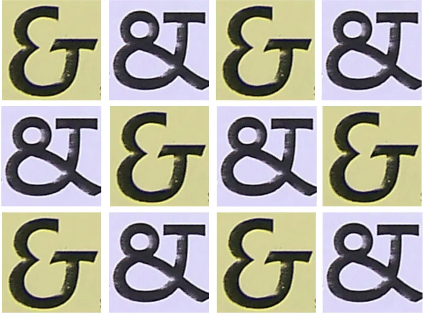
"I fell in love with Albertus while researching the history of Faber & Faber book covers at university,” says Andy Henderson, designer and typographer. “It has a strong, clear structure influenced by metal engraved type but is offset by small quirks like the stemmed ‘U’ and the slanted descender on the ‘g’. The ampersand might be my all-time favourite.”

It has a timeless quality, which is what appeals to Abigail Baldwin, director at design agency Buttercrumble. “It captures a unique blend of classic and modern design,” she says. “Inspired by engraved lettering, its sharp, angular forms lend a bold yet refined character. Albertus became iconic within British design, from book covers to City of London street signs. It symbolises strength and elegance.”
05. Euclid

Designed by Alvin Lustig in 1939, Euclid was originally a set of letters designed from geometric pieces of metal type, and was not released as a typeface at the time. It was expanded as ‘HWT Lustig Elements’ during 2015-2016, based on twelve uppercase letterforms from the original archived design.
“I only discovered Euclid after reading about Craig Welsh and Elaine Lustig Cohen’s project to revive the typeface in 2016,” says Andy. “They developed the full set of glyphs from the 12 existing letterforms designed by Alvin Lustig in the 1930s. Renamed to Lustig Elements, a digital version has been released through P22 and it was cut as wood type by Hamilton for use in letterpress printing.”
06. Stencil

Two typefaces called Stencil were designed and released within a month of one another in 1937. One was designed by Gerry Powell for American Type Founders, the other by R. Hunter Middleton for Ludlow Typograph Company, both all caps with the appearance of the stencilled alphabets. In an era known for many European type creations, Stencil is a decidedly American typeface, with strong associations to the military and industry.
“This is a typeface that can’t escape its vernacular usage. It screams ‘military’, as seen in the titles for classic TV shows M*A*S*H and The A-Team,” says Josh Berta, associate partner and executive creative director at VSA Partners, who points out that it was also co-opted by American rap group Public Enemy. “It simultaneously works well for conveying a raw, blue-collar aesthetic, with associations of labels on wooden crates and makeshift signs at construction sites, which is why Home Depot has used it for decades for its logo. While it’s not open to much varied interpretation, it has proven timeless at conveying what it does – without substitute.”
07. Perpetua

Perpetua is a standout for the decade for Carol Wahler, executive director of The Type Directors Club, an organisation cataloguing and showcasing typography globally. Designed by Eric Gill for the Monotype between 1928 and 1932, and commissioned by Stanley Morison, advisor to Monotype and historian of printing, as part of his aim to build a type library for the company.
“I was not aware that Gill had designed this lovely serif font. I have always been a fan of serif fonts. Perpetua was designed during the end of the 1920s and beginning of the 1930s. The 1930s was a decade in which many believe Modern Design started and has continued today. Gill had designed Gill Sans that same decade. The two are definitely opposites.”
08. Rockwell

Rockwell is a classic slab serif that has been consistently used in headlines and advertisements since its release in 1934, due to its highly legible, distinctive design. It was originally modelled on the 1910 font Litho Antique, revived by Morris Fuller Benton in the 1920s, and redesigned and published as a new project led by Monotype's Frank Hinman Pierpon in 1934.
“Rockwell has some quirky design choices, such as a two-story ‘a’ and a bit more thick to thin in its stroke weights than, say, Memphis, from the same period. That’s probably what makes it so timeless,” Josh says. “I mean, it works just as well for Arby’s ‘We have the meats’ tagline as it does on the poster for 2024’s critically acclaimed film Challengers. What else can you say about a font that has equal success for such seemingly different uses as those, except that it’s a classic?”
For more on typography, see our best typography of the '40s piece.

