Camden Town WFC’s new kit is actually designed for women
The design was made using Adobe’s Creative Cloud.

Sign up to Creative Bloq's daily newsletter, which brings you the latest news and inspiration from the worlds of art, design and technology.
You are now subscribed
Your newsletter sign-up was successful
Want to add more newsletters?
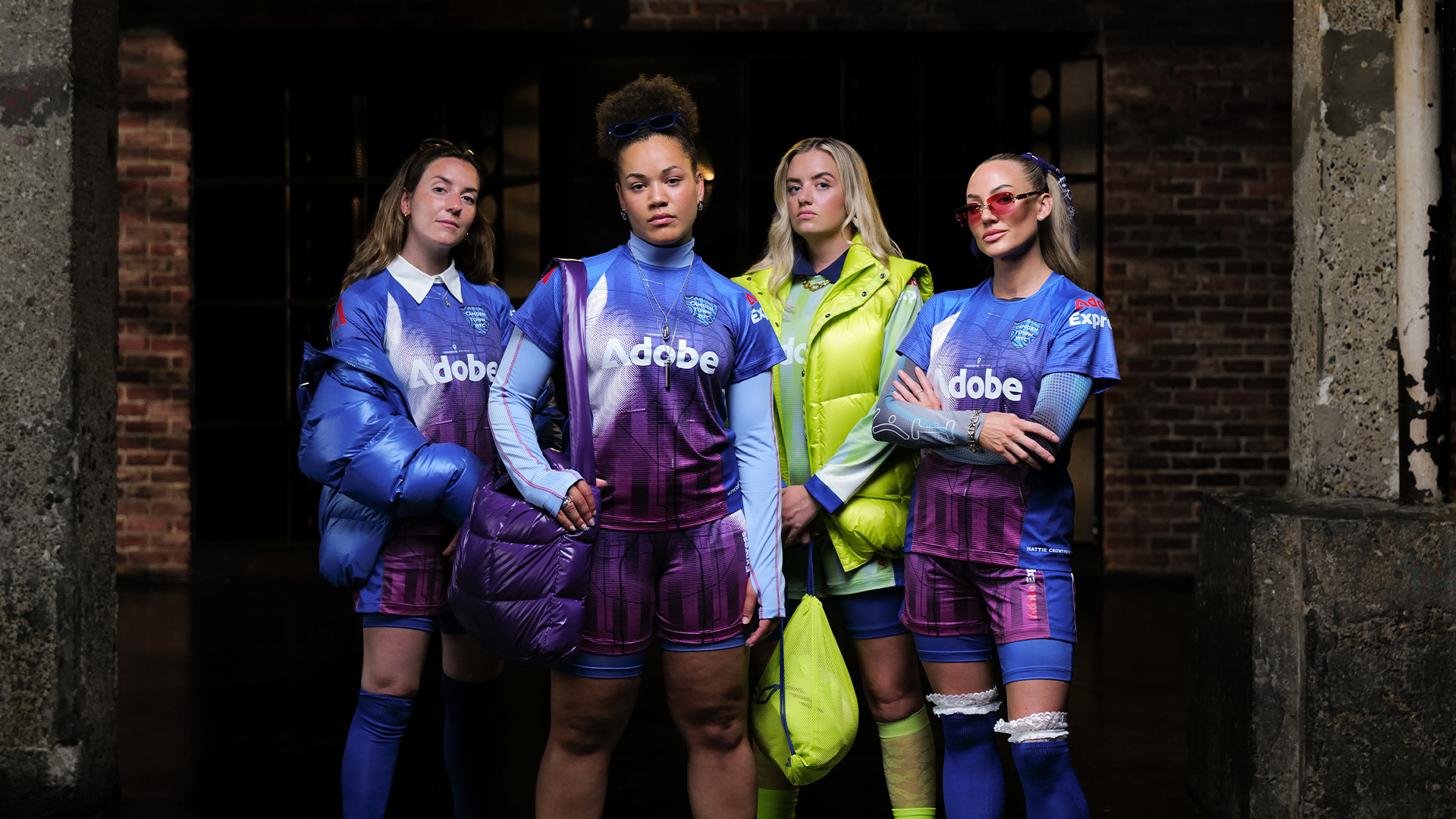
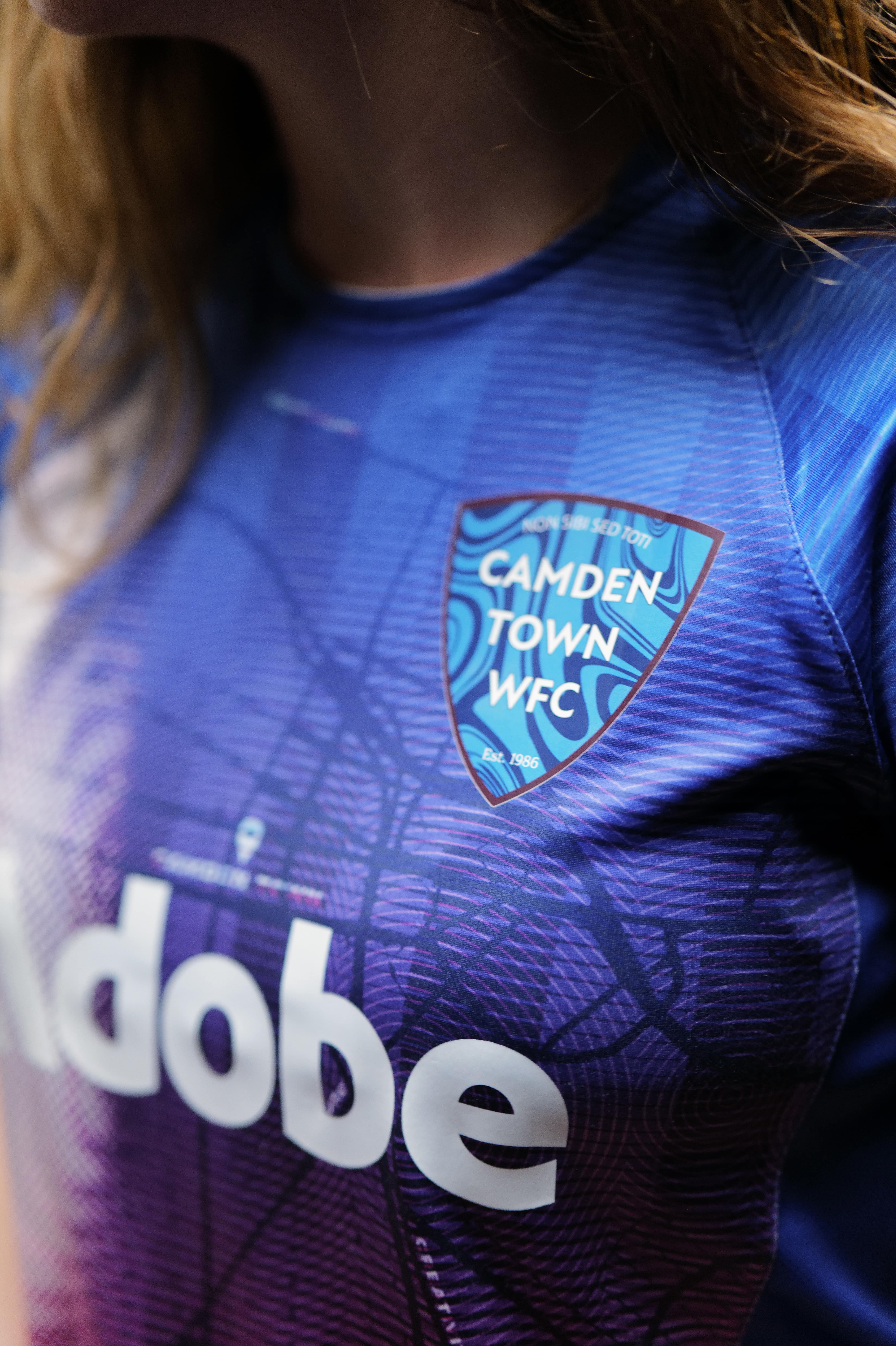
Adobe has partnered with Camden Town Women's Football Club (WFC) to create a redesigned kit for the upcoming sporting season. The new look comes with a reimagined crest design crafted using Adobe's Creative Cloud, blending contemporary style with the team's rich heritage.
Designed with players' needs in mind, the innovative kit goes beyond plain aesthetics to create a design that's innovative, accessible, and functional for female players. Interweaving Camden's culture with the team's core spirit of togetherness, the kit design is a unique visual identity symbolising pride and progression.

Collaborating with UK designer Hattie Crowther, Camden Town WFC's new kit is a homage to the team's roots. The reimagined crest features Camden's coat of arms and the motto “Non sibi sed toti” (“Not for self but for all”), signifying a deep community spirit. The abstract liquified blue pattern gives the design a contemporary edge, expertly blending heritage with a fresh modern aesthetic.
Article continues belowIntegrated into the design are keywords like "Sisterhood, Belonging, Home, Unity, Culture, Creativity, and Progress" – a reflection of the team's core values. Visuals aside, the considered design of the kit features "ventilation panels and ample space under the shirt for players to wear sports bras," creating a bespoke fit that has previously been overlooked in conventional off-the-shelf kit designs.

“The Camden Town WFC kit for the FA Cup fixture embodies sisterhood and unity through its ergonomic design and functionality, specifically tailored for female players. Reflecting valuable feedback from both players and the club, this kit enhances performance and comfort which amateur women's kits often lack. Featuring energetic prints crafted with Adobe Stock and Adobe Express, it celebrates the club's culture and creativity while addressing the unique needs of female athletes,” says creative director, Hattie Crowther in a press release.
Across the board, it seems football kits are increasingly getting more creative and considered design, like the new Liverpool FC kit which features a bold reimagining of the Nike logo. It's not just Camden Town WFC that's had a recent revamp, Chelsea FC's fiery new identity is a feast for the eyes, blazing with passion and electrifying imagery.
Sign up to Creative Bloq's daily newsletter, which brings you the latest news and inspiration from the worlds of art, design and technology.

Natalie Fear is Creative Bloq's staff writer. With an eye for trending topics and a passion for internet culture, she brings you the latest in art and design news. Natalie also runs Creative Bloq’s 5 Questions series, spotlighting diverse talent across the creative industries. Outside of work, she loves all things literature and music (although she’s partial to a spot of TikTok brain rot).
