Jump from graphic to web design in seven easy steps
Graphic designers who want to transition from print to web need to stop being scared of the 'tech boogie man' and make the leap. Jose Caballer presents seven steps to help you get off the fence and start making more money
If you recently graduated from an expensive design school, or are an aspiring self-taught designer who wants to dive head first into the exciting world of web design but are too afraid of the jargon, tech people and CSS, stop!
To be relevant in the 21st-century, you have to be multidisciplinary. More importantly, the demand for web designers is high even in the crappy economy we are in.
I recently shared my seven steps to becoming a user experience focused graphic designer with 500 graphic designers at the HOW Interactive Design Conference. The audience consisted of a wide range of designers – some who were print only and others who did print and web. They all shared the same resounding experience – they’ve all faced challenges with web projects, whether it be code conundrums, difficult interactions with programmers, or setting and managing client expectations.
Does any of this sound familiar?
What is the secret to becoming a successful user experience-focused designer? Here are the seven steps:
1. Stop saying that it's about tech
Stop saying to yourself and to others that it’s about tech or that you don’t know how to build a site. How many times have I heard from students and from professionals: “Oh I
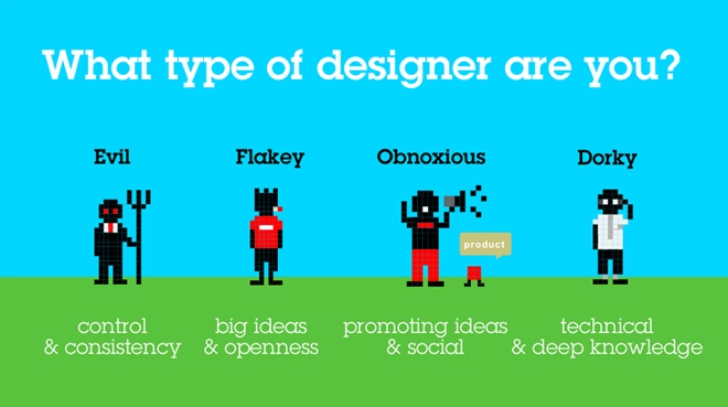
don’t wanna go into web,” “I don’t want to code.” It makes me both angry and sad to see young designers and clients alike paralysed by the fear of “technology”. Web designers come in all flavours. There’s the 'Flaky/Dorky' designer, who’s a both visually and technically oriented hybrid that can design and code equally well. You also have the 'Evil/Dorky' designer who is better at doing wireframes and flowcharts than designing sexy buttons. Or you can be like me and be an 'Obnoxious/Flaky' designer who’s better at selling ideas. Identifying what your strengths are will also help strengthen your web projects.
If you want to find out what type of designer your are (or developer or strategist) take the Beta version of my FEDO (Flaky, Evil, Dorky, Obnoxious) assessment.

2. Collaborate – it's about groups
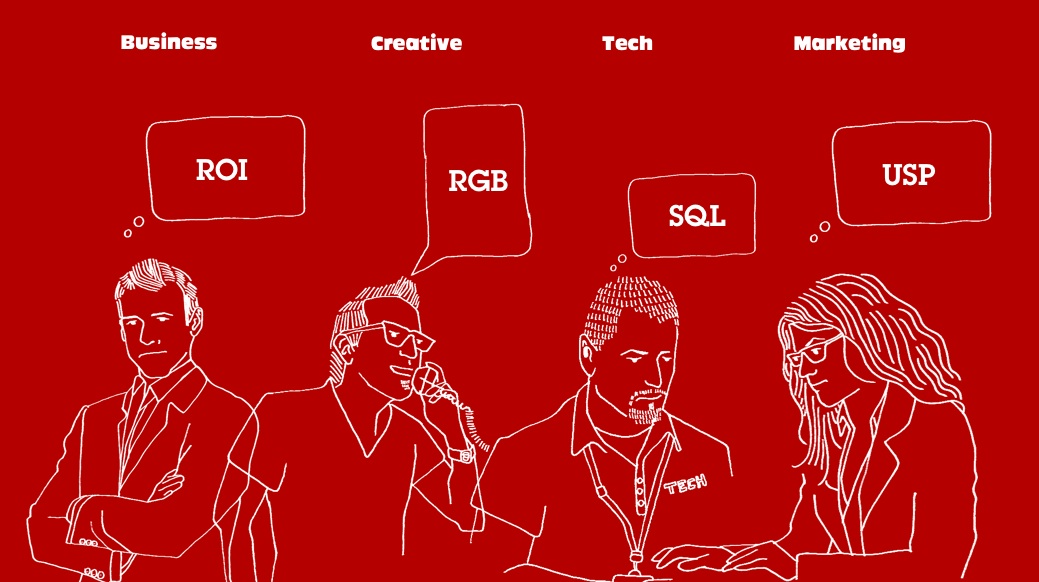
In a Fast Company article of November 2010, a creative director from a large New York ad agency at a training workshop hosted by Hyper Island was quoted saying: “This whole ‘collaboration, we’ll work together as a team’ ... I find it f***ing difficult.” This is because interactive design requires business, creative, tech and marketing people to work together. With each of these having different interests in a project.
The (Evil) business stakeholder only cares about ROI, the (Flaky) creative team member is only interested in aesthetics and their peers thinking they are cool, the (Dorky) developer is concerned about it working and the (Obnoxious) marketing stakeholder – who is usually left out of the picture for a while – only cares if they can communicate the 'value prop' across all of their 'channels' – traditional, digital, PR, social media and so on.
They might as well all speak different languages. There is only one way that I have personally been able to manage this veritable Tower of Babel and that is Step 3.

3. Listen – it's not about you
It’s not about what the business stakeholder thinks is the latest and greatest trend. It’s not about what the creative stakeholder thinks will look good in their portfolio. It’s not about the latest and greatest that the tech stakeholder wants to try out. It’s not about the marketing stakeholder making as much noise across all of the possible channels. The one common language that I have been able to use to facilitate the collaboration between all of these different stakeholders is – drum role please – the users. It’s about what goals the target users have and what they need from you to meet those goals ... It’s about finding out who they are, by using data, trend research and common sense. It’s about doing user testing and actually listening to REAL USERS!
It’s about working together to prioritise what features and functionality the users’ needs dictate.
You are designing a multidimensional experience that exists in time and space, with people’s stories intertwined into every single decision that you make – all the way down to the pixel level.
Ok Jose, so how do I do this?
4. Don't do 'it': design 'why'
Our job is not to design 'it'. It is to learn and surface the story of 'why' and remove all the barriers between 'why' and the user saying “thank you that meets my needs ...”
It’s not about I think 'it' should be like this – or 'it' should be like that. It’s about 'it' meets the story of 'why'.
If you lost me there, let me share with you how we keep all of this straight.
Sign up to Creative Bloq's daily newsletter, which brings you the latest news and inspiration from the worlds of art, design and technology.
To manage the 'story of why' we use what we call 'The Triangle of Pixel Love'.
Three things define your website – or interactive experience – be it in mobile or otherwise: who you are, who your users are and what your business goals are.
First we define who you are. Who are you? (The client). You likely know it already – we are just confirming it together. In order to do this we use several different exercises but one of the most effective is an exercise that helps define the 'brand statement' for a company. Since we usually get hired to design and build a website we call it a 'website statement'. We want to make sure that we are clear that we are not going to redo your brand statement or mission statement.
Second we define your users. Who are they, what are their stories? What are their goals? What are their needs? We prioritise the top three goals and the top three needs.
Third we work together with the entire team to idenfity and prioritise the organisation's business goals. We do this by brainstorming in three categories:
- Awareness – marketing strategies and tactics.
- Revenue – product/sales strategies and tactics.
- Efficiency – strategies and tactics to save time, reduce waste and increase productivity.
We prioritise these by short, medium or long term. In addition we score these on a scale of one to 10 on how much the team desires them and how likely the team is to obtain these goals.
Finally we do what we call 'The Love Quilt', where we match the top three user needs with the top three business goals in each categories. Based on these we determine the key features and functionalities of our digital product. For example, an online camera retailer could say “increase ecommerce sales” as a business goal and a user can say “easy way to find the right camera that fits me and my needs” as a goal. Where these two meet the team could say “easy to use needs configurator with recommmendations” as a feature to pursue.
We do these excersises in a “workshop” style session with three rules:
- Participate
- You can say anything (do not censor)
- Have fun!
These workshops can last one to three days. Usually we do these in two half-day sessions because of stakeholder availablity.
You can watch how to create a user profile with a real client in the Live Website Redesign on my podcast, The Week in Web Design.
5. Be George Lucas: Tell stories
When I ask a (Dorky) left brainer to describe what a website does, I get the 'kraftwerk' robot description listing the features and functionality like a part’s catalouge for a chemistry set. Not easy to understand because it lacks the users (characters) or why they should care (motiviation).
What if I told you that you are not designing or building websites! You are creating compelling stories. You are no different than Lucas or Spielberg [Insert your favourite director]. The difference is that instead of a camera, digital effects and props you are using CSS, SQL and Photoshop.
Ask yourself how to simplify the website and make it seam natural ... bring the stories to life with real people in real settings.
To help make this 'real' to our clients and for ourselves we create what we internally call 'stepping into the future', or living user stories. We write and shoot the user profiles as if we were interviewing the users a year or so after the launch of the website or product that we designed. It works.
Here is a sample for Myspace:
These stories were done early in the design process to validate the user stories and to sell the management team on the direction.
Here is an example for Regal Cinema:
The video was created in one day using an iPhone 4 as the primary camera.
6. Face your fear: "Luke, I am your father"
The only thing standing in your way is you. Your fears – fear of failing, fear of not knowing something, fear of inadequency, fear of not being smart enough.
To overcome you you must know you.
For example, I know that I can’t design a full system – 20 PSDs. The force of my ADD is too powerful. I also can’t code. I couldn’t pay enough attention. I also know that I am good with people and I'm great at selling ideas. Knowing what I do well allows me to leverage my strengths and make what I do fun.
If you don’t already know what you are good at, what you like to do or better yet what you are predisposed to, take a moment to take the FEDO assesment if you haven’t already. Once you know know yourself better, identify what type of role you would like to have on a project or what type of projects to do if you are a freelancer.
If your perception of 'web design' or 'user experience' is one of large amounts of complexity and people that are going to think you are stupid if you don’t know the difference between a LAMP stack and floor lamp, you are in for a huge disappointment.
Web design is about learning to effectively collaborate with the mutliple disciplines. Wether you work on your own or with a team, mastering the language of user experience will make the difference between fear, pain and suffering and innovative, impactful application design. Who knows you might even have an impact and create change.
7. Be (at) the 1 per cent: don't work for change, be change
Like everyone else in America I have been watching the 99 per cent movement and though I have a huge ammount of empathy and support for what they stand for, it makes me sad that so many big picture thinkers, designers and storytellers don’t have the ability to just get together with MBA’s and hardcore nerds (programmers) to create the next AirBnB, the next Etsy, the next KickStarter or the next Threadless.
Graphic designers have spent the better part of the last half century subservent to the industry making their posters, brochures and websites to hawk mediocre products.
Be or beat the 1 per cent whichever way you want to couch it.
“Don’t work for just change – mear pennies” “Be Change”. You now have the tools to be as powerful as the 1 per cent if we know how to use them. The exciting news is that the tools are not about technology, the tools are about language, empathy and pixel love.
Conclusion
I am a graphic designer. I focus on user experience. Fifteen years ago when I graduated from Art Center College of Design I did a (very funny) commencment speech where I made the argument that we should all focus on 'digital' vs 'analog' design. When I joined Razorfish in late 1996 I got a feeling that something was happening there. I knew that it wasn’t a 'design studio' in the traditional sense but I stuck with it.
Today: Am I a graphic designer? An artist? Am I a business strategist? Am I an information architect? Am I an ethnographer?
I am a web designer, I am all of those things but with a deep focus on graphic design. I am what Tim Brown calls a T Shaped Creative. Someone who has deep skill in one area (like graphic design) but broad understanding of many other areas (business and technology).
The term is attributed to David Guest who coined the term 'T shaped people' in 1991 in an article titled 'The hunt is on for the Renaissance Man of computing' published in The Independent.
The best web designers, developers, strategist, information architects that I have worked with have all been 'T Shape' thinkers.
My graduating speech hit it on the nail. The only difference was that I was open enough to take the journey, to fulfil my destiny to become a Jedi web design guy.
You can’t ignore the huge demand for user experience focused designers. And developers, stategists marketers for matter. It can be the difference between making $35 an hour doing design production and making $125 an hour doing user experience-focused design.
So stop saying it’s about technology. Start learning the language, start designing for your users, start helping them accomplish their goals, start creating compelling stories. Get over yourself and go start or join an awesome tech start up and help change the world. Dammit. Do it.

The Creative Bloq team is made up of a group of art and design enthusiasts, and has changed and evolved since Creative Bloq began back in 2012. The current website team consists of eight full-time members of staff: Editor Georgia Coggan, Deputy Editor Rosie Hilder, Ecommerce Editor Beren Neale, Senior News Editor Daniel Piper, Editor, Digital Art and 3D Ian Dean, Tech Reviews Editor Erlingur Einarsson, Ecommerce Writer Beth Nicholls and Staff Writer Natalie Fear, as well as a roster of freelancers from around the world. The ImagineFX magazine team also pitch in, ensuring that content from leading digital art publication ImagineFX is represented on Creative Bloq.
