Audi scraps its logo in bold new EV brand
A new wordmark replaces the famous four rings.

Sign up to Creative Bloq's daily newsletter, which brings you the latest news and inspiration from the worlds of art, design and technology.
You are now subscribed
Your newsletter sign-up was successful
Want to add more newsletters?
When it comes to iconic logos, few are more famous than those four interlocking rings. And before you accuse me of miscounting the number of shapes in the Olympic logo, I'm talking about Audi. So it's somewhat surprising that the brand is ditching the rings for a new EV brand.
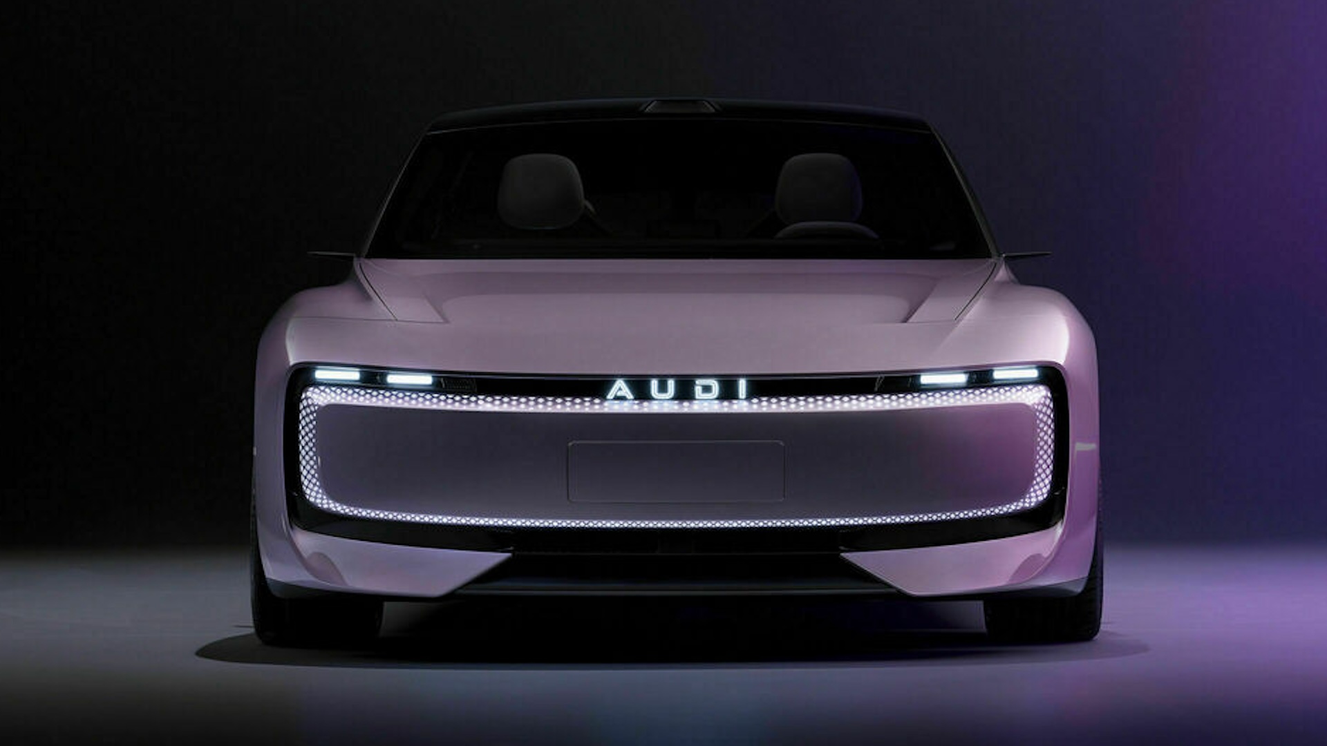
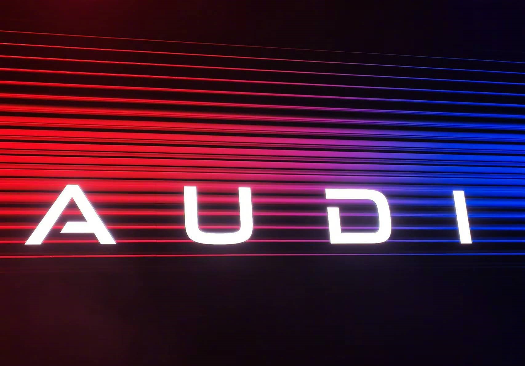
After months of rumous, Audi has unveiled a new EV range in China, sporting, instead of the rings (arguably one of the best logos), a simply 'AUDI' wordmark. The first concept car to sport the new branding is the 'AUDI E concept', a "fully electric Sportback" whose design is "both minimalist and calm".

"Audi is setting up for the future in China," the company announced today. "To this end, the company is launching its first new brand alongside the Audi E concept: AUDI – without the four rings logo but spelled in four capital letters."
Article continues belowThe new brand for the collaboration project between #Audi and SAIC Group has been officially launched. The new brand will officially use the "AUDI" letter logo, and the first mass-produced model will be a B-class shooting brake, scheduled to officially go into production in… pic.twitter.com/yAjUrvpgHCNovember 7, 2024
Audi says the new branding "signals both the connection to and differentiation from the sister brand. Based in and tailored for China, brand and car represent the best of both worlds – unmistakable Audi DNA meets China innovations... breaking new ground to tap into new and more tech-savvy customer segments.”

Audi CEO Gernot Döllner says the branding change is designed to meet the different expectations of Chinese customers. "Chinese premium customers are different from their international counterparts and have different expectations: they are younger than in the rest of the world. They are more tech-savvy. They expect leading connectivity as well as automated driving."
While it makes sense that Audi is leaning into its EV partnership with SAIC in order to specifically target the Chinese market, it's strange that it would deliberately omit such an iconic logo. Indeed, even the slightest tweaks to the tried-and-tested design have caused controversy in recent years, from the brand's misjudged 'socially distanced' logo to the flattening of the rings, have proven, fans are particularly previous about the Audi logo. Surely getting rid of it, even for a specific range, is going to cause even more furore? As one Redditor put it when the change was initially rumoured earlier this year, "Not sure man, I feel like the brand is a big thing for companies like Audi - even in China."
Still, at least the wordmark is legible – clearly Audi decided not to take design cues from Kia.
Sign up to Creative Bloq's daily newsletter, which brings you the latest news and inspiration from the worlds of art, design and technology.

Daniel John is Design Editor at Creative Bloq. He reports on the worlds of design, branding and lifestyle tech, and has covered several industry events including Milan Design Week, OFFF Barcelona and Adobe Max in Los Angeles. He has interviewed leaders and designers at brands including Apple, Microsoft and Adobe. Daniel's debut book of short stories and poems was published in 2018, and his comedy newsletter is a Substack Bestseller.
