This fintech brand's slick logo is a soaring success
Rocket launches into a dynamic new era.

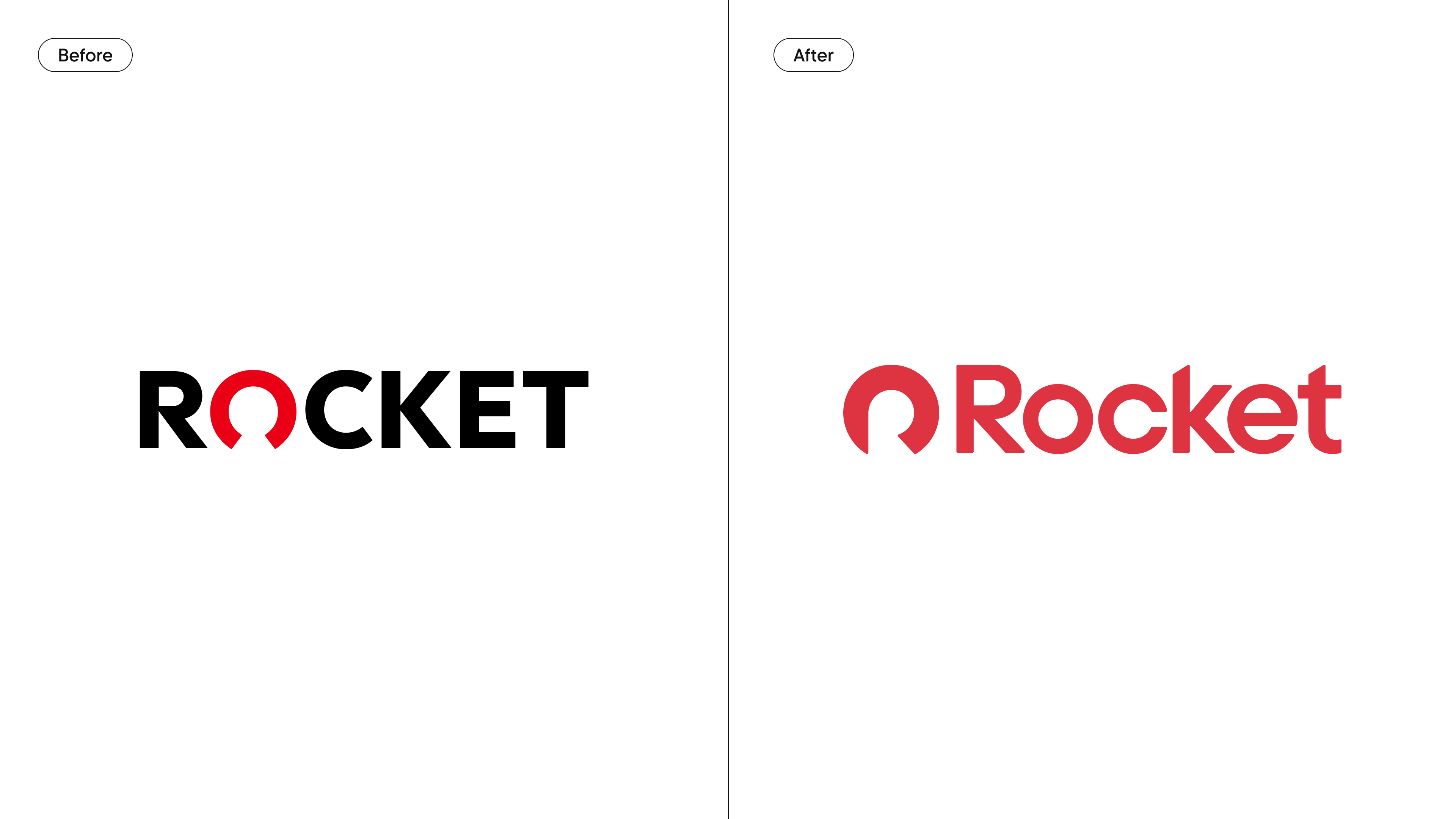
Detroit-based fintech company Rocket has unveiled a slick new logo that unites the Rocket Companies brand under one streamlined new identity. The bold refresh emanates power and authority with its striking red colour palette and contemporary typography, launching the brand into a sharp new era.
The best rebrands are all about building up a brand from its existing identity, and Rocket's new look is no different. Reinforcing its timeless appeal, the new visual identity is strengthened by the brand's refreshed logo – a sleek blend of clean design and considered contemporary flair.

Created in collaboration with design studio Otherway , the new visual identity aims to capture Rocket's mission to create an inclusive and influential end-to-end homeownership brand. Central to the design is the new "halo" logo mark which takes inspiration from the curvature of Rocket's old visual identity, with the circular form evoking a sense of trust. Taking the form of a "protective arc" the design represents "the journey to homeownership and the building of prosperity and generational wealth."
Article continues belowMoving from block capitals to title case, the wordmark has a less corporate feel, aiding in the brand's shift to a more accessible look. The brand's signature "Rocket Red" takes centre stage, altered to a softer tone that evokes a sense of friendliness in comparison to the fiery shade of the old logo. Adding a heartfelt personal touch, two new bespoke typefaces have been introduced, paying homage to Nick Gilbert, the late son of Rocket's founder Dan Gilbert.
“Rocket’s new design elements embody our spirit and commitment to making homeownership accessible to all,” says Jonathan Mildenhall, chief marketing officer of Rocket Companies. “This refreshed identity celebrates the humanity and diversity of the homeownership journey, redefining what it truly means to own a home in today’s America,” he adds.

For more branding news check out the fantastic strapline of this fun new visual identity for Texas Tack. If you're after more design inspiration take a look at the best logos of all time.
Sign up to Creative Bloq's daily newsletter, which brings you the latest news and inspiration from the worlds of art, design and technology.

Natalie Fear is Creative Bloq's staff writer. With an eye for trending topics and a passion for internet culture, she brings you the latest in art and design news. Natalie also runs Creative Bloq’s 5 Questions series, spotlighting diverse talent across the creative industries. Outside of work, she loves all things literature and music (although she’s partial to a spot of TikTok brain rot).
