Visualising quantitative data
Matthew Scharpnick of Elefint Designs explains how his agency created the infographics for .net magazine's Web Design and Development Survey 2012
Sign up to Creative Bloq's daily newsletter, which brings you the latest news and inspiration from the worlds of art, design and technology.
You are now subscribed
Your newsletter sign-up was successful
Want to add more newsletters?
One of my favourite things about infographics and data visualisations is that they simultaneously make a subject more interesting and increase your understanding of the material. In our last tutorial, How to Create Great Infographics, we worked primarily with qualitative data, describing the purpose and process of a nonprofit organisation. This time around we looked at purely quantitative data, digging into insights in the survey .net magazine conducted of its audience of developers. While many of the processes are similar for qualitative and quantitative infographics, there are a few key differences that we can see in this recap of how we created these infographics.
Creating content
The most obvious difference in a quantitative piece is the need to construct the content by finding key insights in the data. While selecting the data in a qualitative piece tends to be the summarisation and organisation of existing content, a quantitative piece requires you to dig through sometimes exhaustive amounts of data, often collected in spreadsheets, to discover the story.
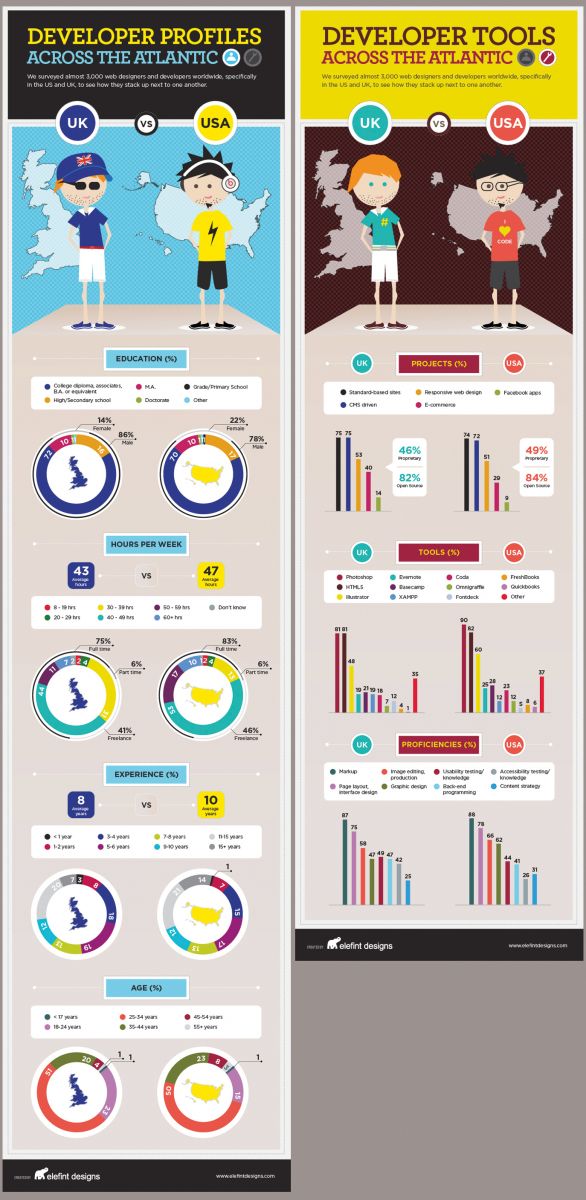
For these pieces, the idea was to contrast English and American developers. As with many pieces, you are looking for interesting and surprising bits of data that will catch a reader’s attention and give them new insights. Since much of the data was pretty similar for both countries, we looked for interesting areas of difference. In a large data set you may find too many contrasts or too few, so the key is to create the right mixture, giving the reader a story to uncover.
This data showed us that more than half of the developers in both countries are between the ages of 25 and 34, but when we look at the other half, the US population is older than the UK’s. We see that UK developers work more in ecommerce and that US developers are more likely to use Illustrator. While there are some differences, in the end the data has to tell us the story, and the major story here is that the similarities between countries are less significant than those within each country. We feel strongly that data driven visualisations should adhere to journalistic standards of accuracy so it’s important to look for interesting insights in the data, but also to present the data accurately regardless of the desirability of its conclusions.

Consider the reader
Think about the last data visualisation you saw online. Did it have a key on one side that meant you had to scoll up and down or left and right to understand what you were looking at? Was there a title way up at the top that you needed to keep reading to remember what the data set was all about? When you design a visualisation, taking a few moments to consider the audience and the context that will surround the piece goes a long way. It’s surprising how many talented designers don’t design with these considerations in mind.
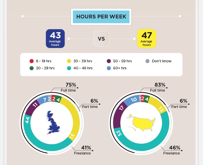
We knew these pieces would be posted primarily online and would contain a series of comparable and somewhat simple data sets. We knew that the primary purpose was to compare the two countries based on a given variable, and then to move on to the next one. Therefore we created a series of paired charts in a long vertical format that makes it easy to compare and continue on. We created separate keys directly above the data, labeled numbers in the charts, and limited the size of each section so that even on a small screen like my 13 inch MacBook Air, you can see the totality of a section without having to scroll.

Conclusion
Infographics are often a mix of both quantitative and qualitative data. Combining these different forms of data, pulling out key insights from large data sets, and making the piece accurate, visually appealing, and informative, can be a huge task. However, when done well, these pieces attract attention and invite learning in a way that few other mediums can achieve. Our advice is to dig through as much relevant information as you can, whether qualitative or quantitative, and figure out what new element you can add to a story. If you can seamlessly weave previously unconnected bits of data together, you will have made something worth sharing.
Sign up to Creative Bloq's daily newsletter, which brings you the latest news and inspiration from the worlds of art, design and technology.

The Creative Bloq team is made up of a group of art and design enthusiasts, and has changed and evolved since Creative Bloq began back in 2012. The current website team consists of eight full-time members of staff: Editor Georgia Coggan, Deputy Editor Rosie Hilder, Ecommerce Editor Beren Neale, Senior News Editor Daniel Piper, Editor, Digital Art and 3D Ian Dean, Tech Reviews Editor Erlingur Einarsson, Ecommerce Writer Beth Nicholls and Staff Writer Natalie Fear, as well as a roster of freelancers from around the world. The ImagineFX magazine team also pitch in, ensuring that content from leading digital art publication ImagineFX is represented on Creative Bloq.
