5 steps to making the most of the colour wheel
Spanish illustrator Paco Rico Torres offers a beginner's guide to one of the oldest art tools.
A colour wheel is a diagram in which you can organise colours following a logical disposition. There are many ways of displaying colours on a colour wheel, but the most common is to place the primary colours on the wheel.
These are cyan, magenta and yellow, which can't be created by mixing other colours, but can be used to create any colours by mixing them. Then between them put the secondary colours (the colours obtained by mixing equal parts of two primary colours: purple/blue, green and red).
Finally, on each side of a secondary colour put a tertiary colour, which is produced by mixing a secondary colour and the adjacent primary colour.
The resulting colour wheel enables you to easily determine what colours are complementary by looking at the opposite side of the wheel: orange/blue, red/green, yellow/purple and so on.
Why is this interesting? Well, unlike luminosity, colour is subjective. There's not a right or wrong way to use colour, but a common technique for successfully using colour on an image is to combine complementary colours.
This works fine most of the time if used properly – in other words, with subtlety and some logic!
01. Opposites attract
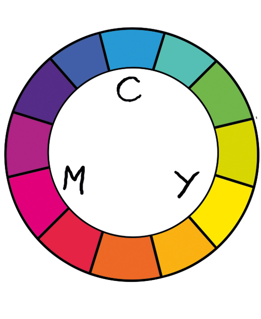
In this colour wheel the complementary colours are on the opposite sides of the wheel.
Sign up to Creative Bloq's daily newsletter, which brings you the latest news and inspiration from the worlds of art, design and technology.
You can create grey colours by mixing complementary colours, so using the colour wheel as a guide doesn't mean applying bright, shiny colours. Chromatic grey created by mixing colours usually looks better than grey made up of pure black and white.
02. Complementary palette

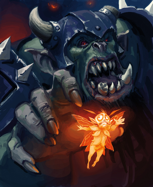
For this example, I want to paint an orc chasing a faerie. As I imagine the scene, there will be a dark background and a bright foreground, so instead of using a similar colour palette for all the image, I choose to use a complementary palette.
It'll look more appealing and I can separate the foreground from the background to make the image easier to read.
03. Follow the hues
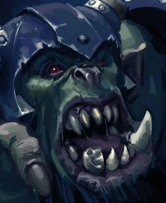
Even if I choose to use green and blue colours for the background, this doesn't mean that I have to use exclusively green and blue. The richer your colours are, the better.
As long as I keep the general hues between bluish and greenish, I can (and I should) add slightly different colours, such as red or brown, to improve the orc's design and to depict him more clearly.
04. Colours can be deep
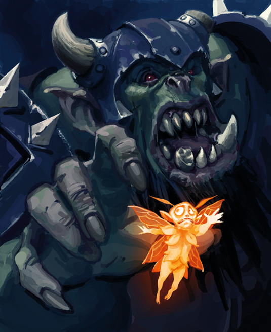
By combining two complementary colours, I manage to separate one figure from the other, which creates more depth in the image, and also a more appealing final composition.
But I need to remember that the colours are affected by other colours on the scene, so I must reflect that. If I don't put a bit of orange on the parts next to the faerie, it won't work.
05. Too much saturation?
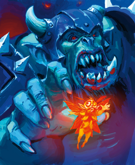
If you mix highly saturated complementary colours, the result will be uncomfortable for the eyes and will spoil the whole image.
Saturation is like salt: it can make a meal better, or ruin it if you add too much.
Words: Paco Rico Torres
Paco Rico Torres is a freelance illustrator living in Spain who's produced art for several card games, magazines, books and role-playing games. This article originally appeared in ImagineFX issue 100.
Like this? Read these...
- The B-movie art that's so bad it's good
- How to become an artist without a traditional art school
- 3 top tips for illustrating personality

The Creative Bloq team is made up of a group of art and design enthusiasts, and has changed and evolved since Creative Bloq began back in 2012. The current website team consists of eight full-time members of staff: Editor Georgia Coggan, Deputy Editor Rosie Hilder, Ecommerce Editor Beren Neale, Senior News Editor Daniel Piper, Editor, Digital Art and 3D Ian Dean, Tech Reviews Editor Erlingur Einarsson, Ecommerce Writer Beth Nicholls and Staff Writer Natalie Fear, as well as a roster of freelancers from around the world. The ImagineFX magazine team also pitch in, ensuring that content from leading digital art publication ImagineFX is represented on Creative Bloq.
