The B-movie art that's so bad it's good
On the cheap and off the cuff: how low-budget horrors inspired a generation of artists.
Sign up to Creative Bloq's daily newsletter, which brings you the latest news and inspiration from the worlds of art, design and technology.
You are now subscribed
Your newsletter sign-up was successful
Want to add more newsletters?

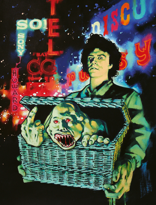
When country boy Duane Bradley arrives in New York City and checks into a down-at-heel hotel, its resident boozers, hookers and wrongdoers all ask the same question: what's in the basket?
Duane is unusually protective of his large wicker basket; he talks to it, feeds it with food. It contains, it transpires, his small, severely disfigured, brother Belial. The pair, Siamese twins separated against their will, are now bent on revenge against the doctors who carried out the procedure.
The plan goes awry when the brothers find themselves locked in a love triangle with the doctors' comely receptionist. The film is 1982's Basket Case. Its plot is, at best, shaky – like the acting.
It's cheap and crude, fast and furious. And very, very bloody. It contains all the key elements of the quintessential 80s B-movie. It's notable for another reason: its artwork.
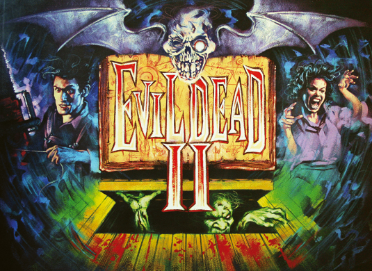
"The poster has no shame, coyness or embarrassment," says Graham Humphreys. "It recognises no boundaries in taste, palette or subject. It's free of taboo, censorship and dignity. And it demands to be seen."

B-movie ethos
Graham – whom one critic has described as "the last great name among Britain's film poster artists" – worked on UK campaigns for Basket Case, The Evil Dead, A Nightmare On Elm Street and Frankenhooker.
The short deadlines and shorter budgets proved invaluable training for a fledgling artist. Graham says there's much to be learned from B-movies' DIY ethos.
Sign up to Creative Bloq's daily newsletter, which brings you the latest news and inspiration from the worlds of art, design and technology.
If something needs to be big, make it massive. If it's violent, hose it in blood. If it's sexual, add necrophilia
"B-movie posters offer no time to wallow in technique. I've learned to work fast. When I begin I imagine what would interest me personally: from basic imagery and outside referencing – subliminal or otherwise – to colour palette and composition.
"I learned to work without restriction. B-movies and B-movie art were the voice of revolution and dissent, sticking a finger up at authority, convention, politics and religion.
"Go with your impulses and refuse to conform. Look at the colours, see how playful the images are – exaggerate. If something needs to be big, make it massive. If it's a violent, hose it in blood. If it's sexual, add necrophilia."

Off the cuff and on the cheap
B-movies were born out of the Great Depression. When attendances dropped and theatres began to fold, proprietors had to be creative. The most successful marketing technique proved to be the double header.
Traditionally created off the cuff and on the cheap, B-movies sat at the bottom of the bill in a double or even triple header of feature films. They were warm-up act for their big-budget counterparts.
Many found their perfect setting when the popularity of drive-in theatres peaked in the 50s, 60s and 70s, and later enjoyed a resurgence on VHS. Horror, sci-fi, suspense, exploitation: these are the staple B-movie genres. Plots were often formulaic, the dialogue as hammy as its delivery. But they had a unique look and feel, a certain charm.
Directors Robert Rodriguez and Quentin Tarantino are vocal champions of the B-movie. Graham now works closely with Creative Partnership, the central London-based film and production company that worked on the Rodriguez and Tarantino collaboration From Dusk till Dawn – which wears its B-movie influences on its blood-soaked sleeve.
Grindhouse – 2007's double header that featured Planet Terror and Death Proof – is the pair's most obvious tribute to exploitation film.
B-movie plots were often formulaic, the dialogue as hammy as its delivery. But they had a unique look and feel, a certain charm
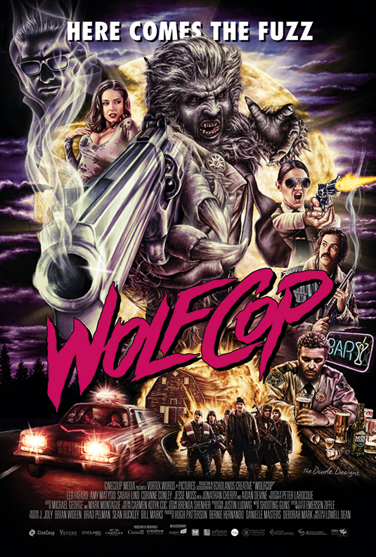
Ahead of the launch of the films, they held a competition to create a fake trailer. Hobo with a Shotgun, directed by Jason Eisener, won and was eventually developed into a full-length feature. Artist Tom Hodge sent Jason a message saying he'd like to contribute artwork and Jason accepted.
"For me," Tom says, "it's all about the 80s VHS video art: moustachioed muscled men, buxom beauties, big explosions, phallic guns and nightmare-inducing monsters.
"It's an unabashed creativity in design. The perfect B-movie art is a descriptive form that tells a story about the film – often better than the film does. It should excite your inner child."
Freelance illustrator Tom, known as The Dude Designs, aims to bring back the "lost magic of film poster and video cover art". While he has a "more is more" approach to art, he stresses the importance of composition.

Tom leads the viewer's eye around his designs so they can absorb – but aren't overwhelmed – by its intricacies. "If the inner child squeals and you're entertained, you're on the right track."
Next page: Jennifer Connelly gives a chimp a piggyback, and Freddie's back. Again...

The Creative Bloq team is made up of a group of art and design enthusiasts, and has changed and evolved since Creative Bloq began back in 2012. The current website team consists of eight full-time members of staff: Editor Georgia Coggan, Deputy Editor Rosie Hilder, Ecommerce Editor Beren Neale, Senior News Editor Daniel Piper, Editor, Digital Art and 3D Ian Dean, Tech Reviews Editor Erlingur Einarsson, Ecommerce Writer Beth Nicholls and Staff Writer Natalie Fear, as well as a roster of freelancers from around the world. The ImagineFX magazine team also pitch in, ensuring that content from leading digital art publication ImagineFX is represented on Creative Bloq.
