8 amazing CSS techniques to use right now
Explore the most exciting CSS that's now in a browser near you.

Recent years have teased us with incredible CSS features such as Flexbox and variable fonts, but the most exciting time to be a web developer is right now as plenty of exciting new features are edging towards almost 100% support in today's web browsers.
We originally published this piece in 2019, as we were looking ahead to new CSS techniques, but now a lot of these CSS properties and specifications are actually live, let's take another look at what's available.
If you want more tools, see our web design tools roundup, and if you need help maintaining your site, a hands-on web hosting service will do wonders for you.
Article continues below01. Gutters for Grid Layout and Flexbox

CSS Grid Layout introduced the grid-column-gap and grid-row-gap properties (in addition to the shorthand grid-gap property) as a way to create gutters between grid items. Since Multi-column Layout already had column-gap (which accomplishes the same thing), these CSS properties have now been restructured as column-gap, row-gap and gap for uniformity, additionally supporting Flexbox in the process.
Gap properties are now supported in the majority of web browsers and are considered a safe alternative to margins when using Grid Layout, Multi-column Layout or Flexbox.
selector {
  display: flex; /* or display: grid; */
  row-gap: 20px; column-gap: 10px; /* or gap: 20px 10px; */
}
02. Logical sizing
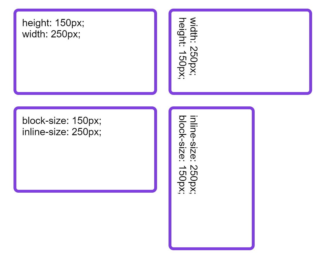
CSS properties and values have traditionally been mapped to the physical properties of a screen. For example, we use width and height and we set margins on the top, right, bottom and left of an element. These physical properties seem strange when working with any writing mode other than horizontal and top to bottom. As a simple example, think about a box with both a width and height.
.box {
    width: 250px;
    height: 150px;
}
This box is 250 pixels wide and 150 pixels tall. Even if we change the writing mode to one that's vertical, the box will remain tied to these physical dimensions.
Sign up to Creative Bloq's daily newsletter, which brings you the latest news and inspiration from the worlds of art, design and technology.
Logical sizing, however, enables us to size elements or refer to their margins, padding and borders in such a way that makes sense even if the writing mode changes. If we return to our previous example, we might want our box to always have a length of 250 pixels in the inline dimension regardless of orientation.
The inline dimension is the way that a sentence runs in that writing mode (so horizontally in English and vertically in any vertical writing mode). We then want it to have a length of 150 pixels in the block dimension, which is the way that blocks such as paragraphs are displayed in that particular writing mode.
To accomplish this, logical sizing is the answer:
.box {
    block-size: 150px;
    inline-size: 250px;
}
There are other logical properties and values relating to margins, paddings and borders - these are generally supported by web browsers and are considered safe to use.
03. Subgrid
Work on the CSS Grid Layout Level 2 specification is still underway, but it's worth learning about it now. Grid Layout Level 2 is all about the subgrid feature. Subgrids will mean that in addition to the direct children of a grid container becoming grid items, we'll be able to create a grid within a grid item and have it use the column and row tracks of the parent grid container. This would mean, for example, that we could create a multiple column grid and use it to line up items nested within the markup.
.grid {
    display: grid;
    grid-template-columns: 1fr 2fr 1fr 2fr;
}

.grid-item {
    display: grid;
    grid-column: 2 / 5;
    grid-template-columns: subgrid;
}
In the above CSS example we have a parent element with display: grid, which defines a four-column grid. The child item with a class of grid-item is placed on the grid from column line 2 to column line 5, spanning three tracks of the parent grid. By using the value subgrid in place of a track listing for grid-template-columns, we tell its grid to use the tracks from the parent. Any child of grid-item will therefore use the sizing of column tracks as defined on the parent grid.
04. Accent colour
As many front-end developers know, styling certain form elements (or styling them in certain ways) can be difficult. Styling the slider or thumb of range inputs is especially difficult, and overall this process could stand to be much more verbose. One of the ways that this is improving is the reasonably well supported addition of accent-color, a CSS property that automatically provides a color of your choosing for checkbox, radio, range, and progress elements/element types all at once.
It's defined on the root, as shown below:
:root {
    accent-color: red;
}
05. Variable fonts
If you've ever used a web font you'll understand the problem of needing to include additional font variants. For most fonts you'll want the regular, bold and italic versions of the font - that's four requests for the web browser to deal with plus a reasonable amount of data for the user to download. A variable font, however, is a single font file that contains all of the above variants and many more.
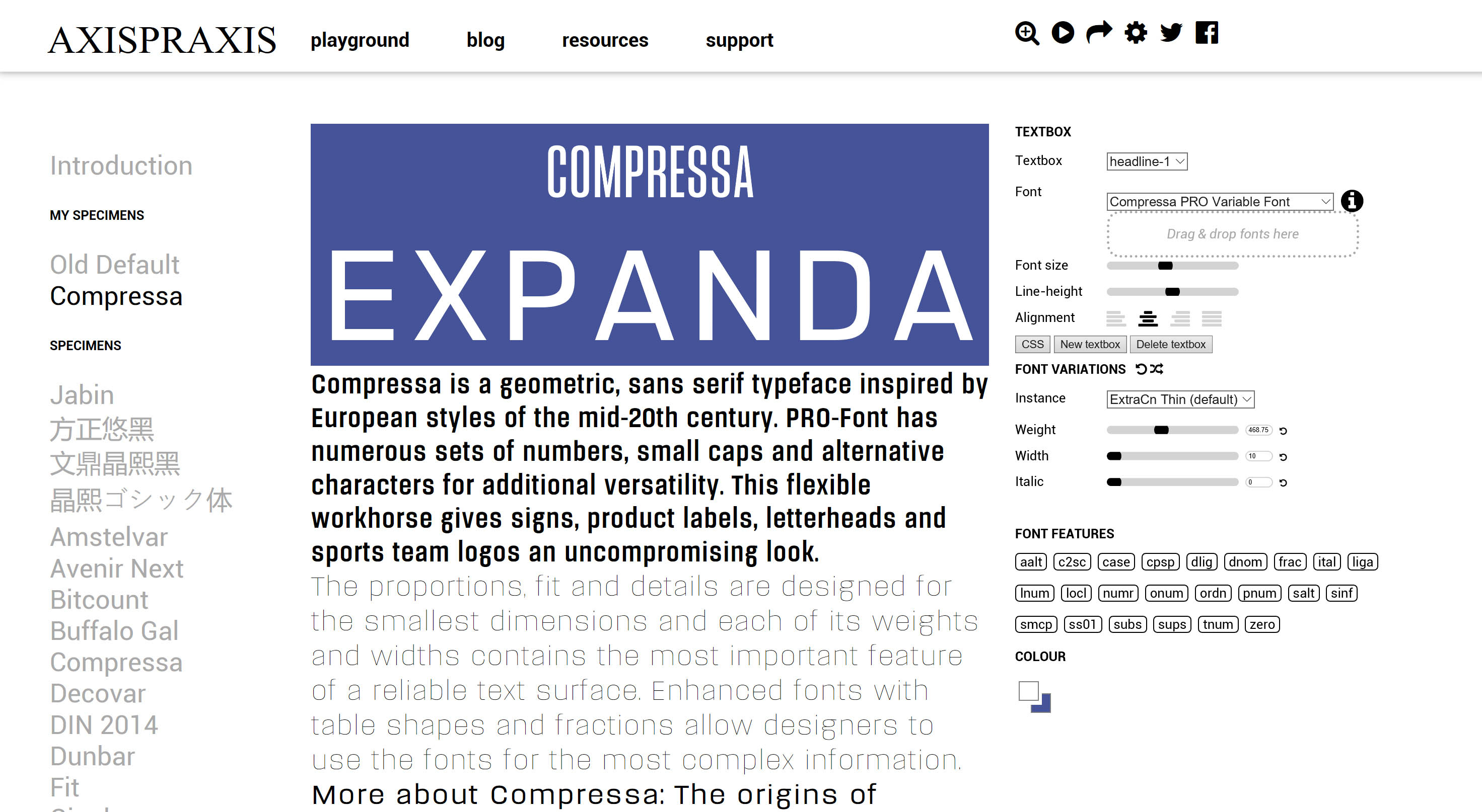
To utilise variable fonts we'll need to use a font that supports it and a browser that has implemented the font-variation-settings property, which enables us to control the various axes of the chosen font. Support in modern browsers is excellent and improving. To get a feel for how controllable fonts can be, check out the Axis Praxis website where you can play with various fonts and copy/paste the CSS used for the font variant you've created.
To find and test variable fonts, visit v-fonts.com. The Variable Fonts Twitter account is worth following to discover new font releases and other news.
06. Scroll snapping
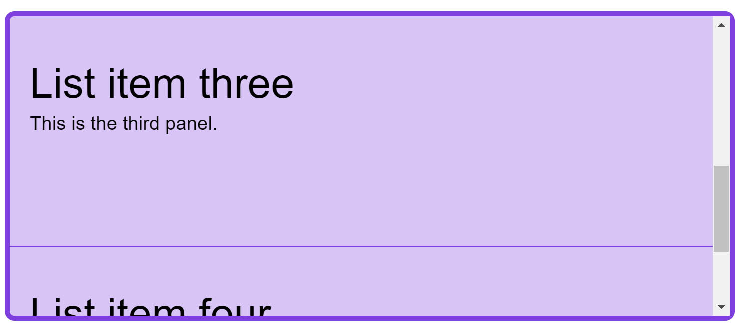
CSS scroll snapping enables us to create interfaces that snap to predefined scroll points. This is useful for full-page interfaces that we want to act in a similar way a mobile app might, snapping from page to page.
The code below creates a list of items where the parent has a fixed height and the overflow is set to scroll. As the user releases their scroll, the page snaps to the closest snap point.
On the parent element we add the property scroll-snap-type, which has a value of the axis that we are scrolling on (x or y) and then a keyword of mandatory or proximity. The mandatory keyword will force snapping to snap points, therefore we should be wary of of causing a situation where the user is unable to scroll to some of the content because of the scroll snapping.
On the snap points we specify scroll-snap-align, which can be set to start, center or end.
ul {
  list-style: none;
  border: 5px solid rgb(126,63,222);
  border-radius: .5em;
  height: 300px;
  padding: 0;
  overflow-y: scroll;
  scroll-snap-type: y mandatory;

}

li {
  background-color: rgba(126,63,222,.3);
  padding: 40px 20px ;
  border-bottom: 1px solid rgb(126,63,222);
  min-height: 150px;
  scroll-snap-align: start;
  scroll-snap-stop: always; /* optionally prevents skipping */
}
07. Interaction media features
The ways in which people interact with a website or application are changing. A user might be visiting on a touchscreen-enabled device, using a keyboard and mouse, or – with devices such as the Microsoft Surface Book acting like traditional laptops that also have a touchscreen – both at once. Therefore, looking at screen size isn't a good way to find out what type of device your user actually has. Media Queries Level 4 introduces Interaction Media Features, which enable us to find out what type of pointer a user has and test for properties such as the ability to hover.
@media (pointer:coarse) {
    /* target touch screens */
}

@media (hover) {
    /* target mice with the ability to hover */
}
These media queries provide another way to test for device capabilities in order to give a great experience to all website visitors. They're generally supported in all modern browsers.
08. Feature queries
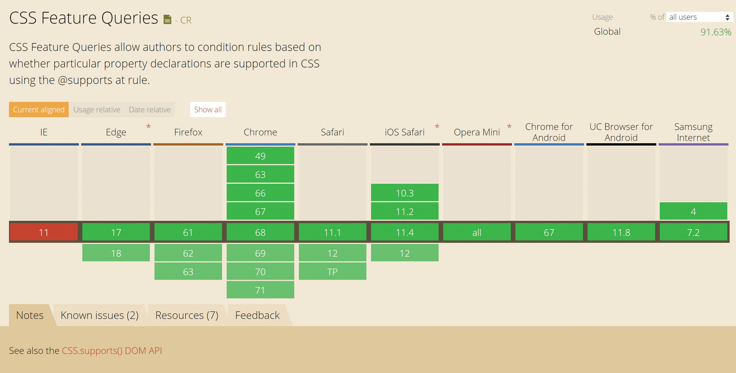
CSS has even developed a way for us to test for browser support of new CSS features - with Feature Queries. A Feature Query behaves in much the same way as a Media Query, except that instead of asking the browser something about the device being used to view the site, a Feature Query asks the browser if it supports a particular CSS feature. This makes it easier to use new features in a safe, progressively enhanced way.
@supports (display:grid) {
    /* target browsers that support display:grid */
}
Browser support for Feature Queries is great, however they are not supported in Internet Explorer 11 and below. This is less of a problem than you might think: as long as you test for support and then write the code for supporting browsers, you can overwrite anything you needed to previously do in your CSS for those older browsers.
Anything new that comes into CSS you can use Feature Queries to test for. I think they are one of the best things to come into CSS recently because they enable us to start using new features more quickly and, as you've seen in this article, there is a lot to get started with!

Want to learn about UX and UI? Don't miss our UX design foundations course.
Read more:
- Daniel SchwarzProduct designer
