3 design books we’d like to read this September
Bulk out your bookshelf with the best new graphic design titles.
Sign up to Creative Bloq's daily newsletter, which brings you the latest news and inspiration from the worlds of art, design and technology.
You are now subscribed
Your newsletter sign-up was successful
Want to add more newsletters?
Looking for a new design book to get stuck into? With hundreds of new titles coming out each month, it can be tough to know which ones deserve your hard-earned cash.
That’s where we come in. Each month we deliver our pick of the best new graphic design books to hit the shelves. Whether you’re looking for industry insight, practical skills or a heavy dash of inspiration to get the creative juices flowing, you’ll find something here.
Read on for three brilliant design books out this month...
Article continues below01. Design Genius: The Ways and Workings of Creative Thinkers
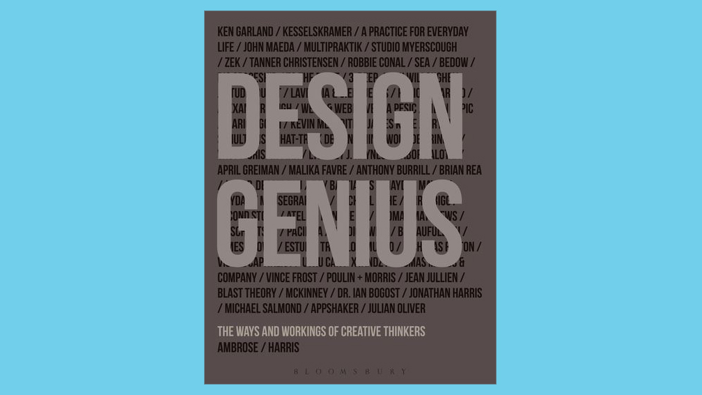
In this detailed and practical guide, Gavin Ambrose enlists the likes of Erik Kessels, Anthony Burrill and April Greiman to explore the ways and workings of creative thinkers.
It’s all well and good acting the troubled creative and idly sitting around waiting for your muse, but it’s not the most practical or productive way of getting something done. Sadly, while projects work to deadlines, muses don’t. So sometimes you need a book that demystifies things and knuckles down into what makes creative minds tick, which is exactly what Design Genius does.
The book brings together insights from 69 leading artists, designers, creative agencies, animators, illustrators and typographers. It aims to help its readers engage with new ways of approaching the design process and creative problem solving that could be applied to any discipline from packaging to graphic design, signage to advertising.
The foreword is penned by Stephen Heller, an unequivocal hallmark of a decent design book. And alongside snippets from the likes of Erik Kessels, April Greiman, Ken Garland, John Maeda and Anthony Burrill (it could do with a few more female voices), the book also presents visual and text-based explanations of design rules, theory, best practice and techniques.
Sign up to Creative Bloq's daily newsletter, which brings you the latest news and inspiration from the worlds of art, design and technology.
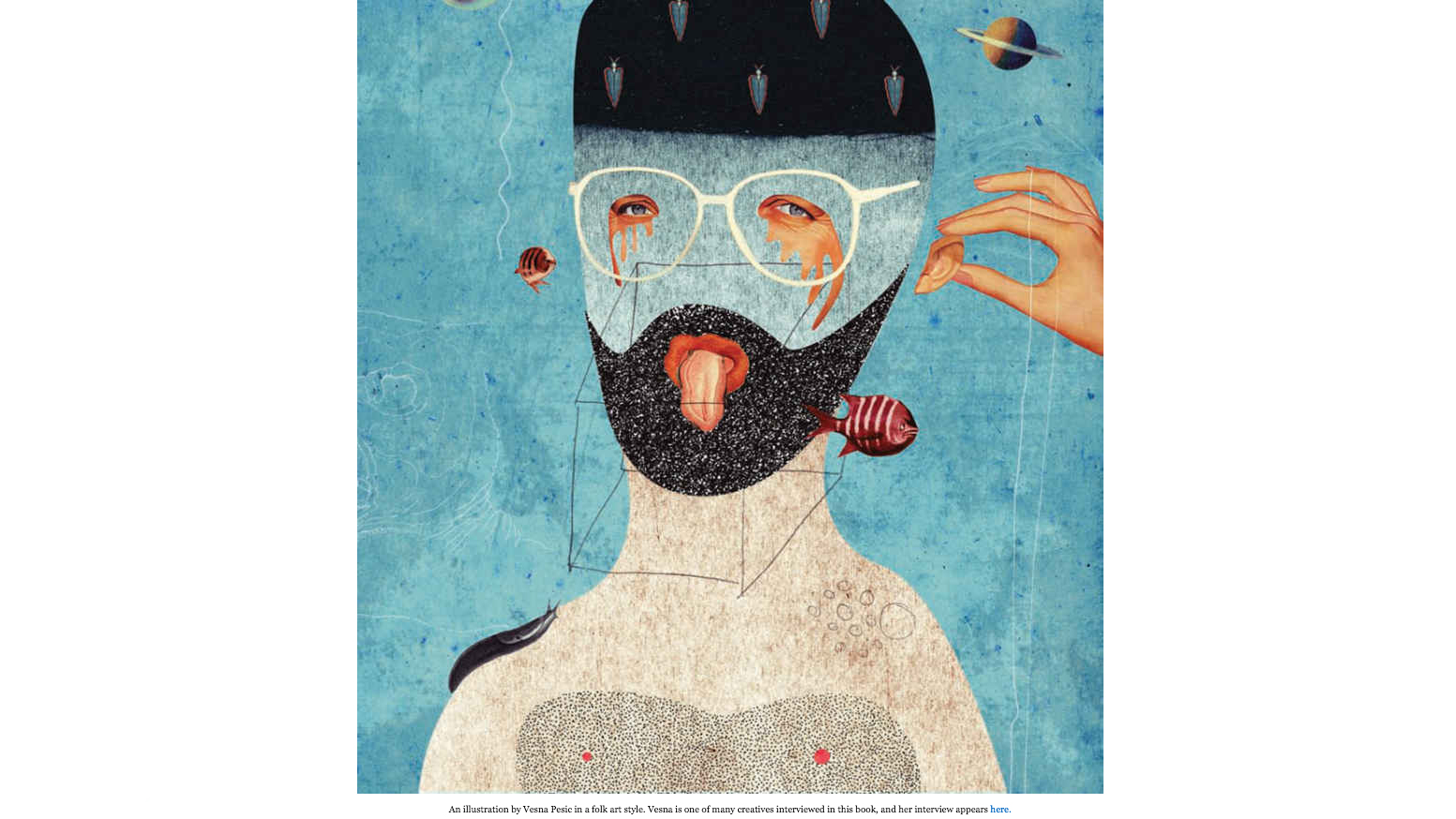
The tone of voice manages to tread the fine line between thought-provoking, authoritative and encouraging without ever feeling patronising.
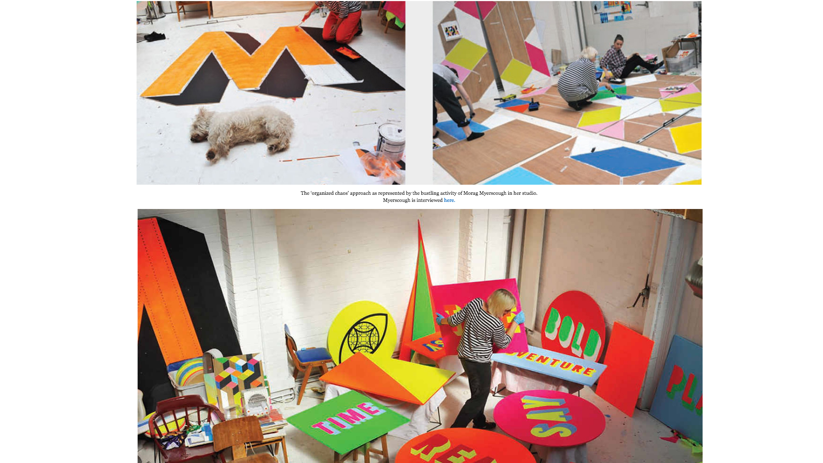
Photography throughout provides a splash of colour, and there's light relief in the shape of Morag Myerscough’s adorable little terrier that accompanies the “organised chaos” of her bold and bonkers studio.
First published in 2014, Design Genius has just been made available as a Kindle edition, so while digital viewers won’t experience the tactility of the print version’s design nuances, it can only be a good thing that these sort of often-overlooked discussions can reach more people.
It’s so refreshing to find something that broaches complex ideas around the unconscious mind as well as linguistic tricks, politics and sustainability, alongside practical tips and tricks.
“We are not claiming that inspiration does not exist; it does, but inspiration is a tool that needs to be facilitated and supported by others as part of an overall design process, rather than being the only element that produces results,” author Gavin Ambrose quite adroitly points out in the book’s introduction.
“Design is not a talent that a person is born with; it can be learnt and improved through experience. Design is something that you do, and like any activity, one that you need to practice in order to improve and develop,” he says.
Erik Kessels sums it up even more succinctly in his discussion of how one can “learn” creativity: “I feel freer now with ideas than I did in art school... My creativity grows every day, and this comes from daring to take a risk.”
02. X-Rated Adult Movie Posters of the 60s and 70s
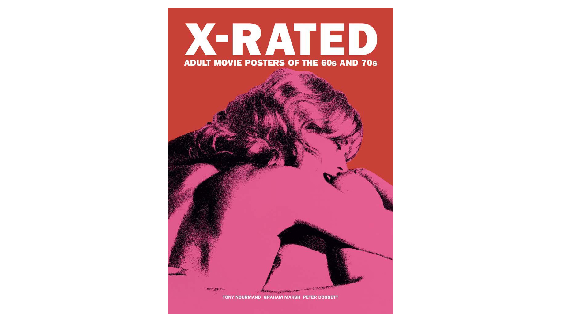
- Authors: Tony Nourmand, Graham Marsh and Peter Doggett
- Publisher: Reel Art Press
- Price: £20.36 / $28.33
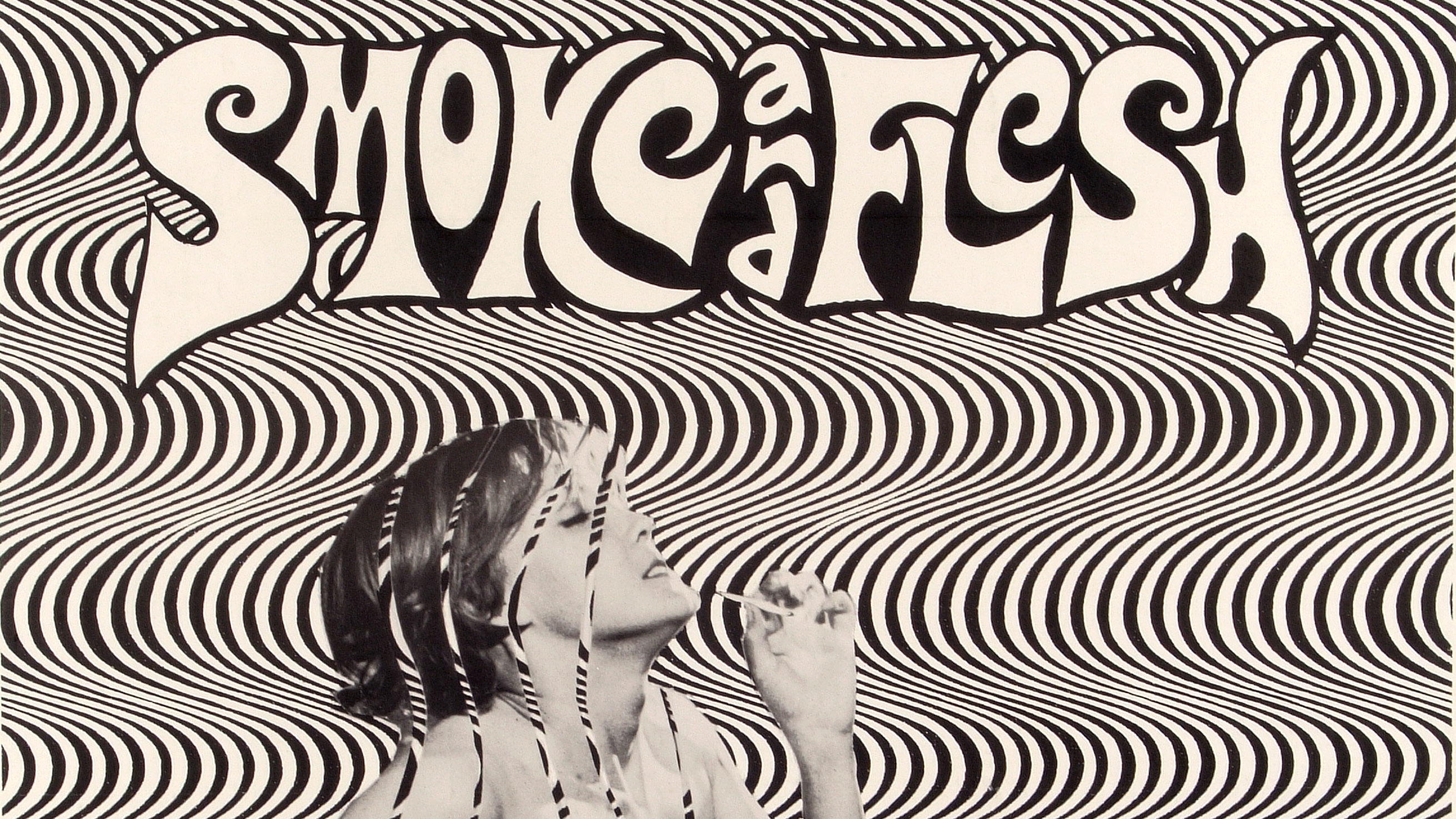
They’re lewd, they’re rude, and they use some of the most beautiful and unusual approaches to typography and graphic design we’ve seen.
The majority of designers will be aware (and in awe) of film posters like Saul Bass’s Hitchcock classics like Vertigo, Philip Castle’s iconic image for A Clockwork Orange and even Polish designers such as Jan Lenica’s superb graphic works for European releases.
But fewer people will have cast their eyes across the images promoting the seedier films of the era, and perused designs for films such as Flesh Gordon, Sex Cures the Crazy, or Days of Sin and Nights of Nymphomania.
Hopefully, that’s about to change with the release of a stunning little volume, X-Rated Adult Movie Posters of the 60s and 70s, which proves just how innovative, cheeky and well-executed the designs for 20th century blue(ish) movies were.
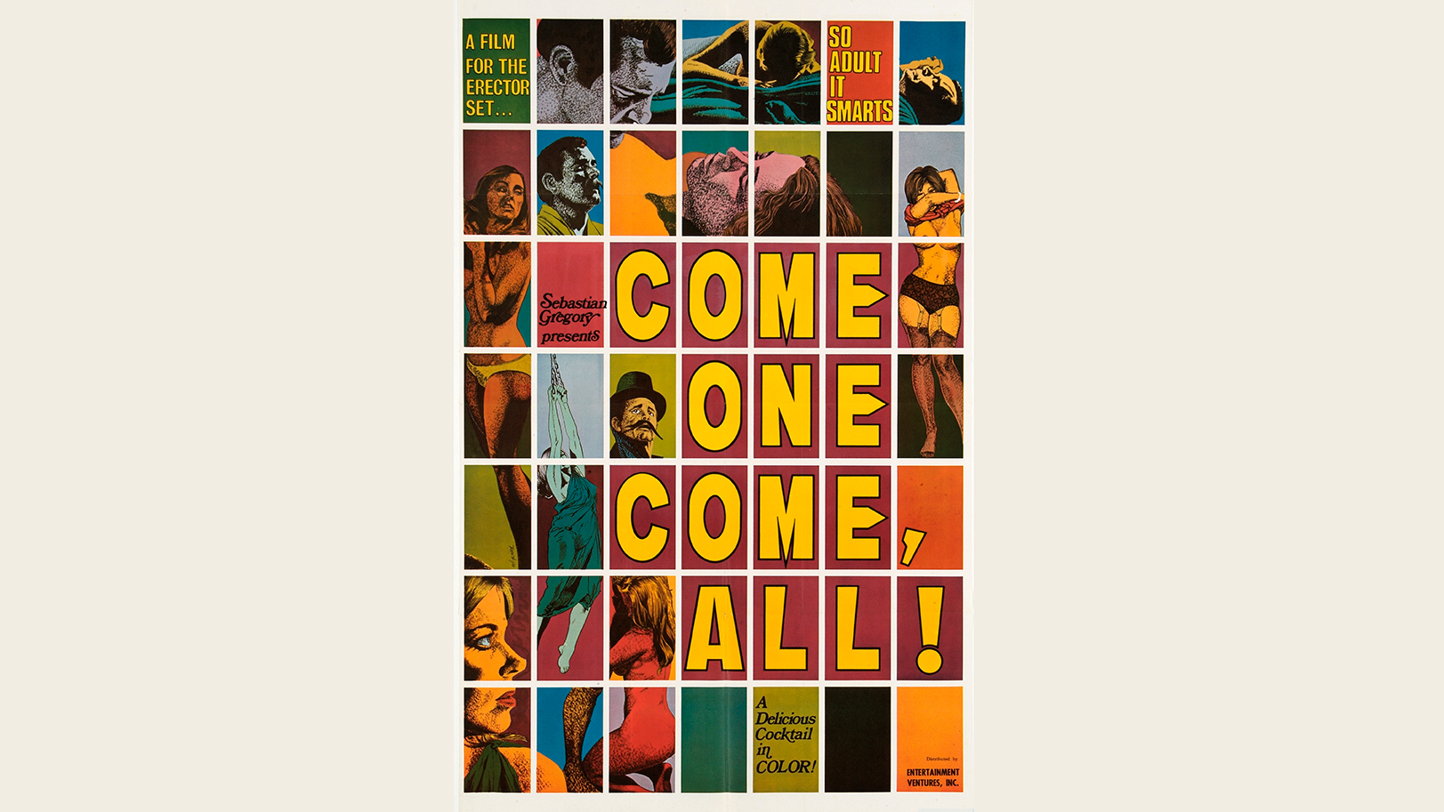
The brazen use of multiple fonts and brassy colourways managed to convey a combination of good old fashioned filth as well as a keen eye for lettering, spacing and composition.
Yet unlike many film posters of the same era that were more above board when it comes to classification, the names of the designers have sadly been lost in time.
One of the few exceptions to this is original 'Mad Man' Steve Frankfurt, a Madison Avenue graphic designer and art director whose work can be seen on posters for films such as 1974 smash Emmanuelle.
The joy of these images for anyone with a passing interest in graphics and typography is in the sheer variety of styles and formats. Many use a sort of cut and paste aesthetic, giving a sense of rawness that aptly echoes the low budget sexual films promised on celluloid.
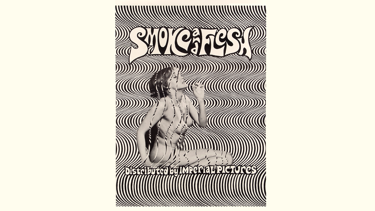
Others echo the photomontage style seen across many French New Wave posters of the time. Much of the lettering is hand drawn and totally bespoke, not to be repeated on another film poster let alone across a set of letterforms for public use.
The designs, as co-author Peter Doggett writes in the introduction to the book, “required no decoding... Their mission was to tease and to provoke, to conjure up fantasies and arouse repressed desires, with minimum budget and maximum impact.
“Everything – typography, pictorials, those enticing verbal come-ons – was focused on the irresistible lure of the forbidden.”
03. The Visual History of Type
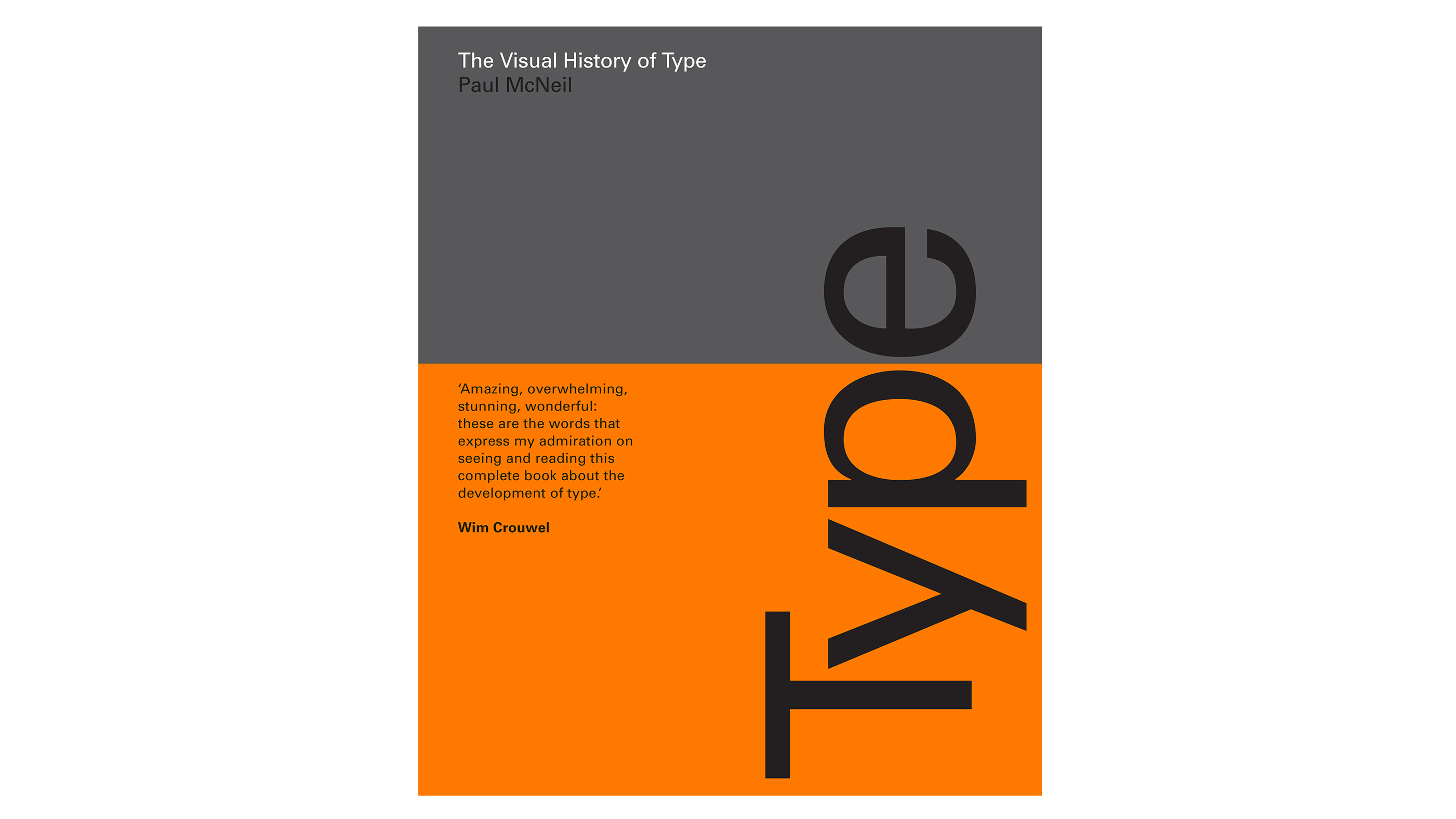
Why we should all understand type past to understand type presence, and even show some love for Comic Sans.
The vast, heavy and superlatively informative book The Visual History of Type is published by Laurence King this month, detailing every major typeface produced since the advent of printing in the mid-15th century until now.
It’s been more than seven years in the making, at the hands of Paul McNeil of type design studio MuirMcNeil.
The design and production have a beautiful mix of impactful and functional, with the cover taking on the feel of a classic mid-century standards manual. A bold orange belly band wraps a functional grey, making for a slick balance of coffee table aesthetic delight and information-heavy learning.
The no-nonsense boldness of the cover was chosen for its mix of simplicity and on-shelf visibility; and the entire book’s text and cover type uses the original digitisation of Univers – surely a design decision that must have been fairly fraught.
The book includes 320 typefaces, presented chronologically and in as faithful a way as possible to their original uses, showing both the typography itself and the pages on which it would have first appeared.
This fosters a deeper understanding of how certain technologies and innovations brought about specific visual nuances in typography’s history.
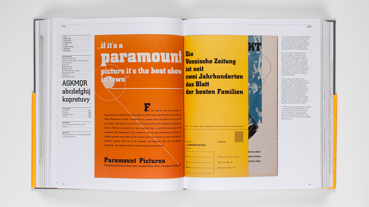
The Visual History of Type is divided into seven year-based sections that bore a particular technological development in type.
1450 marks the birth of printing; 1650 “the loosening of the Roman letter from its humanistic roots during the Baroque and Enlightenment periods” that created the foundations for modern type design; 1800 marks the industrial revolution; and so on until the present age of digital type design’s maturation.
Among the most recent specimens are Jonathan Barnbrook’s gorgeous Doctrine typeface, which exploited OpenType technology to create a massively expanded character set.
While mostly aimed at designers, design students and their teachers, The Visual History of Type is fascinating in its delineation of typographic history as a microcosm of history more widely. It brings home how type design has intrinsically shaped how we view our past, and the associations it engenders.
For example, script serifs have become a visual shorthand for antiquation, while Gill Sans has a reassuring confidence that’s carried it from the 1920s transport design origins to the present. And bulbous, decorative typefaces such as Seymour Chwast’s 1968 Artone are synonymous with the halcyon days of swinging psychedelia.
As this weighty tome proves, typography is a vital component of our visual landscape, and one as shaped by societal and technological changes as art and politics.
Related articles:

Emily Gosling is a freelance art and design journalist currently writing for titles including Creative Review, Eye on Design, Creative Boom and People of Print. She’s previously worked at Elephant magazine, It’s Nice That and Design Week, and was editor of Type Notes magazine. Her book Creative Minds Don’t Think Alike was published by Ilex Press in 2018, and she also plays bass as one-quarter of the eight-titted beast, Superstation Twatville.
