While we love to bring you new and exciting typefaces and free fonts, that doesn’t mean we don’t respect the classics. After all, there’s a reason that certain fonts become iconic, and remain in popular use for decades.
So in this post, we bring together five classic typefaces designed by five famous graphic designers and explain the thinking behind them and why they work so well.
01. Geneva by Susan Kare

Born in 1954, Susan Kare is an artist and graphic designer who created many of the interface elements for the Apple Macintosh in the 1980s, including the Happy Mac and the bomb symbol. Along the way, she created some of Apple’s most iconic fonts, including Chicago, Monaco and Geneva.
A realist sans-serif, Geneva is essentially a redesigned version of Helvetica, hence the name (Helvetica is Latin for Switzerland, while Geneva is Switzerland's second-largest city). And it’s been hugely popular, most recently retunning to prominence when Facebook switched to Geneva from Helvetica in 2016.
Unusually for neo-grotesques, the current version of Geneva includes a basic set of ligatures and the archaic long s and R rotunda (both descendants of traditions in medieval writing) as optional alternates.
Charles Bigelow and Kris Holmes, who also worked on the typeface, explain in Notes on Apple 4 Fonts how Geneva offers a distinct alternative to Helvetica. “The semi-enclosed counters of letters like ‘a’, ‘c’, ‘e’,and ‘s’ are more open,” they write. “The terminals do not enclose the internal spaces as much as in other Grotesques.
"Even though the terminals end with a horizontal cut-off, there is more breathing room for the internal white space. This keeps the counters open and the terminals from visually joining at small sizes, which allows for better differentiation of the letterforms.”
02. Exocet by Jonathan Barnbrook

Born in 1966, Jonathan Barnbrook is a British graphic designer and film-maker who’s known for designing David Bowie’s 21st century album covers, as well as working with Damien Hirst. Currently, he runs his own studio Barnbrook Design, which he founded in 1990.
He’s also a font designer and has released a number of typefaces with provocative titles, such as Bastard, Exocet, False Idol, Infidel, Moron, Newspeak, Olympukes, Sarcastic and Shock & Awe.
Designed in 1991, Exocet is inspired by incised Greek and Roman letter carvings, with geometric shapes used for the main construction. For example, its stylised Q is based on qoppa, an ancient form of Q, while the O with a cross is an early form of theta.
An all-capital font, but with different capital glyphs for both lowercase and capital letters, Exocet’s combination of modern and antiquated forms have ensured its continuing popularity.
It’s been used on a wide variety of products, from films such as Demolition Man and Star Trek: Nemesis, to Goth album covers, to videogames such as Diablo, as well as more genteel uses such as Tazo tea packaging.
03. Glaser Stencil by Milton Glaser
Born in 1929, Milton Glaser is one of history’s most celebrated graphic designers. He's best known for the I ❤ NY logo, the psychedelic Bob Dylan poster and the Brooklyn Brewery logo.
His work has been exhibited worldwide and won numerous awards, including the National Medal of the Arts from President Obama in 2009. He co-founded Push Pin Studios in 1954 and co-founded New York Magazine in 1968.
Glaser wrote in 1973 that he was “not a type designer,” and that his typefaces were only the product of graphic ideas applied to letterforms. Despite this, his heavily stylised, three-dimensional typefaces have remained influential and popular to this day.
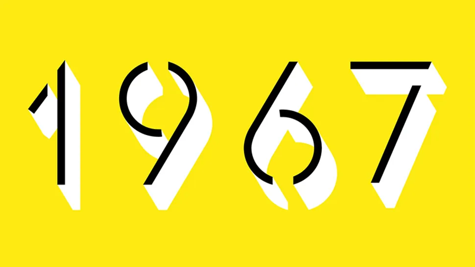
Glaser Stencil was created in 1970, based on type that had originally appeared on a Carnegie Hall poster he designed in 1967. This geometric stencil font instantly summons a feeling of both Modernist proportion and mid-century New York self-assurance. An all-caps font, the letterforms echo some of the most popular sans serifs of the time, such as Futura and ITC Avant Garde Gothic.
A great choice for large, attention-grabbing headlines, Glaser Stencil’s bold weight was digitalised in the computer age, while the forgotten lighter weights have recently been brought back to life by Face37.
04. FF Meta by Erik Spiekermann

Born in 1947, Erik Spiekermann is a multi award-winning designer and author. He co-founded MetaDesign, now Germany’s largest design firm, which has offices in Berlin, London and San Francisco. In 1988 he started FontShop, a company for the production and distribution of digital fonts.
A hugely influential voice on design matters, today Spiekermann sits on the board of the German Design Council, is an honorary professor at the University of the Arts Bremen and is also on the supervisory board of Edenspiekermann, which has offices in Berlin, Amsterdam, London, Stuttgart & San Francisco. He was the first designer to be elected into the Hall of Fame by the European Design Awards for Communication Design.
FF Meta is a humanist sans-serif designed in 1991. Based on an unused commission for the West German Post Office in 1985, Spiekermann developed it to be a "complete antithesis of Helvetica", which he found "boring and bland".
Features including a large x-height, open apertures and an “l” with a tail to distinguish it from a ‘1’ or ‘I’ help to make it super-legible. Consequently, FF Meta is today used extensively across the world, from product labelling to signage.
05. Avenir by Adrian Frutiger

Adrian Frutiger (1928-2015) was a hugely influential Swiss typeface designer and author whose commissions included creating the in-house typeface for BP plus logotypes, signage systems and maps for clients including Air France, IBM and the Swiss Post Office.
Frutiger won awards including the Chevalier de l’Order des Arts et Lettres, the Gutenburg Prize of the city of Mainz and the 1986 Type Medal of the Type Directors Club of New York.
His most famous creations, Univers, Frutiger and Avenir, spanned the three main genres of sans-serifs: neo-grotesque, humanist and geometric. Avenir was a late-in-life design by Frutiger, who considered it his best work. Originally released in 1988, it reinterprets the rigid geometric sans serif designs of the early 20th century in a way that adds elements of organic humanism.
With vertical strokes that are thicker than the horizontals, an ‘O’ that’s less than a perfect circle, and shortened ascenders, it’s a beautifully legible font that works well for both text and headlines.
Famous examples of Avenir abound, including its use by Samsung Galaxy, Walt Disney Parks, the Eurovision Song Contest and Apple Maps.

