8 great fonts to use for your portfolio
Sign up to Creative Bloq's daily newsletter, which brings you the latest news and inspiration from the worlds of art, design and technology.
You are now subscribed
Your newsletter sign-up was successful
Want to add more newsletters?
At Creative Bloq we’re often asked: What font should I use for my portfolio? But it’s not the easiest question to answer. After all, a font doesn’t exist in a vacuum; it’s only one aspect of the overall design.
What we can share, though, is some tried and tested fonts that we’ve often seen pro designers use on their portfolios, and point to some current examples of their use. This is by no means an exhaustive list, but more of a prompt to start you thinking about what kind of fonts you might use in your portfolio design, and how.
Meanwhile, if there’s a font you’ve favoured for portfolios in the past, feel free to share your views in the comments below.
Article continues below01. GT Walsheim
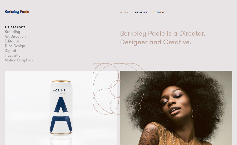
Inspired by the hand-painted lettering of Swiss poster designer legend Otto Baumberger from the 1930s, GT Walsheim is uber-trendy amongst designers right now. Designed by Noël Leu and released in 2010 through Swiss foundry Grilli Type, this geometric sans serif works well in both headlines and body copy.
It’s a fun and friendly font, and hey, why wouldn’t you want your portfolio to exude that? Examples of its use can be seen on the portfolio sites for Berkeley Poole, Anders Drage and Best Friends Forever.
02. Proxima Nova

Straddling the gap between Futura and Akzidenz Grotesk, Proxima Nova is a hybrid font combining humanistic proportions with a somewhat geometric appearance. Released in 2005, it’s gone on to become one of the web’s most popular fonts, and it’s very common to see it in on portfolio sites, such as those of Jan Losert, Melanie Daveid and Lucid Style.
03. Brandon Grotesque
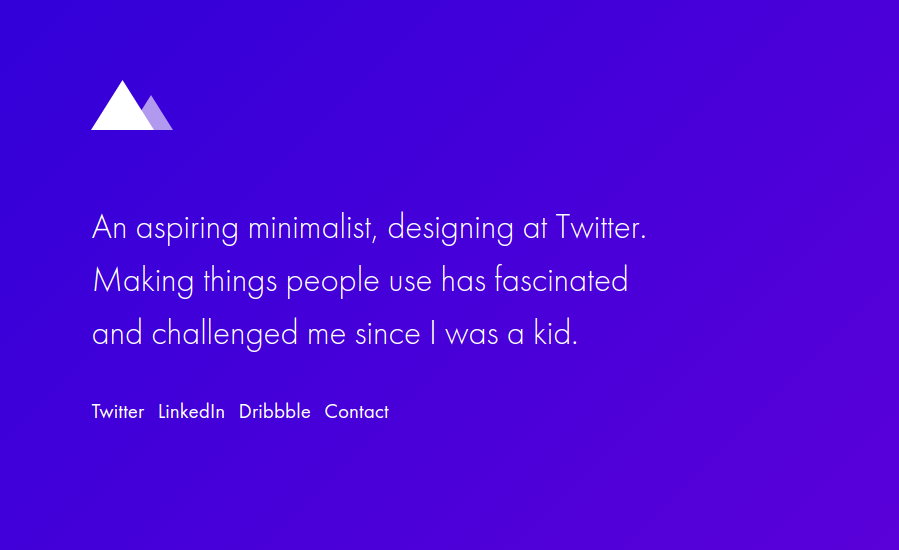
Brandon Grotesque is a clean, crisp font designed by HVD Fonts. Inspired by geometric sans serifs of the 1920s and 1930s, it was designed to appear elegant through having a low x-height, a less common characteristic for sans-serif fonts.
Sign up to Creative Bloq's daily newsletter, which brings you the latest news and inspiration from the worlds of art, design and technology.
The corporate font of Comedy Central since 2010, Brandon Grotesque is very welcoming, and a great choice for portfolios. You can see it in use on the portfolio sites of Sean Thompson, Code & Pepper and Jake Blakeley.
04. Circular
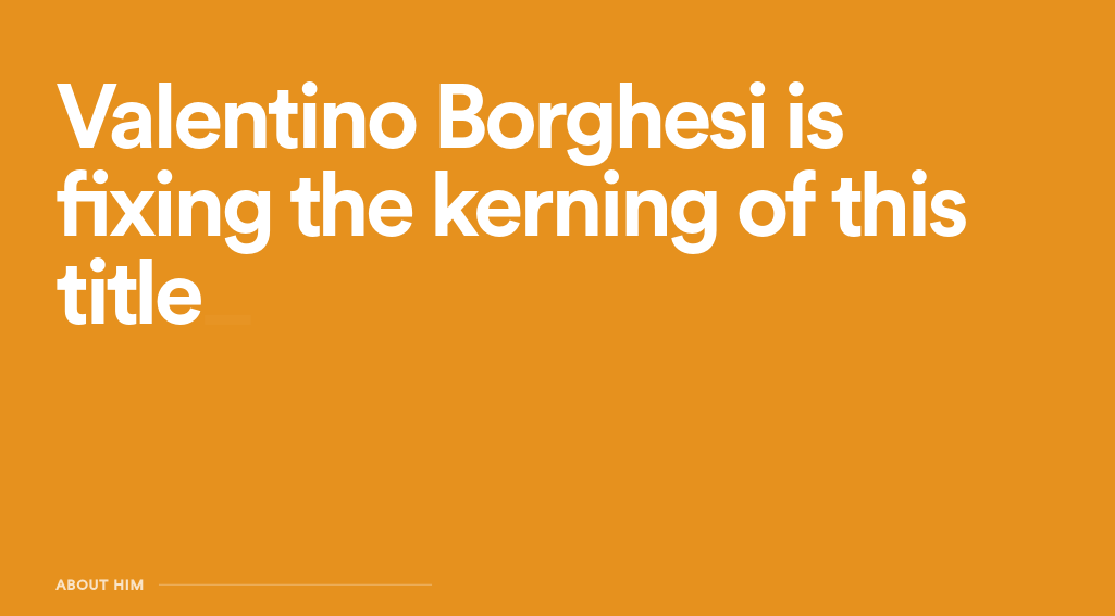
Created by Swiss designer Laurenz Brunner, Circular was released through Lineto in 2013. Based on geometric forms, this sans-serif nonetheless has some cute quirks that give it a real sense of individuality and personality. You can see it in action on the portfolio sites of Villa Bohnke, Valentino Borghesi and THIS.
05. Roboto
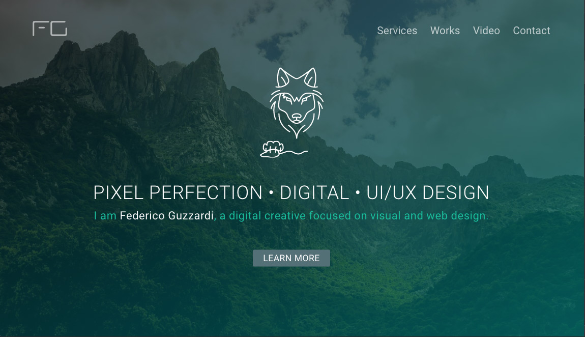
Combining a mechanical skeleton that’s largely geometric with friendly and open curves, Roboto hits a particularly sweet spot, somewhere between style and practicality.
A free Google Font, it’s proved a popular choice amongst web designers due to its supreme legibility and the relaxed reading experience it provides. You can see in use on the portfolio websites of Albino Tonnina, Federico Guzzardi and Nicholas Ruggeri.
06. Helvetica
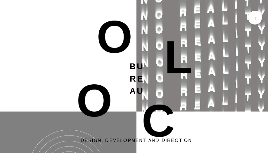
Released in 1957, Helvetica became a hallmark of the International Typographic Style that emerged from the work of Swiss designers in the 1950s and 1960s. And this sans serif remains one of the most famous and popular fonts in the world today. Its clarity and neutrality means it works well for portfolios, especially those aiming for a minimalist aesthetic. You can see examples of its use on the sites of Bureau COOL, Teo Yu Sheng and We are Cirro.
07. Maison Neue
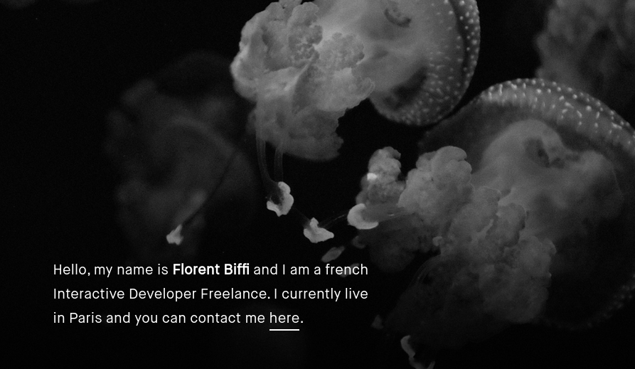
There’s a certain je ne sais quoi to Maison Neue that could help add a splash of originality to your portfolio site. Its distinctiveness lies in its complex origins: created by the Swiss foundry Millieu Grotesque, it’s a carefully redrawn version of a previous font, Maison, removing some its quirks to convey a sense of visual harmony.
The result is a font that’s been described as 'anonymous' – but in a good way. You can see it in action on the portfolio websites of Chris Martin, Florent Biffi and Stuart Regan.
08. Inconsolota
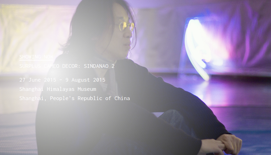
Another free Google font, Inconsolota is a monospace font from Raph Levien, designed for printed code listings and the like. But while it’s not really meant for portfolios, a number of creatives have harnessed its distinctive style to add a touch of quirky touch to their portfolio pages; they include Lorenz Kopczynski, Edgar Schmitz and Jake Dow-Smith.

Tom May is an award-winning journalist specialising in art, design, photography and technology. His latest book, The 50 Greatest Designers (Arcturus Publishing), was published this June. He's also author of Great TED Talks: Creativity (Pavilion Books). Tom was previously editor of Professional Photography magazine, associate editor at Creative Bloq, and deputy editor at net magazine.
