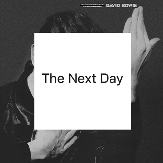
Why Bowie's new album art looks shockingly familiar
For David Bowie's new album art, leading designer Jonathan Barnbrook has recycled an old design - find out why.

The world's going Bowie-mad right now, as the veteran singer launches his new album, his first in 10 years, on his 66th birthday. But the cover design (above) may shock you. It's exactly the same image as that of his 1977 album 'Heroes'. The only difference is a white box covering the singer's face and containing the new title, 'The Next Day', while the original title is crossed-out. So what's the story?
Bowie veteran
The artwork was created by graphic designer, film maker and typographer Jonathan Barnbrook, who has long history of involvement with Bowie; he's perhaps best known for his cover artwork for the 2002 album Heathen, which featured the debut for his Priori typeface.
With 2013 promising to be the year of Bowie's comeback, Barnbrook is also back in the spotlight. He's designed the artwork for the new single, the new album, plus the website - all of which feature a new, specially designed font, Doctrine, which will be released in the coming weeks at VirusFonts.
While singer Boy George earlier announced his love for the album design (proclaiming on Twitter, "It's bloody art!"), its starkly reductionist cut-and-paste approach have understandably raised eyebrows.
Chained to the past
Barnbrook has offered this explanation on his blog. "No matter how much we try, we cannot break free from the past... People will judge you always in relation to your history no matter how much you try to escape it. The obscuring of an image from the past is also about the wider human condition; we move on relentlessly in our lives to the next day, leaving the past because we have no choice but to."
Barnbrook worked on hundreds of ways to obscure the original cover but "the strongest ones were the simplest... it had to be something that was in direct contrast to the image underneath but that wasn’t too contrived." He adds that: "Obscuring Bowie’s image is also reference to his identity, not only in the past when he changed endlessly but that he has been absent from the music scene for the past ten years. Was this an act to hide is identity or that he has simply become more comfortable with his own identity?"
The Berlin connection
Barnbrook chose the cover of Heroes specifically because one of the songs on the new album, the new single 'Where Are We Now?', compares Berlin when the wall fell and the city today: "Most people know of Bowie’s heritage in Berlin and we want people to think about the time when the original album was produced and now."
Sign up to Creative Bloq's daily newsletter, which brings you the latest news and inspiration from the worlds of art, design and technology.
In conclusion, Barnbrook admits: "We know it is only an album cover with a white square on it but often in design it can be a long journey to get at something quite simple which works and that simplicity can work on many levels."
Watch this! New Bowie single 'Where Are We Now?'
Also read:
- The best album art of 2012
- The 20 best album designs from music's greatest decade: the 70s!
- 20 beautiful band logo designs
What do you think of the new cover design? Let us know in the comments!

The Creative Bloq team is made up of a group of art and design enthusiasts, and has changed and evolved since Creative Bloq began back in 2012. The current website team consists of eight full-time members of staff: Editor Georgia Coggan, Deputy Editor Rosie Hilder, Ecommerce Editor Beren Neale, Senior News Editor Daniel Piper, Editor, Digital Art and 3D Ian Dean, Tech Reviews Editor Erlingur Einarsson, Ecommerce Writer Beth Nicholls and Staff Writer Natalie Fear, as well as a roster of freelancers from around the world. The ImagineFX magazine team also pitch in, ensuring that content from leading digital art publication ImagineFX is represented on Creative Bloq.
