6 big portfolio trends of 2019
Frame your work in the best way with an on-trend portfolio design.
Sign up to Creative Bloq's daily newsletter, which brings you the latest news and inspiration from the worlds of art, design and technology.
You are now subscribed
Your newsletter sign-up was successful
Want to add more newsletters?
There's no doubt that the most important thing about your portfolio site is your selection of work. That, after all, is what potential clients and employers are going to want to look at.
But just as any painting can be enhanced by the right choice of frame, the look and feel of your design portfolio can be really helpful, not only by complementing your work but also by showing off some of your personality and also demonstrating that you're in touch with the current design trends.
Modern web design technologies give you almost infinite options for creating eye-catching portfolio websites that'll show your work off to best effect. You can easily find website templates that'll help you achieve the right look for you, or if you know your code then you might be able to create your dream site by hand.
Article continues belowFor some helpful inspiration, though, take a look at six current portfolio trends that you might want to use for yourself, as well as some excellent examples of sites that use them to their advantage.
01. White space
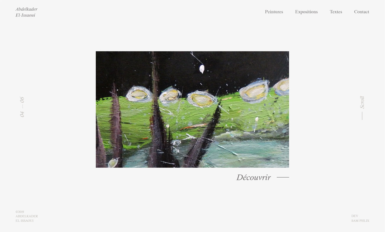
White space has long been the designer's friend; it gives your words and pictures room to breathe and can balance out an otherwise far-too-busy page. The web, though, has always been preoccupied with catering to short attention spans and getting as much information across as quickly as possible.
If you're willing to go back to design basics and employ white space in your portfolio, the results can be striking; for a prime example, take a look at Abdelkader El-Issaoui's slick but calm portfolio, which showcases his artwork beautifully.
02. Clever interface effects
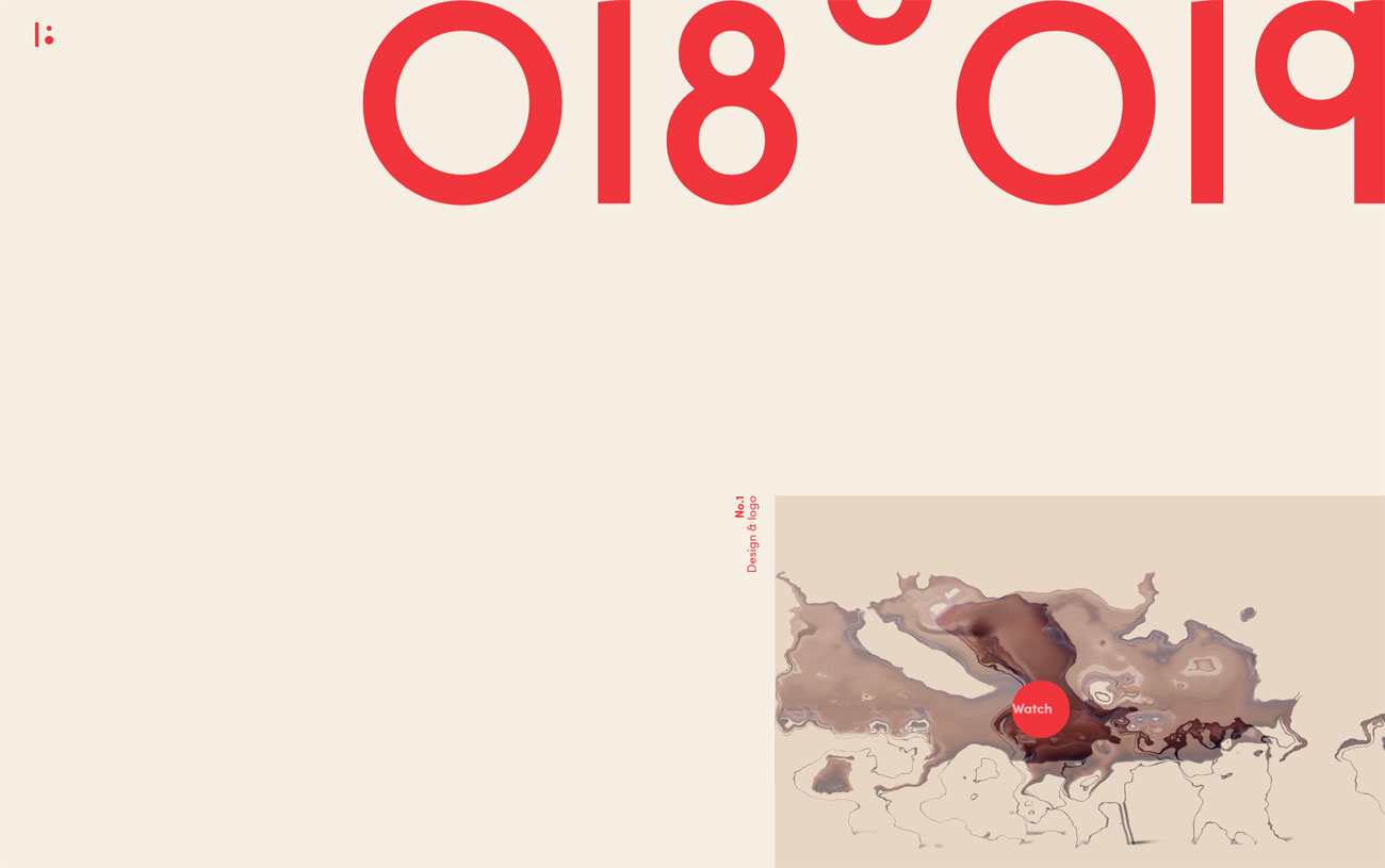
There are so many visual effects that you can pull off in the browser that it's all too easy to go too far and overload your audience while increasing loading times and wrecking performance. But with restrained use of JavaScript, WebGL or even good old CSS you can bring in some micro-interactions or other visual flourishes that can serve to highlight your work and add an element of discovery and delight to your portfolio.
Sign up to Creative Bloq's daily newsletter, which brings you the latest news and inspiration from the worlds of art, design and technology.
Vadim Tyurin's site does just that, with neat mouseover glitch effects, moving buttons that can't quite evade your mouse cursor, and a subtle parallax effect; it's just enough visual excitement to please they eye without overwhelming the work.
03. Click-and-drag
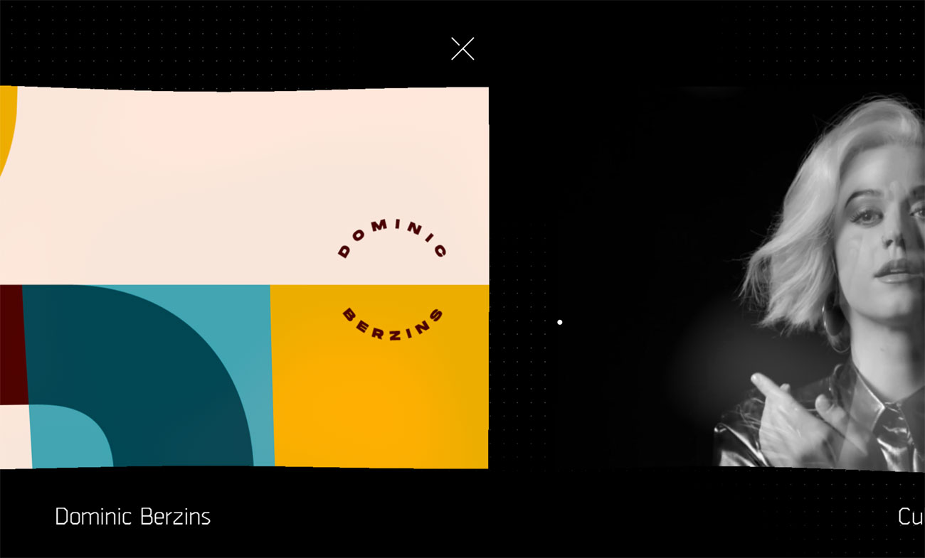
Many web design conventions are based around tried and trusted paradigms that just work, and while it's often self-defeating to break convention for the sake of it. Having a bit of a play with convention, however, can often work in your favour; for example, see how Luis Henrique Bizarro's portfolio site lets you scroll through his work.
For starters it's a side-scroller rather than vertical, and while the mouse scroll wheel will take you through it just fine, you can also click and drag to whizz through his project, much like you'd swipe through on a tablet. It's a small touch, but an engaging one.
04. Vibrant colours
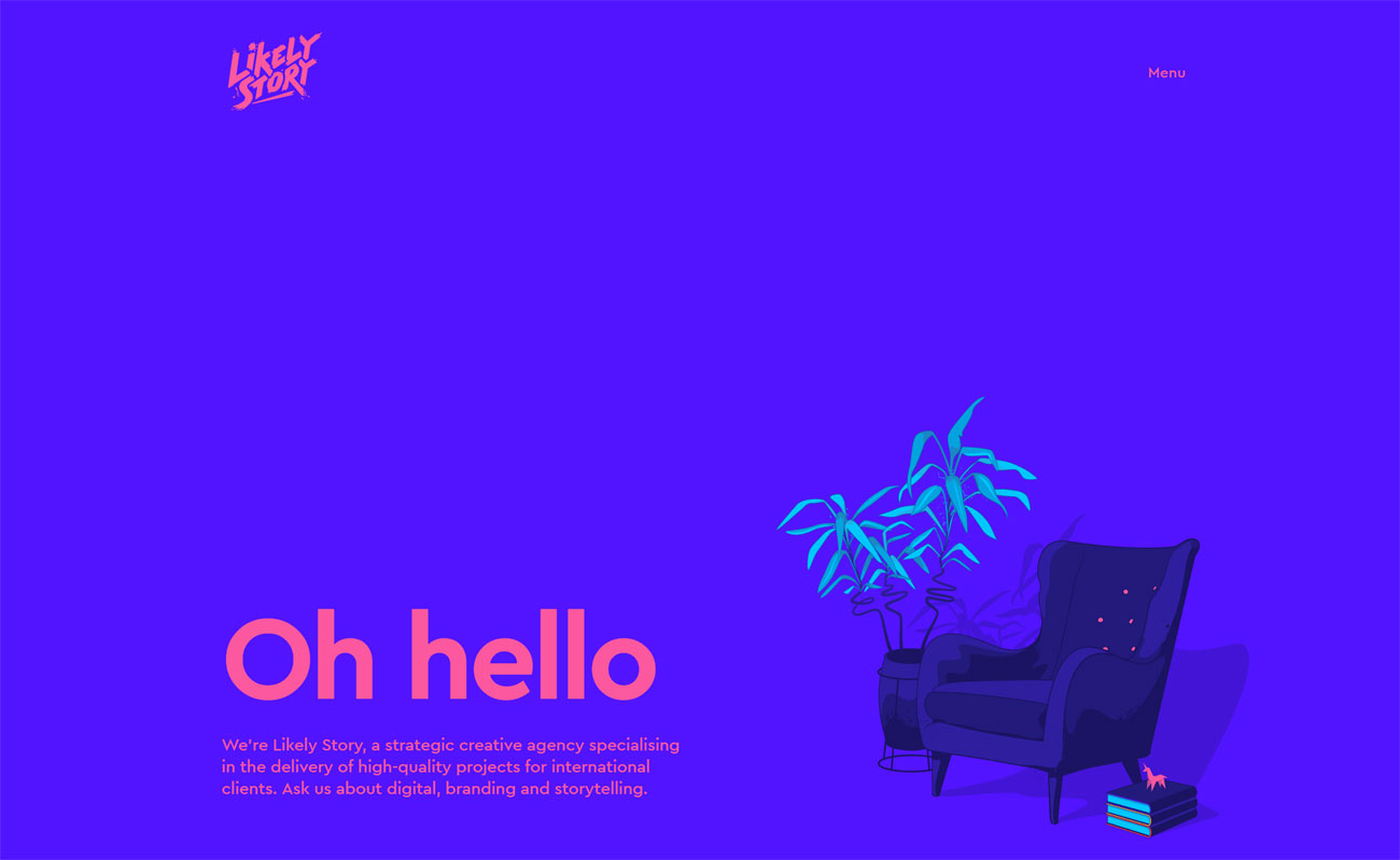
If you've been keeping an eye on this year's big visual trends then you'll know that as far as colour is concerned, the bigger and bolder the better. Ultra-saturated shades and neon hues are the order of the day, with perhaps a bit of contrast being provided by judicious use of calmer, pastel tones.
Depending on your preferred palettes you can work this contrast to your advantage, colouring your site to contrast with, and draw attention to your work; otherwise you can take Likely Story's approach and create a site that's a beautiful barrage of high-impact colour schemes.
05. Split-screen layout
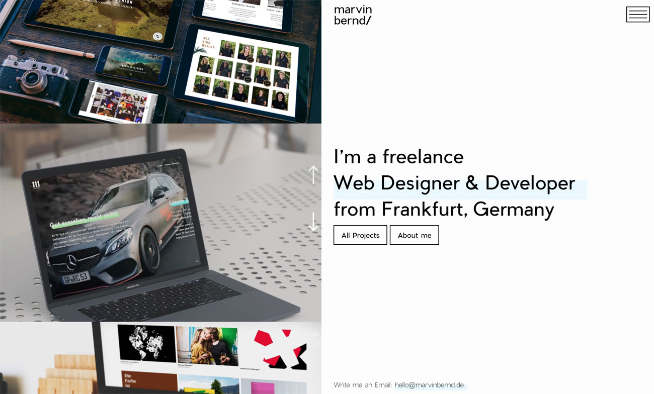
Modern web design techniques such as CSS Grid and Flexbox means that you're a lot more free to play around with layouts these days and create portfolios that have more in common with the printed page than with traditional websites.
A popular look right now is a split-screen layout, with images on one side and text on the other; we're particularly taken with Marvin Bernd's new portfolio site, which uses the left-hand side of the page as a vertical slider, with all the facts you need to know on the right. Click through to a project and it uses the split-screen differently, with the left-hand third of the page explaining the project, and the other two thirds containing either a static image or another vertical slider.
06. Oversized typography
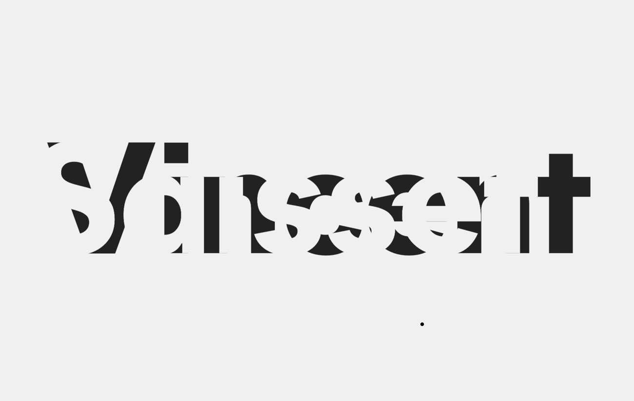
Web typography continues to evolve and improve, again making it much easier to create print-like layouts on web pages. One look that you can't get away from right now is the liberal use of oversized fonts to draw the eye; it's a strong look but it's one that works better if there's more to it than a really big point size.
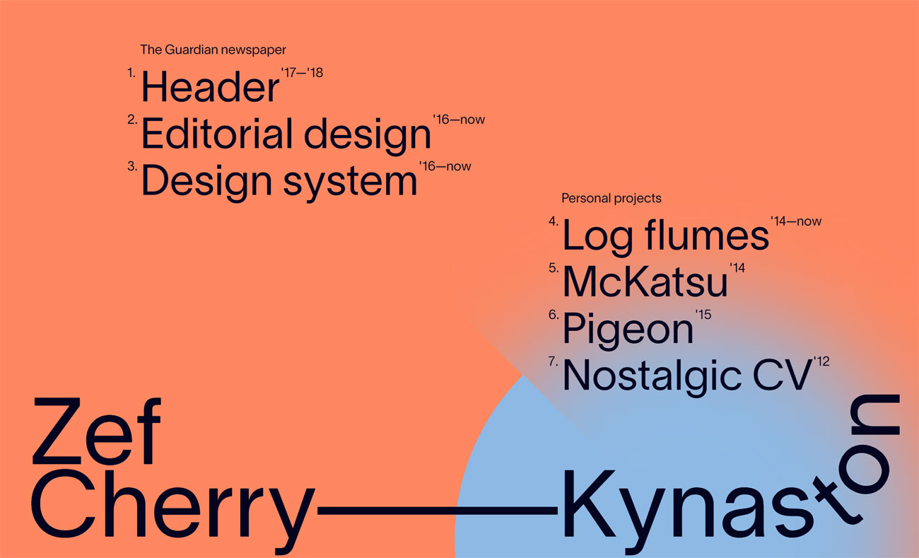
One fabulous example is Zef Cherry-Kynaston's site, which not only makes good use of enormous sans-serifs, but also cleverly simulates text along a curved path through careful use of the translate and rotate functions on individual letters. And for other imaginative applications of oversized typography, check out Vincent Saisset's portfolio, which pulls off all manner of clever tricks with massive lettering.
Related articles:
Jim McCauley is a writer, performer and cat-wrangler who started writing professionally way back in 1995 on PC Format magazine, and has been covering technology-related subjects ever since, whether it's hardware, software or videogames. A chance call in 2005 led to Jim taking charge of Computer Arts' website and developing an interest in the world of graphic design, and eventually led to a move over to the freshly-launched Creative Bloq in 2012. Jim now works as a freelance writer for sites including Creative Bloq, T3 and PetsRadar, specialising in design, technology, wellness and cats, while doing the occasional pantomime and street performance in Bath and designing posters for a local drama group on the side.
