Oktoberfest, the world’s largest beer festival, is in full swing right now: a testament to the traditions of German brewing. But that industry can’t sit on its laurels, and it needs to keep finding innovative new ways to keep people interested.
For designers, that poses a tough challenge. How do you convey the strong sense of heritage that people associate with German beer while still giving it a modern, contemporary look?
Here are 6 packaging designs that we think pull it off. If you’ve seen other great German beer labels you like, please share them in the comments below!
01. TH-König
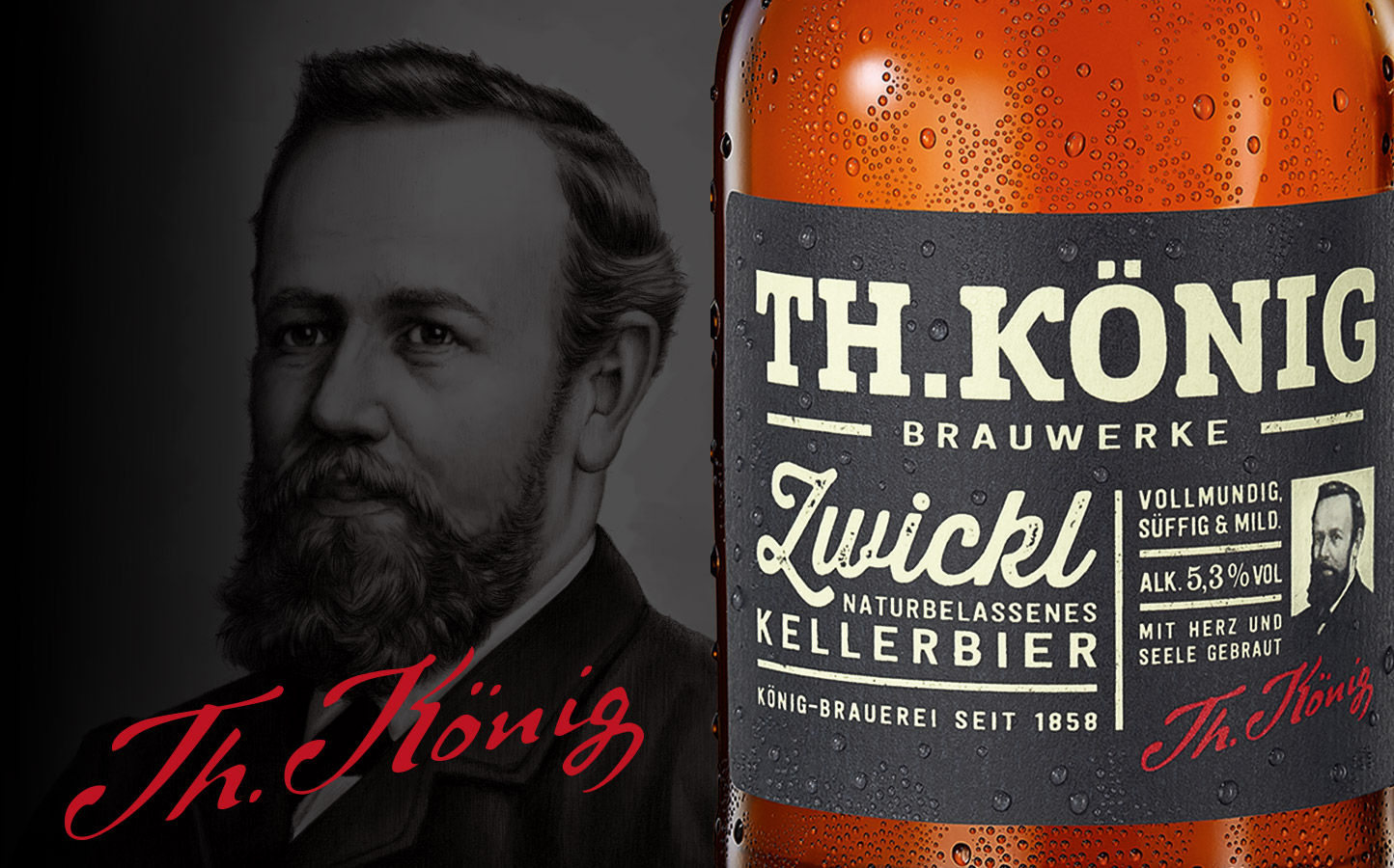
The König Brewery in Duisburg is best known for its König Pilsener, known colloquially as KöPi. This speciality beer, TH-König, is a full-bodied and mild Zwickl that was created in homage to the brewery’s founder, Theodor König.
Its beautiful label, created by Hamburg branding and packaging agency Christoph Petersen Design, uses a black-and-white portrait of the great man, along with his signature, to draw on this strong sense of tradition, while the typography-led, grid-based design feels thoroughly modern. You can see more of the product’s branding and packaging here.
02. Becks 1873 Pils
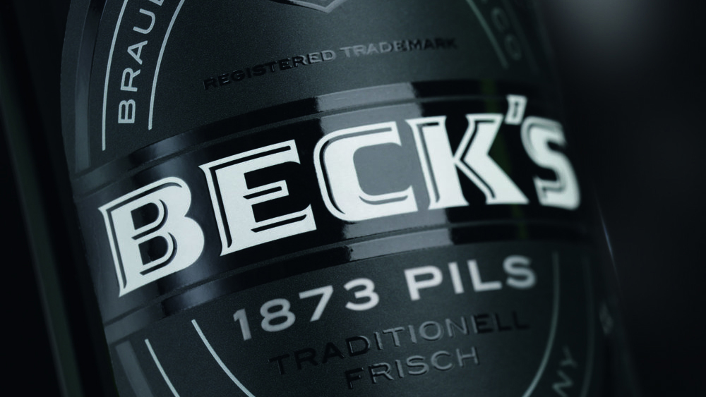
In 2015, iconic German brewer Becks launched a new trio of beers under the title ‘Taste the World’. each representing a distinctive national tradition. Hamburg agency Solutions Branding & Packaging Design were asked to design some suitably distinctive packaging, and they pulled it off with aplomb. The design for the 1873 Pils, shown above, builds on what’s great about the classic Becks label, but gives it a darker appearance and sleek silver lettering that perfectly conveyed the product’s premium essence.
03. Wernesgruner 1436
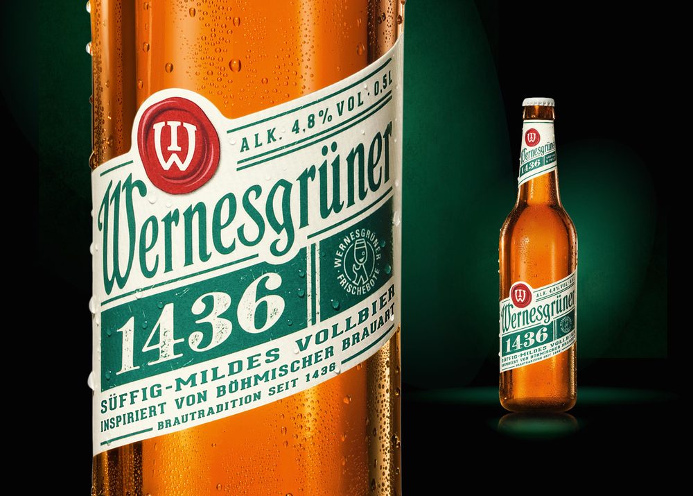
The Wernesgrüner Brewery in Saxony began in 1436, when the brothers Schorer acquired the rights to brew and open a tavern. Named after that founding year, their Czech-style beer ‘1436’ draws on that immense heritage, but also incorporates a cool, modern-retro feel. Christoph Petersen Design’s packaging design points clearly to the past, by presenting the beer in a traditional amber bottle, and with a reinterpretation of the medieval seal. But at the same time, the slanted lettering and punchy greens and reds add a suitably contemporary vibe to the product.
Sign up to Creative Bloq's daily newsletter, which brings you the latest news and inspiration from the worlds of art, design and technology.
04. Warnsteiner art collection
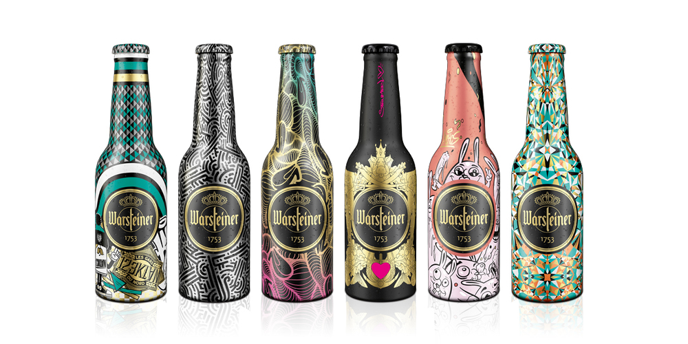
Warsteiner beer is brewed in the Arnsberg Forest Nature Park in North-Rhine Westphalia. To celebrate their 260th anniversary, they teamed up with a group of gallery and street artists including Stefan Strumbel, Aaron De La Cruz, Brooke Reidt, Nychos, 123KLAN and INSA, along with packaging specialists The Ardaghgroup, to create this collection of limited-edition bottle designs. Layering together solid covering colours, brushed, transparent metal effects and gold tones, these beautiful bottles are real works of art, and became instantly collectible.
05. Mazelprost
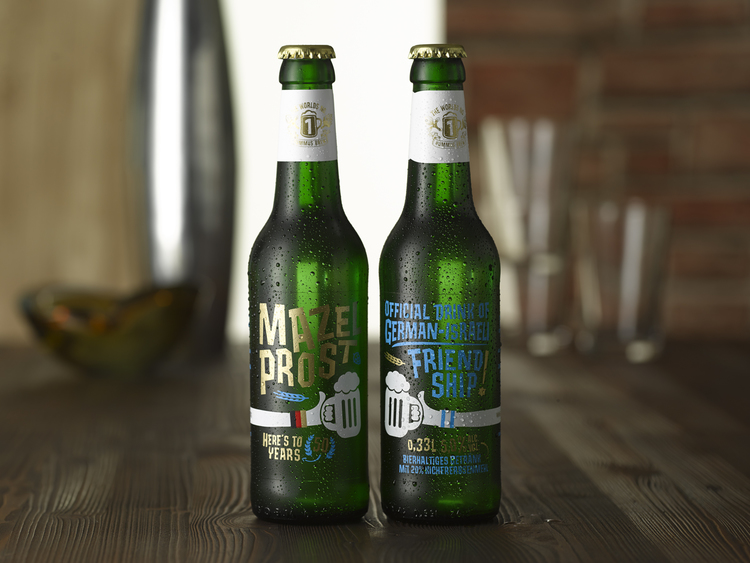
In 2015, the Berlin-based Schoppe Bräu brewery created a special craft beer to celebrate 50 years of diplomatic relations between Germany and Israel. The name ‘Mazelprost’ combines the Hebrew and German equivalents of ‘Cheers!’ (‘Mazel Tov!’ and ‘Prost!’), and is believed to be the world's first hummus beer. Co-designed by the German and Israeli branches of BBDO, there’s a colourful and cartoonish feel to the labelling that stands in stark contrast to the bitterness of the past and looks instead to a friendly future. We particularly like the way the fun and non-threatening way the national flags have been subtly incorporated into the design.
06. Brau:Zeit
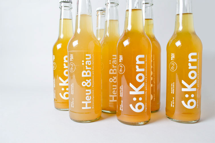
Brau:Zeit is a microbrewery based in Lake Constance, a lake on the Rhine, which focuses on high-quality handcrafted brewing, with locally grown, all-natural ingredients. It wanted a design that would help its beer stand out on the shelves, and media designer Daniel Zenker certainly gave them that. The clear bottle lets the consumer view the product directly, while the minimalist white type adds an eye-catchingly trendy touch.

Tom May is an award-winning journalist specialising in art, design, photography and technology. He is the author of the books The 50 Greatest Designers (Arcturus) and Great TED Talks: Creativity (Pavilion). Tom was previously editor of Professional Photography magazine, associate editor at Creative Bloq, and deputy editor at net magazine.

