We're heading towards the end of the year now, which means it’s time to pause and assess the web design trends that have defined 2022. It's been an eventful year, with a number of trends emerging and evolving, while others have dropped off the scene entirely. See our roundup of web design trends of 2021 to compare.
In terms of commonalities between these trends, we’re seeing a growing love of retro fonts and aesthetics, a bigger focus on homemade/less polished elements, and a continued push towards ever more interactive, playful interfaces. We’re also seeing a bigger push towards finding a balance between looks and speed: the latest web design statistics show users have higher expectations post-Covid, and this includes both loading times and aesthetics; a balancing act we’re all just figuring out.
So, without further ado, let's take a look at the best and worst web design trends of 2022 so far. First up, some of the best…
2022's best trends
01. Memphis design

Memphis takes inspiration from the 1980s. It's popular now because it's a departure from the minimalist, more 'tasteful' formal looks that have found favour among the design crowd in recent years (plus all things '80s have been having a bit of a moment these past few years – looking at YOU, Stranger Things - see our Stranger Things fonts roundup to get in on the action).
Memphis design is fun, colourful, and chaotic – so use it when you want to add some personality and playfulness to your site. Fashion and lifestyle brands, food retailers, and so on – go right ahead. Funeral directors and banks – this one isn’t for you. Unless… well, you do you.
02. Retro looks

We've already touched on the '80s revival that's happening in web design (and beyond). This year, we're seeing a similar trend emerge with other decades – most notably the internet aesthetic of the '90s.
Now obviously '90s sites weren't known for looking, shall we say, chic (it's a love/hate thing), so we're not recommending you copy them to the letter – but they did have some elements you can pinch.
Notably, bright colours, geometric shapes, retro fonts, and purposefully pixelated icons. Ahh, sweet nostalgia! This trend is perfect for fashion brands, music retailers, and anyone else who wants to add a bit of fun and personality to their site, while giving an ironic nod to the sites of yesteryear.
03. Visible borders

This is a trend that's been slowly bubbling away for a few years, but it's now becoming more mainstream. The idea is to use borders around elements on your site to make them 'pop' and help them stand out.
It can be used sparingly to add some interest and focus to key elements, or more broadly across the entire site. Be careful though – too much of it can make your site look 'busy' and cluttered.
See above for an example done well: the visible grid provides a sense of order and cohesion, and helps the viewer pick out relevant information quickly. 10/10!
04. Grainy gradients

Gradients have been around for a while, but they're now becoming more complex and experimental. Designers are playing with a wider range of colours, as well as more unusual colour combinations and textures. This trend is perfect for those who want to add some visual interest to their site, without going too crazy with patterns or colours.
05. Glassmorphism

This is another new trend that's starting to emerge. It takes inspiration from 2020’s neumorphism trend, but adds a 'glassy' sheen to elements. So, buttons might look like they're made of glass, or websites might have a 'sparkling' effect. Again, it's early days yet, but we think this trend has some potential.
Designers can use this effect to add some visual interest and uniqueness to their site. It can be used sparingly to create a focal point, or more broadly across the entire site. Be careful though – too much of it can make your site hard to read.
06. Behavioural design
Behavioural design is a relatively new trend that's starting to gain traction. The idea is to use design to influence and change user behaviour. For example, you might use gamification techniques to encourage users to stay on your site for longer, or you might use 'exit intent' pop-ups to try and stop them from leaving.
This trend is perfect for those who want to increase engagement and conversions on their site. However, it's important to use behavioural design techniques in a way that feels natural and unobtrusive. Otherwise, you risk annoying your users and driving them away. (Find out more with our UX design course.)
07. Neo-brutalism

Neo-brutalism is a new trend that's starting to emerge. It takes inspiration from the 'brutalist' style of architecture and applies it to web design. The result is a raw, stripped-back aesthetic that celebrates function over form. This trend is perfect for those who want to create a simple, impactful site that's easy to navigate and use. It also feels edgy, making it ideal for lifestyle brands. Think clubs, fashion retailers, and festivals.
08. Parallax scrolling
Parallax scrolling is a trend we picked up on in 2021 – and guess what? It's still going strong. Essentially, it's a way of adding depth and dimension to your site by making elements 'scroll' at different speeds. This can create a really immersive and engaging experience for your users. Be careful though – too much movement can be disorienting and off-putting. See our best parallax scrolling page for examples of what to do.
09. Moving type

This trend combines static imagery with small, subtle movements to create something that's both eye-catching and engaging. Cinemagraphs are a type of moving image that's becoming increasingly popular, as they're easy to produce and can be used across a variety of platforms (including social media).
Designers can use it (sparingly) to create a focal point, or more broadly across the entire site. Be careful though – as with all things, too much of any one trend can make your site look busy and cluttered.
10. Oversized typographic hero image

Big, bold, and impactful – that's what oversized typographic hero images are all about. This trend is perfect for those who want to make a statement with their site. These giant typographic statements take the place of imagery, and can be used to communicate a brand message or call to action.
Be careful though – this trend can easily be overdone. Use it sparingly (too many messages makes it feel like all the ‘voices’ on your website are talking at once), and make sure the text is easy to read.
11. Handmade graphics

2022 is all about embracing the imperfect – and while we all love digital tools for creating images and typography, we're after something a little more homemade.
As such, we're seeing a trend towards more handmade, organic graphics. This is in contrast to the clean, flat designs that have been popular in recent years. Designers are using hand-drawn elements and illustrations to add personality and charm to their site.
2022's worst trends
The worst trends of 2022 so far
When it comes to aesthetics, what one person loves, the other might hate – but in web design and UX in particular, there are agreed things that work, and things that don’t. Every entry on this list falls into the latter camp – aside from a few that made the list simply because they’ve been overdone to death.
01. Pop ups
We all know them, we all hate them. And worst of all, they’re still here.
Pop-ups are generally intrusive, annoying, and often completely irrelevant to the user. Also, why are you asking me to subscribe/allow notifications when I have literally JUST landed on your site. I don't know you. I have no idea what you want from me. This is the socially awkward equivalent of a stranger walking up to you and asking to be BFFs. Take note, web designers!
Beyond subscribe popups, advertising pop ups are also rife. You know the ones – you're minding your own business, reading an article, when all of a sudden a giant ad pops up and blocks half the screen. Or how about those video ads that start playing automatically (with sound!) as soon as you land on the page? Yeah, we hate those too.
The solution? Pop-ups should only be used sparingly – and even then, only if they're relevant to the user. If you must use them, make sure they're easy to close and that they don't block the content. And please, for the love of God, don’t have automatic sound. Speaking of which…
02. Auto-playing video and audio
We get it, you want us to watch/listen to your latest video/podcast episode. But do you really think we're going to do that when we're at work, in a public place, or just trying to read an article in peace? No, we're not. We'll close the tab faster than you can say ‘shut it.’
The solution? Don't auto-play video or audio content on your site. If you want people to watch/listen, give them the option to do so, don't force it on them. On the flip-side, if you do it well, you can have a positive impact: According to recent conversion rate statistics, the average session duration is around three minutes – so if you make that video/ audio engaging, you can easily bump this up.
03. Slow loading sites
No one likes a slow website. A slow loading site is not only frustrating for users – it also has a negative impact on your SEO.
The solution? Make sure your site is optimised for speed. This includes compressing images, using a caching plugin, and reducing the number of plugins you use.
04. Too much text
We live in a world of sound bites and short attention spans – so it's no surprise that long blocks of text are a major turn-off for users. No one wants to read a wall of text, no matter how well written it is. But what about SEO, we hear you ask! Well contrary to popular belief, you don’t need miles and miles of text to rank. Just enough to provide real value to your readers.
The solution? Hire a copywriter so your text is pithy and to the point. Oh, and break up your content into shorter paragraphs, and use headings, bullet points, and images to break up the text.
05. Complicated navigation
A complicated navigation can be a major barrier for users. Things like too many options, or pages titled non-obvious things are a no-no. If your navigation is confusing, chances are people will just give up and go somewhere else.
The solution? Keep your navigation simple and easy to understand. Use clear, descriptive labels for your links, and organise them in a way that makes sense.
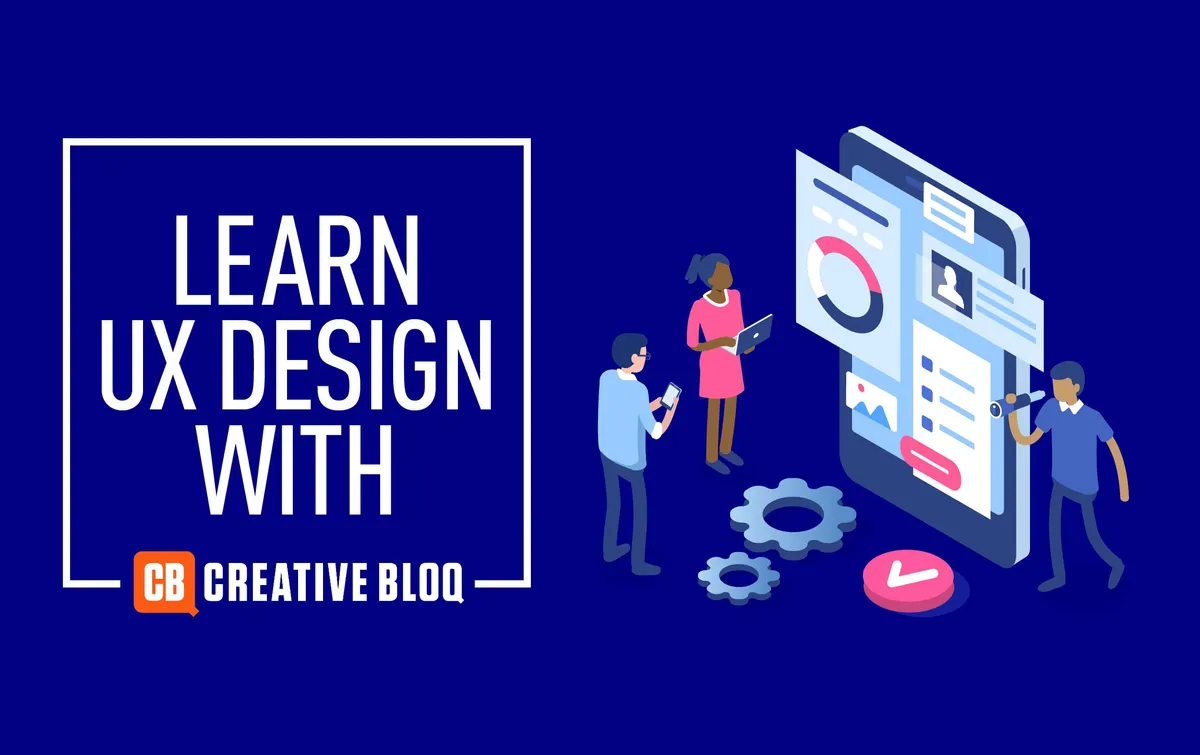
Want to learn more about creating good web experiences? Sign up to our UX Design Foundations course. It's fully remote and open to everyone.
Read more:
- 53 web design tools to help you work smarter
- The 7 deadly sins of web design
- 10 NFT trends that could change the world

