The best (and worst) web design trends of 2021 so far
We’re halfway through 2021 – the perfect spot to stop and take stock of what the year’s brought us so far in terms of web design.
If there’s a golden thread that runs through all of our favourite designs, it’s not that they’re super-futuristic or doing anything mind-blowingly novel – it’s that they’re practical yet playful, eye-catching yet easy on the eye – and most importantly, they’re user friendly. When it comes to the trends we’re not so keen on, it’s usually because we’re seeing designers getting carried away with the look of something without really considering the poor, confused user.
From abstract shapes and retro fonts, to 3D modelling and clever audio – there’s a lot to enjoy. Whether or not you think trends are good for branding or not, there's no escaping them to an extent. So here are the best (and worst) design trends of 2021 so far. And if you want to create your own designs, don't miss these web design tools (or just marvel at these 404 pages for more web fun).
Article continues below01. Bold colours
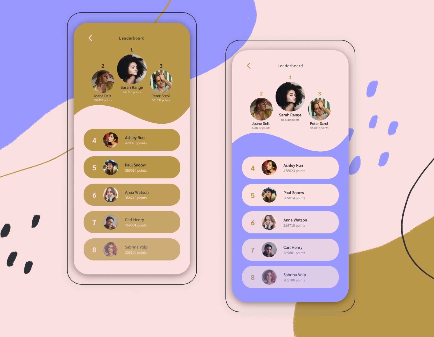
First there was harsh white, then the inky black of dark mode. Now, designers are embracing vibrant colours – from the infectiously warm, to colour-clash palettes that are impossible to ignore.
Given 15 minutes to consume content, two-thirds of people would rather read something beautifully designed than something plain. Incorporating bold colours into your website’s design is one way to hit that brief.
Alongside bold colours, we’re also seeing a rise in abstract shapes (brightly coloured, too) as an alternative to photography or illustrations. Nature-inspired formations, lava-lamp blobs, Pollock-esque splotches – these designs exude freedom and energy when splashed across a page.
02. Use of audio
Auto-play audio has been without a doubt one of the most annoying web trends of the past decade (with special mention to those ads that start up unannounced) – but we’re not ready to write it off entirely.
Sign up to Creative Bloq's daily newsletter, which brings you the latest news and inspiration from the worlds of art, design and technology.
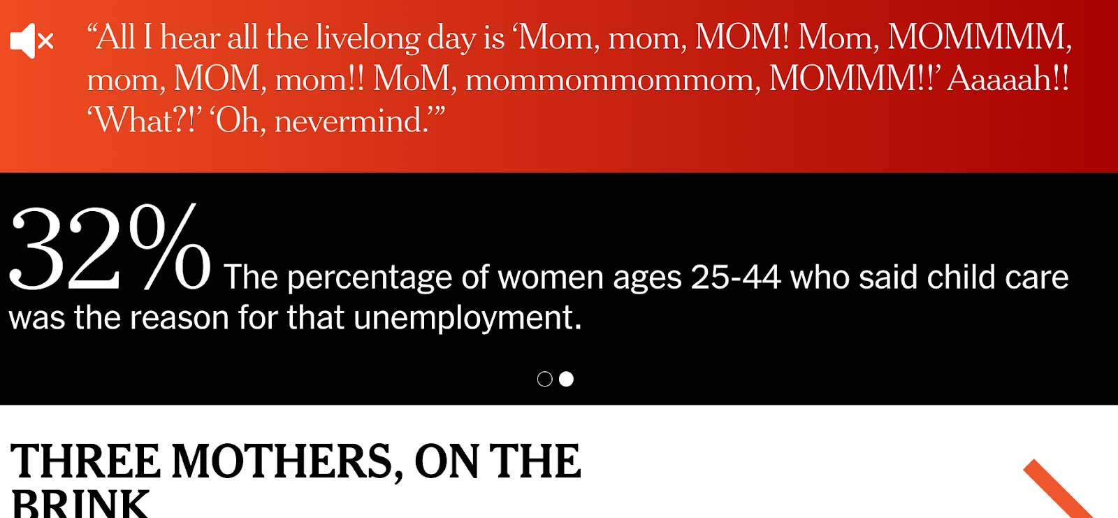
Used sparingly, within context, and under the control of the user (i.e. they get to choose when it activates), audio can be both welcome and enhance the user’s experience. The New York Times did this brilliantly in a recent article about mothers in lockdown. An important design factor here is that the audio is initially muted, which means it’s up to the user whether they play it or not.
Another benefit to having audio on your site is that when it’s done well, it boosts dwell time. According to recent conversion rate statistics, the average session duration is around three minutes. With audio, you can easily bump this up while your spellbound audience stops to listen.
03. Parallax transitions
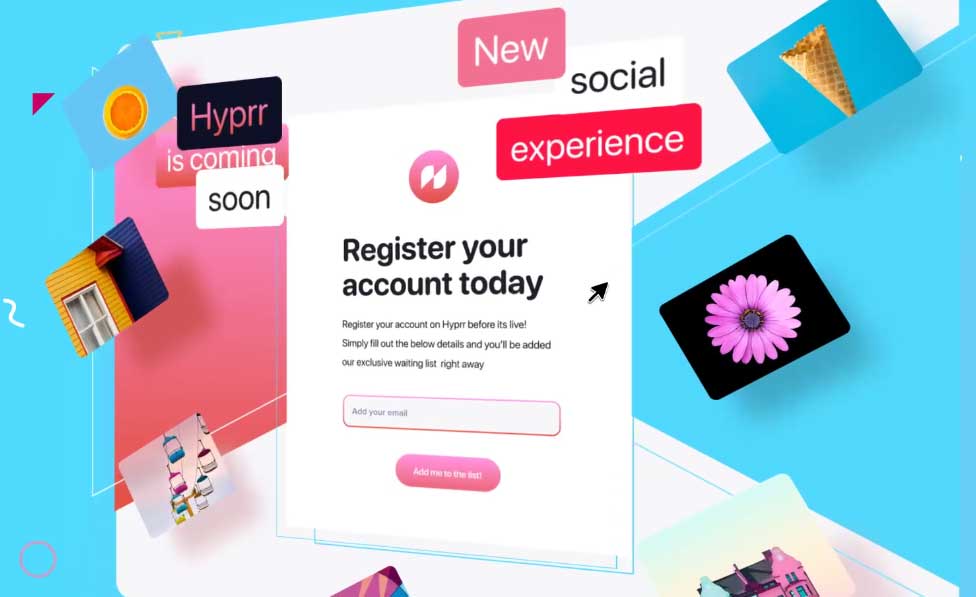
Web-based animation trends have been on the rise, and parallax scrolling and transitions are where we’re at in 2021. It’s done by separating page elements into foreground and background elements, giving the viewer an immersive feeling of depth.
04. Retro fonts
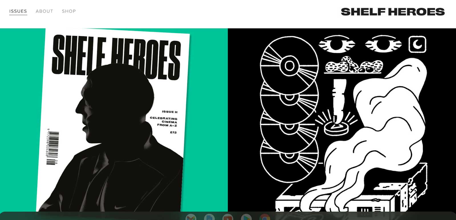
We’ve seen a big return to once-cool fonts that fell out of favour and have swung back around again. But rather than just reuse the typography of the past, designers are re-imagining these traditional typefaces for 2021: vintage fonts of the ‘70s and ‘80s have been spruced up with bold new colours to give them a fresh new look.
Check out Creative Bloq's best free fonts list if you want some typography of your own, as well as the best retro fonts available.
05. 3D animations
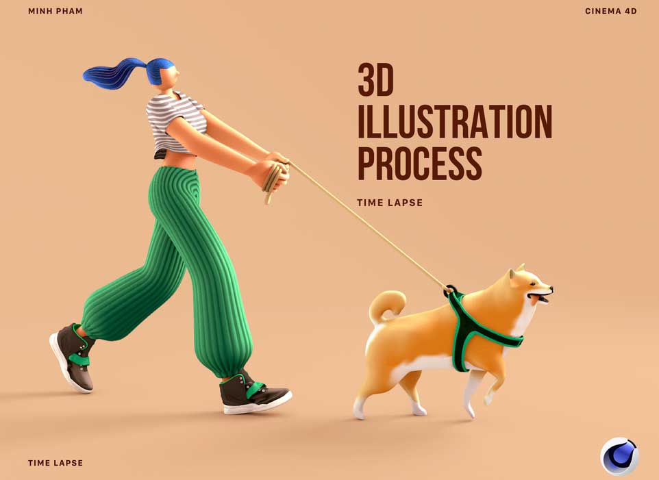
Three-dimensional images are bringing a tactile element to web design, with drop-shadows, and semi-flat colours, which in turn creates an immersive experience for the viewer. See our best 3D modelling software or animation tools to create your own.
06. Dark mode on websites
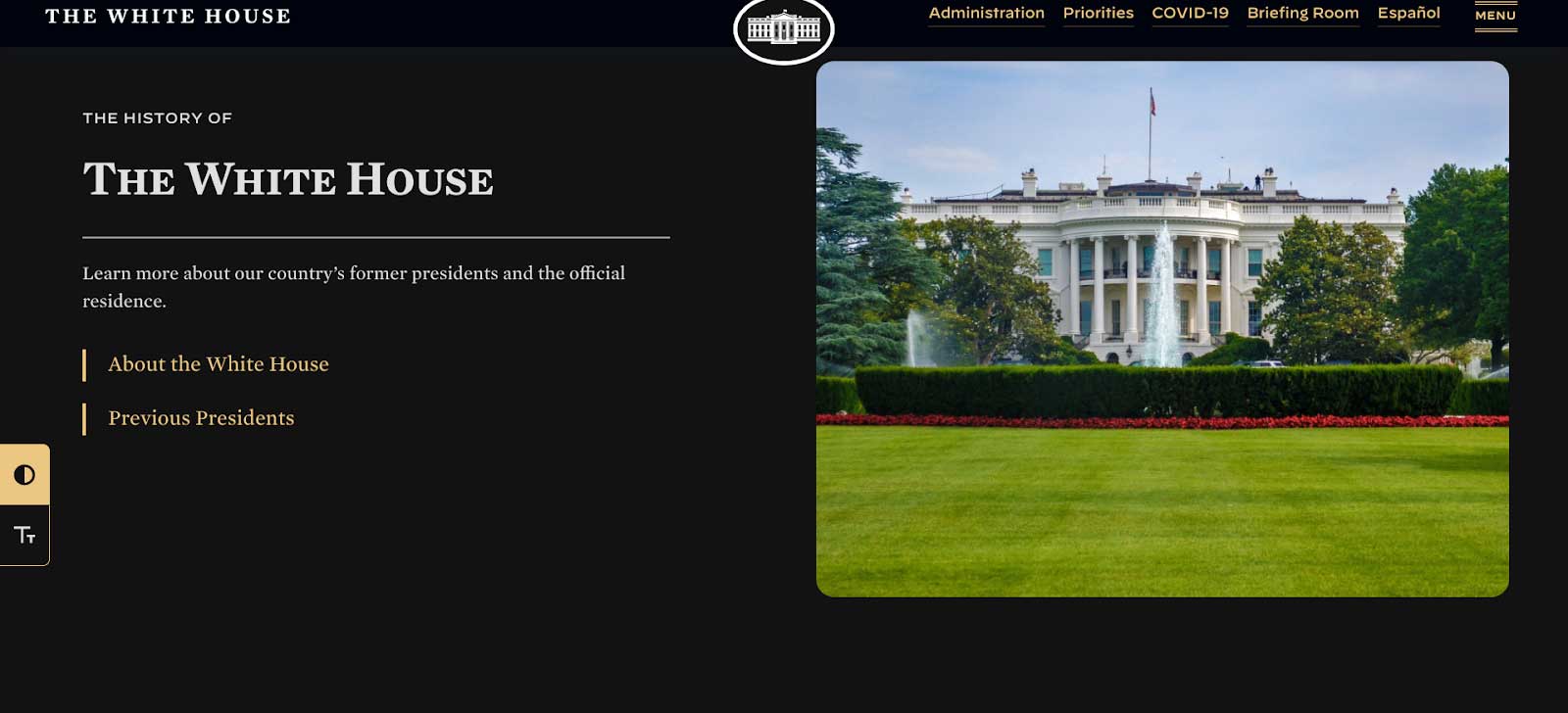
Technically speaking, this was a trend that began a couple of years ago on social media, but now we’re really seeing it really come into its own as designers embrace the dark as a striking backdrop to make images pop. The White House added dark mode as an option to its site in 2021.
Some of the worst trends of 2021 so far
As with all things to do with style, what we think looks good is subjective – but when it comes to web design, there’s one guiding principle behind something flying or flopping – and that’s UX. If the design makes things harder for the user, then it’s a thumbs down. Here are some of 2021’s rising trends (that we hope will soon disappear).
01. Scroll hijacking
Scroll hijacking is a usability nightmare. Not only does it sit outside UX design principles – it’s also just really annoying.
Scroll hijacking is when a designer makes it so that the scroll bar behaves differently on their website. This could include a redesigned bar, fixed scroll points, or scrolling that speeds up or slows down at a certain point on the site.
They’re controversial because scroll bars are designed to behave universally in the same way, wherever you use them. And when they don’t, it’s jarring – a big part of the reason they’re widely disliked.
02. Irrelevant illustrations

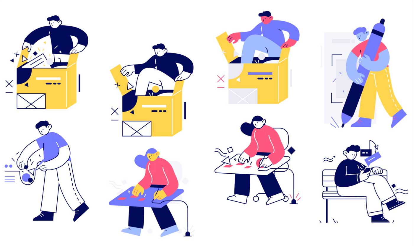
Is it just us or are these oversized-limb-people illustrations everywhere? Illustrations like this win over boring stocking images hands-down – they add personality and charm to a blog post or website. But – and it’s a big one – we’ve reached saturation with this particular illustration trend.
If you want a stock image alternative, we recommend working with an illustrator or 3D designer to get something custom-made for your site. If budgets are tight, then by all means go for a free stock illustration (UnDraw is a good option) – but use them sparingly.
03. Extreme minimalism
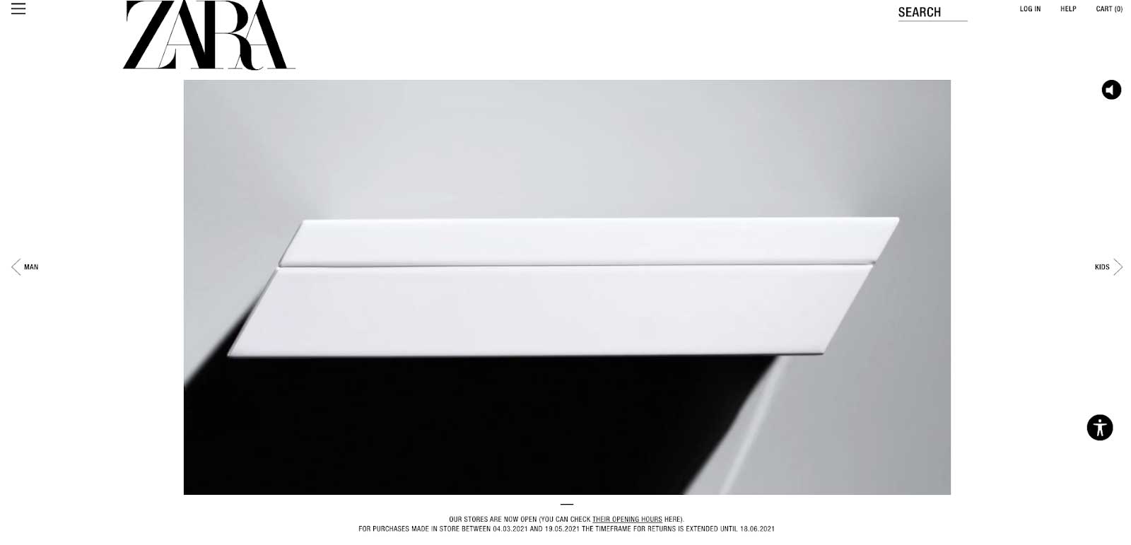
Minimalist website design is achingly cool when done right, but all too often, it’s overdone to the point that the user just has no idea what to do, where to go, or what the website is even about.
We’re also seeing it being overused in the wrong places. Case in point? Zara.com. While the homepage looks nice, it’s near impossible to tell what it actually sells. Speaking of which….to get to the threads, you need to click on that tiny hamburger menu up there in the corner. It’s manageable, but figuring out what you need to do takes a millisecond longer than it ought to – which means that from a UX perspective, it’s a fail.
The product pages aren’t much better. While these lifestyle shots are good for getting across a mood, there are too many, and it slows the user down in their browsing journey: you have to scroll through one lifestyle shot after another, rather than getting to dive into the grid-view layout we’ve come to expect from low to mid-price clothes sites.
04. Near-endless scrolling
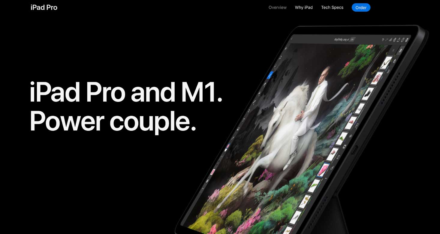
There’s a lot to love about the iPad Pro product page: it’s clean, there are scrolling transformations, there’s parallax design in there… but it just goes on and on and on.
Scrolling websites save the user clicking through to reach information – but there needs to be a cap on how much scrolling the user has to do. If you push past that limit, then that’s potentially important website content the viewer is missing.
The key here is to be concise. You have around 7 seconds to hold a website visitor’s attention, so keep things as short and to the point as you can.
Note that near-endless scrolling isn’t the same as infinite scrolling, another feature that lets visitors access new content simply by scrolling instead of clicking.
05. Horizontal scrolling
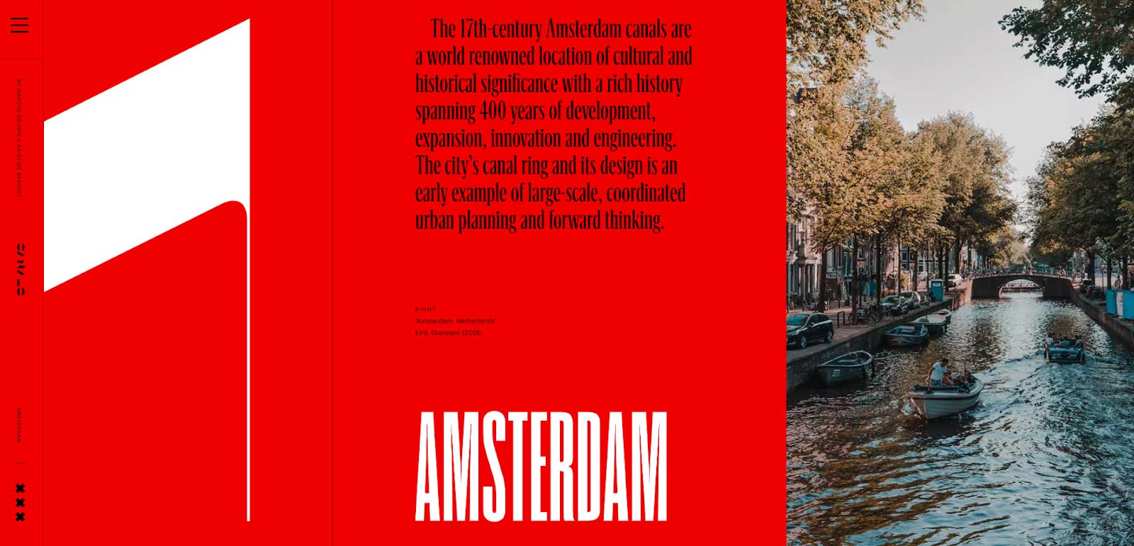
We’re not saying horizontal scrolling is a trend that has no value – but you also need to know why you’re changing default scroll behaviour and how it’s improving user experience. When you make a website scroll horizontally, you’re intentionally going against what your visitor expects – so make sure it has a legitimate purpose beyond looking cool.
There’s a lot to love about this site: stunning typography, parallax scrolling, bold colours and crisp photography. And there’s a point to this site’s sideways scrolling: the goal is to make it feel like you’re flipping through a high-end coffee table book, and – mission accomplished. In short, this is horizontal scrolling done right.
Read more:
- The 17 best typewriter fonts
- These are the hottest logo design trends in 2021
- Logo design: All you need to know

Irwin is the founder of Chromatix Website Design, an award-winning web design and conversion agency based in Australia. Since 2009, he has analysed 60,000+ websites and gone on to amass over 80+ industry awards and mentions for his work. Alongside running a busy digital agency, Irwin also manages Neon Bright Copywriting, a conversion copywriting collective, and Irwin Hau Business Coaching, a business consultancy that specialises purely in digital transformation and business efficiency utilising custom web technology solutions.
