Are trends any good for branding?
Top designers discuss the role that trends play in branding.
Sign up to Creative Bloq's daily newsletter, which brings you the latest news and inspiration from the worlds of art, design and technology.
You are now subscribed
Your newsletter sign-up was successful
Want to add more newsletters?
However hard agencies fight against it, branding has always been subject to stylistic trends. Whether brands embrace or resist the status quo, the fact that some kind of aesthetic benchmark exists remains significant.
Arguably, there’s some value in a new launch sharing certain visual characteristics with the rest of its sector. It helps build familiarity and trust, as a sort of visual shorthand for consumers. There’s no denying that standing out is always easier if you position yourself against the grain of a trend, but you must work a lot harder to do so successfully. Either way, just make sure you outline you ideas clearly, like in these meticulous design style guides.
For Wolff Olins' chief creative officer Chris Moody, it’s clear which route to take. His view is that trends are to be avoided at all costs. “House styles suck, trends suck, looking like your competitors sucks,” he says.
Article continues below“I rate originality and distinctiveness above craft – sometimes even above practicality,” Moody goes on. “Creative movements are circle jerks that only satisfy those in them. Designers should care less about what other designers think, and more about exciting, surprising and energising the end user.”
It’s a rousing call to arms, and few designers worth their salt would disagree with the notion that the end user should be front and centre for key design decisions. However, trends still have their place in some designers’ creative processes.

“In their early stages, trends can be useful to help align you with a style of work, a movement,” says Rob Coke, an executive creative director based at Output. “The brand benefits from being seen as contemporary, part of the culture. It’s possible to be part of it and yet put a different spin on it.”
Coke points out that branding often reflects wider aesthetic movements in architecture, interiors, art and culture. He acknowledges that this is not a recent phenomenon, although the immediacy of trends – and the speed of their proliferation – has changed considerably.
Sign up to Creative Bloq's daily newsletter, which brings you the latest news and inspiration from the worlds of art, design and technology.
“In the distant past you’d find out about Modernism and the Swiss Style by trawling through Graphis annuals at college. In the '90s, people were inspired by Postmodernism, Deconstructivism, or a grungier, cut-up ‘end of print’ aesthetic,” he says.

“These days, things are more homogenised. Designers aren’t forced to hunt around for obscure inspiration: everyone’s looking at the same references, in real time. There’s a recognisable ‘online look’: a vaguely European, friendly aesthetic, balanced by a sense of craft communicated through hipster symbolism and mid-century colour palettes.”
Coke is quick to assert that once trends become ubiquitous, they descend into cliché and are best avoided at all costs. “That’s how a counter-trend starts, like the rush towards serif typography as a reaction to the ubiquity of geometric sans,” he says. “Smarter agencies know how to give their work a contemporary feel, but to build it around strong ideas. This is always what sets original work apart from the herd.”
Why trends risk homogenisation

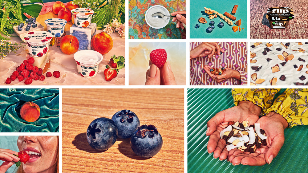
Sometimes, a single stand-out piece of work attracts enough attention in a particular sector that it creates an almost immediate spike in ‘me too’ brands, accelerating the formation of a trend. Koto founder James Greenfield believes exactly that happened last year, following the celebrated in-house rebrand of ‘America’s number-one Greek Yogurt’, Chobani.
“Its Matisse-like, cut-out style and reboot of typefaces with a 1970s feel have seen a plethora of similar identities come out in the past six months,” he says. “That being such a stand-out piece of work in 2018 will cause the trend to come and go quicker than it might have otherwise. It also requires a certain amount of talent and flair to carry off, making the distance between the original and the copies even more stark.”
Johnson Banks founder Michael Johnson draws attention to “the preponderance of ‘technology-serif’ brands”, lamenting the fact that tech companies often default to similar geometric sans serifs in their branding.
“There was once a school of thought that all branding should be timeless,” says Johnson. “Now, many rebrands happen within four or five years, rather than every 10 or 15. Branding has become much more tactical, and we’re seeing more designs that are style based.”
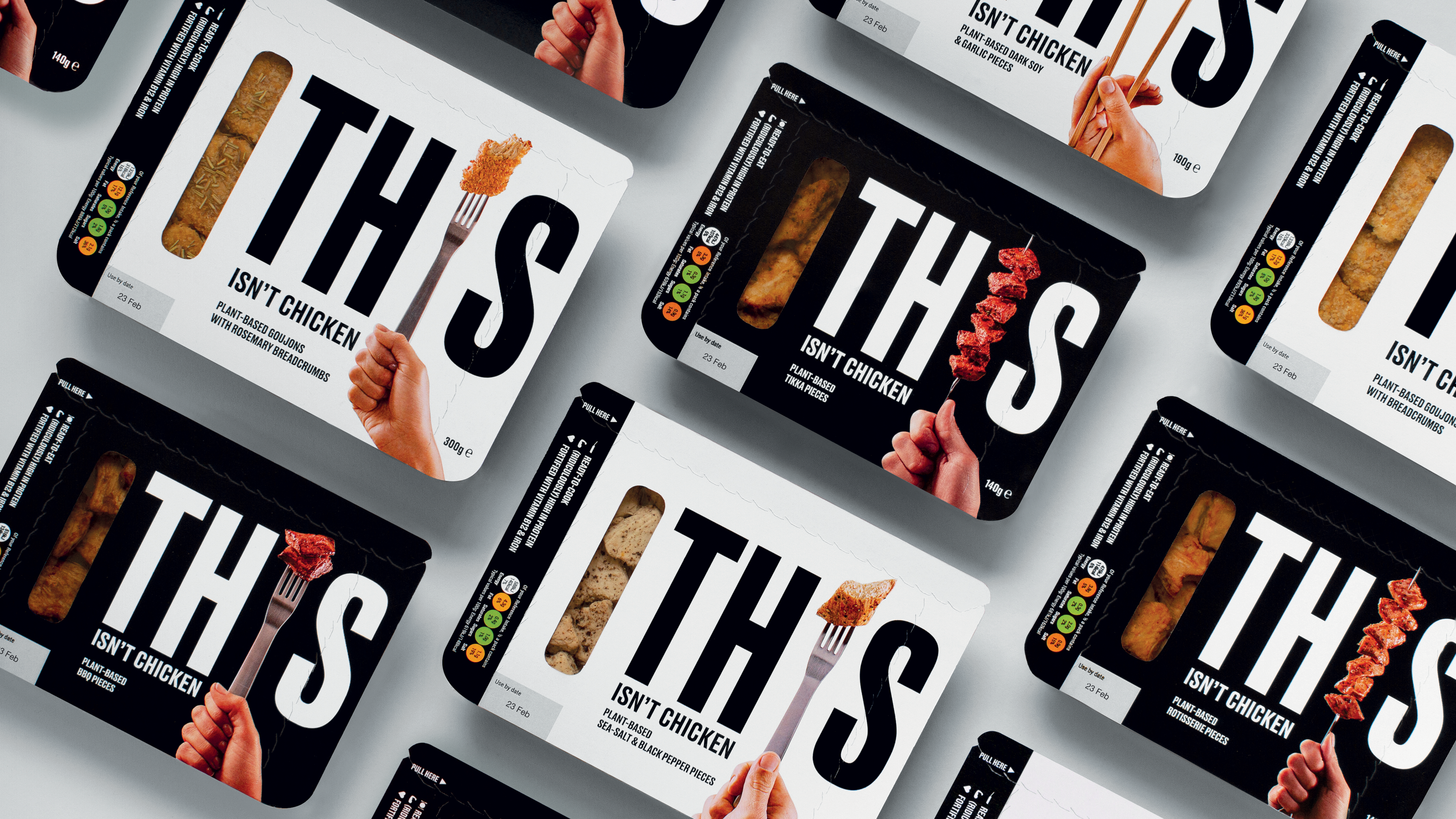
Spencer Buck, co-founder and creative partner at Taxi Studio, concurs: “There’s a lot more style-over-substance branding, and worse, seemingly unnecessary rebranding at present,” he says.
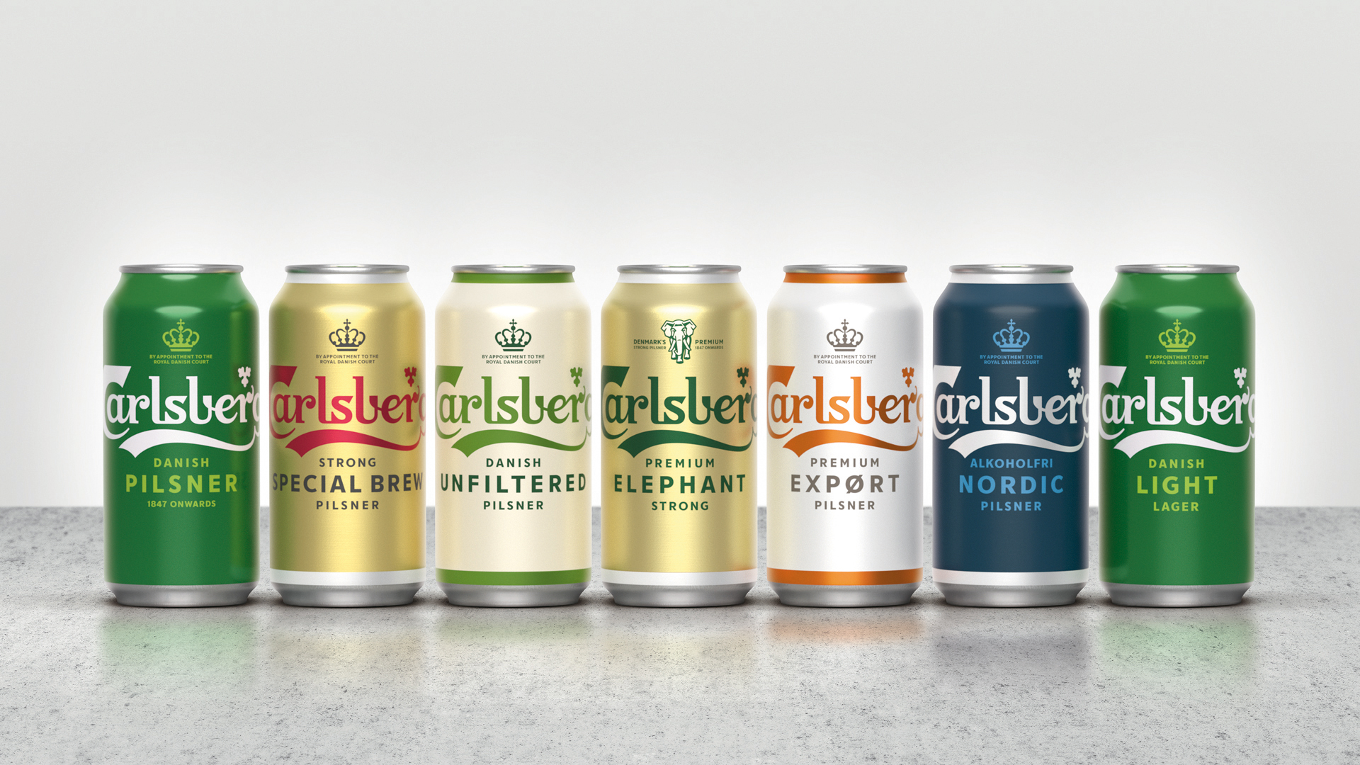
This is exactly the mindset that Taxi fought against with its recent global rebrand of Carlsberg. Its pared-back, distinctively Danish aesthetic has been crafted with timelessness and longevity in mind, making it a great example of an ‘anti-trend’ rebrand that doesn’t need to be rehashed every few years.
Buck highlights luxury fashion as another sector losing its individuality. “It’s bizarre,” he shrugs. “By definition fashion is trend-driven, but that doesn’t explain the homogeneity in a sector that exists because people desire visual differentiation and disruption.”
Ironically, disruption can be a trend in itself. It must be done for the right reasons to be a differentiator, rather than a source of confusion. “The alcohol industry has shrugged off most of its dusty old category conventions, starting with the wine category two decades ago,” says Buck.
“Now the baton has been passed from wine to rum, vodka, gin, craft beer and so on. Anything goes branding-wise, which means very little actually sticks. You can plonk any style of illustration, type or photography on a can or bottle of booze and get away with it because it’s ‘trendy’. And that’s the problem.”
If everyone’s shouting at the top of their voice then no one gets heard – which is why the quiet, crafted confidence of Taxi’s Carlsberg rebrand is so effective by comparison. “Chaos breeds the new normal. It becomes wallpaper,” says Buck. “Even if the work is impeccably executed, it gets lost in a different sea of sameness category by category. If everyone is disrupting, nothing is disruptive.”
Trends in different markets
While some markets used to be more reactive to trends than others, Greenfield believes that’s no longer the case. “Finance has as many trends as FMCG, and within that lie many nuances,” he says.
Coke agrees that trends are prevalent in any sector these days, and he expands on the finance example: “Once banks were all about authority and trust, and the colours, imagery and tone of voice reflected that. First Direct stood out by balancing a stark, modernist black-and-white aesthetic with a quirky, friendly voice,” he says.
“Now, open banking regulation has thrown tradition up in the air, with newcomers like Monzo introducing emojis, animation and downto- earth language. This is already becoming a cliché in itself, with several brightly coloured brands popping up.”
Monzo is a much-quoted example of a disruptor kick-starting a trend, and Moody adds Bulb to the list as a comparable challenger in the energy sector. “Every sector has its tropes and clichés,” he points out. “It’s fascinating that whenever someone breaks out of those they are heralded as mavericks.”

Studio Texture’s strategy director Louise Kyme has particular expertise with charities and not-for-profit organisations. She believes this sector is still getting to grips with the idea of a brand having its own distinctive personality, rather than following trends.
“As the big brands lead the way with chunky budgets and big, ambitious agencies, smaller charities tend to follow diligently in their tracks,” she says. “Rather than taking the opportunity to be risk-taking challengers, we end up with more fighting brands, and more sad advertising.”
Part of the issue, Kyme believes, is that branding is still perceived by much of the public as a waste of charity funds. “As a consequence, charities tread with caution throughout the process, which inevitably results in trend following, rather than trend setting,” she continues. “This is a shame, although I suspect a rebel charity brand will shake us up soon.”
Where are the biggest trends?
One of the most immediately striking trends within any given sector concerns choice of colours – particularly what Coke describes as the ‘Airbnb-ism’ of brand palettes. “It’s not just about the use of pink, but the approach to colour as a whole,” he says. “We now see a lot of range-ambiguous colours, with evocative names, sitting around the colour wheel.”
Much of this comes down to how much harder brand palettes have to work nowadays. “It’s not just about having one or two recognisable brand colours for marketing communications, but about introducing range and tone to digital products and platforms,” adds Coke. “Of course, there’s a danger that every brand can be every colour these days, which can be harmful when you’re trying to create distinctiveness.”
Having overseen the Airbnb rebrand while he was creative director at DesignStudio, James Greenfield admits some responsibility for the trend that Coke identifies. “Bright, poppy palettes have been popular for a good eight years now, and show no signs of abating,” he says.
“Some adventurous brands are trying out some more muted approaches, but this requires talent in deployment,” Greenfield goes on. “The fact of the matter is, there are only 12 to 14 main colours to choose from, and the nuance of how you work with them is the skill. Colour is just one component of a bigger brand world these days, and it’s one of the last things we get locked down on most big branding projects.”
Kyme agrees that bright, flat hues making up multi-colour identity schemes are the order of the day, particularly among digital-first brands. “In the context of this, there’s still equity in owning a single colour or narrow palette,” she points out.
“We’ve also noticed brands making a special effort to steer clear of gender colour-stereotyping or colour-coding, especially in areas where they want to promote and re-establish gender balance, such as in education and skills,” adds Kyme.
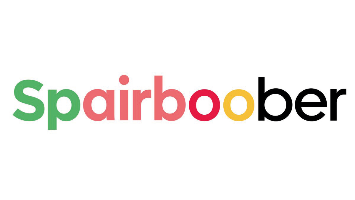
Within the field of typography, those ubiquitous geometric sans serifs still abound among digital-first brands in particular. It’s a well-trodden trend that Johnson Banks mischievously emphasised on Twitter in September 2018 by fusing the word marks of Spotify, Airbnb, Google and Uber into the Frankenstein-like creation ‘Spairboober’.
“This style is largely responsible for what people are calling ‘global blanding’,” says Coke. “The use often comes down to practical reasons around legibility and recognition at small sizes, but it’s leading to a world of sameness and provides opportunities to buck the trend.”
As well as quirky serifs and expressive scripts injecting more personality into branding, dynamic variable fonts are another exciting counter-measure. Wolff Olins has worked extensively with Colophon and Face37 on exactly that: “Both get the fact that type should be intelligently powered,” explains Moody. “The work that went into our Lafayette Anticipations typeface was immense. It could recognise when two similar characters sat together, and automatically swap in an alternate.”
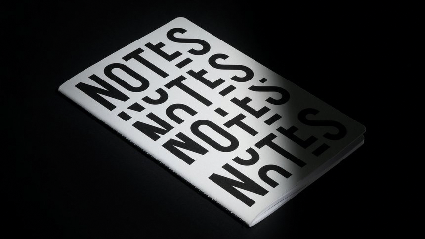
Moody also heralds the use of ‘smart’ illustration – which can adapt to cater to local markets and cultural nuances – as a key part of a modern brand’s toolkit. “The work we did with Signal Noise on data visualisation for our recent McKinsey work was a real eye-opener for me as to how data could be used in a truly illustrative, beautiful way,” he says.
“Illustration is the antidote to the stock imagery trend,” says Andy Howell, co-founder and creative director at The Clearing. “More often than not, stock images are an aspirational or unrealistic representation of real life. Unsurprisingly, that fails to build emotional connections with any audience.”
Emotional connection is what illustration does best, says Howell – and The Clearing used it to great effect to appeal to families in its recent Wimbledon rebrand. “It’s not trying to be realistic, and that’s exactly why it’s relatable,” he adds. “We can all imagine ourselves within the story. Stylistic trends within illustration come and go, but using illustration for storytelling is here to stay. Let’s embrace that.”
Coke agrees that illustration can be invaluable for brands to express character and playfulness, and to find that all-important point of distinction in a trend-driven world. “When almost every website leads with a centred headline over a full-bleed image of vaguely trendy, happy people, illustration provides potential for difference,” he adds.
What clients and consumers want
Of course, many of the bigger-picture trends that affect the industry at its core aren’t stylistic at all: they concern the constantly shifting landscape of consumer attitudes, expectations and behaviour.
Consumers expect more of brands than ever before, and the pressure is on to step it up. “If it’s made up, false or inauthentic, people see straight through it,” confirms Johnson. “Our decision is simple: only work with brands – and people – that you can trust or believe in.”
Trust has been a particularly thorny issue in the charity sector in recent years, reveals Kyme, as high-profile failures and public critique of chief executive pay have dragged the worst parts of the sector into the spotlight.
“Audiences are warier of charity marketing techniques, partly because charity marketing has become increasingly commercialised,” she says. “This misses the chance to tell a genuine story. That’s not easy to achieve, but we believe it’s where the real opportunities lie.”
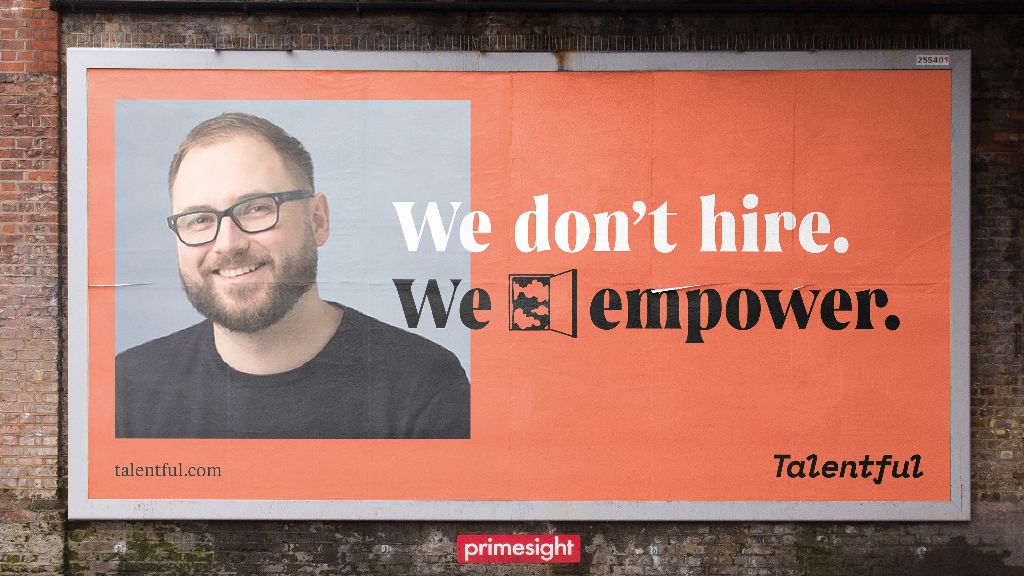
According to Howell, it’s all too easy for brands to become blinded by the success of others and lose sight of how they could find a point of difference. “Just look at the domination of Amazon and Google, and the rise of businesses clamouring to be just like them,” he says. “Finding a problem, a gap or a need – that’s where real impact can be had.”
For instance, The Clearing worked with Ownable - a service that bridges the gap between offline and online by making off-the-page purchases in a magazine as smooth and simple as clicking a website link. “While Amazon gives us an overwhelming amount of choice, Ownable helps you buy recommended products in just a couple of clicks,” he explains.
With budgets and time-frames becoming progressively tighter, the pressure is on from clients to deliver more for less. “The need for speed is overwhelming. It’s all about being ‘right now’ compared with ‘being right, now,’” says Buck.
“Quicker. Cheaper. Better. These three things used to be a choice. Now it’s a shopping list,” says Moody. “The brand industry is being disrupted, commoditised and put under pressure.” But he relishes the challenge.
“One way of looking at this is to say: ‘Isn’t it a shame we don’t have time to think about projects anymore?’ But I prefer to say: ‘Great, now we can get more stuff out in the world,’” asserts Moody. “Things are tougher? Good, it’ll get rid of the bullshitters and charlatans that have had too much airspace.”
This article was originally published in issue 292 of Computer Arts, the world's best-selling design magazine. Buy issue 292 or subscribe to Computer Arts.
Related articles:

Nick has worked with world-class agencies including Wolff Olins, Taxi Studio and Vault49 on brand storytelling, tone of voice and verbal strategy for global brands such as Virgin, TikTok, and Bite Back 2030. Nick launched the Brand Impact Awards in 2013 while editor of Computer Arts, and remains chair of judges. He's written for Creative Bloq on design and branding matters since the site's launch.
