The best new logos of 2020 (so far)
Whether they're created for a well-known brand or a feisty new startup, new logos can highlight the latest visual trends and give you fresh ideas about how to approach your own projects. But let's be honest: during the first half of 2020, the world has had a few other things to think about. And so even the biggest new logo designs have been easy to miss.
In this article, then, we recap the best new logo designs of the year so far, from small tweaks to radical rethinks. For further logo inspiration, check out all our posts on the our posts on the best logos by decade, or our ultimate guide to logo design.
01. Coronet Theatre
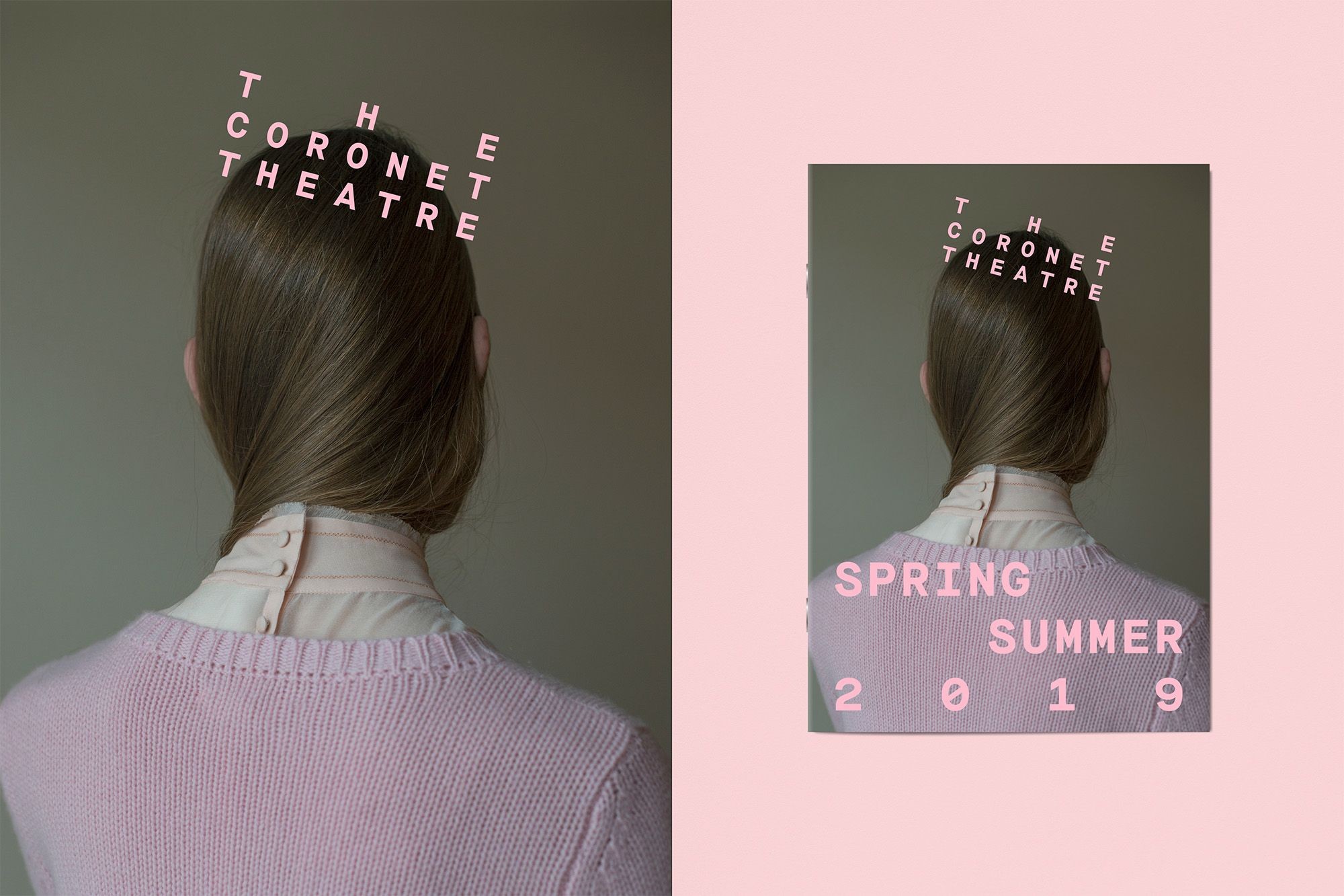
This design for the Coronet Theatre in Notting Hill, London, makes clever use of type to represent an actual coronet. As we noted on its release in March, it's so simple, you'll wish you thought of it.
It's a risky strategy, as this kind of literalism in logos can often look obvious and dumb. But North has pulled it off brilliantly, exploiting the fact that 'Coronet' and 'Theatre' have the same number of characters, and spacing out the letters of 'The' evenly to create a visible crown effect.
The design works perfectly whether positioned horizontally or on a slant, as in the poster above. And it also interplays nicely with a number of hand-drawn coronet symbols North has created as a secondary visual language, across the theatre's merchandise and staff badges.
02. Royal Astronomic Society
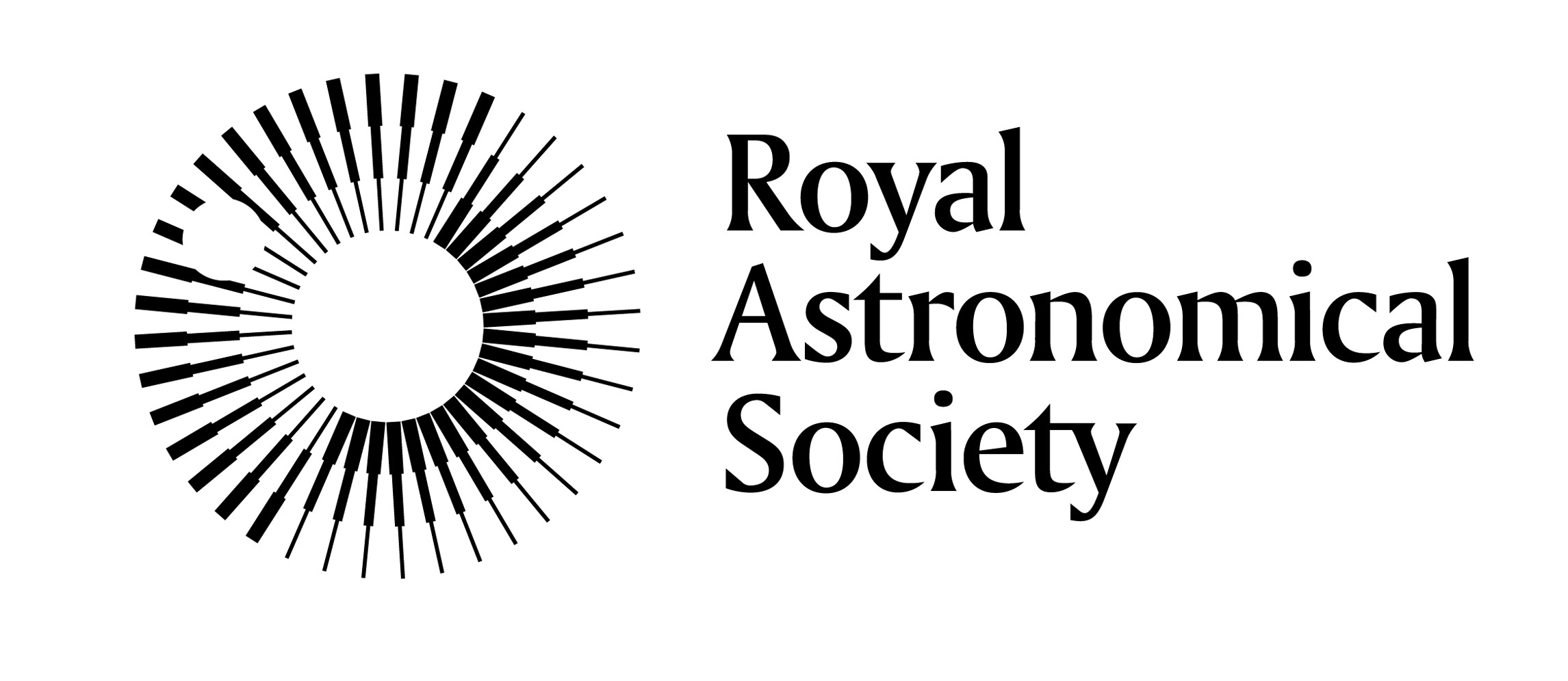
To help mark the Royal Astronomical Society's 200th birthday, Johnson Banks was tasked with crafting its first new logo since 1820. No pressure, then. Thankfully, it came up trumps with this fabulous design.
Released in January, the new logo avoids anything obvious like stars or planets, and instead goes for something a little more abstract. Stepped spokes are repeated and rotated to form a symbol that can be interpreted in multiple ways: a stylised eye, perhaps, or planet with an orbiting moon. It's a beautifully original way to reflect the many different sides of the Society’s work.
The emblem is complemented beautifully by the wordmark; an elegant serif. We love how it manages to condense the super-long word 'Astronomical' in a way that retains readability, while achieving a pleasant shape overall. In short, this logo design strikes the perfect balance between classic and futuristic, making it match-fit for decades to come, and perhaps even another 200 years.
03. Move United
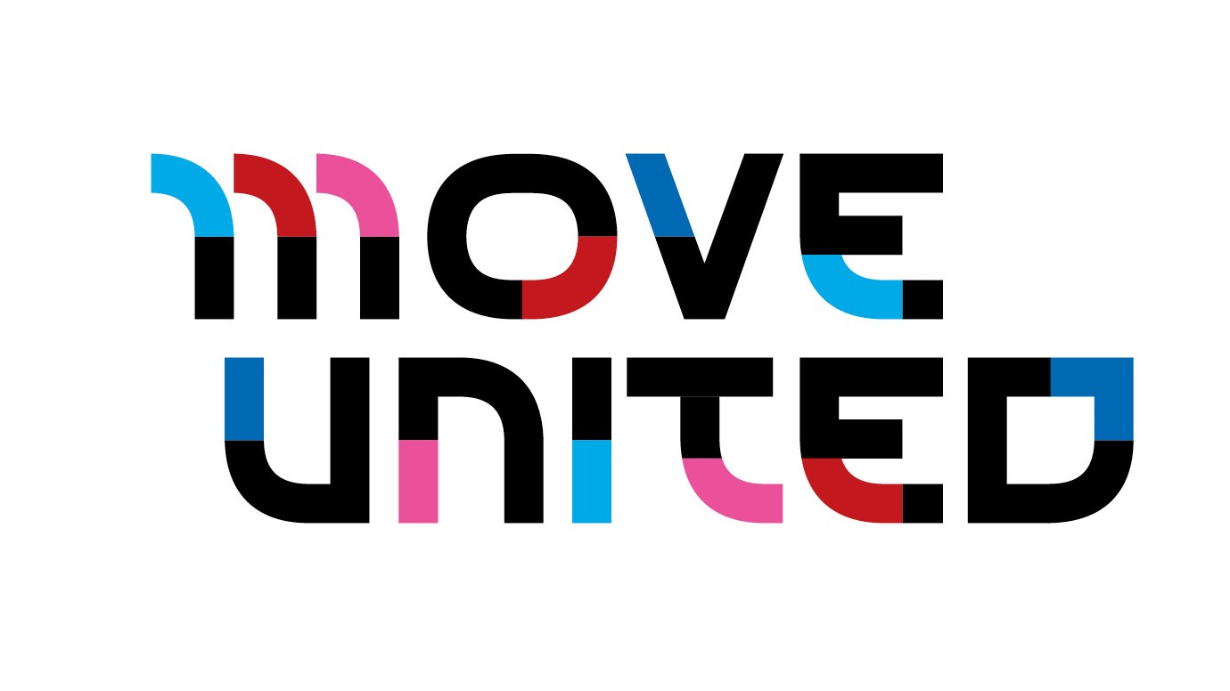
Established from this year's merger of Disabled Sports USA and Adaptive Sports USA, Move United is a non-profit organisation devoted to the promotion of sports among people with physical disabilities. This inspiring logo, released in May, deftly avoids cliche and stereotype, and offers something striking, eye-catching and visually impactful.
Designed by the New York office of Superunion, the logo is based on the deconstruction and reconstruction of the word 'disability', while the patchwork design reflects the patchwork of community-based adaptive sports organisations at the new body's heart. These might sound like complex concepts, but Superunion have skilfully fused them into a single, evocative design that 'just works', and for that the team deserve much applause.
04. GoDaddy

It's not unreasonable to say that web hosting provider GoDaddy has had a pretty cheesy image for some years now, as the previous logos (shown below) will attest to. So we were delighted to see that its new logo (above), created by Koto and launched this January, strikes a very different note.
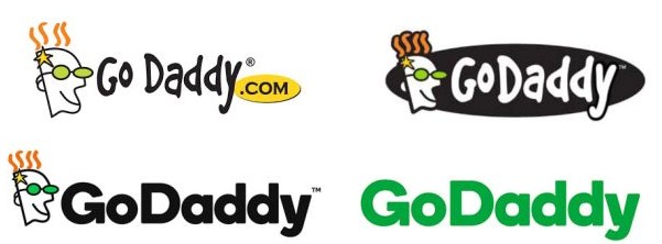
Its curvy new emblem, somewhat reminiscent of Airbnb's, is matched nicely by a slimmed-down wordmark, and the brand now feels far more sophisticated and grown-up as a result. We're not sure it quite achieves the stated aim of summoning the "entrepreneurial spirit", but that's not really important. GoDaddy now has a logo that's as professional as the service it offers, and that's truly something to be celebrated.
05. North Shore
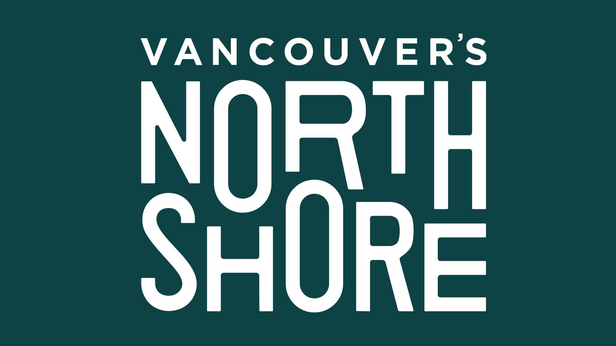
Vancouver’s North Shore Tourism Association brings together three municipalities (The District of West Vancouver, The District of North Vancouver, and the City of North Vancouver) under one banner, and promotes the North Shore as a multifaceted, four-season tourist destination.
Local design studio Loki were tasked with crafting a logo that would be flexible enough to work across a wide range of activities, and they've pulled it off masterfully. Released in May, this fun and flexible logo, with its dramatically rising and falling letter heights, feels instantly outdoors-y and adventurous, as well as subtly evoking the movement of the sea.
06. Thrillist
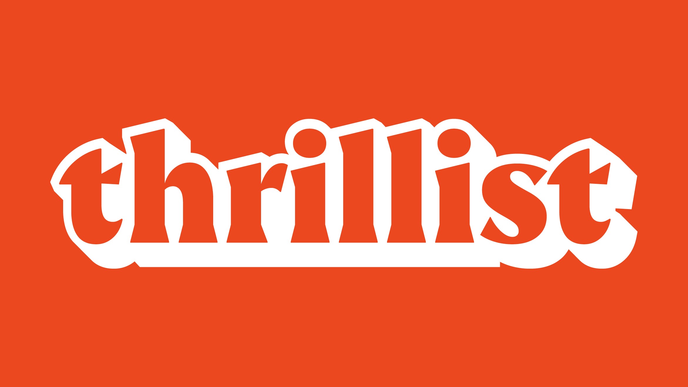
Founded in 2004 and based in New York, Thrillist is an online magazine covering food, drink, travel and local culture. Aimed squarely at millennials, it claims to have the biggest digital reach of any travel content publisher today. In April, the site launched a refreshed brand identity, aimed at evoking the feel of "loosening up, chilling out, and having a good time no matter what".
With its '70s movie poster vibe, the new bouncy and colourful logo (above) conveys that spirit beautifully, and much more so than its relatively formal and stripped down sans-serif predecessor (below).
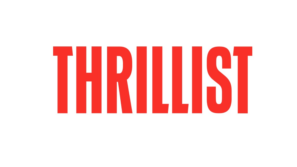
Designed in-house, the new logo has an obviously retro vibe, but still feels fresh and forward-looking. The character shapes are thoughtfully crafted, the shadowing gives a real sense of 3D, and the design as a whole looks great, even when reduced to monochrome and small sizes.
07. Adobe Creative Cloud
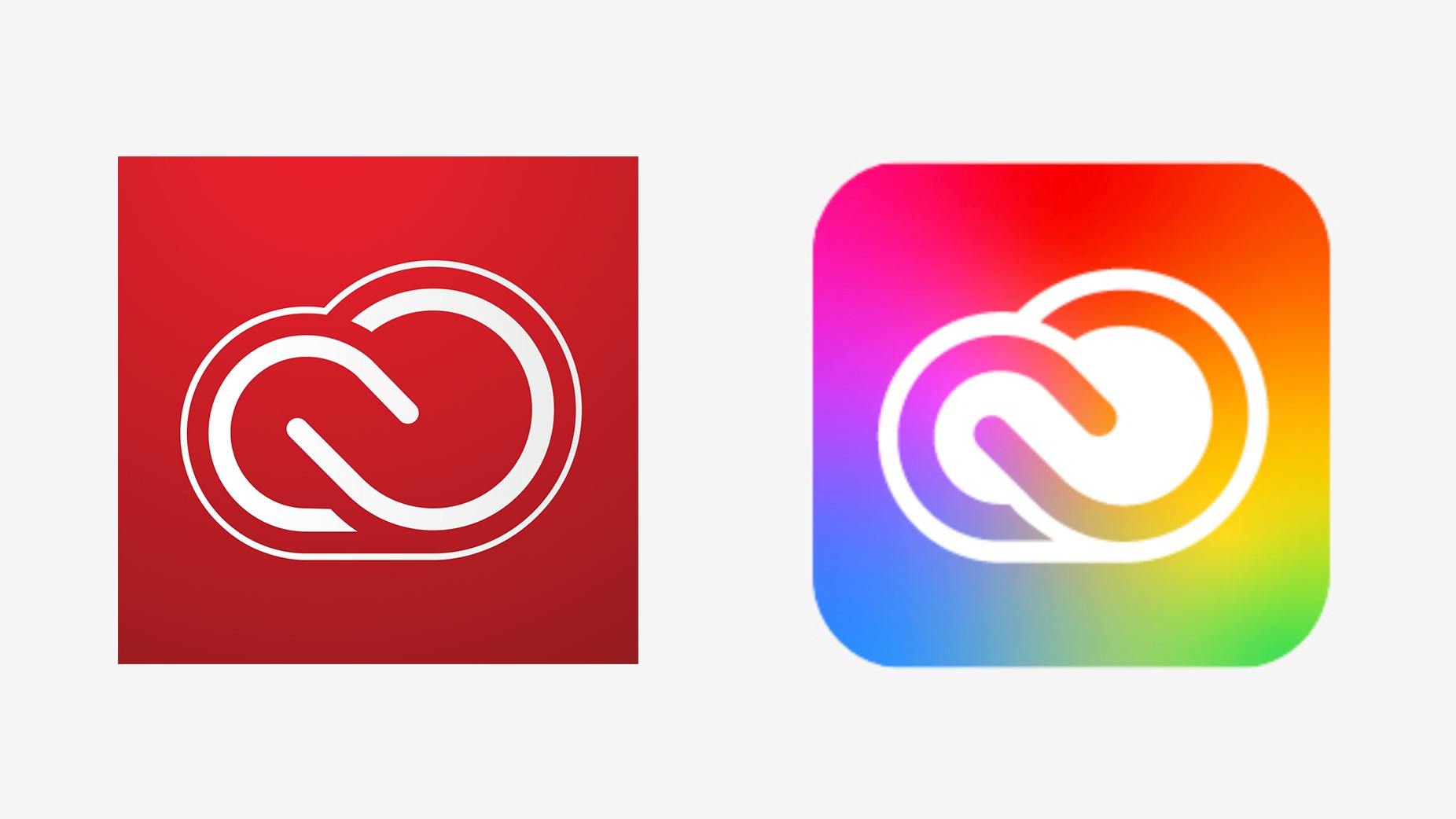
When Adobe moved its software to the Creative Cloud back in 2013 (yes, it was that long ago!), it caused such a stir that its clever logo icon, based around two interlocking C's, was somewhat overlooked. So we're pleased that with the 2020 update, Adobe hasn't replaced it, but refined it and made it even better looking.
Released at the end of May, the new logo combines the colours of all the Creative Cloud product brands, together with Adobe's new corporate red, in one gorgeous gradient that effortlessly conveys the theme of creativity. Adobe has also increased the weight of the logo itself to increase legibility and scalability. As you might expect from a company focused around art and design, the end result is the perfect example of evolution, not revolution.
08. DK
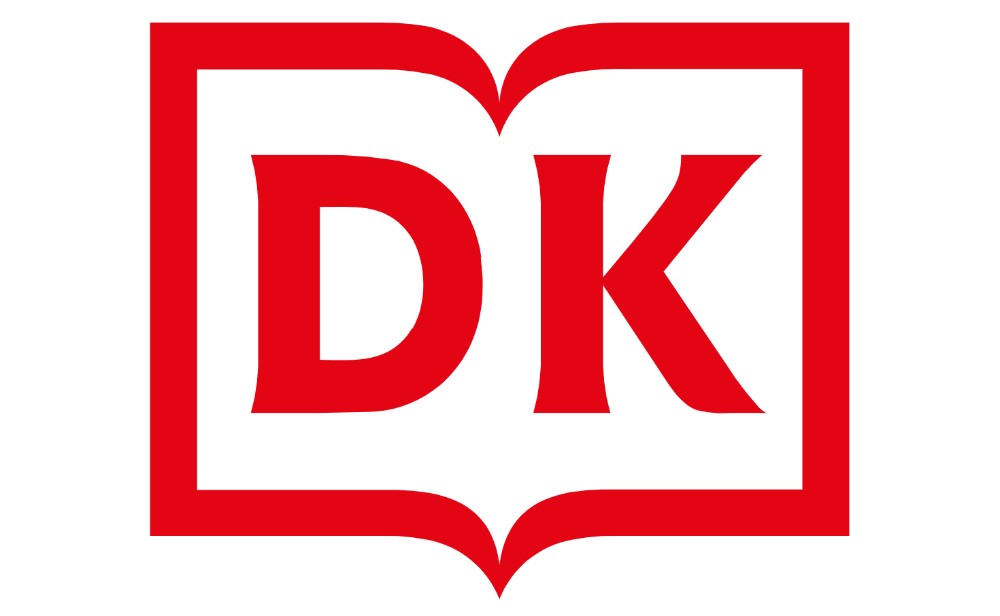
Although skeuomorphism is starting to return to graphic design after a long absence, we haven't quite returned to full-on representation of worldly objects; it's more of a halfway house referred to by some as neomorphism. So DK, the British publisher formerly known as Dorling Kindersley, was bang on trend in January with this new logo design (above), which nicely updates its anachronistically ornate predecessor (below), without throwing the baby out with the bathwater.
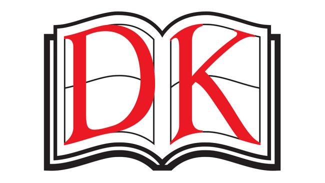
The new logo, designed by Pentagram's Angus Hyland, is clean, modern and forward-looking, while retaining the distinctive open-book framing. The lettering itself is bespoke, and hits that perfect sweet spot; it's minimalist, but makes subtle use of serifs to sidestep the perils of blandness. Overall, the design is flexible, scalable and, well, just looks fantastic.
09. Fisher Price

Another logo designed by Pentagram, this new design for US toy company Fisher Price (above) hits all the right notes. Emily Oberman has made some small but important updates to the previous logo (below), most notably changing the awning from four to three semicircles to represent the brand's three founders: Herman Fisher, Irving Price and Helen Schelle.
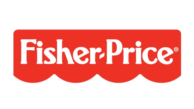
The new design, launched in January, also swaps the F and P from upper- to lower-case, and turns the hyphen into a subtle smile. These changes may not be huge, but they add up to a remarkably refreshed design that feels fun and childlike (as we reported at the time), while never feeling childish.
Read more:
Sign up to Creative Bloq's daily newsletter, which brings you the latest news and inspiration from the worlds of art, design and technology.

Tom May is an award-winning journalist specialising in art, design, photography and technology. He is the author of the books The 50 Greatest Designers (Arcturus) and Great TED Talks: Creativity (Pavilion). Tom was previously editor of Professional Photography magazine, associate editor at Creative Bloq, and deputy editor at net magazine.
