Calls to action: How to create successful CTAs

Sign up to Creative Bloq's daily newsletter, which brings you the latest news and inspiration from the worlds of art, design and technology.
You are now subscribed
Your newsletter sign-up was successful
Want to add more newsletters?
Calls to actions (or CTAs) count. The vast majority of the websites or applications will have at least one form of call to action, this could be anything from signing up to a newsletter to following you on social media or confirming a payment. However, there are a number of obstacles in the way of actually getting users to complete a CTA, and also considerations about the next steps they should take once completed.
To fully understand why users are dropping out of your booking flow or failing to notice your newsletter sign up button on your landing page, you should engage your analytics team and ensure that you rigorously test your digital products with the people using them. That said, you may not have an analytics team, or might need a bit of extra help (and remember, decent web hosting will provide some helpful analytics).
Here are a few things to contemplate when you're in the design phase that will tilt the scales of conversion in your favour. But first, up, let's make it really clear what a call to action actually is.
Article continues belowStarting a new site? Make it easy with the right website builder, and if you're planning on it being media-heavy, stash it all safely in the best cloud storage.
What is a call to action?
Calls to action (or CTAs) is anything that tries to get the user to do something. This is often to buy something, fill in a form, follow on social media or simply to click on a piece of content. The more engaging and persuasive your CTAs are, the more likely it is that your users will click on them, or engage with them. Here are three tips on creating successful calls to action.
01. Introduce calls to action at the right time
When it comes to calls to action, timing is key. Introducing a sign up for a newsletter to someone who is about to make a purchase can be a fatal distraction and lead to abandoned checkouts. At the same time, displaying a full-screen overlay within seconds of a user landing on your website can have a detrimental effect, as you’ve not yet given them time to explore your offering and decide whether or not they’d be interested in exchanging their email address for your juicy discount code.
The current Uniqlo site introduces a full-screen overlay with an enticing £10 off voucher when you sign up to receive its marketing emails. The overlay appears pretty soon after landing on the homepage, meaning new users have had very little opportunity to see what’s on offer.
Sign up to Creative Bloq's daily newsletter, which brings you the latest news and inspiration from the worlds of art, design and technology.
Furthermore, Uniqlo have made some interesting UX decisions within the overlay itself. The hairline-thin close button in the top right is not instantly available and takes a full eight seconds to appear, leaving users with the dull grey, ultra-uninviting ‘No thanks’ button under the email form as the one way to immediately close it down.
Mapping out user journeys can really help work out where to introduce calls to action
These kinds of timing decisions stand to influence the behaviours of users and negatively impact their experience on your website. Mapping out user journeys can really help work out where to introduce calls to action. Knowing where users are coming to your site from is a great start, and understanding the journeys they take through your site will enable you to show calls to action at appropriate moments.
It would need testing, but the Uniqlo sign up may have served better on a confirmation screen post-purchase, as you’d then have a converted customer who might enjoy a discount on their next visit.
02. Make credible claims

In pursuit of conversions, we have the capability to promise the world with the copy used in our calls to action, but while attention-grabbing links and headlines can result in click spikes, your long-term goals may suffer as a consequence. If, for example, your dating website claims to ‘find your soulmate’ with one click, it better have some Black Mirror-like algorithms going on in order to deliver on that promise, or people will be disappointed not to have met their match and are unlikely to return.
Even less life-changing products or services need to balance what they say with what they deliver. If you are saying that something is free, it's important to not then ask for a user's credit card details, or at least be clear about that if you are.
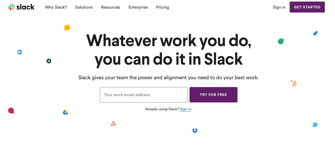
Slack offers collaboration tools for teams around the world. And its main CTA reads 'try for free'. When we type in our email address, we get further options, rather than an immediate pesky email welcoming us before we have even figured out if we want Slack.
Opting for credible claims in your call to action copy, with trustworthy copy lines over attention-grabbing clickbait, will ensure that you’re delivering on your promises and establishing trust with your users in the short term and into the future.
03. Provide post-click feedback

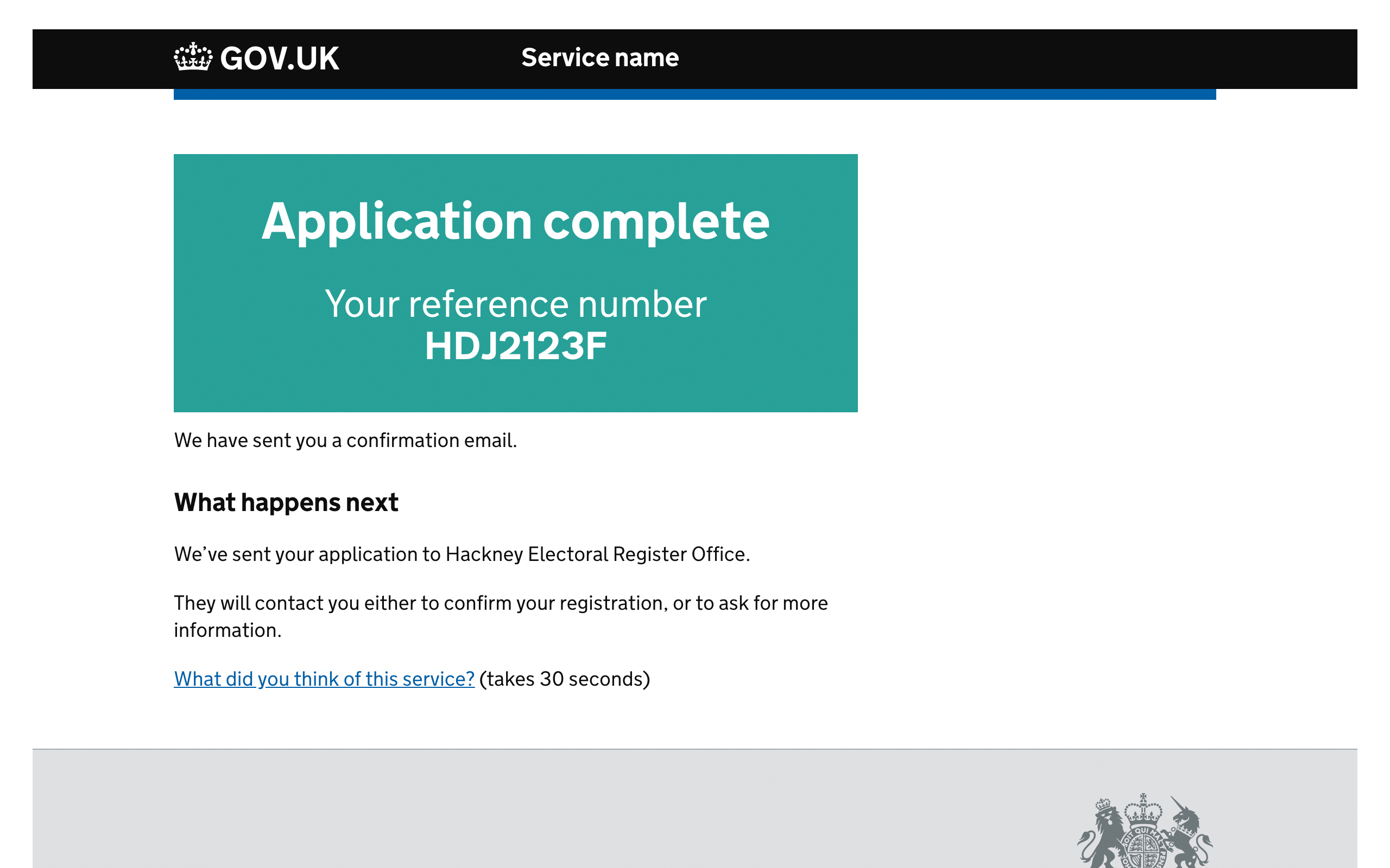
Pouring all of our creative energy into getting that all-important click can often result in less attention being paid to the user experience post-conversion. However, lack of feedback or direction around ‘what happens next’ at the end of a process can leave users confused and uncertain about the consequences of their actions, especially if they suffer from anxiety.
Tasks like transferring large sums of money or applying for a disability benefit can be stressful, so while it’s important that you empower users to complete these processes, it’s vital that they are given reassurance of what’s to come next, or how to make contact to resolve any issues that may arise.
The Gov.UK Design System includes a number of design patterns specifically for confirmation pages. These resources have a strong accessibility slant and are a great source of information and inspiration as to how and why these considerations are so important.
Post-conversion interfaces can be an opportunity to upsell products or grow your email database, but there may be more useful functions for these pages that should be reviewed in the design phase to better serve your users.
This is an updated article of a piece that was originally published in creative web design magazine Web Designer.
Related articles:
Joss Cook is a freelance designer and design manager at Unity. Formerly design manager at Lush Digital, he was awarded Wirehive 100 Creative of the Year 2014 and voted No. 1 in The Drum Design Census 2015. He has written for Web Designer and Net magazines.
