Creating line art for a colouring book
Discover how this detailed line art for a colouring book based on Alice’s Adventures in Wonderland was created.
Sign up to Creative Bloq's daily newsletter, which brings you the latest news and inspiration from the worlds of art, design and technology.
You are now subscribed
Your newsletter sign-up was successful
Want to add more newsletters?
Much of the work I do as a professional illustrator is in colour, but my first love is pencil art, and inking over it is a close second. So in this workshop I’ll show how I approach the more complicated pieces I like to do.
In 2015 I was asked to illustrate Jonathan Green’s adventure game book Alice’s Nightmare In Wonderland, which presented a dark and twisted Wonderland populated by nightmarish versions of Lewis Carroll’s well-known characters. We produced a colouring-book companion volume, which was received so well, Jonathan decided to do a second volume entitled Through the Looking- Glass and the Horrors Alice Found There. Again, I was asked to illustrate it.
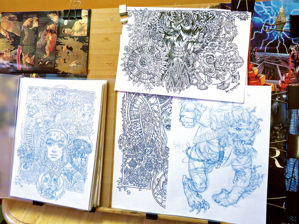
Right away I knew I wanted to indulge in the detail I love so much. To do this for all 23 illustrations for the book would take far too long, so I picked out five drawings to become the stand-out pieces for the book and started to sketch out ideas for each of them.
Some colouring books are filled with fairly basic line art, but I wanted these illustrations to be almost as fully realised as any other commission I’d done. So, although the finished art had to be clean with limited shading (so it wouldn’t hinder the colourer), the development process of the art would be business as usual for me. This involved thumbnail doodles in my sketchbook, followed by pages and pages of ideas, lists of elements and characters I wanted to use, and further rough sketches exploring and experimenting with layout options.
For this sort of illustration, I fill page after page with sketches, often far more than I’ll actually need, then I scan them all into my computer and digitally adjust, arrange, then re-arrange them until I have a digital composite sketch that looks good. I then use this guide to build the finished illustration. I don’t always work this way, but it is an efficient, creatively rewarding way to work and encapsulates what I love about the way that working traditionally can be augmented digitally.
01. Visualising my ideas in sketch form
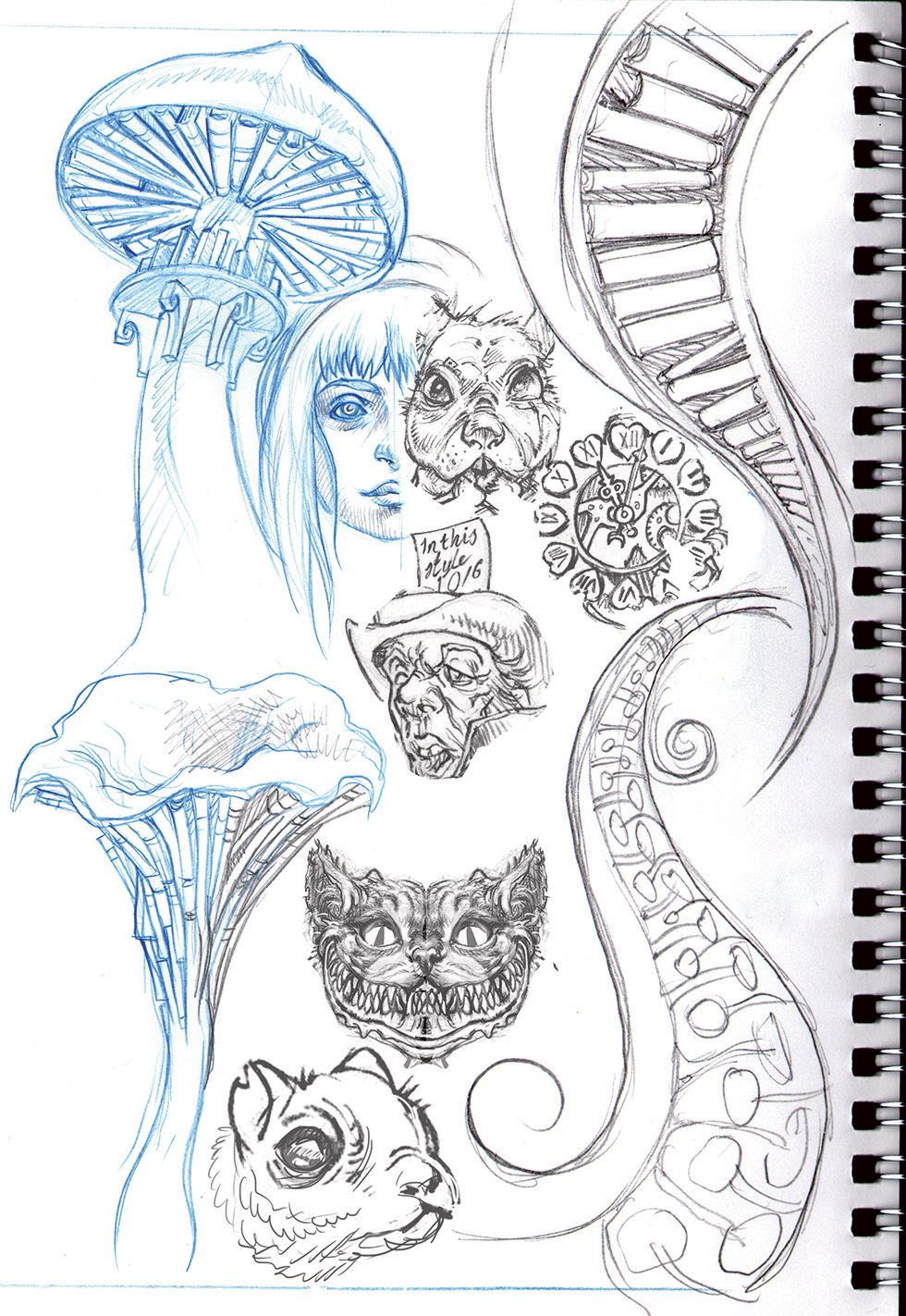
I begin by filling pages in my sketchbook with ideas. For an illustration of this scope I’ll need as many ideas as I can muster, and not just characters – interesting shapes, embryonic layout elements and variations are all sketched and gathered. At this stage I’m not certain how things will go together, but I have all the ingredients I’ll need.
Article continues below02. Developing a rough layout
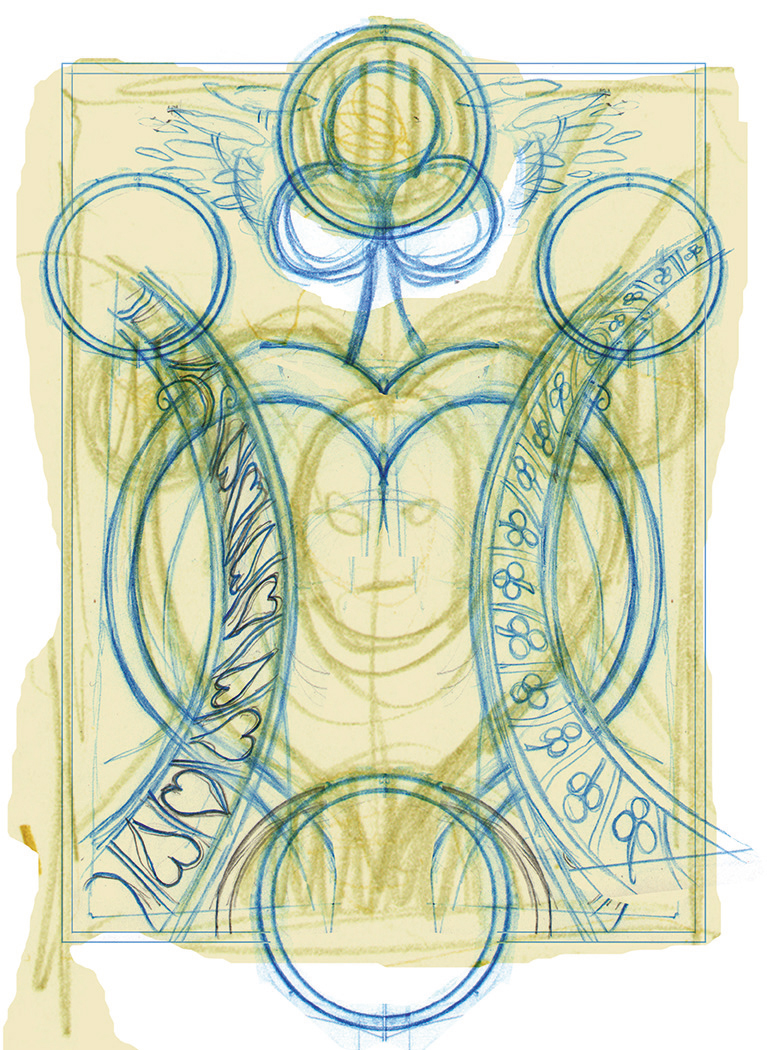
After scanning my sketches into Photoshop, the first thing I do is build up a well-balanced layout. I chanced upon an interesting idea in one of the first thumbnails I sketched, so I use this as my starting point, overlaying other doodles and sketches to add definition. I then build a clean, line skeleton over the top of this composite sketch.
03. Building the composition
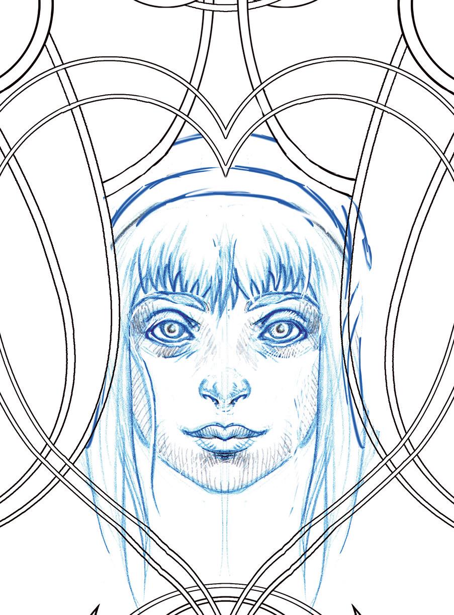
Next I add some characters. Alice will sit in the central ‘heart’ shape, with the other characters arranged in the other four circular frames around the image. This is one of the parts of my process I enjoy the most, and any version of Photoshop can be used to do this.
04. Introducing more elements
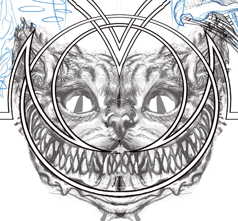
I continue adding elements from my sketchbooks. Some parts are derived from drawings I did for the previous book, such as the clock from the Hare’s stomach, and the Cheshire Cat. The latter I copied, flipped, then flattened to create this symmetrical portrait. It looks clumsy and obvious but like the rest of the image it’s only for reference.
05. Maintaining balance as the composition becomes more complex
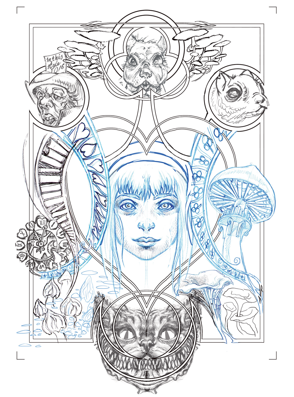
Among the sketches I was particularly happy with were mushrooms with books beneath the caps, but they were tricky to place in the image. Eventually I chose to obscure the right side of the “heart”, but this was balanced by the curving book-strip I positioned on the opposite side. I also add white fill into the border lines.
Sign up to Creative Bloq's daily newsletter, which brings you the latest news and inspiration from the worlds of art, design and technology.
06. The finished digital layout
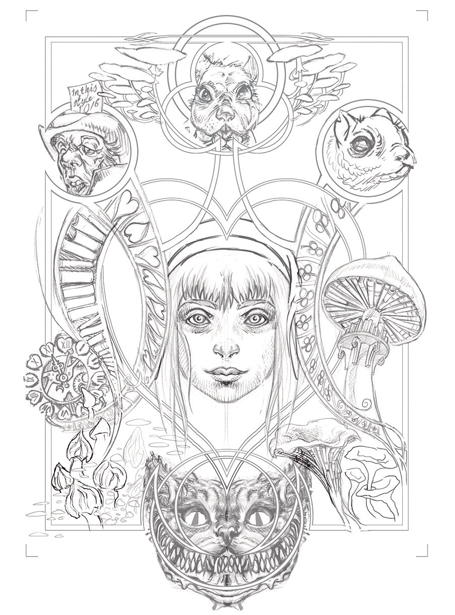
When I feel that the layout is complete, I desaturate each layer to remove any colour, turning the whole thing into a greyscale image. I adjust the values of each element (darker elements are lightened and lighter ones made darker), balancing the image. Finally I flatten the image and turn it blue. It’s almost ready to print!
07. Tweaking the layout for printing
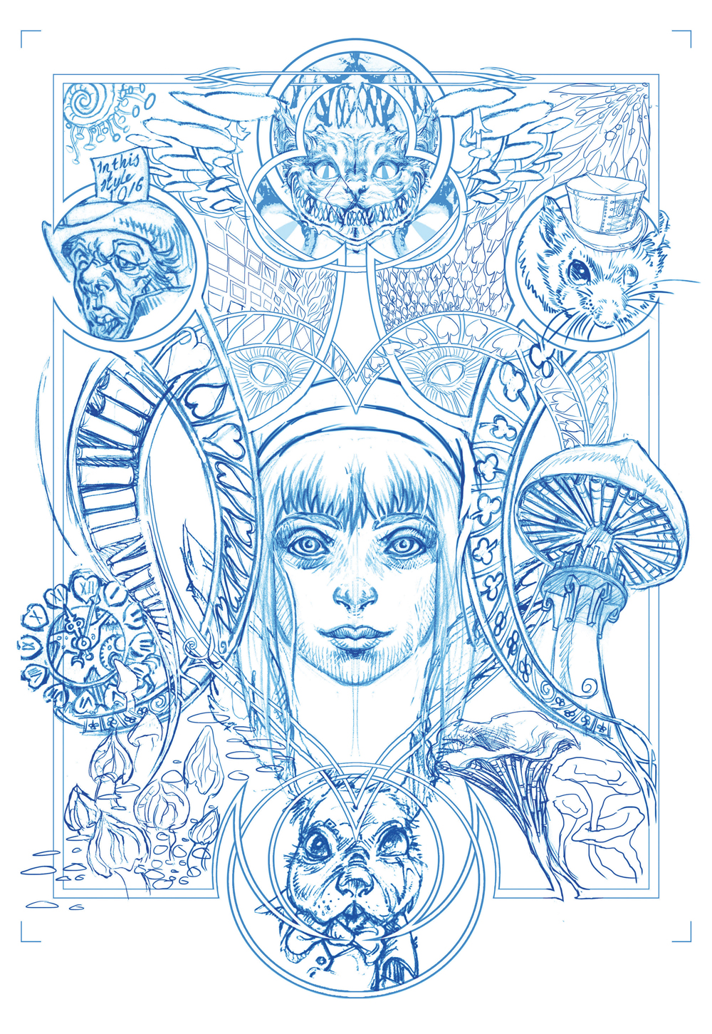
The fantastic versatility of working digitally means changes can be made at any stage. Before printing the digital layout out on A4 Bristol art board, I change the positions of the cat and the hare and replace the dormouse head with a new version, itself cobbled together from two digital sketches. Now it feels ready for the next stage.
08. Pencilling over the digital layout
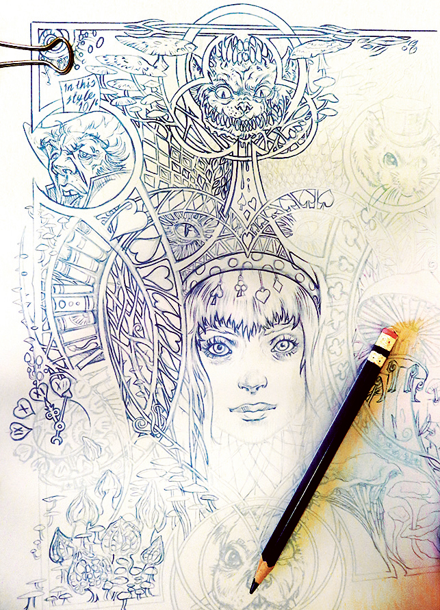
Although I could ink directly over the digital rough, producing a new pencil drawing first is a valuable way of homogenising the various composite parts that went into building the layout. It becomes a single whole piece rather than a collection of parts; details can be added and refined too. The cat, for example, no longer looks so symmetrical.
09. The finished pencils
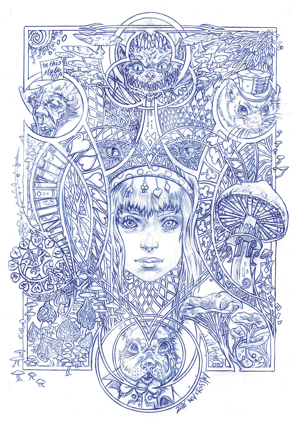
While the digital layout was a hodge-podge of different parts, this new pencil drawing pulls everything together: the borders and lines flow into the illustrative elements, and anything that might have looked discordant in the digital composite is now solved. I usually send the client a greyscale version to review before I start inking.
10. Preparing the artwork, ready to inking
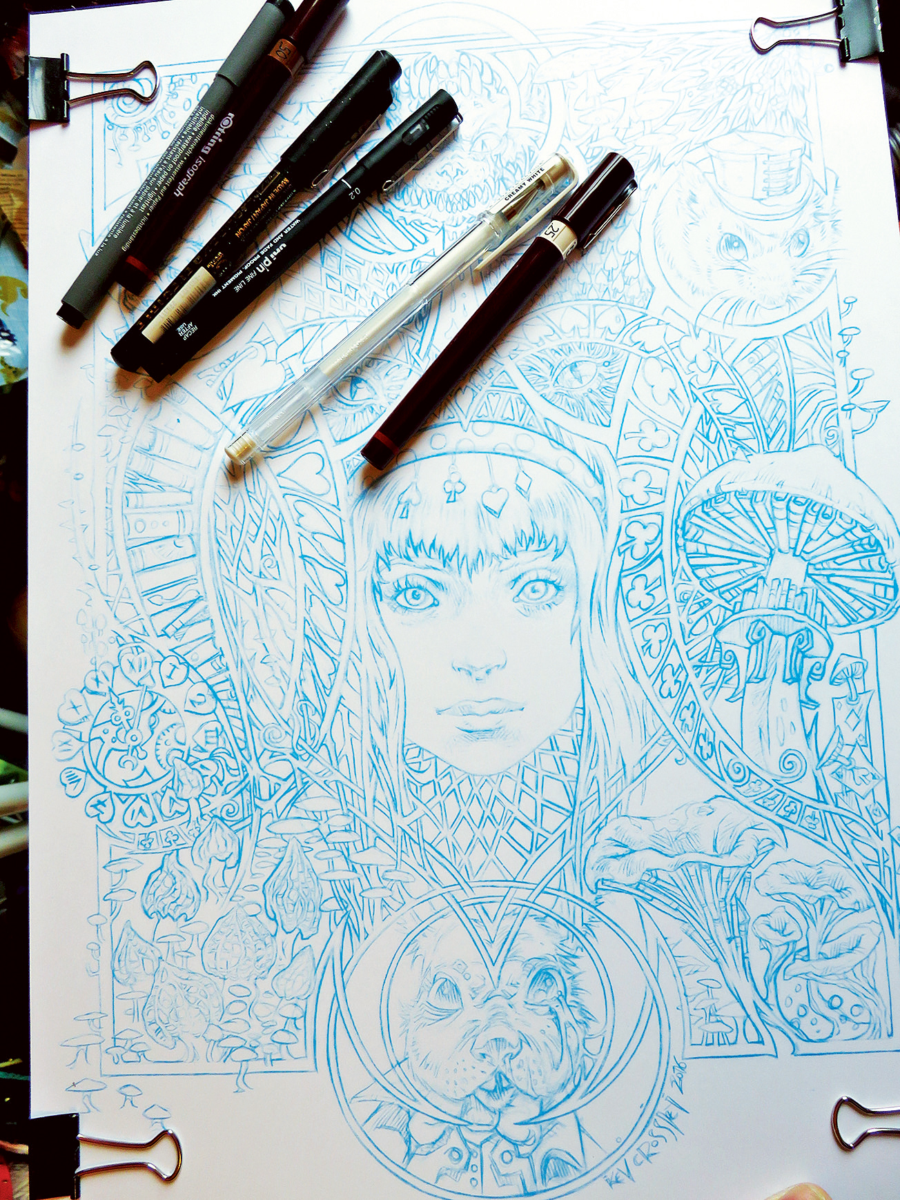
And so the final stage begins! I print out a light blue version of the image on to smooth art board. (I’ve included the actual “blue-print” file in the resources.) When inking, once again I always do this traditionally. Many people choose to ink digitally, but I still enjoy the process of working on a physical piece of paper with wet ink.
11. Inking over the pencil
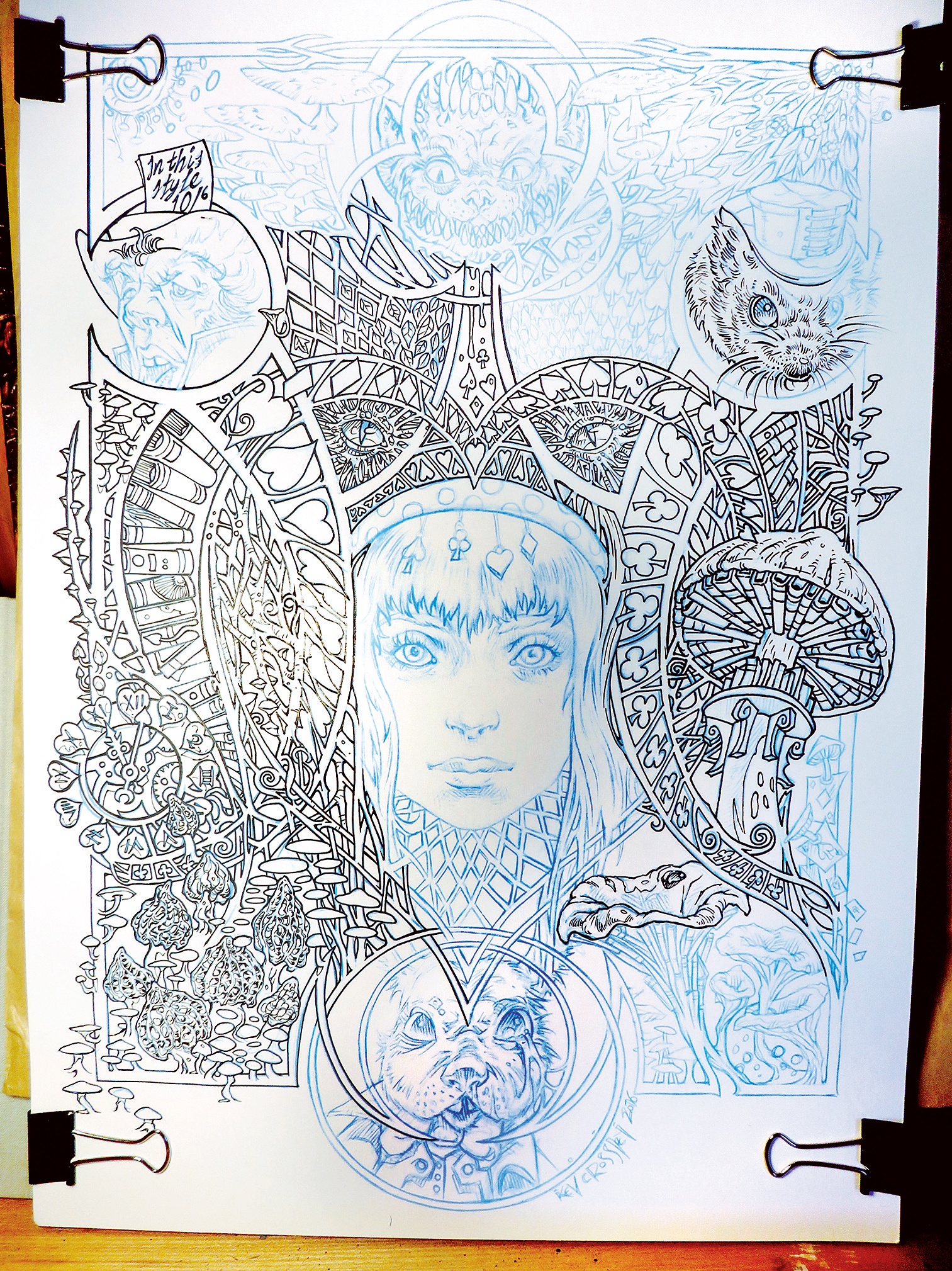
I use whatever pens come to hand when I ink. Although I sometimes use brushes when I’m in a painterly mood, for this illustration I mainly employ the sorts of pens you can buy inexpensively from any stationery store. That said, I did use my refillable Rotring pens for some of the finer line work. They are awesome tools!
12. The finished inked illustration
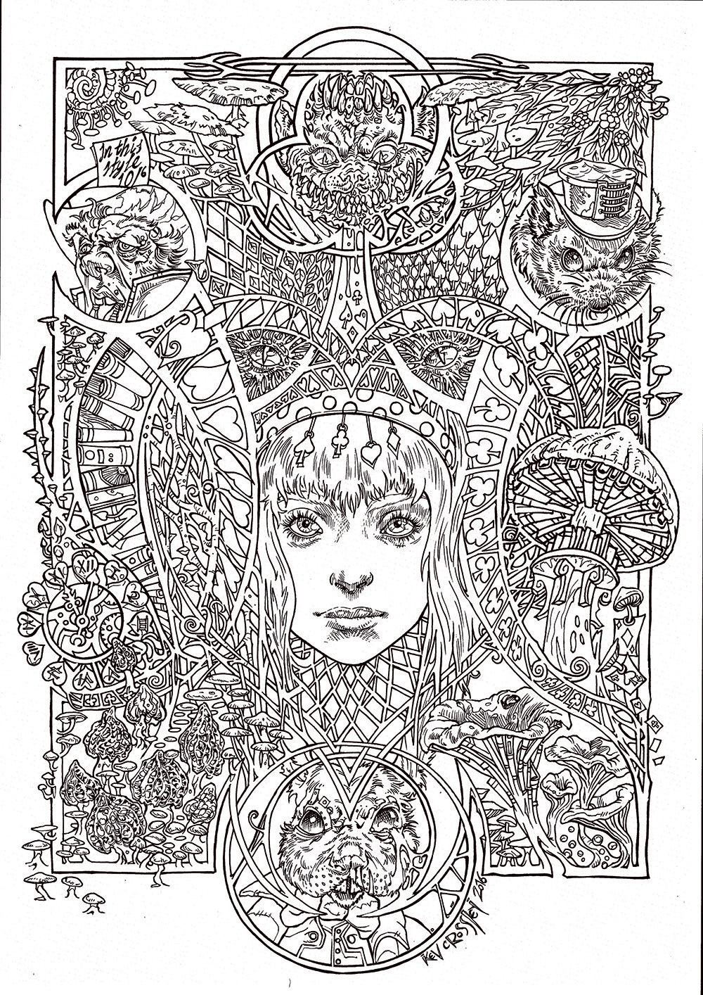
After around 20 hours, perhaps more, I decide the inking is complete. The line work needs to be clean with minimal shading so there is still paper visible for colouring pencils to cling to, but I don’t want to keep the final image free of such detail entirely. Therefore I allow a little extra line definition here and there.
This article was originally published in ImagineFX magazine issue 141. Buy it here.
Related articles:
