Design Indaba 2019: 8 categories of bad design
British design critic Alice Rawsthorn shares her definitions of bad design – and pulls no punches when it comes to examples.
Design is all around us. But have you ever stopped to think whether something is a good or bad design? British design critic Alice Rawsthorn has. In fact, she thinks we all need to pay more attention to bad design – and she's not afraid to say exactly who she thinks is guilty of it.
Speaking at Design Indaba 2019 she says: “Very little design is actually great." But also recognises that defining what is good and bad design can be tricky, especially when the definition can change with time and depending on context. In order to demonstrate this, Rawsthorn used the famous architect Frank Lloyd Wright as an example.
While there is no doubt Wright created some truly innovative, beautiful designs, they weren't all fit for purpose, with many of his famous buildings, including Waterfall House, plagued by leaks due to structural flaws (for building designs that do work, see our list of inspiring famous buildings).
Article continues belowRawsthorn followed on from this by outlining eight common categories of bad design, showcasing some truly shocking examples along the way.
01. Useless design
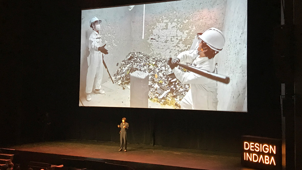
This is the category Rawsthorn highlighted as breaking the cardinal rules of good design because they simply don’t work properly. There are many examples to choose from, but topping her list is the one product that sparks rage among many a creative: the digital printer. Paper jams, ink mess, wonky printing… we’ve all been there, right?
02. Pointless design
These are designs that fulfil their function, but that function is so pointless, why bother in the first place? Rawsthorn was quick to name and shame Google Glass for this category, commenting: "Google was so enthralled by the new technology of Google Glass that they assumed we would be too, but we weren’t because we’re not idiots.
"The new tech was not able to do much more than an ordinary smartphone, made the user look ridiculous and also open to potential lawsuits for invasion of privacy." Rawsthorn went on to explain how Google ceased production of the Glass just 18 months after it was first released, before ending with the nickname given to anyone who wore one: "It's too rude to say, but it starts in glass and ends in holes," she said.
Sign up to Creative Bloq's daily newsletter, which brings you the latest news and inspiration from the worlds of art, design and technology.
03. Lazy design
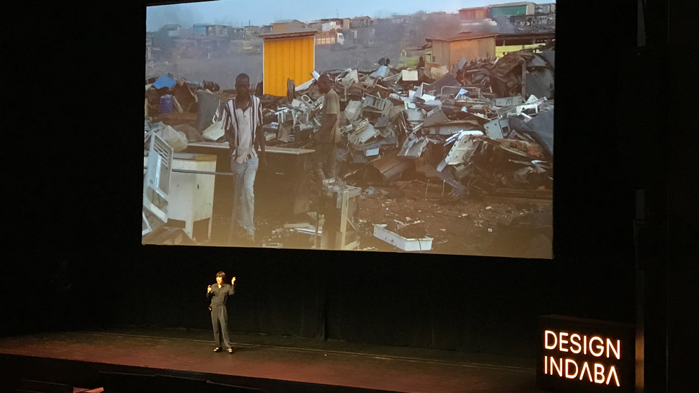
Next up, Rawsthorn highlighted the devastating effects lazy design can have on the world, using Agbogbloshie, the world's largest electronic waste dump, as an example. "It's a hellhole," she says. "Most of those products you'll find here should never have gone there, designers should have created these products so they could be recycled."
However, almost all of these products contain toxic chemicals, meaning even if they were recyclable, it'd be expensive to do so. As a result, this growing dumping ground sees electronic waste arrive from all over the world.
04. Thoughtless design
As the name suggests, this is design where creators have simply not properly thought through the consequence of their ideas. Artificial intelligence program PredPol, designed for the US police department to predict where crime is likeliest to occur is the thoughtless design example Rawsthorn highlights.
“Predpol very quickly revealed a racial bias," she said. "It almost always identified black neighbourhoods as the likeliest place where crime will be committed, sending police resources to safeguard respectable black neighbourhoods in anticipation of a crime that didn’t actually happen there, leaving other areas horribly exposed.”
05. Ominous design

This is the kind of bad design that Rawsthorn says "fills us with foreboding". And the example she chooses is Uber. "While Uber's business model has, in fact, been brilliantly designed to fulfil the need for affordable private cars, it also left the company open to accusations of labour exploitation, endangering the safety of its drivers and causing congestions, so much so it has been embroiled in lawsuits and political crackdowns."
06. Untrustworthy design
One brand you probably didn't expect to see on this list is Apple. As far as Rawsthorn is concerned, Apple falls under the category of untrustworthy design following recent reports that the company might be using software upgrades to drain the battery of older devices, therefore forcing consumers to buy new ones.
This time last year, the Wall Street Journal reported iPhone customers had filed at least 59 lawsuits accusing Apple of slowing down their phones so they would be encouraged to buy a new one. "This kind of breach of trust in a company can be very difficult to recover from,” she said.
07. Offensive design

Last year, multinational toy brand Mattel launched a number of new Barbie dolls based on inspirational women to coincide with International Women's Day. Frida Kahlo was one of them. During Rawsthorn's talk, she explained how distinct characteristics of Kahlo – including her skin colour, nearly conjoined eyebrows and physical disabilities following a bus accident and polio in her early childhood – were not represented in the design. In fact, the Kahlo design was so far removed from the artist her family took legal action, winning an injunction to stop the sale of the doll in Mexico.
08. Strategic design
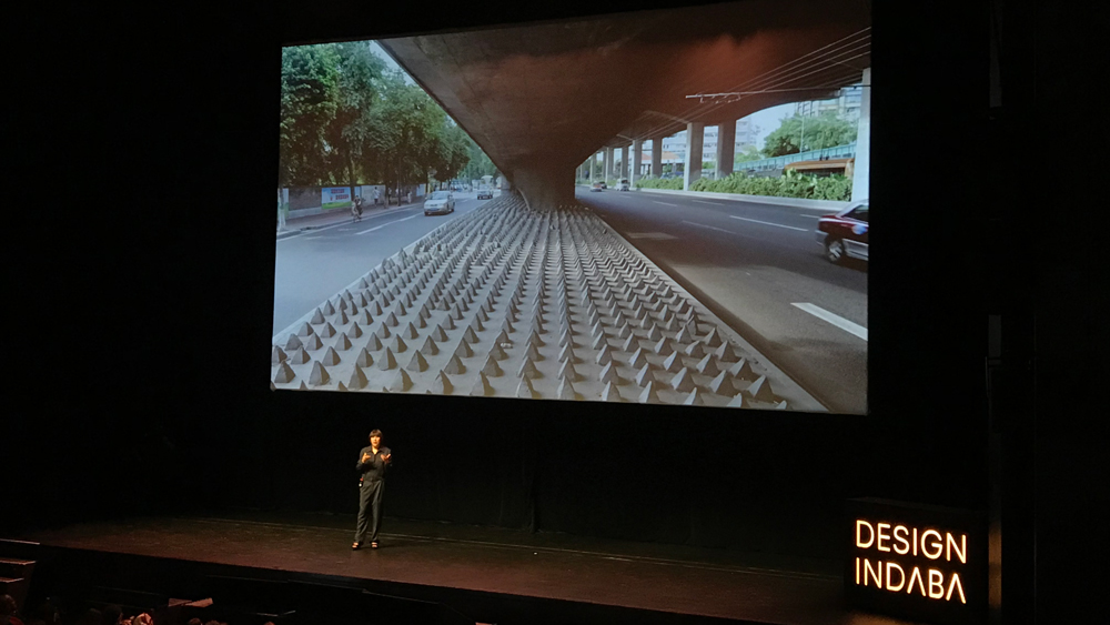
This is the category in which bad design is actually a strategic move to achieve a purpose, be that negative or positive. With a gasp from the crowd, Rawsthorn presented images of these anti-homeless spikes, which have been installed in areas where expensive properties are found around the world. "From the functional perspective, it’s brilliant and successful. But for us, it's a really ugly piece of design that targets the most vulnerable members of our society."
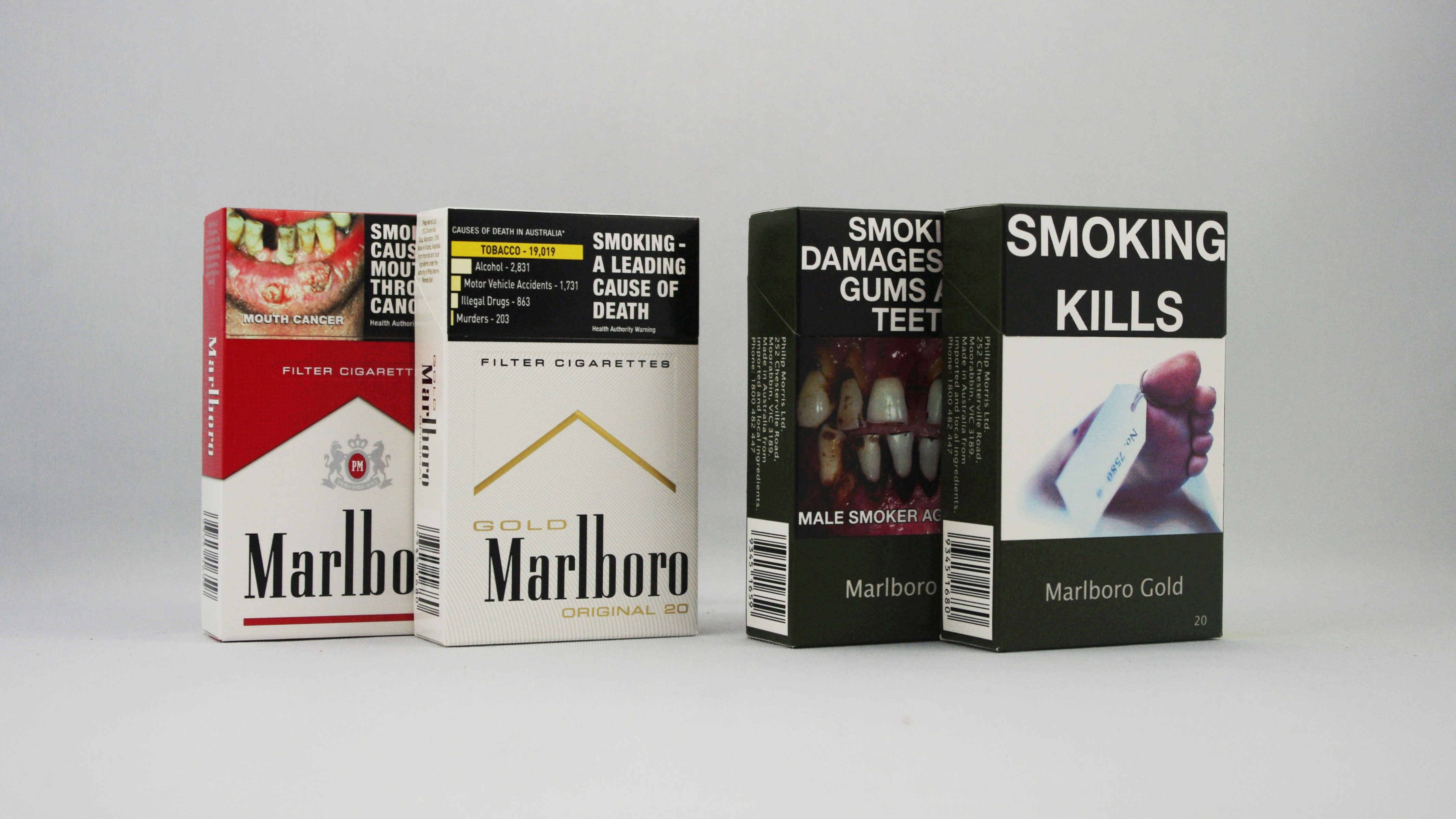
Rawsthorn also named Australian cigarette packaging as a brilliant example of this category, sharing how the Australian government has mandated cigarette companies to use the ugliest colours and pair them with graphic images of people suffering the health consequences of smoking. This is a design most definitely not easy on the eye, but one that resulted in a record decline in tobacco consumption.
But what about good design?
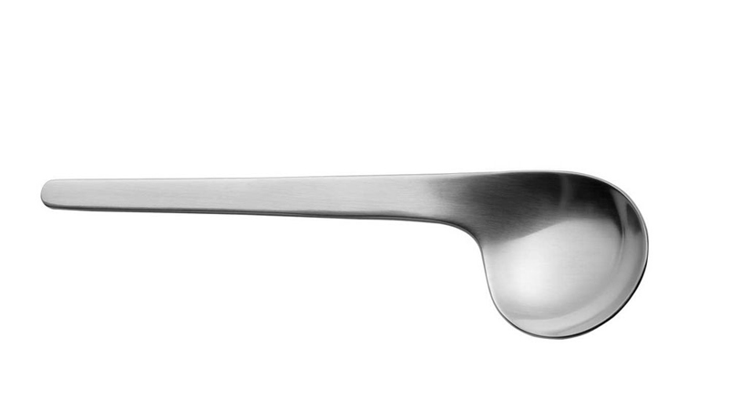
But not all design is bad. When speaking to Rawsthorn after her talk, we asked her to share her favourite example of good design.
"One of my favourite examples of design that fulfils its function in an exemplary manner is an incredible old-fashioned one, with not a bit of technology in it, and that is the soup spoon that Arne Jacobsen, the great Danish designer, created back in the late 1950s. The bowl of the spoon is designed to hold exactly the correct quantity of soup, because if you have a too shallow a spoon, it will cool too quickly, but too deep and it will be too hot. So the spoon is precisely tuned at the correct depth and is also asymmetrical, so if anyone jars your arm when eating, it will actually throw the soup over them, rather than you. And brilliantly, he designed a left-handed version too, so I hope it also fulfils the integrity aspect too."
Read more:

Kerrie Hughes is a frequent contributor to Creative Bloq, and was once its editor. One of the original CB crew, Kerrie joined the team back in 2013 after moving from her role as staff writer on 3D World. Since then she's written regularly for other creative publications such as ImagineFX, Computer Arts and Digital Camera World. After a stint working for the police, Kerrie is back reviewing creative tech for creative professionals.
