How responsive web design changed the world

Sign up to Creative Bloq's daily newsletter, which brings you the latest news and inspiration from the worlds of art, design and technology.
You are now subscribed
Your newsletter sign-up was successful
Want to add more newsletters?
In the year that Apple launched the first iPad, the old approach of coding one 'desktop' site and one 'mobile' site was becoming increasingly untenable. With more and more devices coming online, web design was crying out for a bold new strategy.
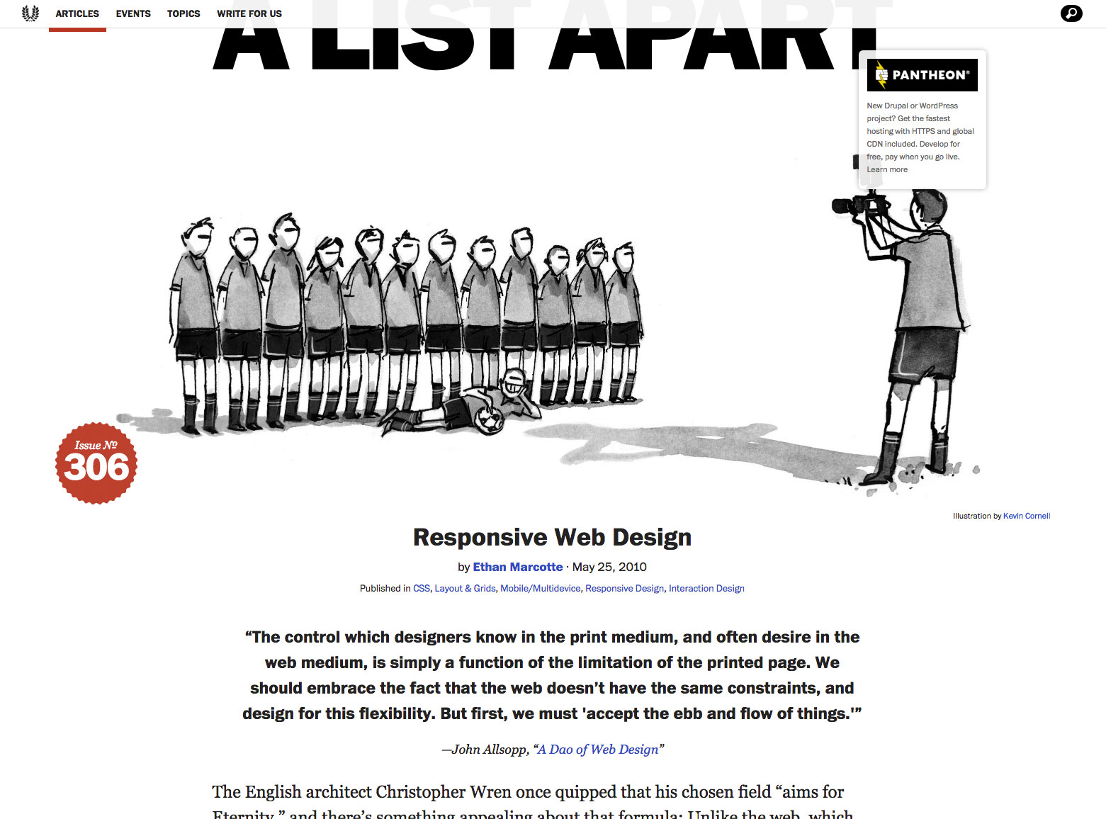
It arrived in the form of an article by Ethan Marcotte on A List Apart. It drew inspiration from John Allsopp's article, A Dao of Web Design, and looked at architectural principles to explain how we could create layouts that adapt seamlessly to different screen environments, yet still retain the best principles of print design.
The rest is history. His essay, entitled Responsive Web Design, introduced a new approach that was so simple, elegant and effective that it was swiftly adopted by the industry as the standard way to design a site, and remains so today.
Article continues belowMarcotte followed up with a book of the same title in 2011. Mashable called 2013 the 'Year of Responsive Web Design'. And today, from Bangkok to Boston, São Paulo to Sydney, whenever someone starts working on a web design, it's more than likely going to be responsive.

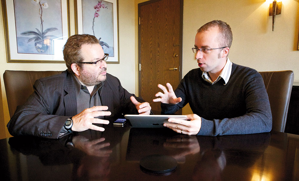
So it's fair to say that Marcotte is entitled to feel somewhat pleased with himself. But he's breathtakingly modest about the whole thing. "It still surprises me that responsive design took off the way that it did ," he reflects. "I say this with all sincerity: I met a publishing deadline. I wrote an article. And when I turned it in, I thought that was going to be the end of it. The way it exploded has been terrifying and humbling."
He adds that, while he may have been the first one to put all the pieces together, responsive design was in some ways inevitable. "The way that the core idea resonated with people so much suggests that if I hadn't come up with it, someone else would have. Because our way of designing, it just wasn't sustainable."
Still figuring it out
While Marcotte continues today to curate the @rwd Twitter account, on which he shares links to useful articles and interesting redesigns, he certainly doesn't feel as though he 'owns' responsive design, or should be considered an arbiter of it.
Sign up to Creative Bloq's daily newsletter, which brings you the latest news and inspiration from the worlds of art, design and technology.
"Some years on, I think some people look to me as though I have answers for some of the challenges we have out there," he says. "But I'm very much part of a conversation that many, many people are having right now. So I don't see myself as being an owner of responsive design, in any way. I'm trying to figure out how to design responsively in my own practice on a daily basis."

He's still willing to share his views, of course. "Some folks have kindly asked me to contribute forewords to their books, because I've been talking about some of the topics they're interested in," he says. "And others have been kind enough to send me articles or redesigns that they think deserve a wider audience; I'm happy to help with that. But I definitely don't feel like I can control responsive design, or that it's my thing."
And neither is he militant about the idea that responsive web design is always the 'right and truthful path' to creating the best digital experiences.
"There's a tendency in our industry to pit ideas against each other," he says. "You can see this with responsive design versus device-specific experiences, responsive design versus adaptive design. Even something as broad as native versus web, or mobile versus desktop. We tend to think of things in these binary terms. Like it's either this, or it's this, until something better comes along."
That's never been Marcotte's experience of the web, though. "In my work, there's never been one single best way to design, or to solve a problem. It's ultimately about what helps us solve problems for our clients and our stakeholders in the most effective way, given whatever constraints we're dealing with."
That said, that way usually is responsive design. "I work with clients that do native work all the time," he says. "But when I'm talking to them about strategy, it's really a question of what's going to help them reach the widest audience possible. And invariably, that's the web, and creating a responsive experience for a web-based design.
"That's not to say I'm not going to urge them to look for interesting native solutions if they have a problem," he says. "But generally speaking, investing yourself in a device-agnostic, beautiful responsive layout is going to be the best way to get started. And it might lead to some interesting approaches around the edges."
New challenges
But the world of the web is changing fast. Device-agnostic design might work when we're just talking about smartphones, tablets and desktop computers. But will responsive design survive the tsunami of new devices to come?
"I feel like that's a conversation that's ongoing right now," replies Marcotte. "For instance, I worked with one client who launched a beautiful responsive redesign and then a few months later we started getting screenshots from Google Glass. This wasn't a device that hadn't even been invented when we started the site. And this wasn't maybe the best way to encounter the design or the content… but it was still accessible."

And the moral is? "Thinking about the web first as a flexible design medium means that when those interesting edge cases pop up, because you've designed this as properly as possible, that frees you up in future to say: 'Okay, so here's a device that's getting some real traction with our audience, what sort of solution do we want to explore for that? Is it about refining our responsive approach, do we tune it for that context? Or maybe it's something that's more customised and discrete?'"
For an example, he points to smartwatches. "What's going to happen to the web when it's on a screen that small?" he asks. "Who knows: again, it feels early, and Apple Watch isn't really a web-friendly experience right now."
"But if you go on YouTube, you can find lots of great videos of people browsing through responsive designs on Android Wear devices. It may not be ideal, may not be popular. But by having that flexible device agnostic design in place, we've at least made something accessible to that audience."
Staying grounded
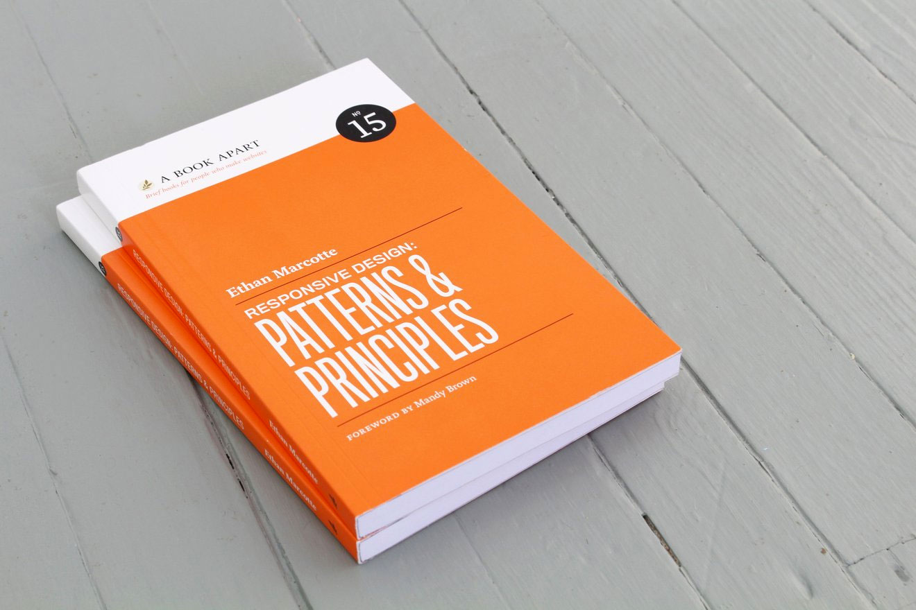
Throughout our conversation, Marcotte constantly brings everything back to client work. And it's clear that this is as important to him as speaking at conferences, writing articles for his blog, and books such as his latest work, Responsive Design: Patterns & Principles.
"I've been travelling a lot, which is great, but it needs to be a mix between talking about work and doing work," he reflects. "Because I think one informs the other. There are things I've learned from speaking to people at conferences that I bring back into my practice, and things I'm designing for clients that I get really excited about and want to share with a larger audience."
Balance is something he's always trying to figure out, though. "Travel takes a lot out of a person," he notes. "So this year, I've really focused on client work. I've ratcheted down a lot of speaking engagements and really tried to focus on some hands-on design and working with some good people."
Interestingly, in a year dominated by 'fake news', these good people have included two innovative media organisations, Source's OpenNews project and the independent, non-profit newsroom ProPublica.

"Source is helping designers and developers who work in newsrooms across the planet to tell the stories about how they produce their work," Marcotte explains. "For example, they pulled together two years' worth of data and interactive visualisations from different news organisations on gun violence in the US."
"It's a repository of all the work that's been done around this very difficult problem, but it's also helping promote any tools or frameworks or processes that might have come out of making those stories. To make them more accessible to people, so they can also produce that work, if need be."
Marcotte got involved in a month-long design sprint for Source, working closely with the team to get a redesign up and running. "They'd been planning it for quite a while and had done mountains of research before I showed up for my sprint, so they did most of the heavy lifting," he recalls. "Deadlines were tight, but ultimately they were a wonderful client."
As were ProPublica. "They really focus on some really tough, meaty issues, like corruption and consumer-focused stories ," he says. "So it was nice to have an opportunity to help them out in some small way. They're a very fast-moving newsroom, so it was nice to just sit and watch them do their thing."
And despite being so gifted at strategic-level thinking, Marcotte still likes to get hands-on with the code. "I generally find myself pretty involved in some aspect of the design and the front-end work," he says.
"And even if I'm not directly involved in implementing a layout myself, I usually try to make sure we're adhering to some good principles. Ensuring that we're not making any decisions that are going to compromise accessibility, that will compromise building a fast, beautiful, responsive design."
This article was originally published in issue 300 of net, the world's best-selling magazine for web designers and developers. Buy issue 300 or subscribe here.
Related articles:

Tom May is an award-winning journalist specialising in art, design, photography and technology. His latest book, The 50 Greatest Designers (Arcturus Publishing), was published this June. He's also author of Great TED Talks: Creativity (Pavilion Books). Tom was previously editor of Professional Photography magazine, associate editor at Creative Bloq, and deputy editor at net magazine.
