How to design a book: the creative's guide
Take your book design to new heights with this expert advice.
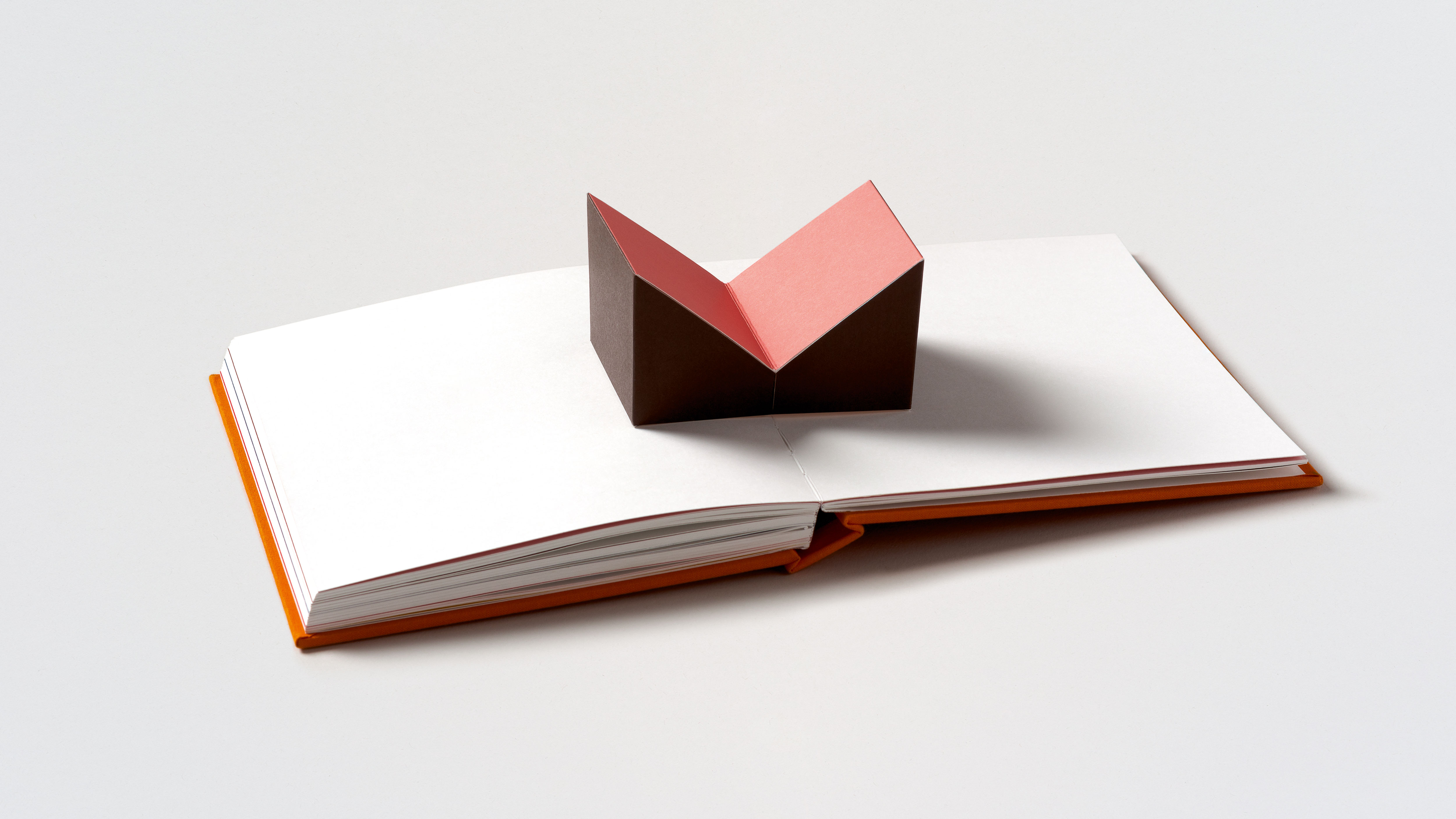
We all know the unspoken rule is you shouldn’t judge a book by its cover. Indeed, in terms of design thinking, there’s a hell of a lot more to creating a beautiful, legible book than what’s on the outside. The principles of layout, type selection and use of imagery are complex; the role of a book designer holds much more than meets the casual reader’s eye.
As with any creative project, there are no hard and fast rules for designing a book, but there are a few basic principles that designers adhere to. Again though, such rules are often there to be broken: legibility seems like an obvious one, but with more conceptual art books, for instance, sometimes you can get away with type and layout that challenge the reader to look as much as to read; images can be layered and morphed and chopped and screwed around with; stories can be told in traditional, linear formats, or as post-modern, nonlinear modes of expression.
Sometimes a relevant solution can also be something that doesn’t suit the content
Sara De Bondt
The basic tenet is design should adhere to what’s being designed, format should work with content, and design shouldn’t (most of the time) overshadow what the book is conveying to its readers.
Article continues belowNaturally, a shiny, seductive cover just isn’t enough. Erik Spiekermann once said that a book with a great cover and shoddily designed interior is “like great packaging, but when you open it, the food inside looks brown and boring. It may still be nourishing, but my appetite is gone.” So how does good book design keep us hungry, and ultimately satiate us?
The book design process
Once a designer has been commissioned to design a book, they’re usually briefed on the concept, and given some placeholder content to play around with. After that, it’s often a period of heavy research into the book’s themes and topics. Then it’s on to some experimenting with rough ideas of layout, playing around with typefaces, possible colour combinations, and the image selection.
Along the entire process, a good designer will also be considering the mechanics of the production: how it will be bound, the paper, cover stocks, and so on.
“I start by listening to the people involved: the authors, editors, artists, etc,” says designer Sara De Bondt. “Then I try to find out more about the subject, and find relevant design solutions that suit the content of the book. Sometimes a relevant solution can also be something that doesn’t suit the content, but that contrasts it.”
Sign up to Creative Bloq's daily newsletter, which brings you the latest news and inspiration from the worlds of art, design and technology.
While as a designer you aren’t always in a position to pick and choose the projects you take on, the vast majority agree that an interest in the subject matter – or at least, working to find something in it that piques your interest – is pretty important.
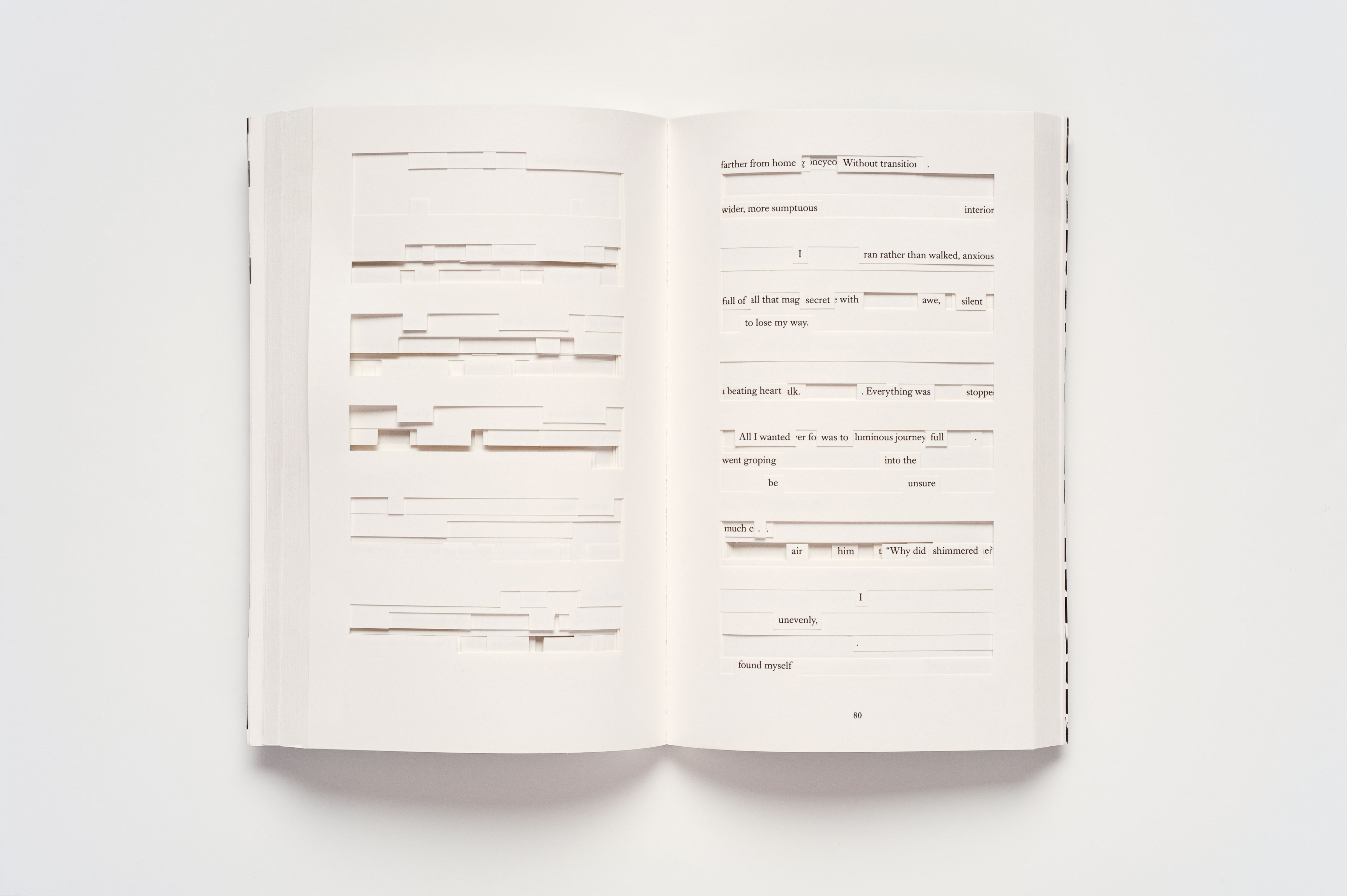
“The better you understand the content, both text and images, the better you can deal with it in terms of positioning and sizing as well as coming up with hierarchies,” reveals graphic designer and art director Maximilian Mauracher.
“Of course it’s possible to make a nice book layout by having a grid first and then just strictly laying out the content according to it, but I think it’s only going to be outstanding if you adapt typography, colours and the page layout to the content.”
Book covers usually go through a series of meetings with the editor, the sales and marketing teams, the designers and eventually the author before being approved.
“As a designer, hearing so many opinions can be a bit daunting, but I often find it opens me up to pathways I might not have considered,” says Henry Petrides, designer at Cornerstone, part of Penguin Random House. “The whole process usually lasts a few weeks; sometimes shorter, and sometimes longer,” adds Emma Grey Gelder, senior designer at the publisher.
Typography in book design
Great book design is only as good as its typography. In very basic terms, it makes sense that fonts should be unobtrusive, in as much as the reader doesn’t ‘notice’ the font, simply the words. It’s often said that monospaced typewriter fonts such as Courier are to be avoided in body copy, as the uniform spacing gives too much standout to individual letters.
The debate is still very much raging as to whether serif or sans serif fonts are the most legible, or most suited to body copy: and after decades of research and bickering over the matter, we’re still far from a conclusion. So really, do what you feel in that sense: legibility wise, there’s not much in it.
Petrides and Grey Gelder agree that while there are fonts designers fall back on, it’s more interesting to use less known typefaces, and introduce handwritten elements where appropriate.
“I work on women’s fiction titles and I find that hand calligraphy works well on these kind of covers, and often feels more organic with the illustration used,” says Grey Gelder. “It’s really enjoyable to commission hand lettering artists to create a signature look for a cover.”
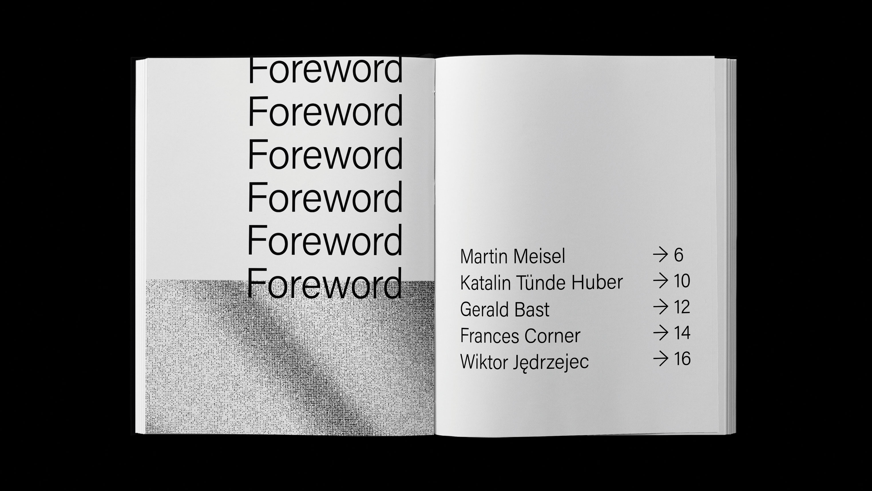
Mauracher takes a strongly typographic approach to his designs for books, mainly in the cultural field, and advises that type-wise, “less is more.” He explains: “It’s all about readability – that’s what most books are for, to be read – and the mood I want to create or feelings I want to evoke when reading or looking at it.
"Of course I have some favourite fonts, but I usually vary them and see what matches the content best. As soon as I choose one or two typefaces I have a look at the hierarchies – headlines, sub-lines, body text and pagination.”
Book design is all about rhythm and pacing
Sara De Bondt
It all comes back to there being certain rules – those dictated by content, and a somewhat intangible sense of what feels and looks right – and then letting each project dictate how such rules are executed. “Book design is all about rhythm and pacing,” advises De Bondt, and points out that the typography is only as good as the production.
“You might design the most beautiful layouts on screen, but if you haven’t fully considered the binding or grain direction of the final thing, your book will end up looking like a hostile brick that doesn’t open.”
Layout in book design
Layout is made up of a careful selection of decisions regarding page size, font styles and combinations, line spacing, margin size, and which images are used.
The vast majority of designs will adhere to a grid system, which at their most basic can be broken down into four categories:
1. Manuscript grid – a rectangular space made up of large text blocks and margins, often used for large blocks of text such as essays.
2. Column grid – helpful for presenting text that isn’t necessarily continual, perhaps with various boxouts, images, and captions.
3. Modular grid – prizing order and clarity to organise a series of complex information and images, as popularised by the Swiss International Style and Bauhaus School.
4. Hierarchical grids – more often used online than in print, where the column widths differ, and the designer needs to unify a number of disparate elements.
Considerations around layout come down to vertical (typographical hierarchies) and horizontal (double-spread design and sequencing).
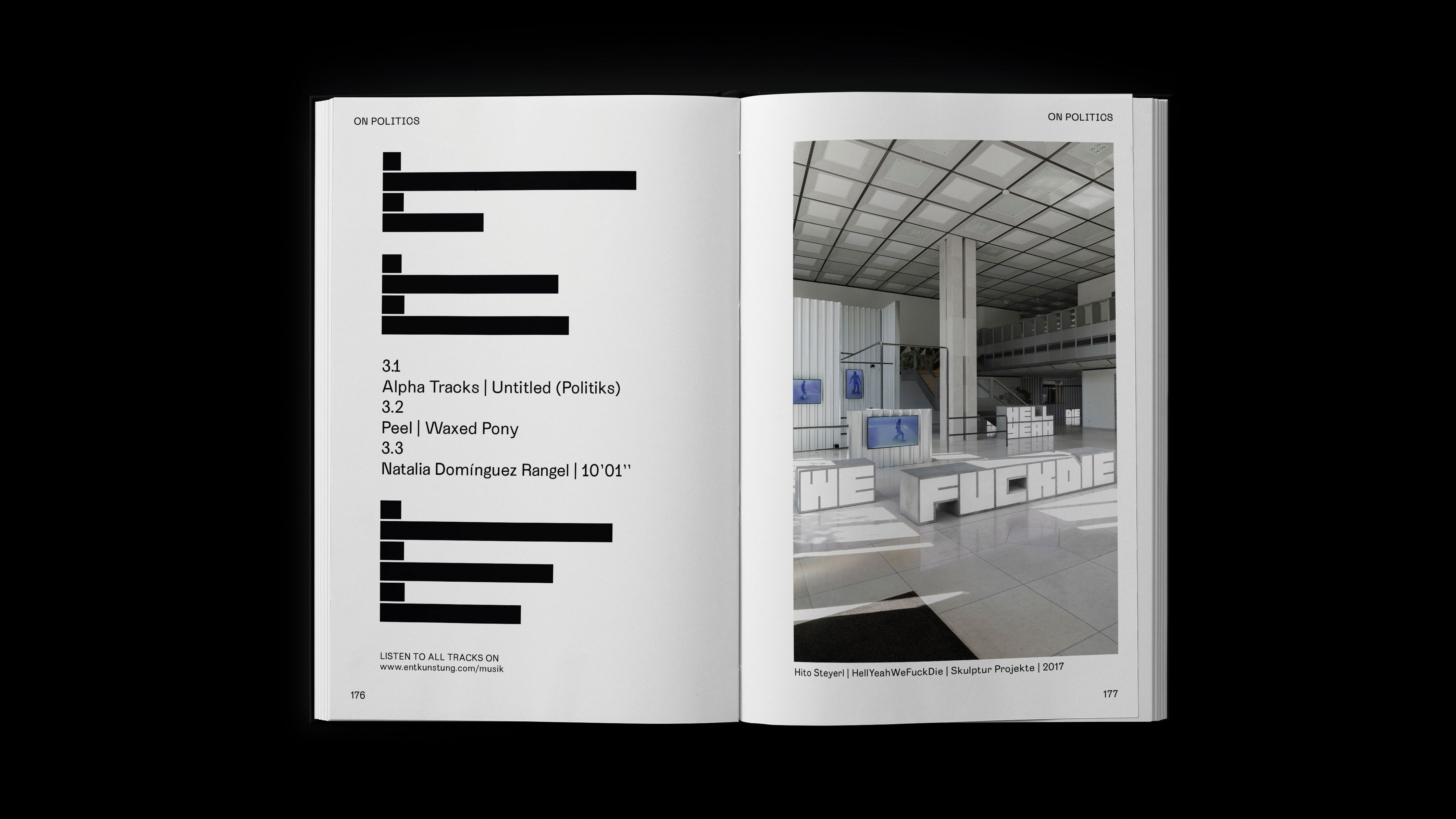
“I prefer reducing the typographical image to its core essence and try to establish clarity for the reading,” says Hanover-based designer and art director Yevgeniy Anfalov. “Sometimes the structure is more complex and requires more hierarchies. At this point, I need a good grid to use the surface in a rational and flexible way. The sequencing has a cinematic nature. It is less about graphic design, but narration.”
Swedish designer Marcus Gärde has created an online grid calculation tutorial for figuring out the basics in any book design project. It’s based on a ratio method that works with all paper formats, and “always results in both horizontal and vertical lines fitting perfectly within the area,” according to Anfalov.
Again, the right layout is only correct for the book it’s meant for. “In the end it always depends on the content and the book format,” Mauracher says. “That’s why I never reuse a grid or a page layout for another book. I want to create something new every time.”
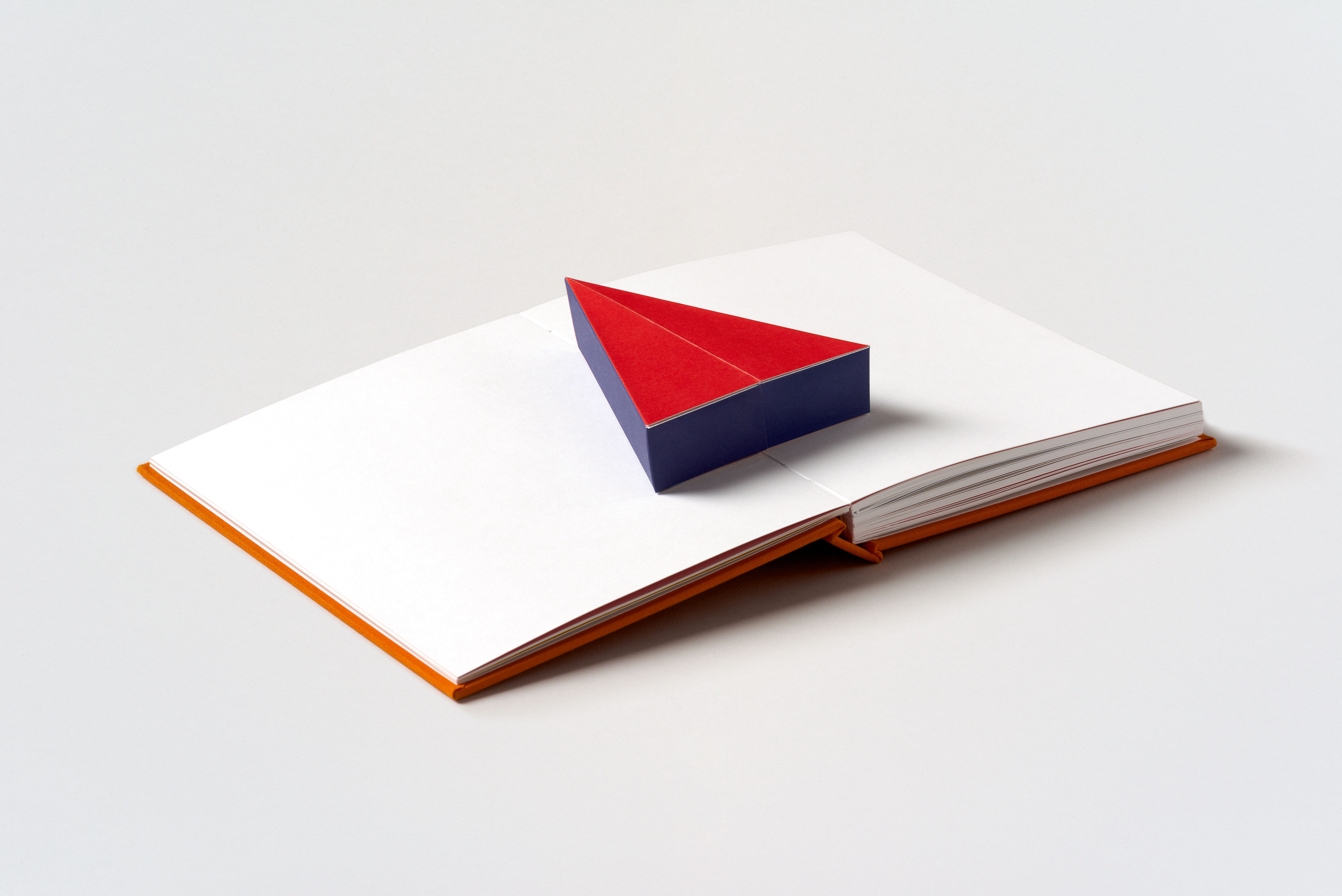
Anfalov agrees that ‘golden rules’ are inherently fluid. “It’s good to learn different approaches in layout composition and to always extend that knowledge,” he says. “I don’t believe in the power of dogmas. Approaching new projects, I often think: ‘Should I have a grid? Or is there no grid at all? How can I design something without sticking too mechanically to the rules?’ But it’s really up to the project’s nature. The content gives me clues on how I should proceed.”
De Bondt has an “internal unspoken rule” when it comes to the process of designing layouts, “which is to try not to be too wasteful – the environment is already suffering so much.” Where possible, she tries to use standard book sizes to avoid paper wastage, and steers clear of laminating.
“Unfortunately a lot of books get shrink wrapped in plastic, I hope someone will invent a more ecological solution for that soon,” she says.
Printing a book
Once you’ve slaved over a book project for weeks, months or even years, it would seem frankly daft to relinquish control once it all goes to print. As such, most designers work very closely with the printers themselves, building up relationships over many years and meeting to discuss the process way before the printing wheels start turning.
It’s only by working closely with printers and really understanding how they work that you can push the limits of the books you’re making, and deliver something truly unique.
De Bondt emphatically states that it’s “incredibly important” to work closely with the printer. “Printers often have good ideas,” she says. “Sometimes I ask them to help find a paper, or we try to find solutions together when we hit a problem. I really like going to printers’ offices to see other things they’ve made and learn about techniques I wasn’t aware of. Print technology is moving all the time.”
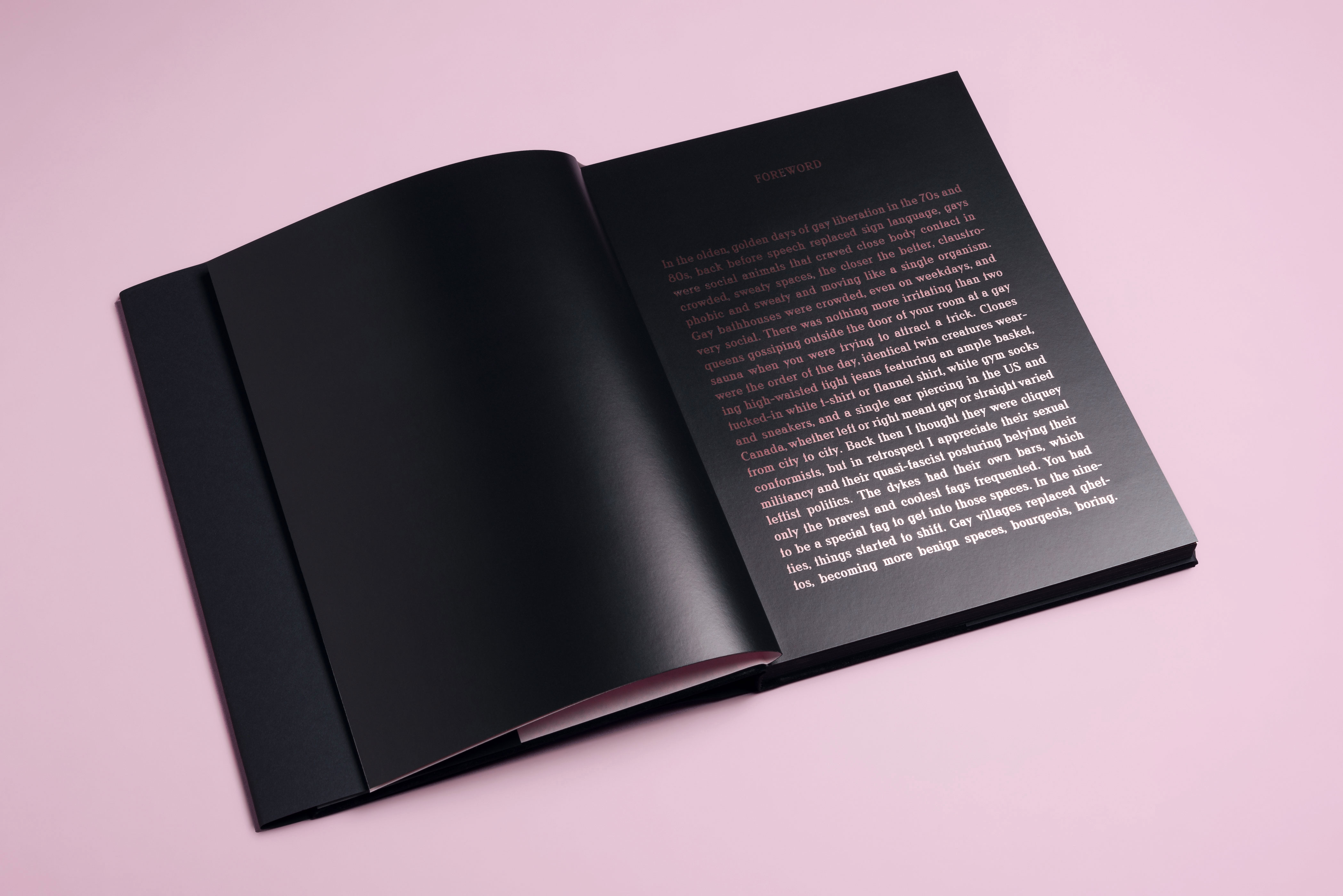
Berlin’s Studio Yukiko art directed the first publishing venture from gay dating app Grindr – Home. Formed of a collection of photographs by artist Matt Lambert, it explores intimacy and LGBTQ stories.
The book is characterised by bold and complex printing flourishes, including black passe–partout frames, spot varnishes, a special cold foil production technique, and use of shiny, near invisible text. The production wasn’t without its challenges: they couldn’t get the cold foil to stick to the original choice of paper; and the varnish machine even caught fire.
The result was worth it, and a testament to the drive and vision the studio has become known for. “We’re so grateful to have a really good relationship with our printer, and every time we come up with an idea we discuss it and see what’s actually possible,” says Studio Yukiko co-founder Johannes Conrad.
“So we’re not trying to come up with ridiculous things that aren’t doable... We’re always in very close communication.” The ultimate project for him is when it becomes “more than just designing, but creating something that hasn’t been done before.”
A book is an object
It’s worth remembering in a design process so largely screen-based, that a book is a tactile thing to be held, touched and pored over in a very physical way, so its manifestation as an object should always be front of mind for designers. One of the most important decisions – and one that’s as much dependent on budget and printers’ limitations as imagination – is materials.
Book designer Emily Benton recommends building up a paper library of swatch books and samples, containing everything from standard uncoated and coated stocks to coloured, transparent, mirrored and textured substrates. Other samples might include grey board, marble papers, head and tail bands, and ribbons.
After a few years I realised how misleading the layout on the screen can be
Yevgeniy Anfalov
The vital element of tactility in books means it’s perhaps little surprise that many book designers featured here espouse the importance of looking away from the computer as part of the book design process. Anfalov sometimes takes images, cuts them out by hand in various sizes, and moves them around. “After a few years I realised how misleading the layout on the screen can be, if it happens without proper paper proofing,” he explains. “Scissors, glue, and handcraft tests became essential.”
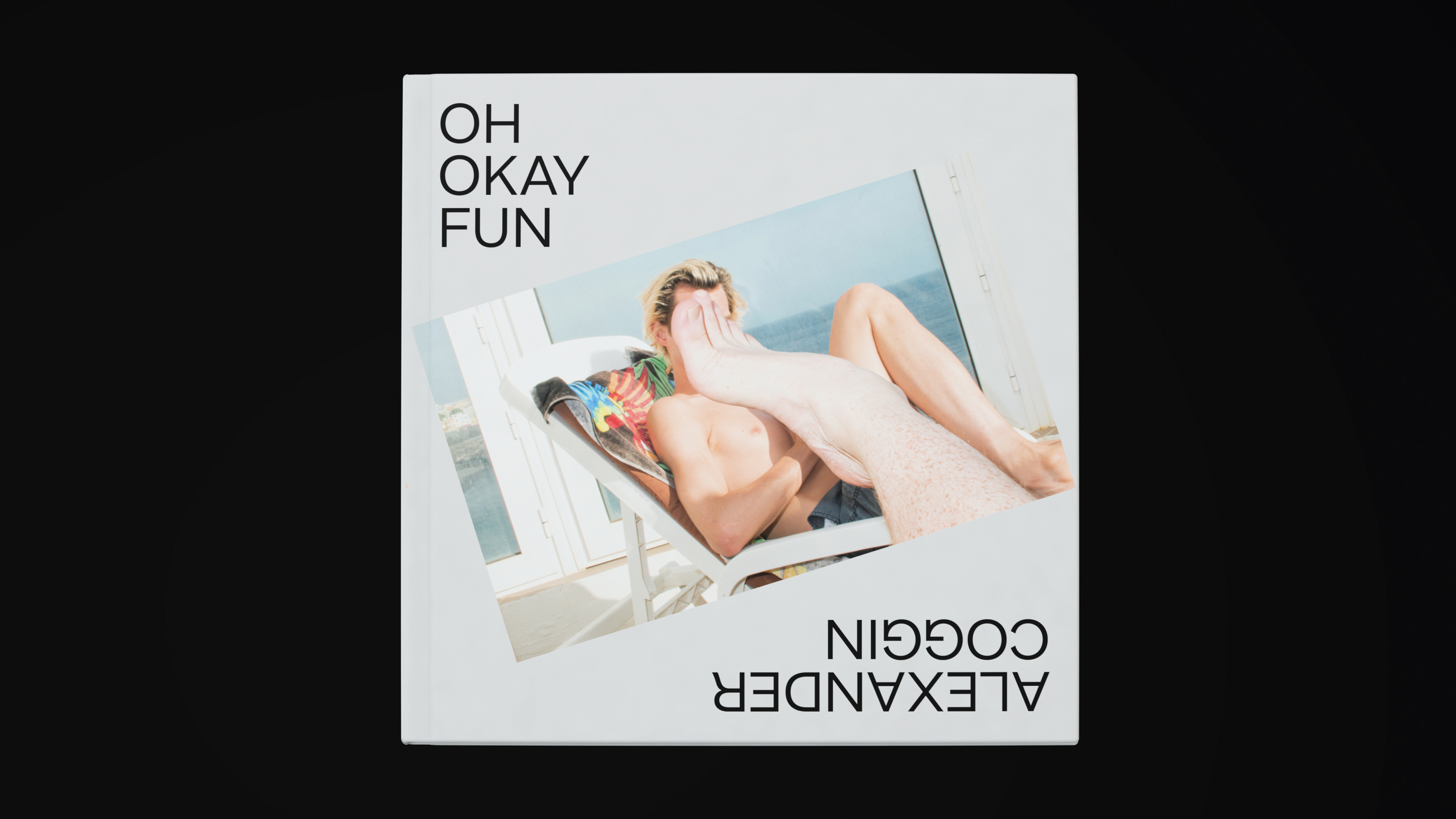
“I learn a lot from the mid-century magazines, where the editing is sharp, generous, reductionist,” he adds. “The page is never alone, but is a part of the whole. Images on the double spread interact with each other. The way they are set is the means to establish the rhythm and dramaturgy.”
Mauracher agrees, and advocates the importance of looking outside of the obvious touchpoints for ideas: “Of course I get inspired by other books, but they’re mostly not about book design. I read a lot and I think that’s important, to see what works and what doesn’t.”
As Petrides states, the best book designs come from being relentlessly curious: explore film, fashion, art, music and illustration “away from a phone screen,” he says. “The more you see, the more you’re building a bank of references to pull from as a designer.”
This article originally appeared in Computer Arts, the world's leading graphic design magazine. Buy issue 281 or subscribe here.
Related articles

Emily Gosling is a freelance art and design journalist currently writing for titles including Creative Review, Eye on Design, Creative Boom and People of Print. She’s previously worked at Elephant magazine, It’s Nice That and Design Week, and was editor of Type Notes magazine. Her book Creative Minds Don’t Think Alike was published by Ilex Press in 2018, and she also plays bass as one-quarter of the eight-titted beast, Superstation Twatville.
