A good mobile app must boast a great interface design and an engaging user experience, of course, but people also judge by appearances. In a crowded marketplace, developers must make sure that their app is beautiful enough to stand out. Animations can help on all counts. When used properly, UI animations can help reduce cognitive load, attract and direct users’ attention, and make an experience easier to follow.
In my work at EffectiveSoft, I often advise developers on how to integrating animations into their UIs in order to win over customers. Get it right, and it really works. But use too many animations or use them in the wrong places, and it can create an irritating or noisy experience.
So, when are animations appropriate? This article pulls together some best practices for using animation in mobile apps, to show you how to build an app interface that works. For guidance on adding motion to your interfaces, take a look at these CSS animation examples article.
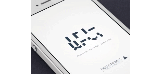
01. Animated app launch screens
Studies show that people expect apps to load instantly, but with complex mobile apps this isn’t always possible. Loading animations can help distract users and make the load time appear shorter than it is. There are a lot of different animation options for load screens.
A simple option is to use an animated logo, as Édouard Puginier has done here in his design for the launch screen of Wit.
Other designers like to get more creative, and tie their animation in with the theme of the app itself or the rest of the branding. In the loader design below, Anton Drokov has animated a spacecraft travelling to the stars.

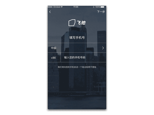
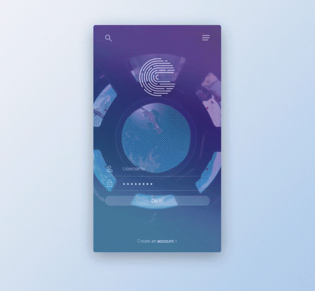
02. Animated login screens
Some apps ask users to log in before they launch. Here, an awesome background illustration can help liven up a login screen, and keep new users on side so they’re willing to take the time to log in.
In the login animation below, @herac1es has used a time-lapse animation of a busy city to add momentum to the process of logging in.
Other apps use animation to distract the viewer while they check the username and password that has been entered. In the space-inspired concept below, Oliver Günther has even designed an error state.
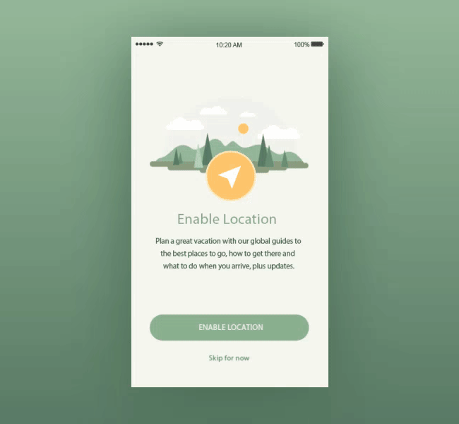
03. Animated onboarding screens
Software developers understand the importance of the onboarding process. This helps first-time users to become familiar with the app – there’s a real risk people will abandon the app if they do not understand how to work with it.
Showing static slides to users is a common approach to the onboarding experience, but animated walkthroughs are much more engaging, as this calming onboarding animation from Zhenya Rynzhuk proves.
04. Animated progress and activity indicators
It is common knowledge that people are impatient and hate waiting. Developers do their best to ensure their apps work smoothly and speedily but sometimes waiting is inevitable – for example, when something needs to be loaded or a new element is installed.
Apps often employ animated progress or activity indicators to capture users’ attention. These could be circular or linear, and developers tend to choose indeterminate indicators for operations that are performed quickly, and determinate indicators for actions that take more than two to three seconds.
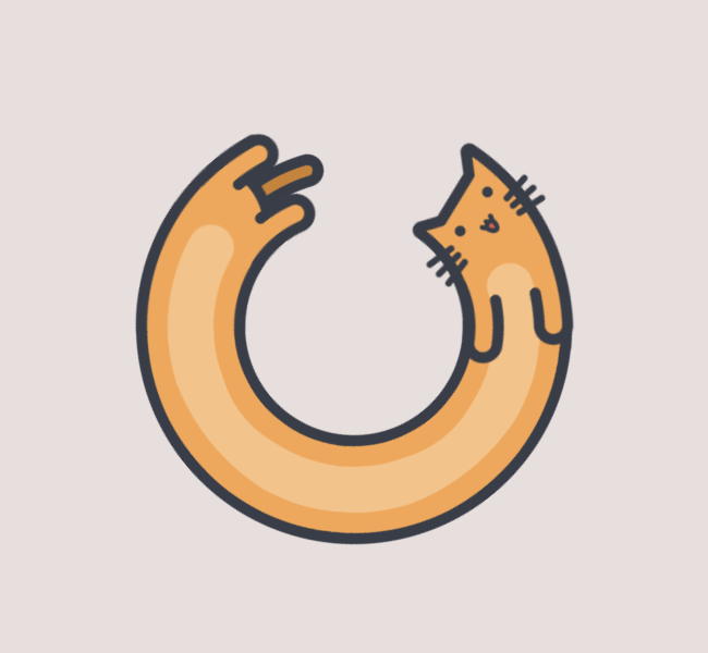
However, some app designers make their activity indicators more distinctive. For example, Domaso’s circular progress indicator has been turned into a cute cat that stretches as it moves.
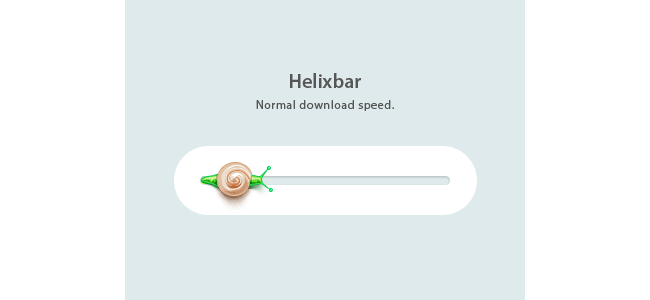
Andrey Davlikanoff has also plumped for a cute creature. His tiny snail moves forward to indicate progress.
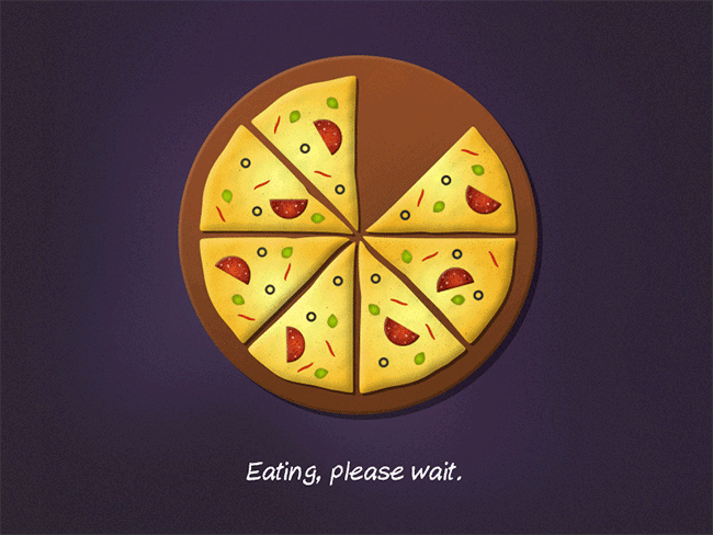
Other developers have chosen to tap into our obsession with food. Such indicators are a great choice for mobile apps that deal with food delivery, recipes or cooking. For instance, Giedrius Butkus’ mouthwatering pizza preloader design would fit a pizza delivery app perfectly.
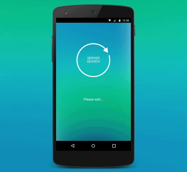
Roman Kryzhanovskyi has opted for a simpler, geometric design in his Android app server search progress screen.
Finally, Mark Martemianov has decided to combine a circular and linear progress indicator in his Material Design-style subscription button.
Next page: UI animation ideas for buttons, menus and error pages
