8 imaginative ways to use animation in mobile apps
Get inspired by these mobile UI animation examples.
05. Animated buttons and controls
Developers extensively make use of animations when it comes to different buttons and controls. A common example might be an animated handset to indicate there is an incoming call – as in this design by Andreas Storm.

Animated toggle buttons are also popular. The toggle switch below, by Tsuriel, enables the user to switch between day and night modes.

06. Menus
Mobile app menus offer plenty of scope for imagination. Most designers use different fonts and backgrounds to make them beautiful. Some go a step further and take advantage of animated buttons and fonts to make their apps to be even more distinctive. This charming menu animation from Anastasiia Andriichuk is a sweet surprise for users.
Article continues below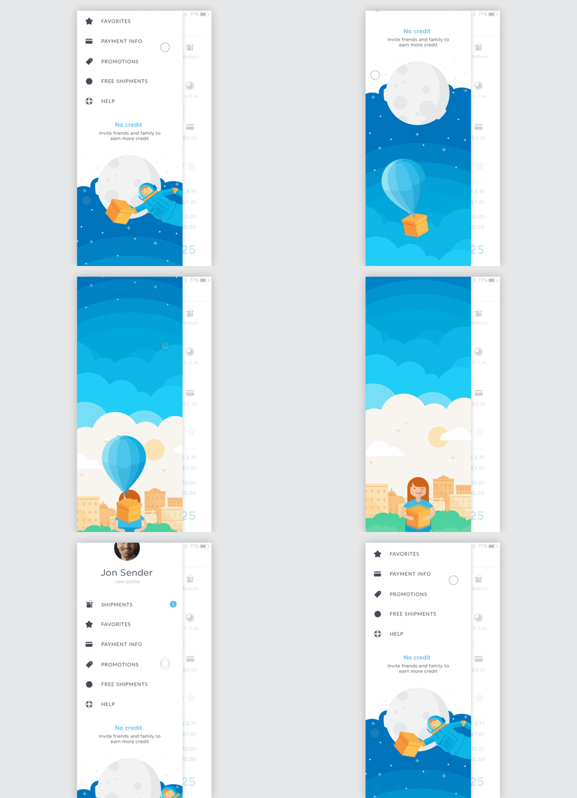
07. Pull-to-refresh
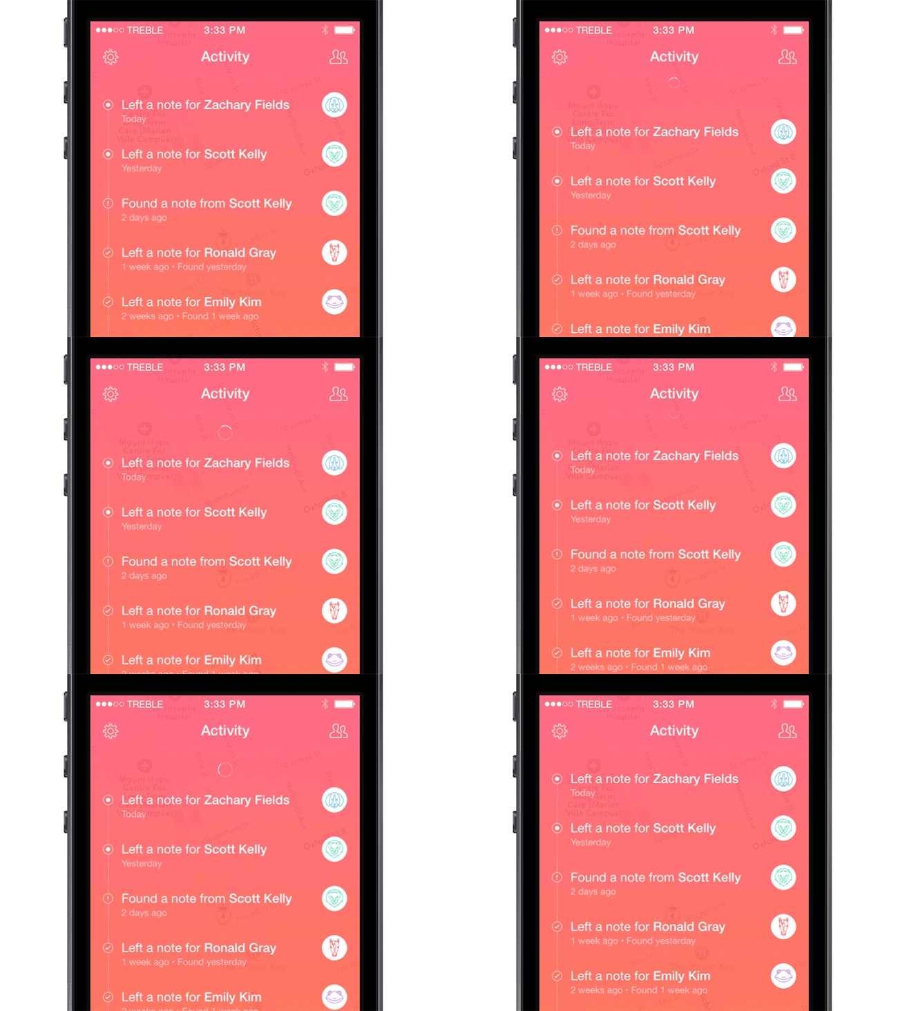
Both users and developers love swipe-to-refresh patterns. This method for updating content involves a physical interaction between the human being and the app, almost like a dialogue between the two.
This pull-to-refresh animation from Jon Rundle takes a simple approach, with a satisfying elastic bounce effect when the user lifts their thumb.
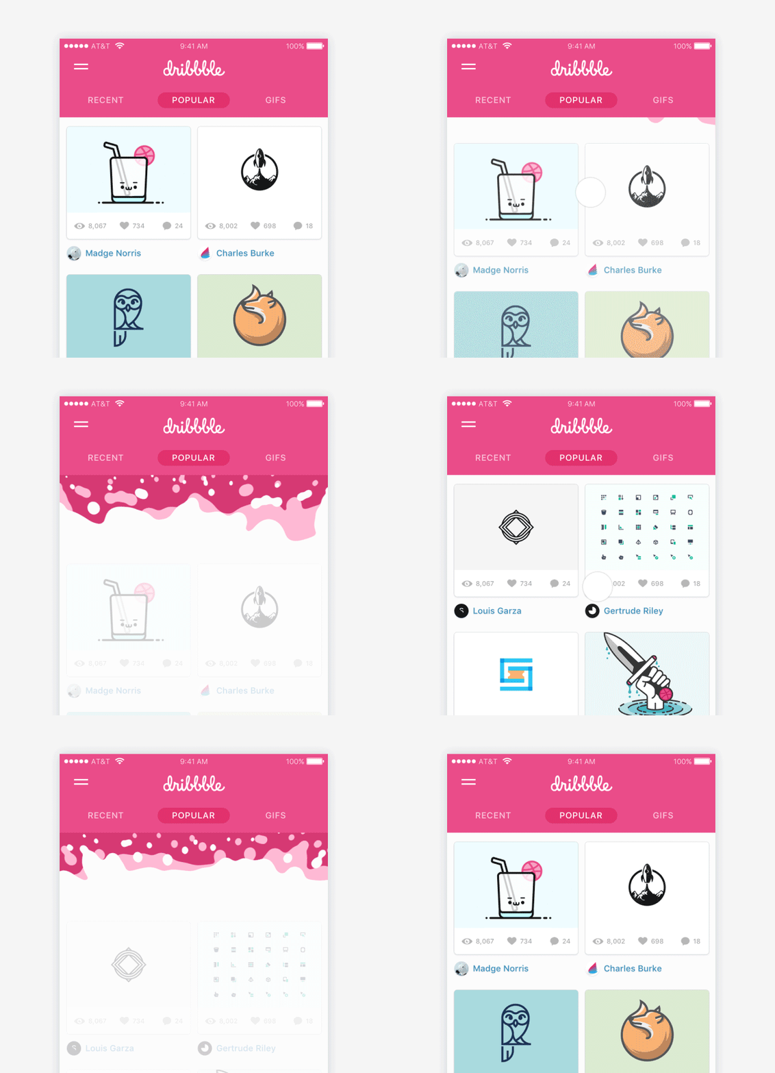
In other cases, more complex animations can work better. Ramotion’s liquid pull-to-refresh animation for Dribbble adds a touch of fun to the experience.
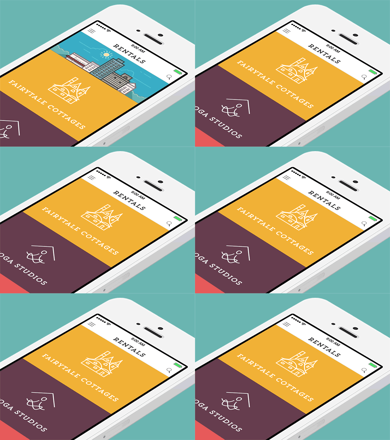
It's a good idea to use animations that match the overall style or subject of the app. Dmytro Prudnikov’s design for a rentals app gives the user a cheeky peek of a skyscraper in the sunshine.
Sign up to Creative Bloq's daily newsletter, which brings you the latest news and inspiration from the worlds of art, design and technology.
08. Error pages
In an ideal world, errors would never occur. But realistically, sometimes things don't go to plan. Putting some effort into your error pages can help diffuse the frustration of hitting a dead end. A custom error page can help retain users.
Sathish Kumar's 'no internet' animation shows a bee falling out of the sky when the user's connection isn't working properly.
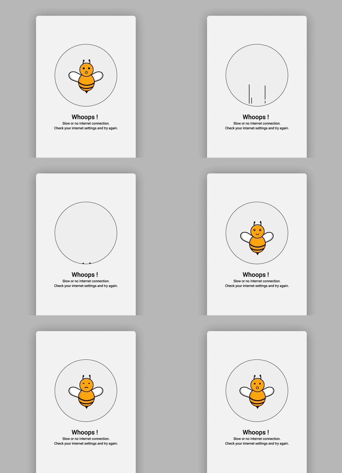
These kind of animations work well when designed in tandem with other error pages – for example, Kumar has designed an accompanying animation for when something goes wrong, which shows a bee being blown off course – sure to take the sting out of not getting the information you were expecting
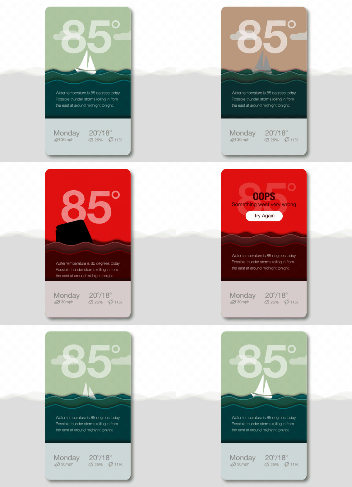
Similarly, Scott M Thigpen's design for a weather app introduces an element of surprise and humour when an error page occurs.
Related articles:
