Understanding colour theory in digital art and design
Colours affect how we feel. Here, we explain the reasoning behind colour theory in design throughout the ages.
Sign up to Creative Bloq's daily newsletter, which brings you the latest news and inspiration from the worlds of art, design and technology.
You are now subscribed
Your newsletter sign-up was successful
Want to add more newsletters?

Social scientists tell us the division between warm and cool colours seems woven into the fabric of our human existence.
Take a look at the McDonald's sign on this page. Would you stop for a burger if the logo were green and purple? The neural pathway that processes colour is not only separate from our perception of tone, but it's also strongly tied to the emotional brain.
The evolution of colour
Anthropologists Paul Kay and Brent Berlin have studied the evolution of colour terms in languages around the world.
Article continues belowEuropean languages have about 11 or 12 basic terms to describe colours. Yet some so-called primitive languages, such as the New Guinean Dani, have only two basic terms.
Kay and Berlin wrote: "One of the two encompasses black, green, blue and other 'cool' colours; the other encompasses white, red, yellow and other 'warm' colours." Primitive peoples don't have poor vision.
Anthropologists suggest that as language evolved, it developed its first word concepts around the most psychologically important groupings.

Cool vs. warm
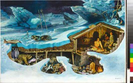
The cool colours seem to evoke feelings of winter, night, sky, sleep and ice. So the colour blue suggests quietness, restfulness and serenity.
Sign up to Creative Bloq's daily newsletter, which brings you the latest news and inspiration from the worlds of art, design and technology.
Warm colours such as red, orange and yellow make us think of fire, energy and hot spices.
Advertisers use all these bright, warm colours to whet the appetite for fast food.
Complementary colours suggest an opposition of elemental principles - such as fire - and they can suggest a feeling of conflict in a painting.
The emphasis on the complementary oppositions of blue-violet versus yellow, green versus red, and light versus dark echoes the opponent process system of colour vision, where all colours we see are the result of interactions between opposing pairs of colour receptors.
Further reading
True Colours:
Colour speaks to people. It's one of the most instant forms of graphic communication, yet it can so easily be the medium most over-looked. Time, then, to open your eyes to colour all over again.
Read more.
New Adventures in Colour:
Be it eye-poppingly vibrant or high-contrast monochrome, the design world's use of colour is shaping our reactions to the world around us more than ever. Mark Penfold discovers how.
Read more.
Brand New Colour:
Brands rely on colour as a shortcut to their customers' hearts, but how can a designer guarantee a palette says all the right things? We ask the experts.
Read more.
Did you find this useful? Let us know in the comments box below!

The Creative Bloq team is made up of a group of art and design enthusiasts, and has changed and evolved since Creative Bloq began back in 2012. The current website team consists of eight full-time members of staff: Editor Georgia Coggan, Deputy Editor Rosie Hilder, Ecommerce Editor Beren Neale, Senior News Editor Daniel Piper, Editor, Digital Art and 3D Ian Dean, Tech Reviews Editor Erlingur Einarsson, Ecommerce Writer Beth Nicholls and Staff Writer Natalie Fear, as well as a roster of freelancers from around the world. The ImagineFX magazine team also pitch in, ensuring that content from leading digital art publication ImagineFX is represented on Creative Bloq.
