How to design user-friendly mobile interfaces
Top tips for more ergonomic mobile and tablet UIs.

Sign up to Creative Bloq's daily newsletter, which brings you the latest news and inspiration from the worlds of art, design and technology.
You are now subscribed
Your newsletter sign-up was successful
Want to add more newsletters?
Some mobile designs suffer from a problem: they might look great on the surface, but start to use them and you soon find out that an all-too-important factor has been neglected: the ergonomics. The noble art of creating designs that fit the human body (rather than the other way around) is one of the true unsung heroes of the design world.
Ergonomics has always been very important to industrial designers, but it's becoming increasingly important to digital designers as well. Why? Because smartphones and tablets are changing the way we interact with digital designs. We no longer only use a cumbersome keyboard and a mouse to tell our digital friends what to do. Now it's more direct, more physical. We hold our devices. We tap them. We pinch them. We lovingly stroke them.
This increasingly physical bond with our beloved mobile devices forces designers to not only think about how a design looks and feels, but also the physical aspects of using it. It forces designers to think about how users hold and interact with their smartphones and tablets; about how much of the screen they can comfortably reach and how a design will feel in the hand. It forces designers to think about the ergonomics of a mobile design.
Article continues belowSo how do you go about creating a mobile design that is ergonomic and therefore comfortable to use?
01. Get out of the office
Even before you start thinking about possible designs, get out of the office to carry out some first-hand observations. Spend a morning or afternoon looking at where, when, how and why people are using their mobile devices.
Make a note of how people are holding and interacting with their device, what they might be doing at the time and the sorts of challenges and distractions they might have to contend with. This information will help inform the ergonomics of the design, and means that when it comes to testing a design you can test against scenarios you know actually happen in the real world.
02. Design for multiple holds
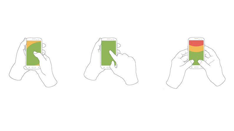
If you observe people using mobile devices, you'll soon see that they use a variety of different holds. The variety of holds used and the frequency with which users change their hold means it's important to design with multiple holds in mind.
Sign up to Creative Bloq's daily newsletter, which brings you the latest news and inspiration from the worlds of art, design and technology.
For example, start a smartphone design with one-handed use in mind (as this is the most challenging), but always test designs out across a range of holds to see how comfortable each of them are.
03. Place popular controls in reach
Place frequently used controls, such as buttons and links, where they can be easily reached by fingers or thumbs. The middle and bottom of the screen are good areas to use, although bottom corners can be tricky to tap when a device is being held in only one hand (read more here).
It's still the convention to place menus at the top of the screen. However, this can be a hard-to-reach area, so it's a good idea to also support a swipe action to bring up the menu.
04. Place content above controls
You don't want someone's finger or thumb obscuring the content as they tap the screen, so place content above controls. Also ensure that key information is not in an area of the screen where it can easily be obscured by a finger or thumb – such as the bottom corners, which are frequently covered up when a smartphone is held in one hand.
05. Design with portrait mode in mind
While the hold used might change, one thing that is much more consistent for both smartphones and tablets is the tendency for people to hold them vertically for the majority of the time. A horizontal hold is often used for particular tasks, such as viewing videos or photos, but this is the exception, not the norm.
Of course a mobile design should ideally support both portrait (vertical) and landscape (horizontal) modes, but unless you're designing a video or photo-heavy site or application, design with portrait mode in mind.
06. Design for thumbs
Thumbs drive the majority of all smartphone interactions. This is because thumbs are exclusively used when a mobile is held in one hand and heavily used when it is held in two hands.
Thumbs are slightly larger than fingers, and therefore need a larger tap target. Try to make these tap targets at least 44 x 44 points (16 x 16mm), with at least 7 points (2.5mm) between them. Bigger tap targets are always better and you should certainly not go any smaller than 44 x 30 points (16 x 11mm).
Even if you're designing for tablets, still design for thumbs because a design should support the least accurate method of touch that it will encounter. A large tap target isn't just good for thumbs, it's great for fingers too.
07. Design for big gestures
So bigger tap targets are better. What bigger tap target is there than the whole screen? Try to design with big gestures in mind, such as allowing users to swipe to move forwards or backwards in a photo gallery, or to bring up a menu.
Remember users might not realise a gesture is supported, so it's always a good idea to provide a secondary way to do something, such as tapping an arrow icon to bring up the next photo.
08. Rise to the challenge
In ergonomics you sometimes hear talk of designing to suit at least 95 per cent of users by creating a design that is comfortable from the 2.5th to the 97.5th percentile of users. There will always be extreme users that are very hard to accommodate – as we all know you can't please everyone all the time, but if you can create a design that the more challenging users can use with comfort, it should also work for all those in between.
This is why it's a good idea to design with challenging users and scenarios in mind. For example, think of a busy commuter walking down the street with coffee in one hand and mobile phone in the other, or someone with arthritis.
09. Keep interactions to a minimum
Do you know which the most comfortable mobile device interaction is? It's not a tap, or a swipe, or a press. It's no interaction at all. The less interaction your mobile design requires, the less you have to worry about the ergonomics. I always try to keep interactions to a minimum. Ruthlessly cut down mobile forms, use autosuggests, and restrict notifications to only the things a user really needs to be notified about.
10. Prototype designs
You simply can't judge the ergonomics of a mobile design until you can physically hold it in your hands and try out different grips. This is why I will prototype a design as soon as possible. We like Axure, but there are lots of other great prototyping tools.
For a quick trial, you can even run basic user tests with simple paper prototypes. A sketch or paper printout stuck onto a mobile device will tell you a surprising amount about the ergonomics.
11. Test, test, then test some more
Want to know the one guaranteed way to create ergonomic mobile designs? It's to test designs, then iterate and test, iterate and test... and continue until you've got a bunch of different people, covering a bunch of different devices, all reporting that the design is comfortable to use. It's that simple.
Mobile devices are of course designed to be 'mobile', so get out of the office to test designs in the environments and situations they're likely to be used in. Coffee shops are always a good place to test in. Test designs with as many people as possible (at least five or six) and focus on more challenging scenarios, such as using a smartphone one-handed. If the design works well when the user's interactions are more constrained, it's sure to excel the rest of the time. It's primarily by continually testing and iterating that you can create truly ergonomic mobile designs.
This article originally appeared in net magazine. Subscribe here.
Related articles:


