A responsive workflow for Axure
Axure may be shy of responsive features, but the beloved UX tool can still be used on your next responsive project with a little help from responsive frameworks
Sign up to Creative Bloq's daily newsletter, which brings you the latest news and inspiration from the worlds of art, design and technology.
You are now subscribed
Your newsletter sign-up was successful
Want to add more newsletters?
The content, layout, and interaction challenges posed by the device-agnostic approach of responsive web design (RWD) forces Axure lovers to get creative with their favorite UX tool. Rather than abandon it all together, this tutorial will show you how to combine code generated from a responsive framework with Axure's native capabilities – like inline frame widgets and onPageLoad events – to create a responsive workflow.
You can view the prototype we're creating here, and you can download the Axure trial here.
Why prototype with a responsive framework?
The answer is simple: responsive frameworks take the guesswork out calculating pesky percentages and come packed with a variety of flexible UI elements to unleash into your prototypes fast! Chances are that if Axure is in your toolbox, you’re probably not a developer by trade. Does it make sense, then, to improve your coding skills just to convey responsive user experiences? Not really. With only basic HTML and CSS knowledge, responsive frameworks empower you to produce responsive wireframes and prototypes and even use the code for your final production site.
Article continues belowWhich responsive framework should you choose?

That’s a tough one. There are so many options for responsive frameworks, yet the choice depends on your project’s needs. ZURB's Foundation is mentioned in this tutorial because of its speed and versatility, although we won’t be diving deep into the framework. Instead, we’ll use its documentation page as an example responsive page since it is already coded and available online. To keep things simple, our Axure environment will only consider three pixel-based breakpoints:
• 1024px: desktop
• 480px: iPhone (pre-5) landscape
• 320px iPhone (pre-5) portrait
It's important to note that any responsive page, coded from scratch or with a framework, will work for this tutorial as long as its HTML/CSS/JS is accessible online.
Setting up your Axure environment
With our sample responsive page ready to go, let's configure our Axure workspace. First, copy the following URL: http://foundation.zurb.com/docs/
Create your Sitemap pages
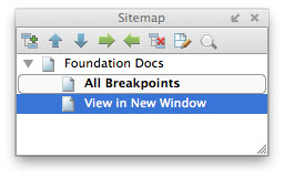
In the Sitemap pane, create the parent page Foundation Docs with two child pages beneath it:
Sign up to Creative Bloq's daily newsletter, which brings you the latest news and inspiration from the worlds of art, design and technology.
- All Breakpoints
- View in New Window
Your Sitemap pane should look like this:
Integrating responsive pages into Axure
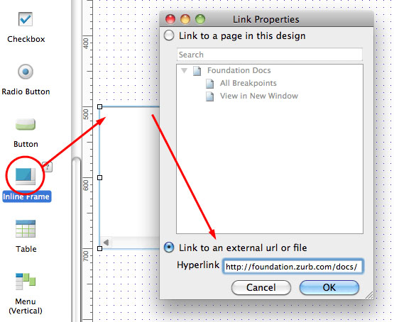
Double-click the All Breakpoints page from the Sitemap pane to open it in the Design pane. Drag an Inline Frame widget onto the Design pane and double-click it to reveal its Link Properties dialogue window.
For repetition's sake, let’s refer to the inline frame widget simply as an iFrame. Paste the URL for the Foundations docs page into the external URL text field and click OK to save your changes. This will make the responsive page show up in the iFrame when we generate our prototype later:
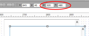
Select the iFrame and resize it to 320x480 pixels for our portrait iPhone view then duplicate it by pressing Ctrl+D (PC) or Cmd+D (Mac).
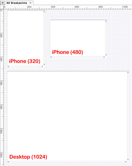
Now resize the copied iFrame to 480x320 pixels for our landscape iPhone view. The copied iFrame has the same URL reference to our docs page as the original, so you don't have to set it again using the Link Properties. One last time, duplicate one of the iFrames and resize the copy to 1024x768 pixels for our desktop version. Your workspace should look like this:
Add familiarity to the mobile iFrames
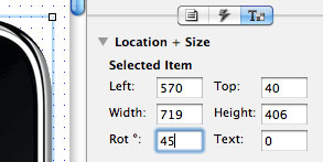
Use your favourite iPhone image, or grab one from an Axure widget library, to use as a background for your mobile iFrames. Place the iPhone image on the Design pane, duplicate it, then rotate the copied image 90 degrees. You should now have portrait and landscape images of an iPhone:
Select both mobile iFrames and bring them to the front using the toolbar menu option Objects > Order > Bring to Front or the shortcut Shift+Ctrl+] (PC) or Shift+Cmd+] (Mac).
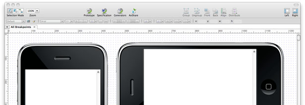
Move the iFrames over the screens of each iPhone until your Design pane looks like this:
It’s not necessary to add a browser image behind the desktop iFrame, but go ahead if you prefer the consistency!
Provide a standalone page view
Seeing all three breakpoints at once is great for the imagination, but can be distracting. Let's configure the View in New Window page to open a new window with only a single view, one breakpoint, of our responsive page.
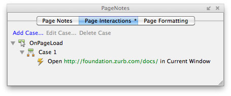
Double-click to open the View in New Window page and find the Page Properties pane at the bottom of the screen. Nothing will go on the Design pane for this page because we are only adding an OnPageLoad event.
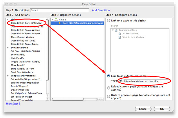
In the Page Properties pane, click the Page Interactions tab then double-click the OnPageLoad icon to open the Case Editor. Select the Open Link in Current Window action in Step 2 then select the radio button for Link to an external url or file in Step 4. Paste the URL we’ve been using for our iFrames into the textfield and click OK to save your changes.
Render and view your prototype
With everything in place to view the breakpoints for our responsive page, generate your Axure prototype. When your browser loads, click the All Breakpoints page under the Sitemap tab on the left to see the responsive page in action:
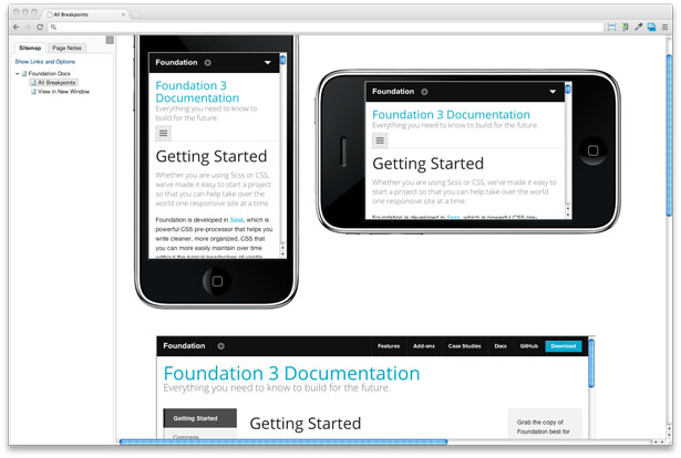
The iFrames we used on this page trigger the media queries of our sample responsive page to help us visualise all breakpoints at once. Go ahead and scroll through all three iFrames to see the content. It's all there! When you're finished, click the View in New Window page to open a new browser window with our responsive page in it. The new window will not have the Sitemap and Page Notes tabs and can be used for viewing layout changes by manually resizing the browser.
Evolving and sharing your responsive Axure project
Specs, design elements and more
With our foundation in place – no pun intended – our Axure environment is set up to evolve into an extensive resource for any responsive project. Pages for additional responsive views can be added quickly using the technique we’ve covered and supporting documentation – such as Style Tiles, page notes, functional requirements and so on – can be set up the same way.
Sharing your prototype with AxShare
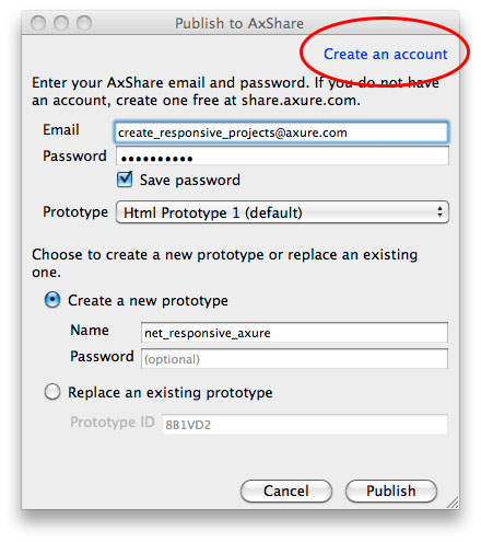
One of the most helpful aspects of this workflow is the Axure feature to upload
prototypes directly to AxShare for free and share them with teammates and clients.
One your prototype is online with AxShare, this means that all code changes made to
your responsive pages will instantly display in the iFrames we’ve set up without
regenerating the prototype. AxShare is free so create an account and start
experimenting if you haven’t already.
Conclusion
Combining Axure and responsive frameworks during the creative process requires a low learning curve and encourages Axure enthusiasts to think outside the box. Experiment with this approach the next time you want to convey responsive concepts without using multiple devices or having to open numerous browser widows.
Of course, there’s always the option of hacking Axure to simulating responsive prototypes, but why not take the path of least resistance and revel in the process?

The Creative Bloq team is made up of a group of art and design enthusiasts, and has changed and evolved since Creative Bloq began back in 2012. The current website team consists of eight full-time members of staff: Editor Georgia Coggan, Deputy Editor Rosie Hilder, Ecommerce Editor Beren Neale, Senior News Editor Daniel Piper, Editor, Digital Art and 3D Ian Dean, Tech Reviews Editor Erlingur Einarsson, Ecommerce Writer Beth Nicholls and Staff Writer Natalie Fear, as well as a roster of freelancers from around the world. The ImagineFX magazine team also pitch in, ensuring that content from leading digital art publication ImagineFX is represented on Creative Bloq.
