Card-based website layouts have taken over the web. Made popular by Pinterest, Twitter, Facebook and Google, cards have become a go-to design pattern for many different use cases.
It’s not hard to see why. Cards work perfectly within responsive web design. As self-contained units, they can be moved, shuffled and mixed with different content types. They also respond easily on different screen sizes, from single columns on mobile devices to multi-column on larger devices.
The ZURB team has used card-based layouts in its design work for years. Its frontend framework, Foundation, has always sought to equip web designers with the tools they need to quickly design and build responsive websites by including a wide range of modular and flexible components. Version 6.3 added to this collection of building blocks brings a brand new off-canvas implementation, responsive accordions/tabs, and a powerful new card component.
In this tutorial we’ll be learning how to create a responsive card-based UI that takes advantage of Foundation’s Flexbox-based grid to open up a whole slew of possibilities.
01. Set up a development environment
The first step is to set up a development environment. For this tutorial, we’ll be using a node-based development environment, so you need to install Node.js. The details to do this depend on your environment, so check here to find out what to do.
Once you have Node installed, install the Foundation CLI using npm install -g foundation-cli, which will make it easy to set up a new Foundation project.
02. Start a new project
Let’s create a new project based on the ZURB template. Run the command foundation new net-magazine-tutorial, select ‘A website (Foundation for Sites)’, ‘net-magazine-tutorial’ and then ZURB Template. This will set up a project template based on Foundation, complete with build system and development server.
The template comes with a sample page in src/pages/index.html. For simplicity, we’ll remove that sample and replace it with an empty <header> </header> to start from scratch building out our card-based UI. Run npm start from the command line to run the development server, and you should see a bare HTML page ready for cards.
03. Create a card
Now it’s time to create our first card. For now, let’s just put it straight inside a section with the class .cards-container. When creating a card using Foundation, there are three core classes to be aware of: .card, .card-section and .card-divider. For more advanced users, each of these corresponds to a SCSS mixin (card-container, card-section and card-divider).

But, for this tutorial we will use the default classes for simplicity. The .card class is the container; every card will live within a .card. This defines things like borders, shadows, and default colouring.
The .card-section class defines an expandable content block, where you might put content, while the .card-divider class defines a non-expanding block, such as a footer, header or divider. Let’s use all of these classes to create our first, basic card.
<header>
<div class="row columns">
<h3>Cards Are The Best</h3>
</div>
</header>
<section class="cards-container">
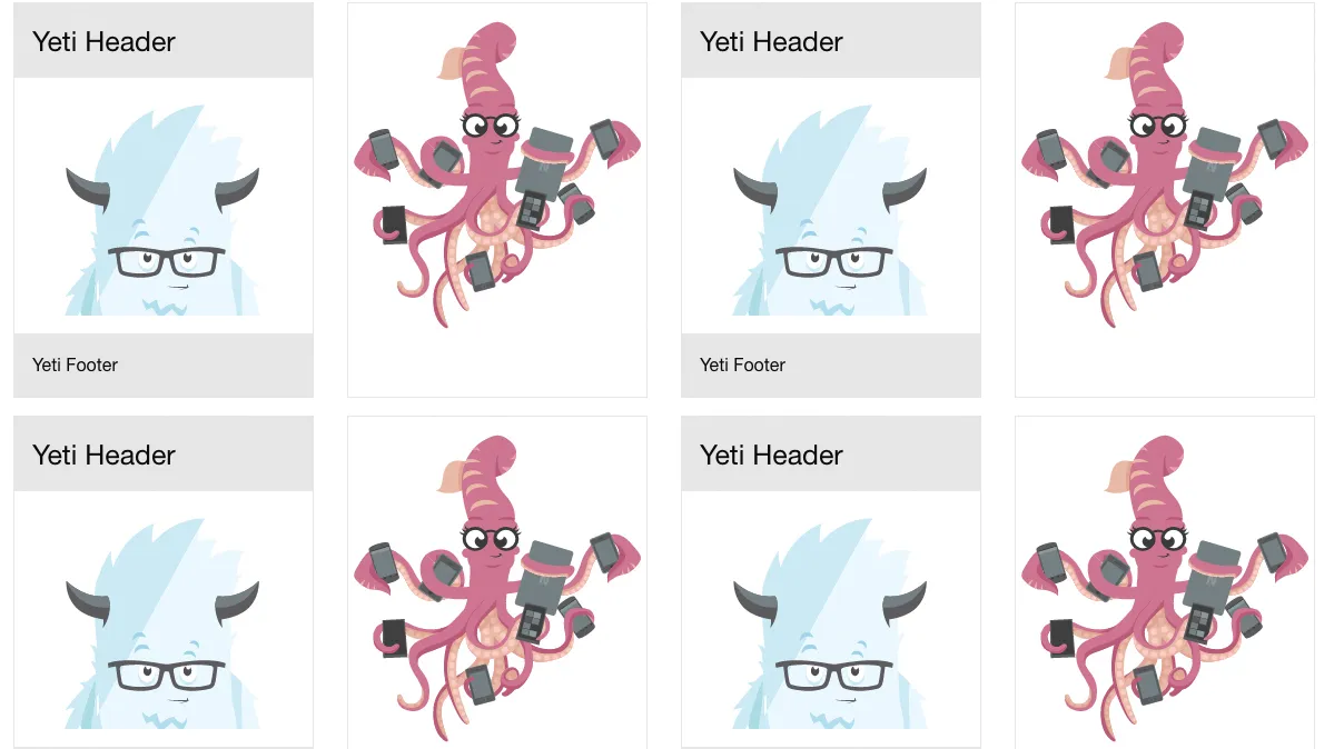
<div class="card">
<div class="card-divider">
<h4>Yeti Header</h4>
</div>
<div class="card-section">
<img src="https://foundation.zurb.com/sites/docs/assets/img/yeti.svg"></img>
</div>
<div class="card-divider">
<p>Yeti Footer</p>
</div>
</div>
</section>04. Add component styles
If we just do this, our card will be huge, expanding to fill the entire screen. We’re going to deal with overall sizing shortly, but for now let’s use this as an excuse to learn how to add component styles in the ZURB template.
Add a file _card.scss to src/assets/scss/components/ specifying a max-width: 300px for .card and include the file in our main CSS by adding @import components/card; to src/assets/scss/app.scss.
05. Make your cards reusable
In order to create a repeatable layout with multiple cards, we’re going to want our cards to be reusable components that we can plug in over and over again. The ZURB template that we’re using for this tutorial uses a templating language called Handlebars, which includes the ability to create partials, or reusable blocks of code.
To move our card implementation into a partial, simply cut and paste the .card component we built into a file in src/partials, say src/partials/basic-card.html. You can then include that content by simply adding the line {{> basic-card}} in your index file.
06. Start building your layout
We’ll cover different card types in a little bit, but first let’s use our reusable basic-card to start creating a larger, responsive layout for our cards. To do so, we’re going to use a concept from Foundation called the block grid.
Foundation contains a few different types of grids, but they all start from the concept of rows and columns. A row creates a horizontal block which can contain multiple vertical columns. These basic building blocks make up the core of almost all layouts.

Block grids are a shorthand way to create equally-sized columns and to allow yourself the flexibility and freedom to add an indefinite amount of content and have it lay out nicely in equal columns. You simply add a class to the row and then add as many column components as you like. Foundation will lay them out for you neatly and cleanly.
Since we expect to have a very large and changing number of cards, this is ideal for our purposes. Let’s set this up quickly in a four-column grid and add a few dozen cards. For now we’ll only worry about large screens, so we’ll simply apply the .large-up-4 class to the row.
<section class="cards-container">
  <div class="row large-up-4">
    {{#repeat 24}}
      <div class="column">
        {{> basic-card}}
      </div>
    {{/repeat}}
  </div>
</section>
07. Make it responsive
Next, let’s consider what we want to happen on different screen sizes. Foundation comes with small, medium, and large breakpoints built in, so we can simply apply a different block-grid class for each breakpoint to shift things around.
Let’s put one card per row on mobile screens, and three per row on tablet, by adding the classes .small-up-1 and .medium-up-3 on the row. If we do this, and remove the stopgap max-width property we put _card.scss. We already have a beautifully responsive layout that looks good on all screen sizes.
08. Try some new card types

Now let’s diversify our set of cards, another type is a pure edge-to-edge photo. Card sections and card dividers contain padding by default, but to have edge-to-edge content we can simply put the image directly inside of the card. Let’s add this as a photo-card.html partial in src/partials.
<div class="card">
  <img src="http://foundation.zurb.com/assets/img/foundation-emails/inky-all-devices.svg" />
</div>
09. Introduce Flexbox
There are hundreds of possible ways we can put together cards – for some inspiration, you can check out the Foundation cardpack repository. But let’s move on to how we manage layout when we have different-sized cards. If you insert the photo-card partial into the layout alternating with the basic-card as we did before, we end up with a bit of a jagged experience because our heights are different. This may be fine, or we may want to adjust our layout to compensate.

For this tutorial, we’ll compensate by using our favourite new CSS layout technique – Flexbox. Foundation comes with a Flexbox mode for its grid. To enable it, you simply need to open src/assets/scss/app.scss, comment out @include foundation-grid; and @include foundation-float-classes; and uncomment @include foundation-flex-grid; and @include foundation-flex-classes;.
10. Make your cards the same height
With the Flexbox classes enabled, it’s simple to get our cards to be the same height. First, we can make our columns flex parents by adding the .flex-container class. This is a prototyping shortcut for adding the display: flex; property to them. Once we do this, all of the cards will become the same height, but since flex child elements shrink by default, some of our cards get kind of narrow.
We can fix this issue by simply telling those elements to grow. This is done by either targeting them with CSS and giving them flex-grow: 1; or for simplicity while prototyping, just by adding the class .flex-child-grow. Once all of this has been done all of our cards fill the columns and will be nicely the same height.
This article was originally featured in net magazine issue 293. Buy it here or subscribe to net here.
Liked this? Try these...
