Concept design tips for artists
Create believable worlds for animation with these 15 workflow tips.
09. Think about staging
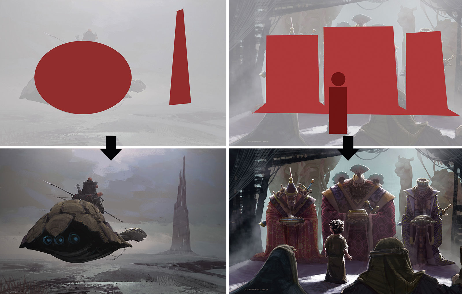
Combining different shapes and sizes together in a shot creates the perception of intensity. Intentional overlap in images also develops cohesion and relationships among characters and environment. The higher the contrast between sizes the greater the intensity. The same goes with shapes.
10. Make sure your shapes are readable
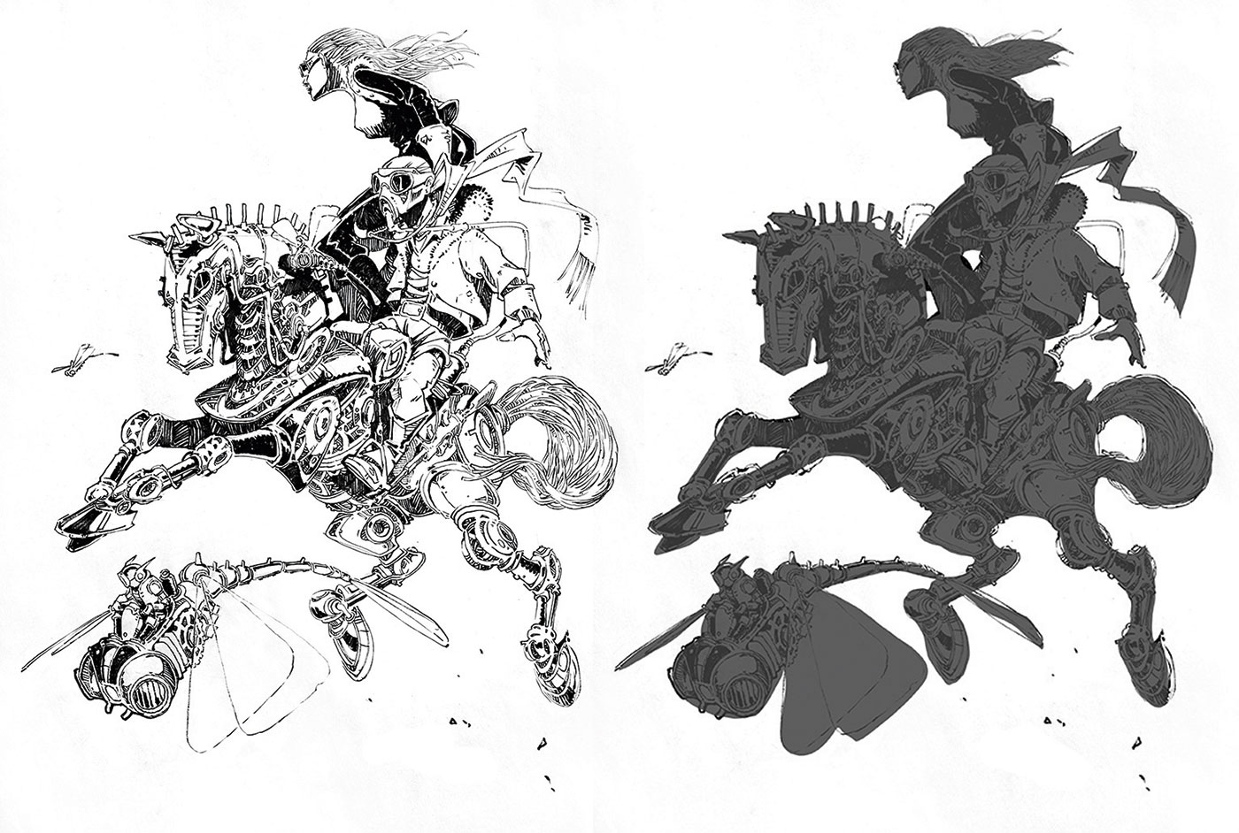
From the overall form to the least visible prop, every shape has to be readable. Even in a busy setup, the effectiveness of information is not dependent on the details, but the readability of shapes. Even if those shapes were stripped of details to the point of silhouette, they will still be easily identifiable.
World War II pilots were trained to identify specific enemy ships at sea by reading their silhouettes. So I would say your designs must be exaggerated and simplified, with clear silhouettes working harmoniously.
Article continues below11. Aim for balance
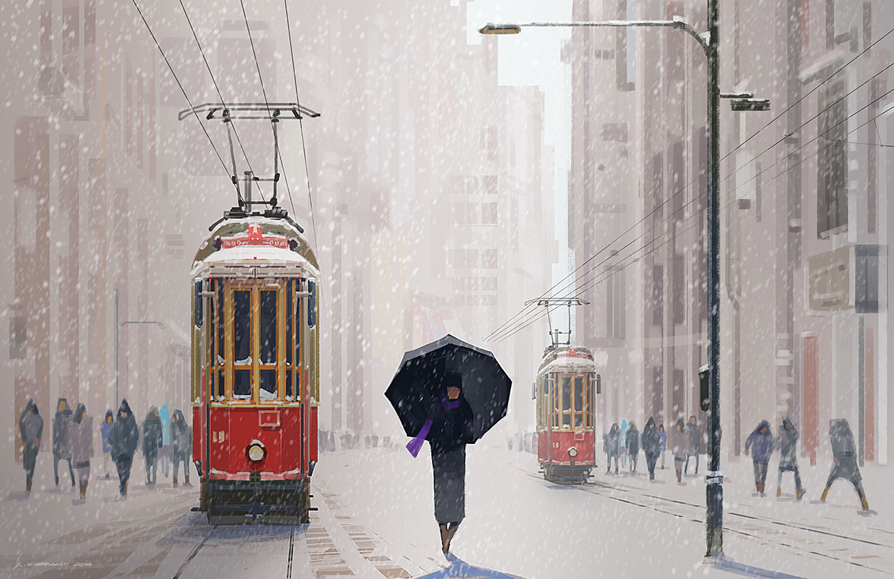
Imagine the subject as the pivot of a horizontal lever. Now remember, all other elements that will be drawn on the canvas will have 'weights' that are based on their shapes, sizes and value. Balance will be attained if these elements are staged on both sides of the pivot, without having the lever tilt on either side.
12. Less is more
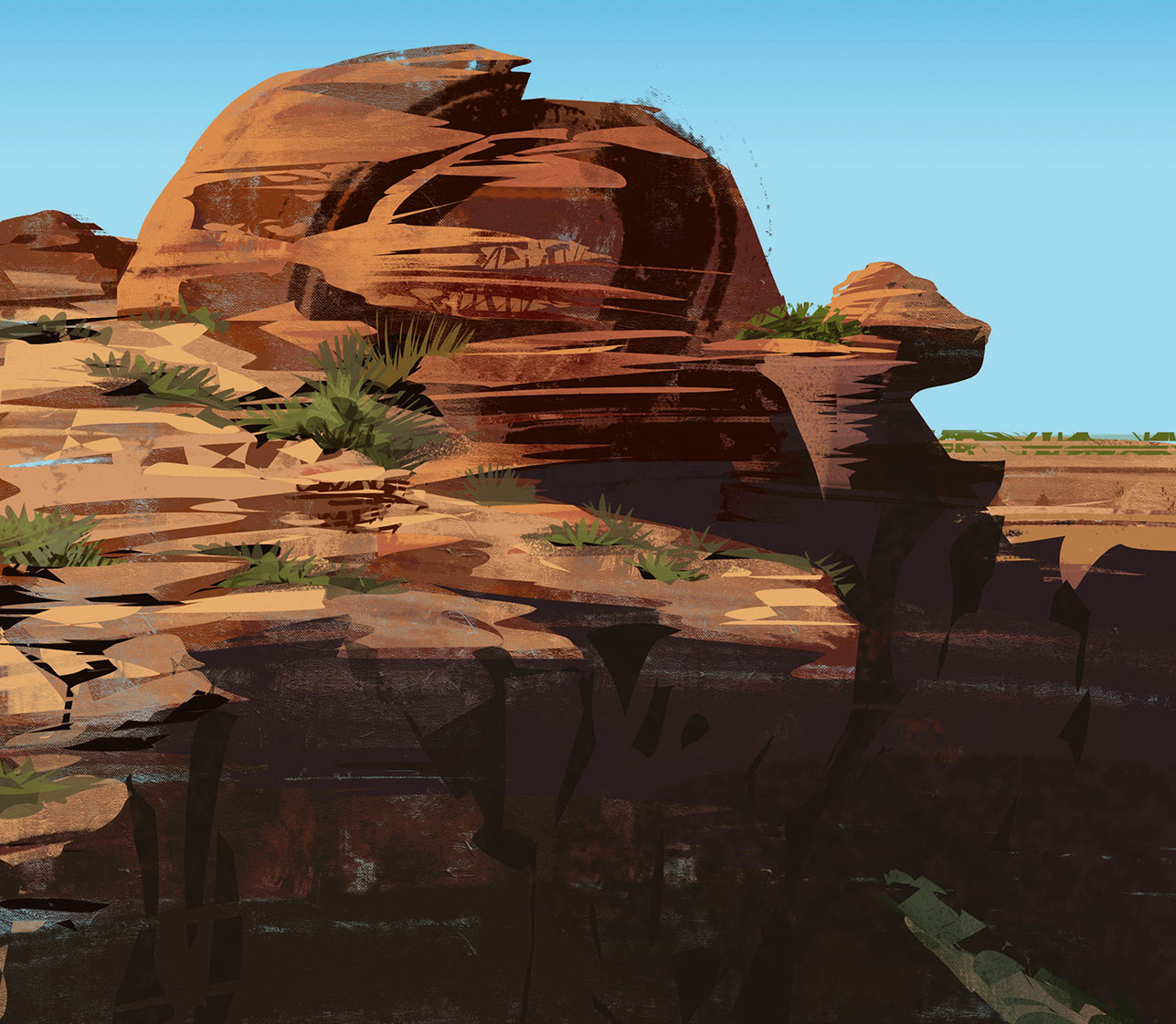
In designing what's supposed to be repetitive patterns, such as bricks on a wall, or organic patterns like rough textures on rocks, always apply the economy of lines and simplify without the compromise of information. This can be done through the less-is-more approach. This is either the simplification or purposeful removal of details on some sections. By doing this, the designer leaves room for the viewer's imagination to fill in the missing details.
13. Add a hand-drawn touch
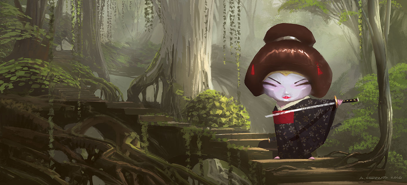
This tip doesn't intend, in any way, to look down or undermine the direct use of photos in the digital painting process. If it's needed in production, then go for it. But the heavy reliance and dependency on photos should not become a designer's priority. Your goal is to learn how to create simplified textural patterns and concentrate on the design essentials first and foremost. There's a charm added when hand-drawn textures are applied.
14. Add history and story
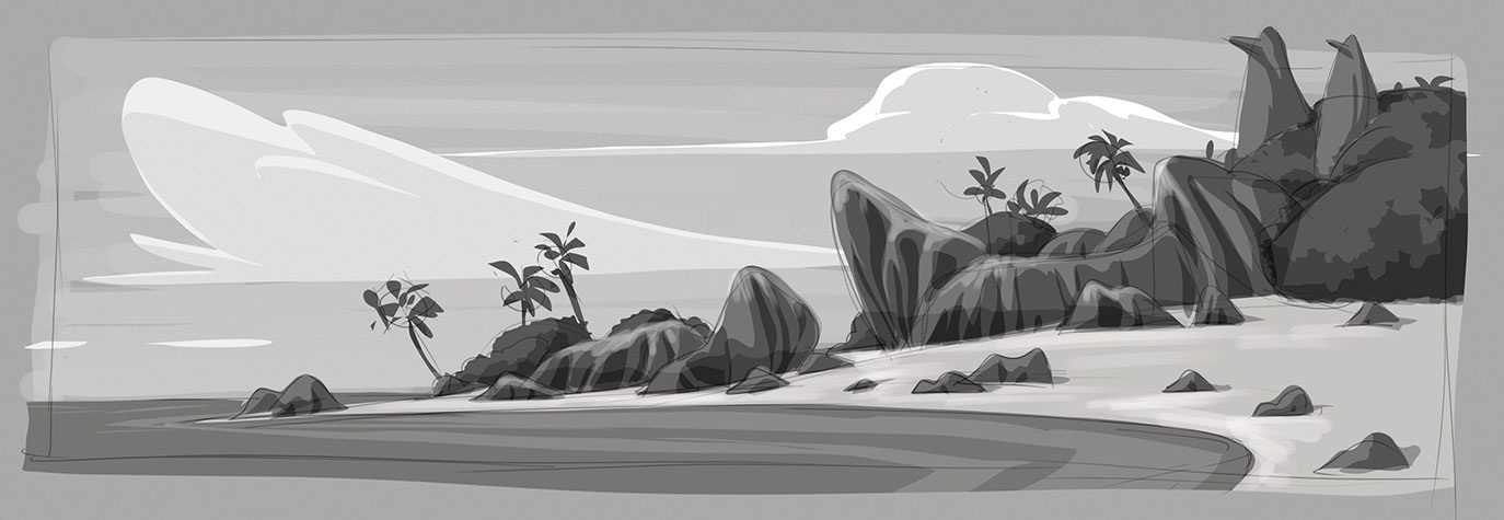
Research plays a big part in this process. The believability of a world doesn't come from a literal application of a photo. The designer has to find a way to design the history and story of an environment that personifies and supports the personalities in it.
Sign up to Creative Bloq's daily newsletter, which brings you the latest news and inspiration from the worlds of art, design and technology.
So in the image above, we're creating an island that's inhabited by penguins. Just designing from a photo wouldn't be convincing – what makes it believable is applied history and story. Adding the two penguin monuments made sense in establishing the penguin world.
15. Use Lasso painting
This is the technique I use when I'm pressed for time. I coined the name from the Lasso selection tool in Photoshop. Its simplicity and ease of use enable me to drop the values, carry out speedy colourisation and paint over highlighted surfaces. With practise, this process is very effective for a quick turnaround of art. At this point the heavy lifting has been done and all I need to do is a bit more painting over the image to create a refined, final version if needed.
Create thumbnail and line work
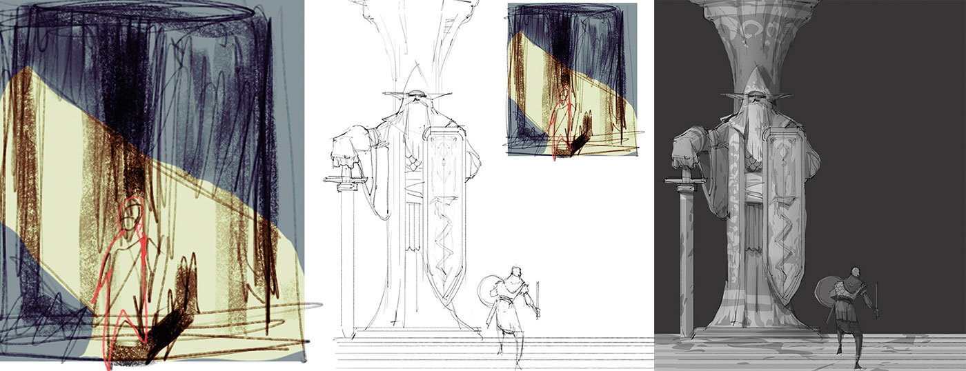
I create a very quick thumbnail idea for composition and direction, then lay down the line work. The column and the character are on two separate layers. Then I drop and separate the local values using the Lasso tool. I also use a little bit of Airbrush to soften the edges.
Duplicate the layer
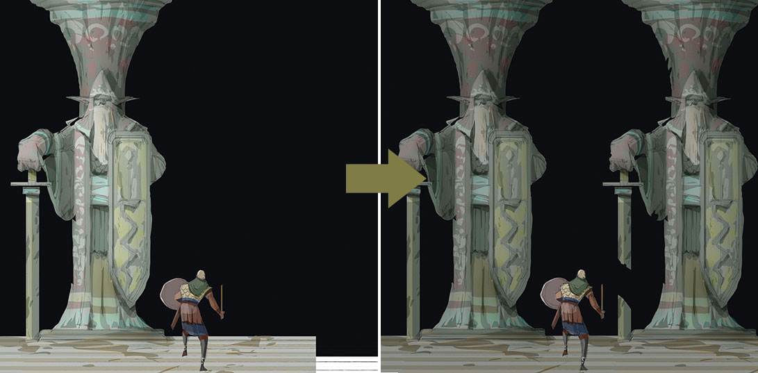
Next I duplicate the desired layer to be colourised, then select it. I pick the desired brush and then from the Brush Mode drop-down menu, I select Color (and I make sure to bring it back to Normal mode after this step).
Keep lighting consistent
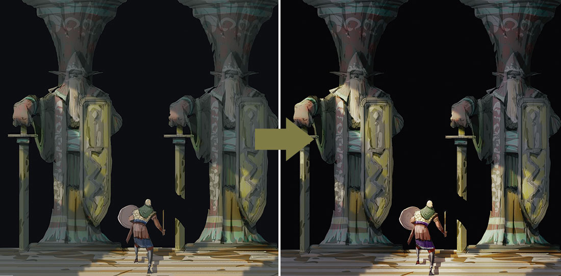
Using the Lasso tool, I select the cast shadowed surfaces. I soften the mask for the columns but keep it sharp on the character. Consistency in lighting is the key for this step. I create separate new layers for shadowed and highlighted surfaces and I increase the cool tone, then darken the layer with the shadowed surface. I increase the warm tones and contrast on the layer using highlighted surfaces.
This article originally appeared in ImagineFX, the world's best-selling magazine for digital artists. Subscribe here.
Related articles:
