Generate endless colour palettes with Khroma
Supercharge your colour workflow by combining your favourite hues with an AI algorithm.
Sign up to Creative Bloq's daily newsletter, which brings you the latest news and inspiration from the worlds of art, design and technology.
You are now subscribed
Your newsletter sign-up was successful
Want to add more newsletters?
Excellent use of colour theory in design is one of those things that separates the great from the average. While subjective and nuanced, colour is a powerful tool that can define the emotion and tone of a digital experience. For something so important, my own workflow around colour was severely lacking.
Although there are plenty of great resources already out there, I found there was no way to browse and compare original colour combinations quickly that felt ready to use. That's what I intended to solve by building Khroma.
Pick a colour, any colour
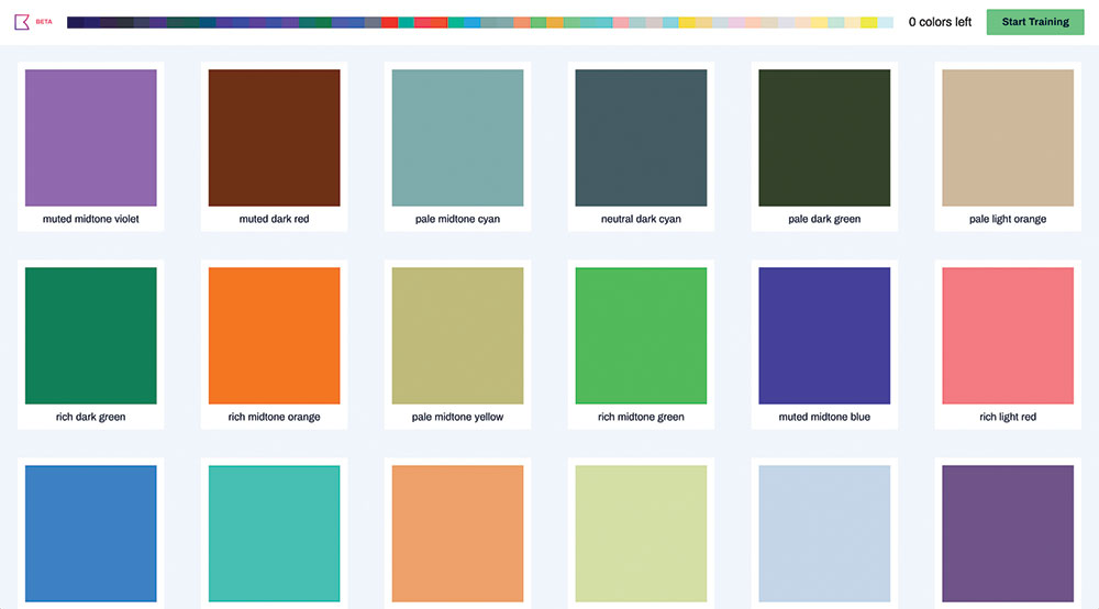
One of the exciting things about Khroma is that you get to train an AI algorithm to act like an extension of your colour designer brain. The challenge is that in order to do that well, you must choose 50 colours that you like. When building the algorithm, I tried to make it work with less but the results weren't good enough.
Article continues belowFifty ensures that the generator has a decent range to be varied and flexible enough to help with all of your designs. The training process is relatively unstructured and is probably equal parts science and art. A few pro tips from my experience should help you get the most out of it.
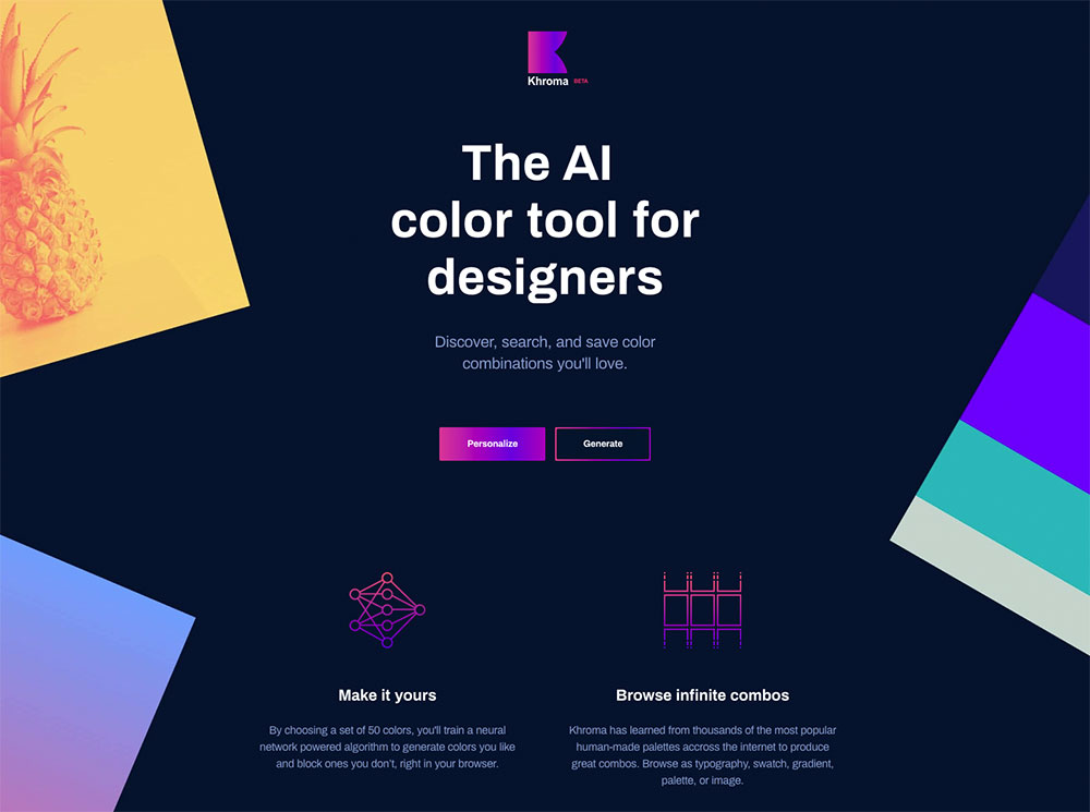
It's worth mentioning briefly here how the algorithm works. Your 50 colours will be used to train a neural network that will be able to recognise hundreds of thousands of other similar colours that you'll like (we'll call this your colour affinity). It knows which colours you don't like because it's not in the original 50 you chose. That means if you don't select dark brown, you won't see it. That's fine if you're not a dark brown fan but not if you miss something you really like. That's what makes going for variety so important.
To start training your Khroma generator, go to khroma.co and click Personalize. You'll see some instruction and an infinite scrolling wall of colour blocks. A click on one of these blocks will add it to your chosen colours bar and another will remove it. The best way to proceed is to scroll through and choose any colour that jumps out as something you might want to use in a design. This works well for the first 30 colours.
Time to refine
At this point you'll want to look up at the chosen colour bar and see how it's shaping up. If this was your document colours in Sketch, would you have everything you need? The next 20 colours from here should be about refinement. As you proceed a little tooltip will pop out with some suggestions, eg 'picking some more magenta, yellow, and pale colours will improve your results'. I recommend trying to stick to these but don't be afraid to continue picking new colours. From here you should pick 10 more, bringing the total to 40.
Sign up to Creative Bloq's daily newsletter, which brings you the latest news and inspiration from the worlds of art, design and technology.
Look up at the bar again. Do you see colours that are virtually the same? It's not unusual to pick the same colours more than once since, well, you like them. But that won't be useful to your algorithm.
I had a friend try an early prototype and he told me his results weren't very good. "It's mostly just blue," he said. "Did you pick mostly blue in your training?" I replied. "Yes. I really like blue."
The best outcome will come from finding the widest breadth of colour affinity possible. It you mouse over a repeated colour in the top bar, you can click to remove it. This frees that slot for a colour you haven't yet chosen. Do some pruning of any repeats and continue to fill in new colours until you have five picks remaining.
Toss in some wildcards
I've found it rewarding to throw in some wildcards for my last five picks. These are colours that I don't think I'd ever use on their own. Often I've been pleasantly surprised by what Khroma does with them. When next to other colours, they seem to fit perfectly in a way I wouldn't have imagined.
When you've chosen your wildcards you'll see a Train button pop up in the top right. You can continue to pick colours for as long as you'd like from this point but if your chosen colours look like a nice dark to light palette with lots of variety, you're probably set to begin training.
Training should take about three minutes. You can expect the accuracy to get up to the high 90s. This essentially represents how well the algorithm can identify your colours. You can actually go back and edit your training colours later on if you want to try out some tweaks.
Build your collection
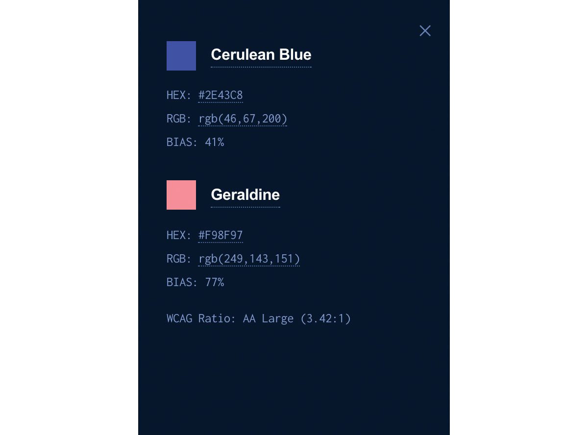
When the training process finishes, you'll be dropped into the generator. You'll be presented with an infinitely scrolling grid of colour combos in the type template. Each combo has an info panel you can open up to see details like the name, hex and RGB values, as well as a WCAG accessibility ratio. With the heart icon on the top right, you can start building a collection of your favourites.
Find the right combo
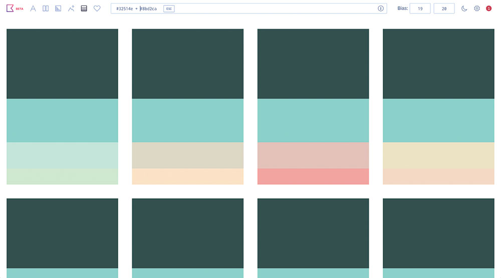
Search is one of the most powerful features of Khroma. Often I'll have a loose idea of what I'm looking for, or I'm already working with a certain colour and want to find complements. Since Khroma gives you access to hundreds of thousands of RGB colours in your affinity range, it seemed important to be able to sift through them.
There are different parameters you can search with: type, hue, name, Hex and RGB. Types include dark, light, pastel, pale, deep, muted, rich, bright and neon. Hues are warm, cool, red, orange, yellow, green, cyan, blue, violet, purple and magenta. There are 1,566 specific colours you can search for with names like 'royal blue' and 'coffee'. Lastly, it accepts Hex and RGB values.
Since Khroma works with two colour combos, save for palettes, there are two slots for search queries. If you enter one term in the search bar and search, you'll get results matching that term for the first colour slot and the second will be random.
For example, if you search for 'bright', you'll get a high-saturation colour and a random pair with it. If you search 'bright and blue', you'll get those bright colours and a random blue in the second slot. You can also chain type and hue terms together, like 'bright blue' and 'pale yellow', for example.
One big use cases where search is especially useful is when you have two colours you like and want to find complements to them. You would just enter those exact colours (#8BD2CA and #32514E say) and search under the palette template.
Sometimes you'll search for a colour or term that isn't in your affinity range. That's where the bias controls come into play. You'll see them as two click and drag fields in the top right of the toolbar. Bias represents how strict the generator is in matching colours to the 50 you chose.
Each colour Khroma generates runs through the algorithm and gets a percentage (how likely it believes you will like the colour) in response. If that percentage is beneath the bias, it will be thrown out and the process repeats.
In the case of an out of range search query, the bias is automatically lowered until it can pass the threshold test. If it's totally out of your range (like our dark brown from earlier), then it will automatically turn it to 0. This way, every colour you get in Khroma defaults to your affinity but is able to adjust so you're not only limited to those colours.
Custom images
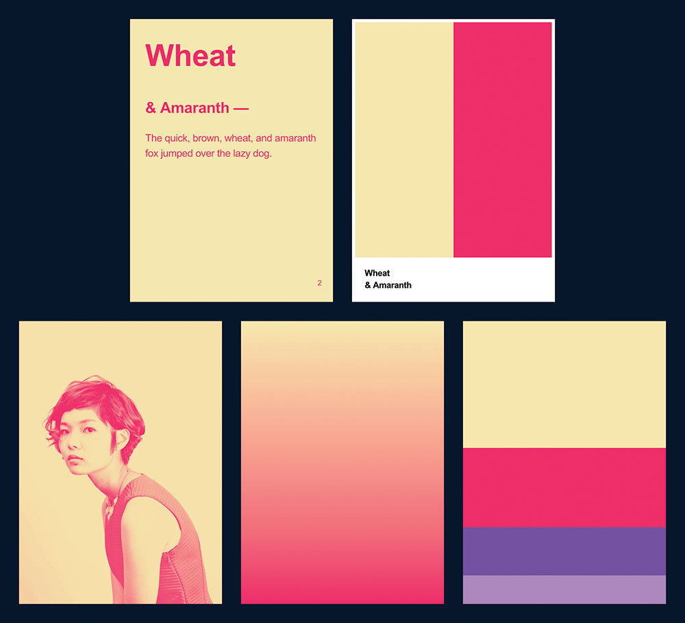
You can find a few handy options in the top right under the Settings icon. One of them is the ability to upload a custom image to the image template. You don't need to do anything to the image beforehand; just make sure it's the right size.
While you can go ahead and use your own headshot (I won't judge), it's better to think of it as the ability to make your own template. Take a screenshot of something you're working on in Sketch or your design tool of choice, upload it, and start browsing limitless combinations!
I hope you give Khroma a try and find it a useful and powerful addition to your design toolkit.
This article was originally published in issue 303 of net, the world's best-selling magazine for web designers and developers. Buy issue 303 or subscribe here.
Related articles:
