
Painting a portrait can be a difficult task. Even if you've mastered how to draw a face, you can easily end up lost in details and jewellery. So before starting anything, have a basic rough idea of the final image.
Here, I want to depict a portrait inspired by the Venetian carnivals, but without the mask, because we want direct eye contact. We'll be using Photoshop.
Light is a key part in any portrait piece. It's how the character stands out – it brings volume, life and intensity – so it must be carefully worked. The light is challenging here, mainly because of the amount of detail. Indeed, I don’t want the detail to become too distracting, which can soon be the case when there’s a lot of it.
Remember – if you're not satisfied, don't hesitate to go back and change the elements you don’t like. Sometimes I even restart the entire illustration. For me, that’s just a part of the painting process – and it’s often for the best!
01. Assemble some concept sketches

The pencil sketch is an important step. I always do a few of these before starting the real painting, to help me visualise where I want to go. I can quickly add details like the crown, or think about what kind of costume I want for my character. It’s a good base to start from.
02. Create colour thumbnails

Then I scan the pencil sketch into Photoshop and do some quick colour thumbnails. I pick a harmonious colour scheme and start to mix those colours, to see whether they work well together.
The challenge when there are multiple elements is to develop something consistent; I find doing a quick colour sketch really helpful in this respect.
03. Lay down colour blocks

I start the face in huge blocks of colour, to quickly get everything placed correctly. I try to develop a lot of colour variations in this area because it’s the focal point of my painting and so it needs to be realistic and feel alive. I mix some red and pink for the eyes, mouth and nose to help achieve this effect.
04. Adjust the composition

At this point I change the composition and go for a classic dress instead of a neck ruffle collar. The dress will be covered with colourful patterns and some hints of golden embroidery. I always use a big, round, soft brush to sketch patterns, because I need to blend colours quickly at this early stage.
I find it helpful to ensure all the details work as a whole and are well integrated; the soft brush is ideal for achieving this.
05. Develop the carnival-esque crown

This portrait is carnival-inspired, so my character will be wearing an outlandish crown with feathers. I start with a pyramid shape made up of many little baroque-style curves. I visualise my idea on another layer and start to correct the previous shape based on this.
I want the crown to be completely gold, so I pick a colourful yellow/brown to paint the base. I don’t work up the light yet – before starting that, I need to refine the entire crown and add some texture.
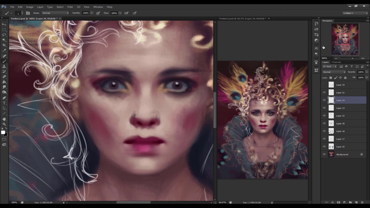
06. Define the facial features

Now I start to add more details to the face. I work the eyes, add eyelids and eyebrows – this is an important step because it’s now that I decide what expression and attitude I want for my character.
I choose to try to make her look mysterious, so her eyes will have a lot of makeup. I use some deep, dark violet to paint the eyelids. I never use pure black for shadows or creases, because that will only make other colours look muddy. Always colour your shadows!
07. Give the skin a sense of texture

I’m happy with how the face looks and I can now start to work on texture. For this I use my scribbling technique. I add colour variations and volume all over the face with a one-pixel, Hard-edged brush.
I work the light and shadows, but also on some details such as the eyelids. This is a long process but I like the final render – once it’s smoothed it adds a lot of tiny texture or grain. A speckled brush also gives this effect.
08. Design the costume

I want my character to be colourful, so I create a specific pattern for her dress with turquoise and red. I keep the design simple because I don’t want it to distract the viewer too much. I also refine the ruffles and crown. I leave the feathers very dark and blurred – they aren’t the main decorative element and must stay discreet.
09. Revise the composition

I decide I’m not happy with the composition: it needs to be brighter. The character’s position was too stiff, so I move her slightly to the side to develop a more natural pose. I also change the crown and the light on the upper part of the composition, opting to add more red instead of yellow, and bring in more light there, too.
10. Update costume elements

I now take the opportunity to change the ruffles – I found the previous design too boring. I also quickly sketch some more rounded curves to give a sense of lightness to the dress and character.
I bring in a degree of transparency, which will help an object look either very light or fragile. I approach the crown in the same way, painting thinner, longer, baroque curves to break the heavy style of the previous one to help produce a more feminine, delicate look.
11. Paint a lace collar

I decide to add lace fabric to increase the delicate look of my character and add some mystery. Lace is intricate, but it’s easily done: I use a textured brush to roughly draw some curves and flowers – it doesn’t need to be precise. I add a few dots of light on it to create some volume so that it doesn’t look too flat and unrealistic.
12. Add more life

I accentuate the colour of the character’s lips and cheeks, picking a deep pink/red to do this. Red and pink are the perfect colours to add life to a character, especially on the face. Then I select a very small, precise brush and create some long, curvy eyelashes to give her eyes a more dramatic and mysterious look.
I always blur the extremities to make them more natural. And finally I add some beauty spots here and there on her face – this quick extra detail is particularly effective when you want to create realistic-looking skin.
13. Introduce texture to the crown

Now I need to add more texture to the crown, especially on the feathers. I use a basic Round edge brush (with Hardness at 100 per cent and Opacity Jitter set to 100 per cent), and then paint some little brush strokes all over the feathers, to create a myriad of colour variations that mimic the texture of their real-world counterparts.
I do the same on the crown to emulate the appearance of old, slightly tarnished gold. I don’t want something clean. Including flaws helps to achieve more realism in the scene.
14. Make some final adjustments

Now it’s time to add some extra light coming from the top. I choose to use a pink colour close to the one in the background, to retain some unity and bring in a colourful glow all over the crown and feathers. I use a big, Round, soft-edged brush to create this special effect, and adjust the layer’s Opacity if I go too far with it.
I repeat the same process on the face, this time picking a pale blue to contrast with the background colour. Finally, I use a Brightness/Contrast adjustment to slightly correct the general contrast of my illustration. And we’re done!
This article originally appeared in ImagineFX issue 147. Buy it now.
Related articles:

